Amber Shockey & Co.
Tableware pattern design. Built as systems that layer, mix, and scale from single accent to full table.TL;DR Built→ Three tableware collections: blue florals, black linework, red dragons. Hero, secondary, accent per setScope→ Pattern design, product design, colorway developmentTools→ Illustrator, Photoshop, InDesign. Multiple colorways per collectionAngle→ Patterns built as a system, not a single print. Cream as shared ground, so a pattern only works if the next one fits.
Field Pattern Design Product Design Colorway Development
Author Jeremy Prasatik Published: 2017 Status: Live
Classification Pattern Design Product Design Colorway Development
Abstract
Tableware patterns built as systems. Each collection runs hero, secondary, accent. Designed to layer from a single dish to a full setting without losing logic.
Three collections shown here: blue florals, black linework, red dragons. Each direction balances structured against organic. Each runs multiple colorways so the same set flexes from minimal to maximal depending on how it pairs.
Built for a tableware startup that needed a system, not a single pattern. Pattern design, product design, and colorway development as one continuous process.
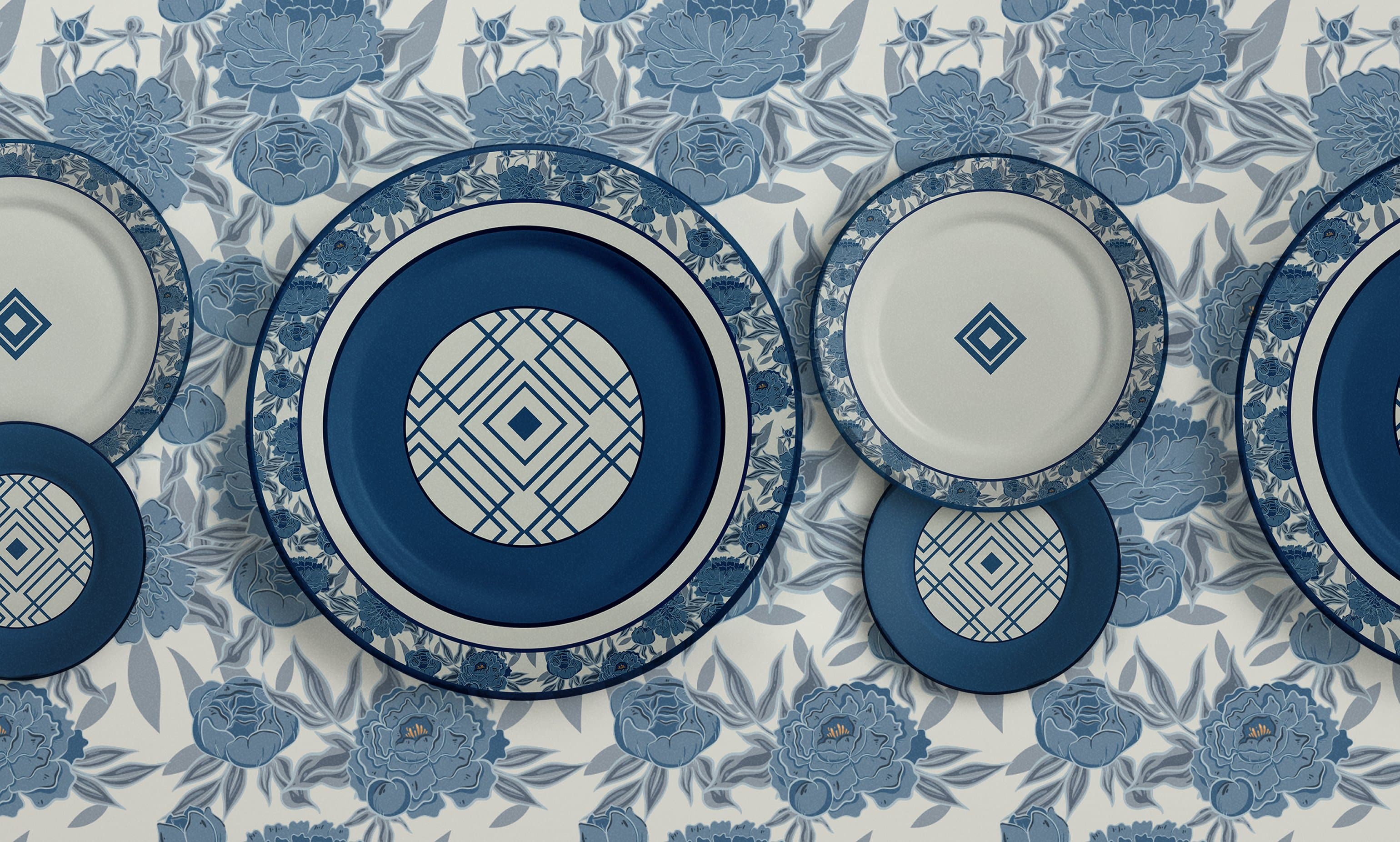
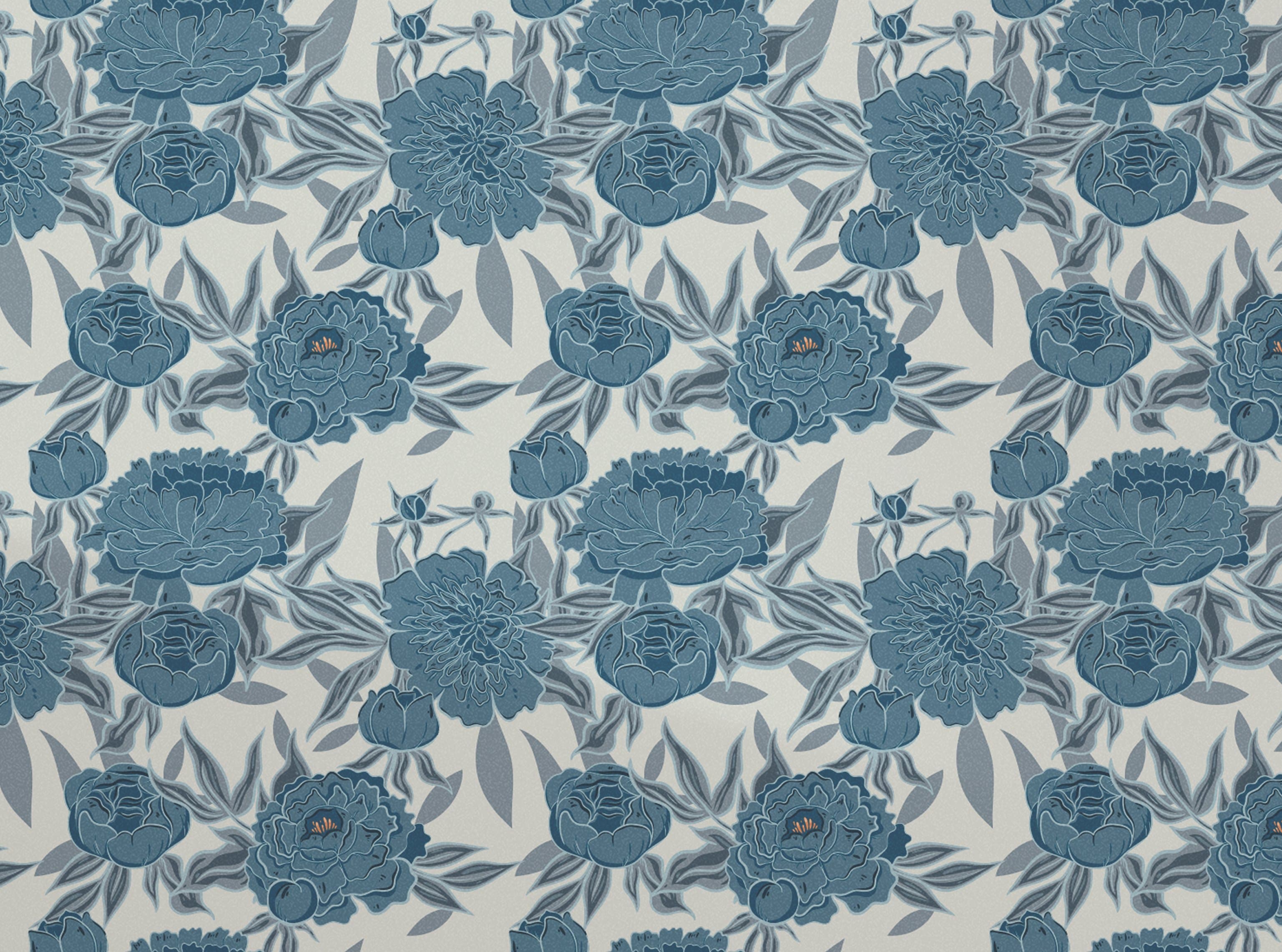
Peonies and Geometry.
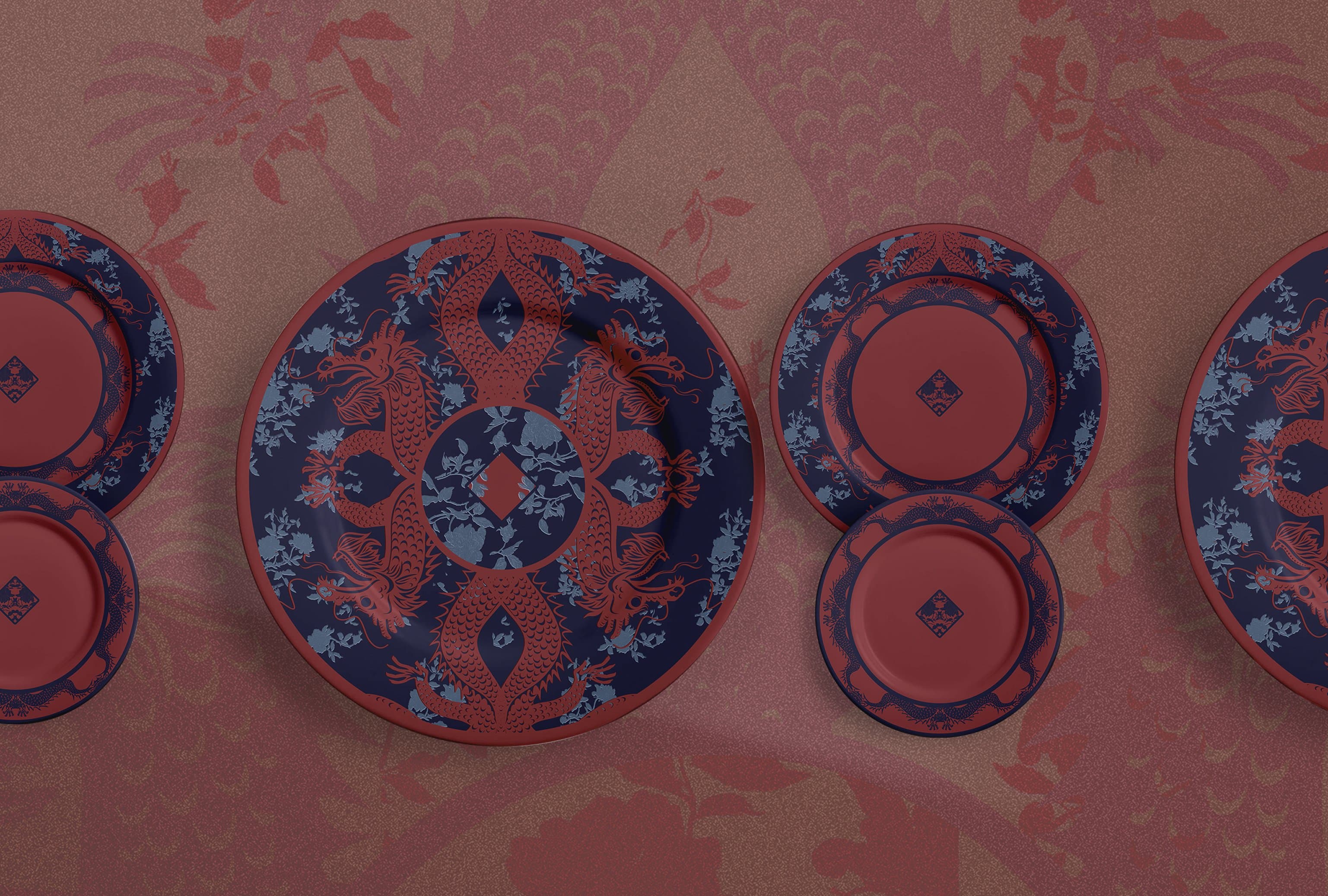
The most pattern-on-pattern direction. Blue peonies layered against a geometric grid. Plates that read as a still life when set, as a single object when used alone.Pairs with black linework when the set needs structure. Pairs with red dragons when the table needs heat. The cobalt anchors any combination because every other collection shares cream as the common ground.

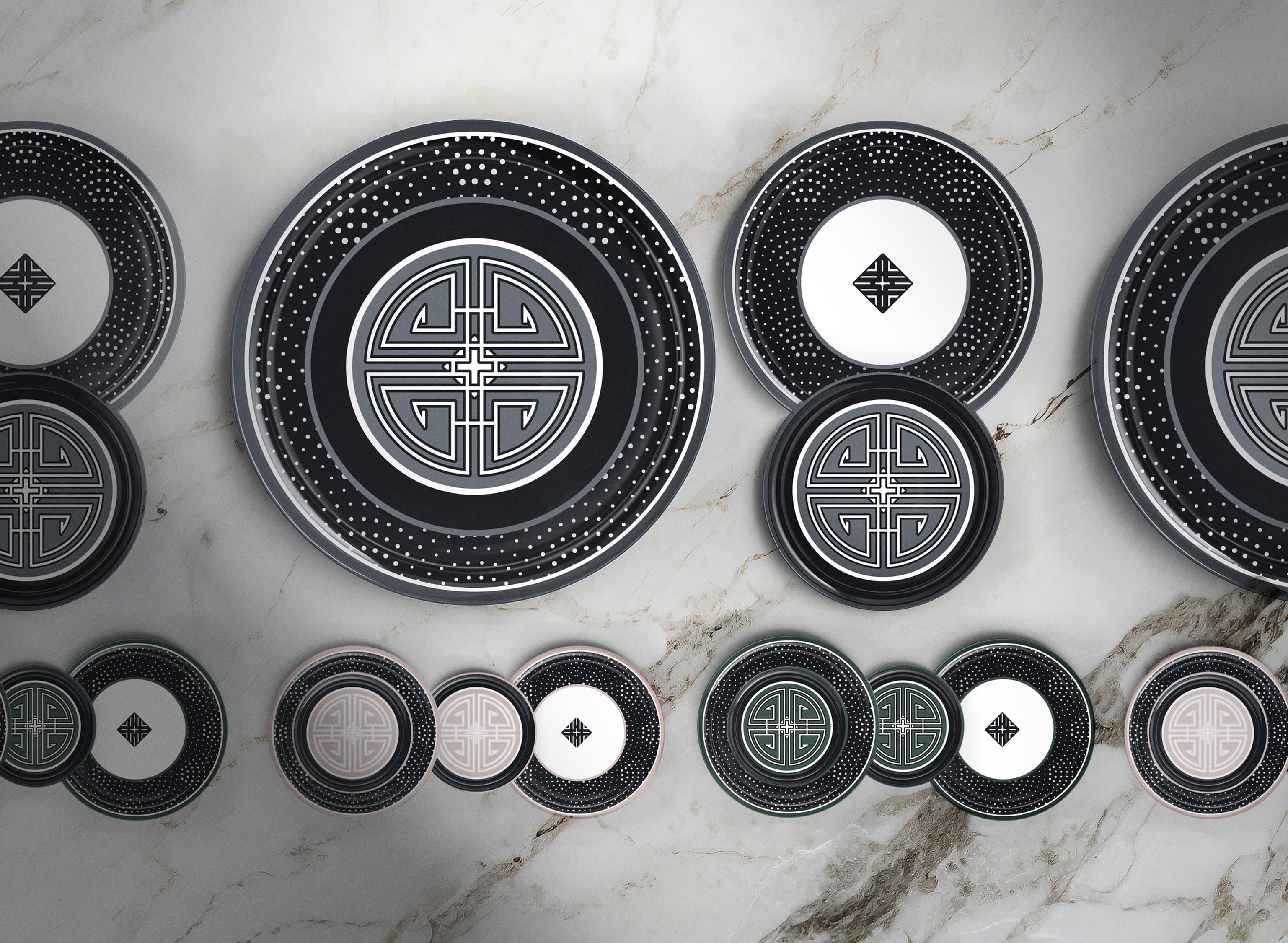
Linework and Dots.
The most reductive direction. Geometric grids and halftone density on charcoal. Reads as the most modern of the three. Holds against everything else.Mixes into any other collection without competing. The graphic flatness lets blue florals or red dragons sit on top of a black linework setting without losing color depth.
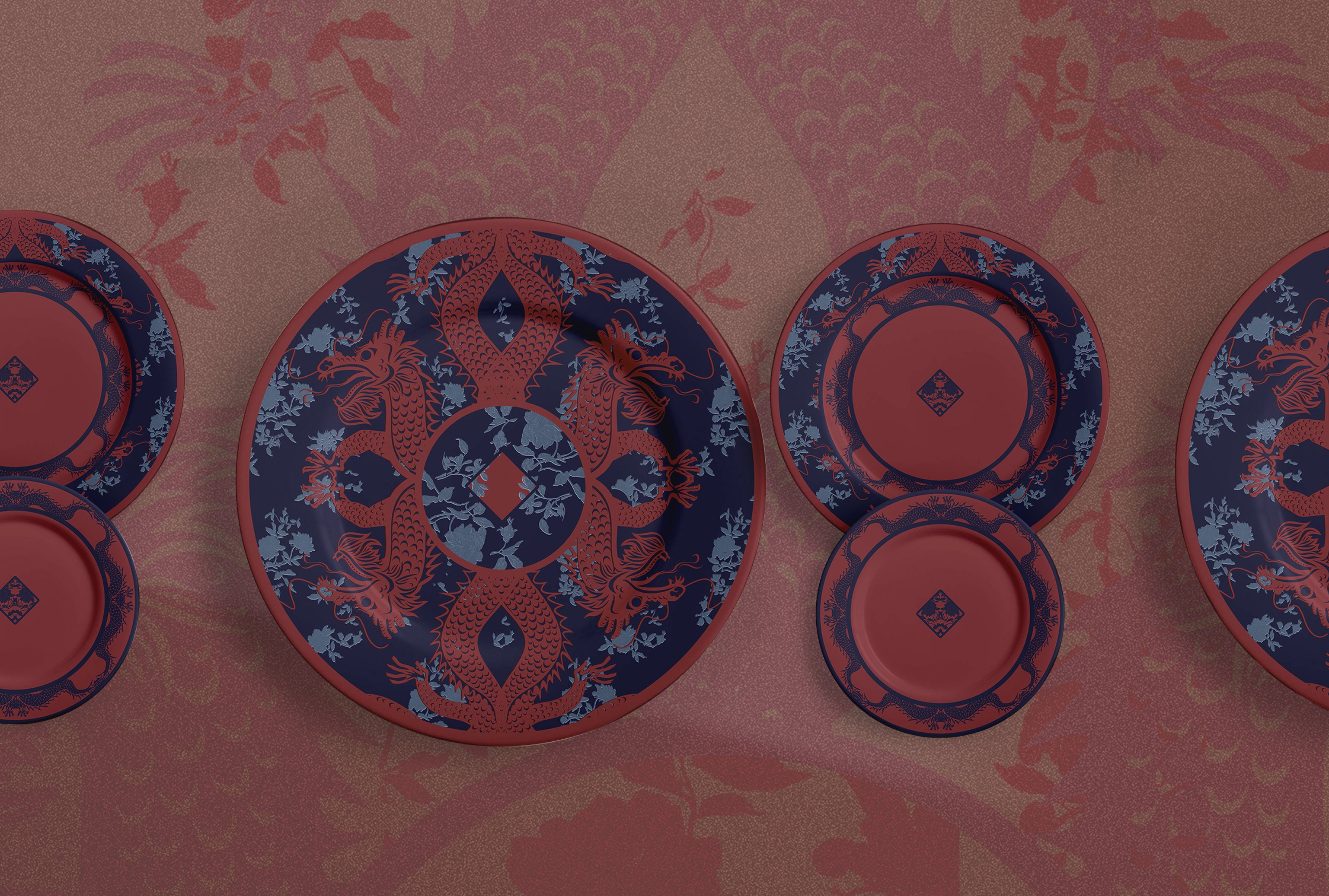
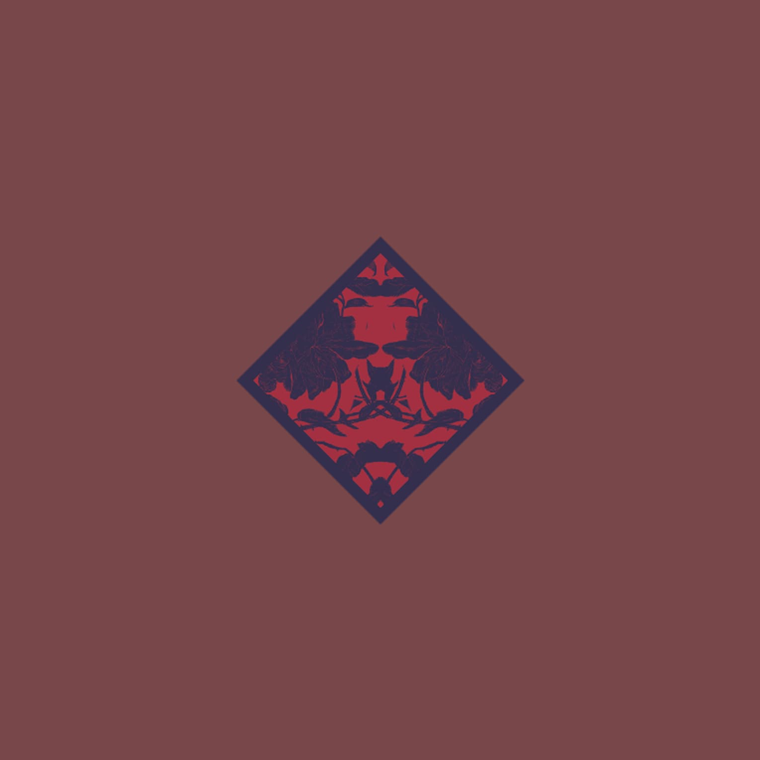
Dragons and Florals.
The most ornamental direction. Burgundy dragons curled against floral filigree. Reads as Eastern textile work. The hero piece of the line for buyers who want one statement plate.Lands well with black linework underneath as a setting. Hard against blue florals; the cobalt and burgundy fight. Pair with the cream pieces in either collection to break the contrast.
A pattern only works
if the next one fits.
A Family of Shapes. A Single System.
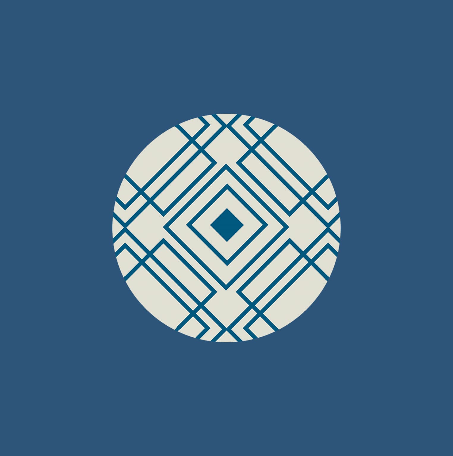
Five colors. Four shapes. One rule. The whole line scales out of a small set of decisions made once and held across every direction.Chromatic brand circle
Cobalt
#1F4D78
Blue florals
Blush
#D87A82
Pink geometry
Burgundy
#8E3F40
Red dragons
Charcoal
#1F2434
Black linework
Cream
#ECE6D5
Shared ground
Brand philosophy
Patterns work as a family. A buyer can start with one accent dish in cobalt and end up with a full red-dragons setting two seasons later. Nothing in the second buy fights anything in the first.
Each collection has a hero shape and a colorway. Peony lives in cobalt. Circle lives in blush. Chinese dragon lives in burgundy. Halftone dot lives in charcoal. Cream runs underneath as the shared ground that lets any two collections sit together without fighting.
Peony Blue florals hero
The largest motif in the line. Layered florals that read as wallpaper at field scale and as a single bloom at plate scale.
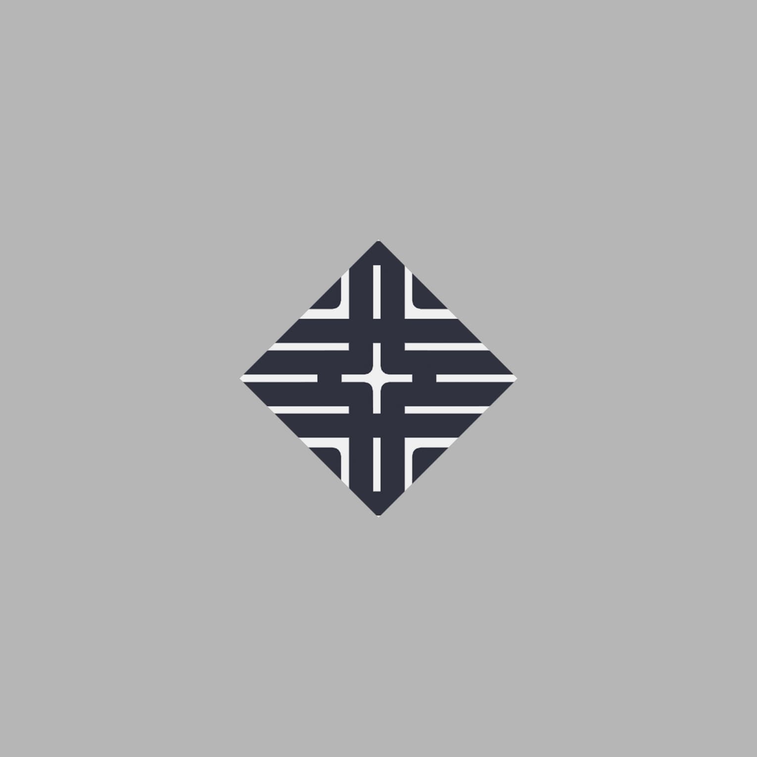
Circle Pink geometry hero
Linework circles built on a construction grid. The most reduced form of the geometric language. Carries the colorway when the collection needs an accent without a full pattern.
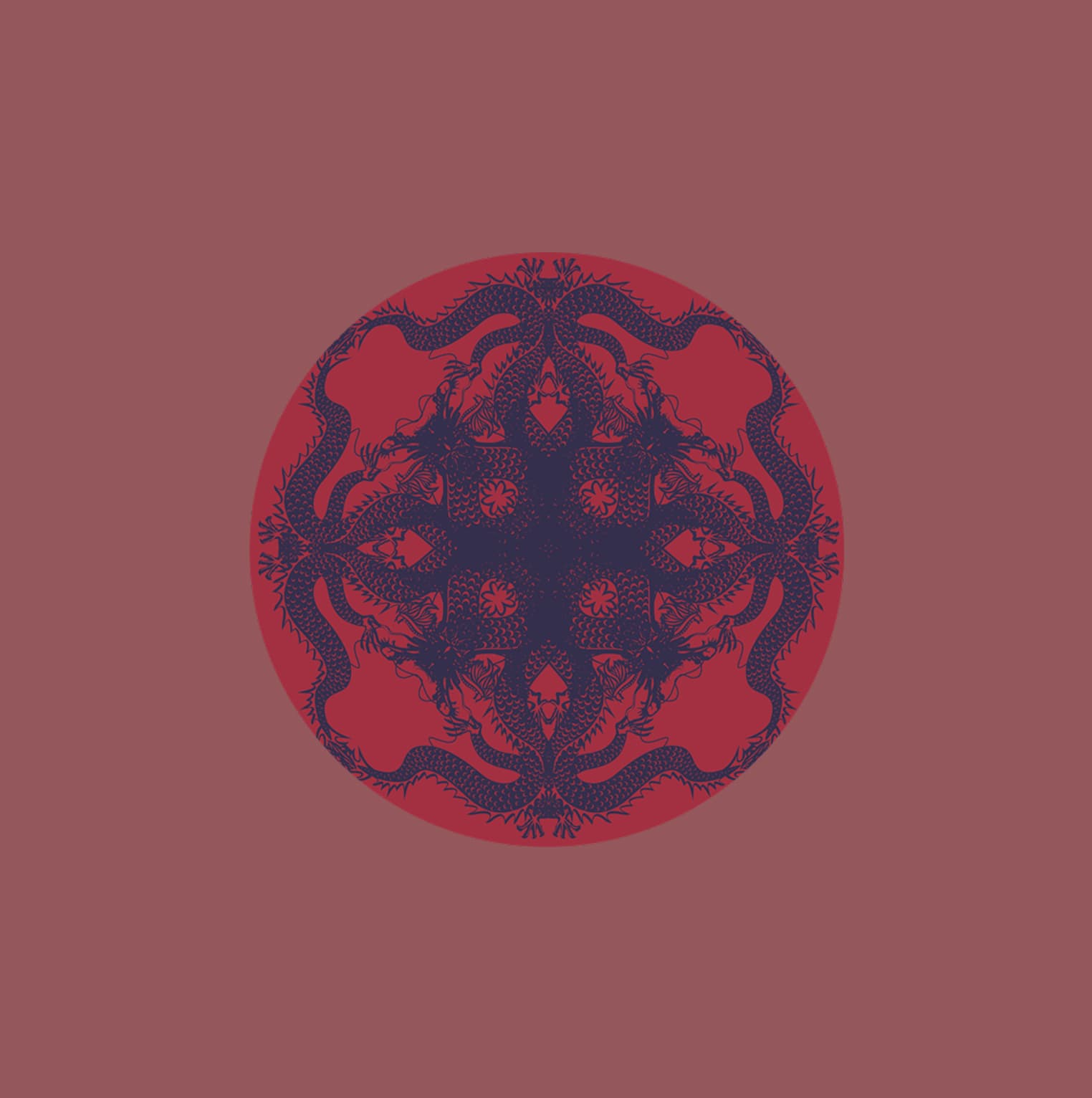
Chinese Dragon Red dragons hero
Dragons curled around floral filigree, set in a circular mandala. The most ornamental motif. Pulls Eastern textile work into a Western tableware context.
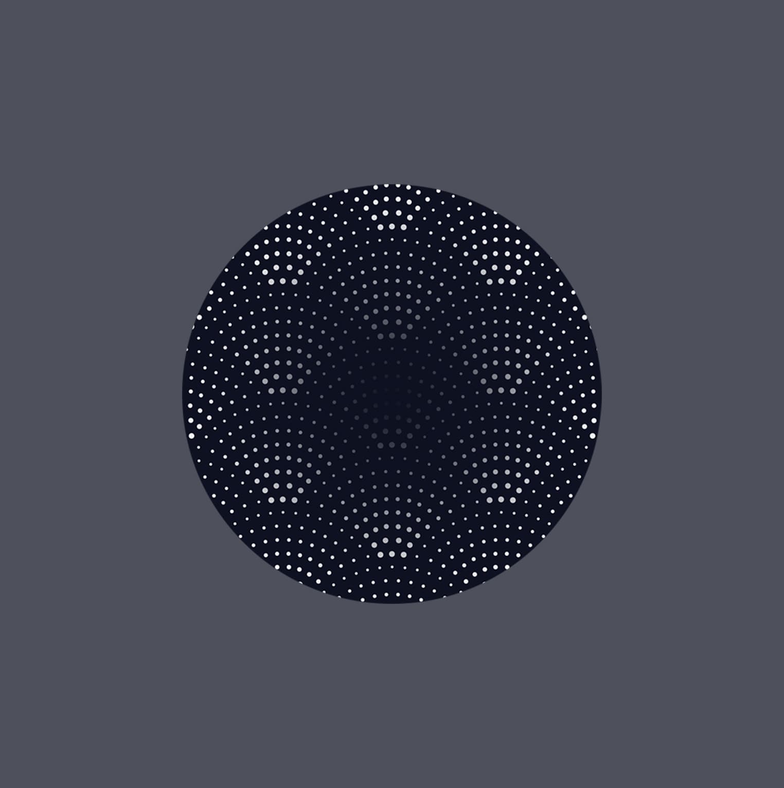
Halftone Dot Black linework hero
Density built from points instead of lines. The most reductive direction in the family. Sits under any other pattern without competing for the surface.
Peony
Blue florals hero
Cobalt · #1F4D78
Circle
Pink geometry hero
Blush · #D87A82
Chinese Dragon
Red dragons hero
Burgundy · #8E3F40
Halftone Dot
Black linework hero
Charcoal · #1F2434

The Set Builds Itself.
Pattern, product, color. Same hands across the system, so each new direction inherits the logic.Services
Pattern Design
Product Design
Colorway Development
Stack
Illustrator
Photoshop
InDesign
Links
A startup needed patterns that could hold a full tableware line without locking into a single look. The system answers in three marks per collection and shared ground colors across the family. New directions slot in without breaking what came before.