Creative direction, campaigns and brand.
Most brand work I take on has the same underlying problem - the brand has to read like the same brand whether it shows up as a logo, a billboard, a bottle, or a website, and the work is mostly the small calls between those things that decide whether it actually holds together.
I'm drawn to the projects where every surface matters, where someone can tell that the headline and the photography and the typeface and the packaging were all picked by someone paying attention to the same thing. Those are the projects in this section.
Field Brand Identity Campaign Direction Surface Design
Author Jeremy Prasatik Active Since: 2002 Status: Making
Classification Logo Systems Art Direction Photography Pattern Design Editorial
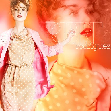
Robert Rodriguez x Neiman’s
Creative direction, design
Jeffrey Spring Campaign
Creative direction, design
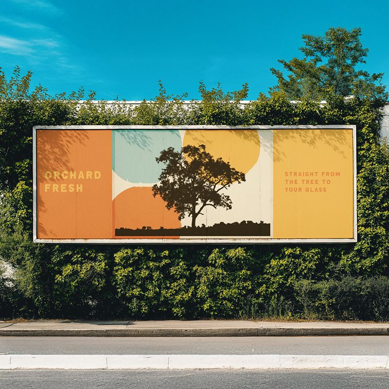
Hill County Oakworks
Campaign direction, branding
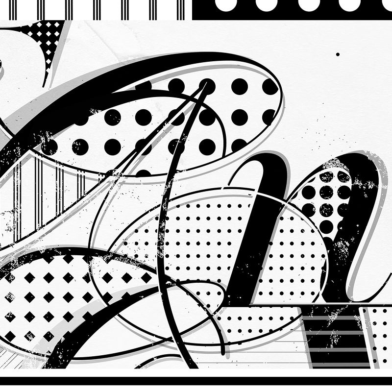
Black & white type
Custom typography, patterns
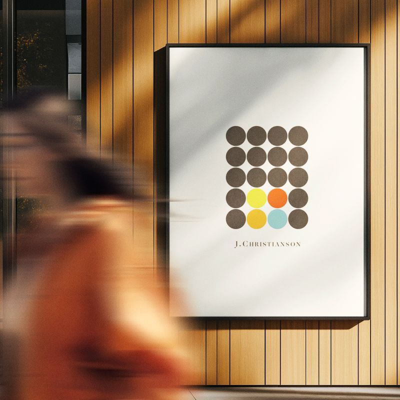
J.Christianson
Brand development, design
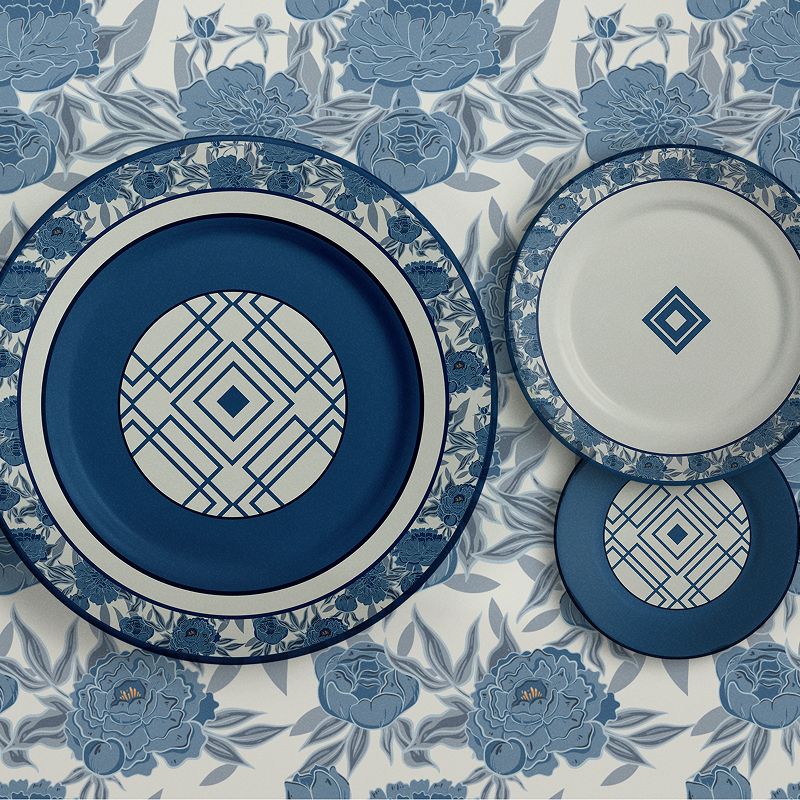
Amber Shockey & Co.
Tableware design, branding
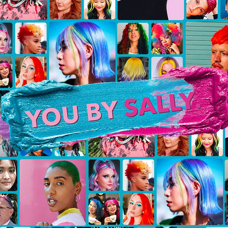
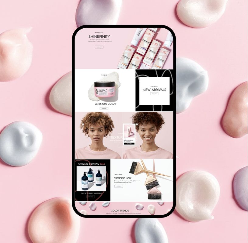
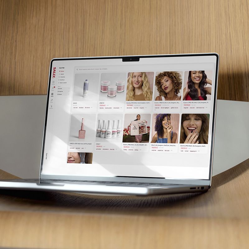
You By Sally
Brand campaign
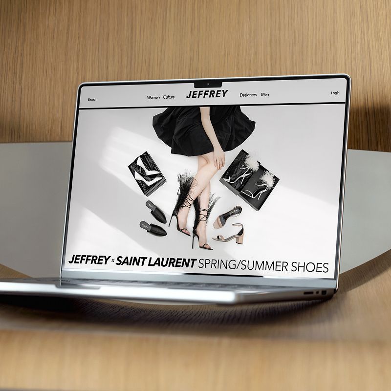
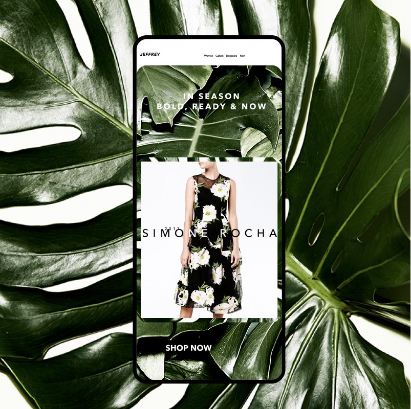
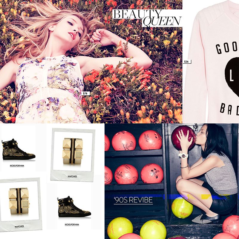
Jeffrey NYC
Campaign direction, design
Nordstrom framework
Content direction, design
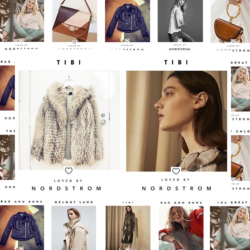
Loved by Nordstrom
Brand campaign, design
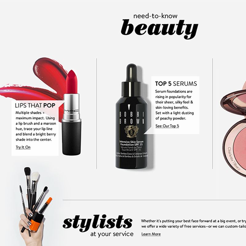
Neiman Marcus
Editorial direction, design
Various design
Branding, art, apparel
From brand strategy to the finished frame
Campaigns, identity systems, art direction - the kind of work where the concept has to survive every surface it lands on, from a storefront window to a phone screen to a clothing tag. The best of it holds together because the same thinking ran through the strategy, the shoot, and the production files.
Some of these projects ran the full arc from positioning through final deliverables. Others were specific pieces of a larger effort. The scope varies, but the attention doesn't.
Brand Identity
A logo is a five-second argument for why someone should pay attention. The identity system is the longer conversation that follows - typography, color, hierarchy, the small rules that govern how the brand behaves when it isn't trying to introduce itself.
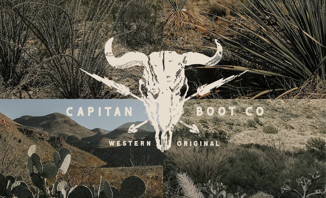
Capitan Boot Co. needed a mark that would survive on leather and read at a distance. J.Christianson needed a system flexible enough to span hospitality and retail. Different industries, same underlying question - what does this brand sound like when it speaks, and how does it look when it isn't speaking.
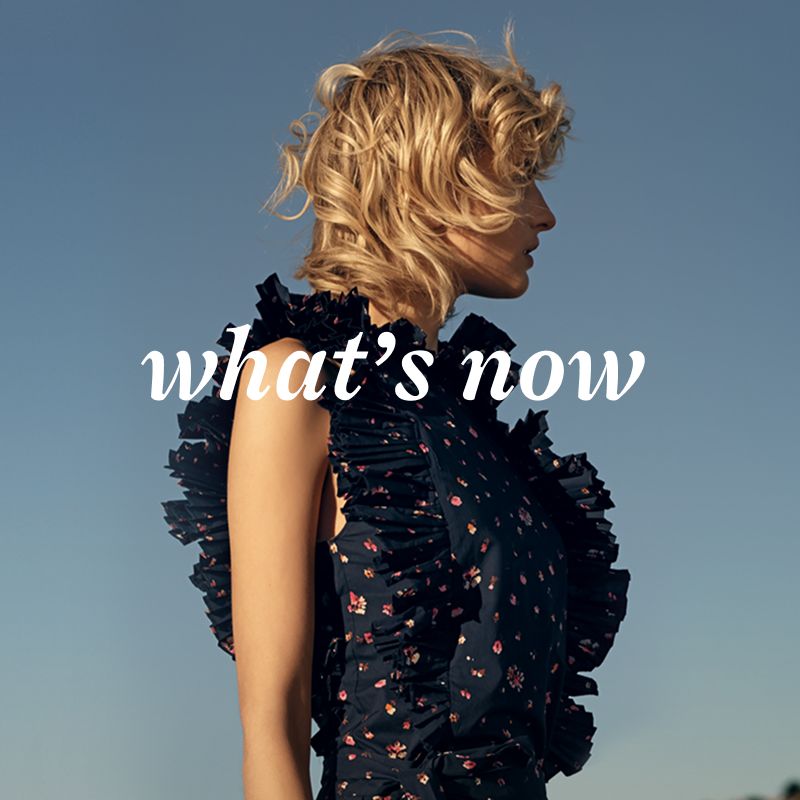
Campaigns & Art Direction
Art direction is mostly about controlling what the frame is allowed to contain - the lighting that flatters the right thing and ignores the rest, the wardrobe that argues for the brand without performing it, the set that disappears when it should and shows up when it shouldn't, the talent that works in a thumbnail and holds up at billboard scale.
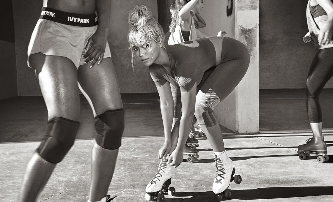
At Neiman Marcus, the Robert Rodriguez campaign came together as one shoot day producing four frames that ran across storefront, editorial, social, and email. The Ivy Park by Beyonce launch was the exclusive US digital rollout at Nordstrom. Sally Beauty's "You By Sally" campaign repositioned a brand that had drifted from itself. Different scales, same job - making sure the work survives the long trip from set to whatever screen or surface it eventually lands on.
Surface & Object Design
Designing for a plate or a print or a textile is a different problem than designing for a screen. There's no hover state to bail you out, no responsive breakpoint to forgive a layout decision. The object is the final output, and it has to hold up in someone's hands or on someone's wall, in the light of an actual room, ten years from now.
Amber Shockey's tableware line, pattern systems that translate between textile and ceramic, typography studies rendered as lithographs that nobody commissioned - the work moves off the screen and onto physical surfaces, where the rules change and the tolerance for getting it wrong drops.
Brand Identity
A logo is a five-second argument for why someone should pay attention. The identity system is the longer conversation that follows - typography, color, hierarchy, the small rules that govern how the brand behaves when it isn't trying to introduce itself.
Capitan Boot Co. needed a mark that would survive on leather and read at a distance. J.Christianson needed a system flexible enough to span hospitality and retail. Different industries, same underlying question - what does this brand sound like when it speaks, and how does it look when it isn't speaking.
Campaigns & Art Direction
Art direction is mostly about controlling what the frame is allowed to contain - the lighting that flatters the right thing and ignores the rest, the wardrobe that argues for the brand without performing it, the set that disappears when it should and shows up when it shouldn't, the talent that works in a thumbnail and holds up at billboard scale.
At Neiman Marcus, the Robert Rodriguez campaign came together as one shoot day producing four frames that ran across storefront, editorial, social, and email. The Ivy Park by Beyonce launch was the exclusive US digital rollout at Nordstrom. Sally Beauty's "You By Sally" campaign repositioned a brand that had drifted from itself. Different scales, same job - making sure the work survives the long trip from set to whatever screen or surface it eventually lands on.
Surface & Object Design
Designing for a plate or a print or a textile is a different problem than designing for a screen. There's no hover state to bail you out, no responsive breakpoint to forgive a layout decision. The object is the final output, and it has to hold up in someone's hands or on someone's wall, in the light of an actual room, ten years from now.
Amber Shockey's tableware line, pattern systems that translate between textile and ceramic, typography studies rendered as lithographs that nobody commissioned - the work moves off the screen and onto physical surfaces, where the rules change and the tolerance for getting it wrong drops.
More digital
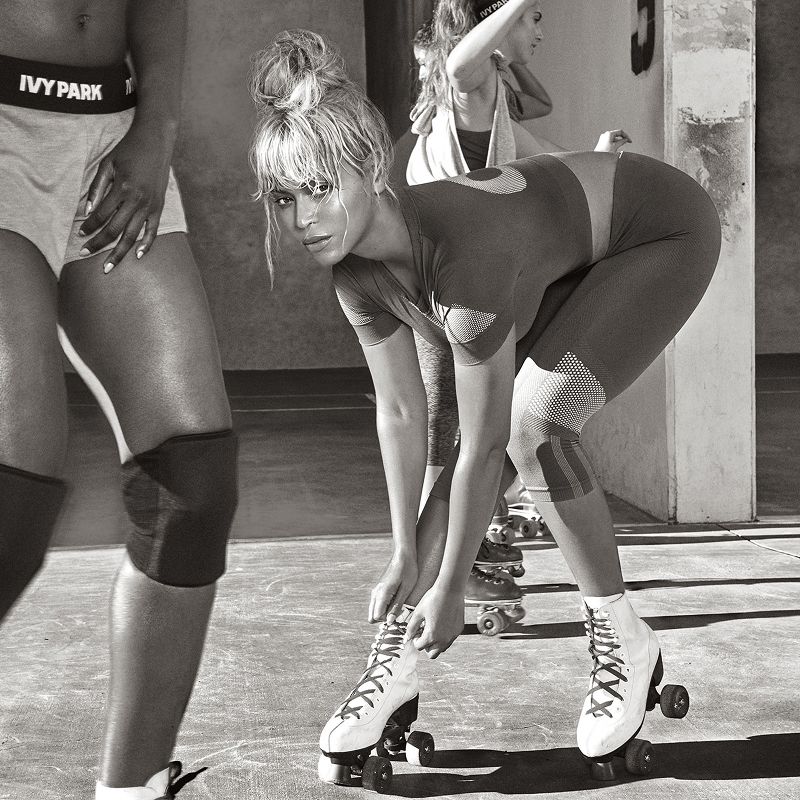
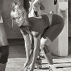
Ivy Park by Beyonce
Digital design, brand launch
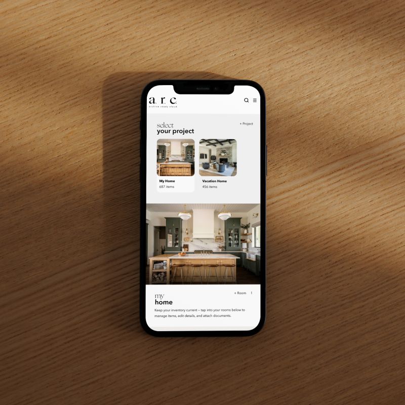
A.R.C. - AI home Inventory
App & brand development
Nordstrom personalization
Design system, direction
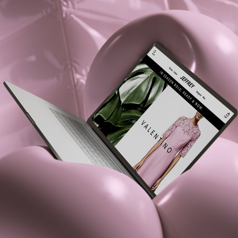
Jeffrey NYC
Ecommerce, web design
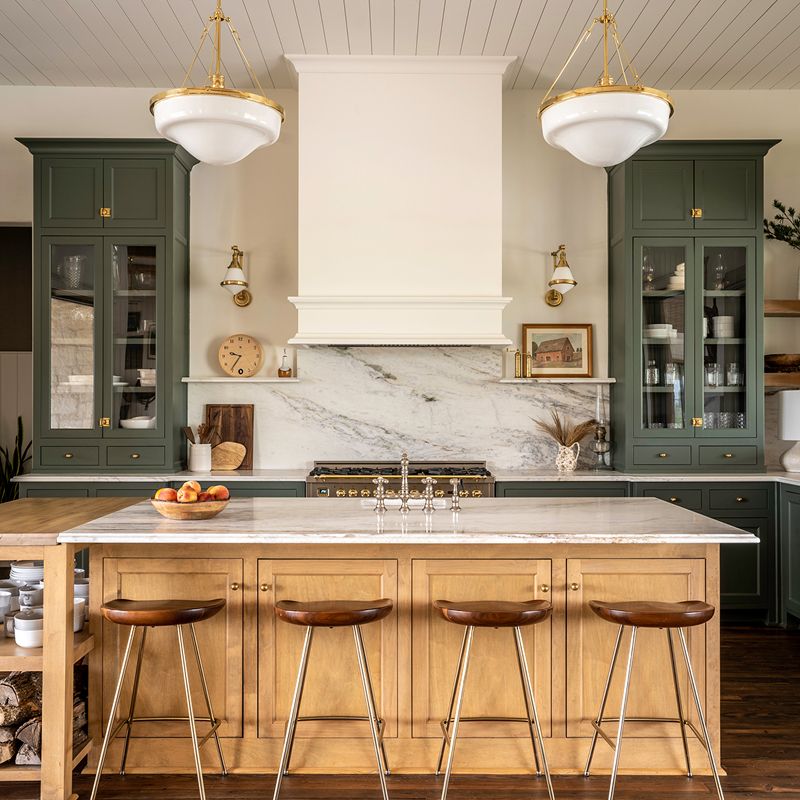
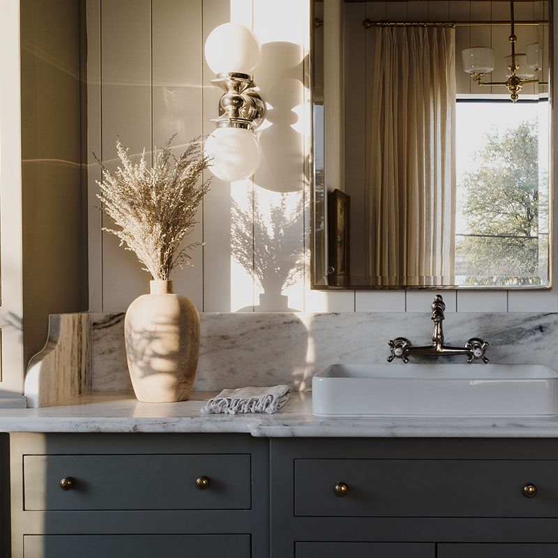
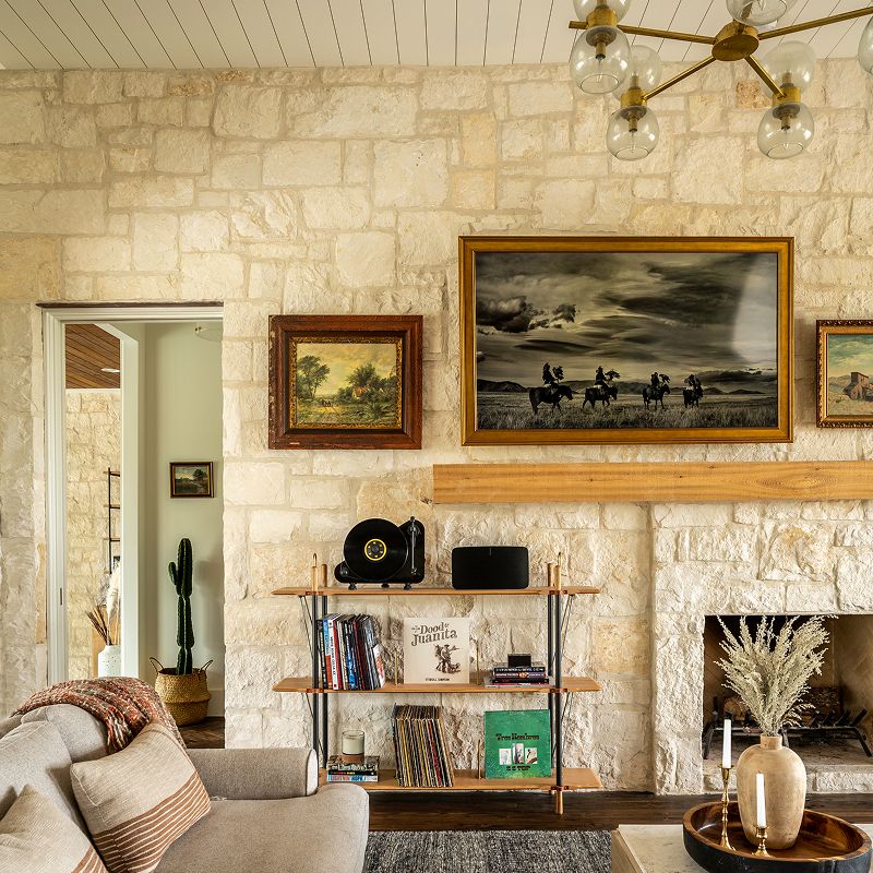
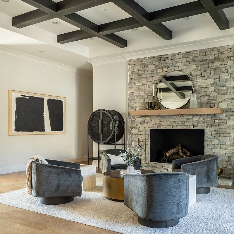
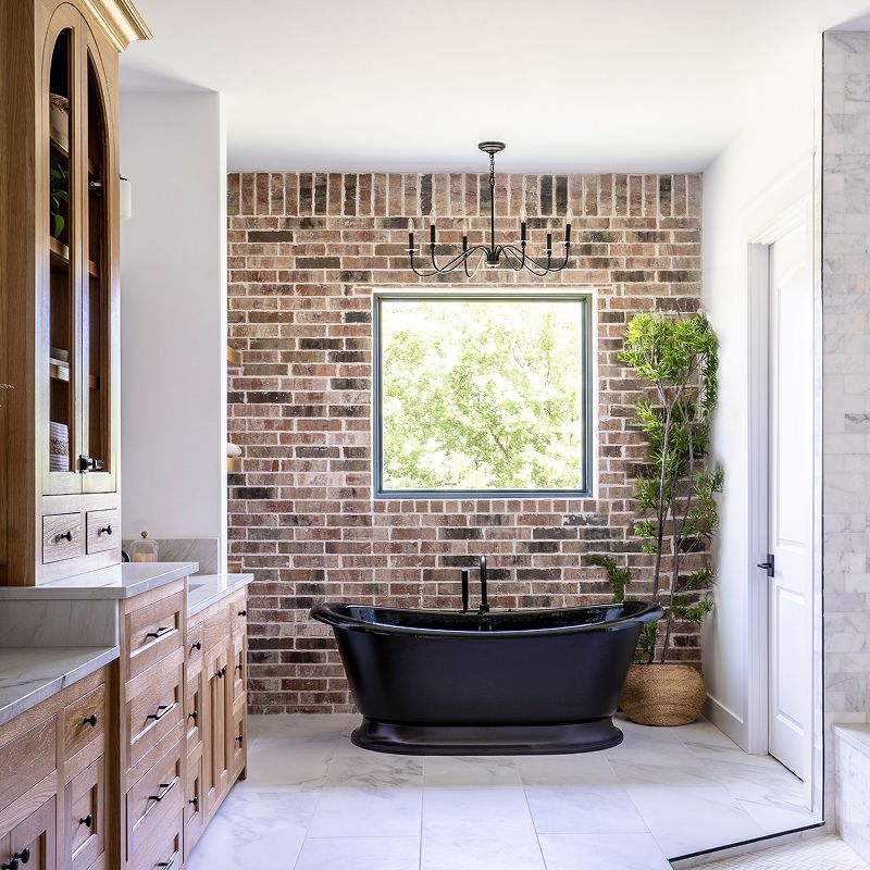
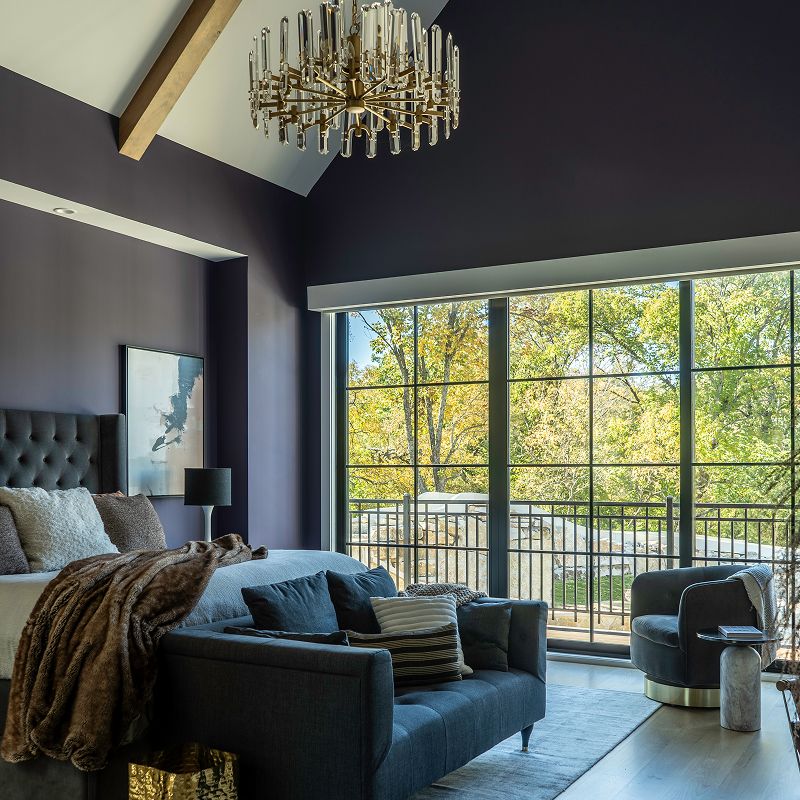
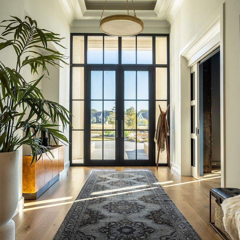
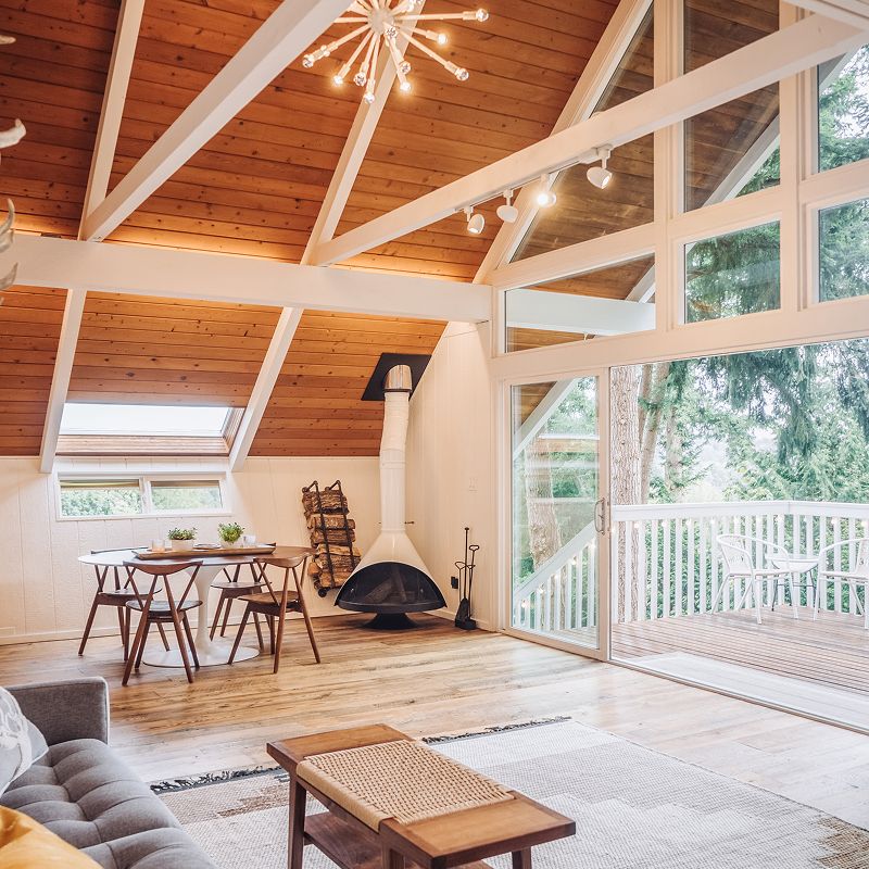
Designing across space and material.
Putting the work first.
Studio Reckon House Staples, a multi-disciplinary design and engineering practice
Founded 2002, based in Texas, working anywhere
Status Open for projects
Classification Digital, Branding, Interiors
Contact hello@reckon.house 214.697.4578 IG @reckonhousestaples LinkedIn /jeremy-prasatik
The Through-Line
The work means a lot of things at once - writing the code that ships an app, picking the marble that goes in a kitchen, art directing a campaign shoot, building a brand voice from scratch, designing the AI tooling that runs marketing operations at enterprise scale. These aren't separate jobs, they're the same job showing up in different rooms.
What makes it work is the no-handoff part. Wireframing and coding happen in the same week. Picking kitchen finishes and coordinating the install happen on the same site visit. The thinking and the making stay close to each other, which is why the disciplines stay connected instead of competing for attention.
© 2026 Reckon House. Made by Jeremy Prasatik.