Branding, Print & Apparel
Graphic work. Album covers, gig posters, prints, logos. No single client. No single style. The point is fluency.
Field Graphic Design Album Art Poster Design Logo Design Photo Compositing
Author Jeremy Prasatik Published: 2008 — 2018 Status: Ongoing
Classification Graphic Design Album Art Poster Design Logo Design Photo Compositing
TL;DR Built→ Four album covers, posters, prints, logos, a storefront windowScope→ Graphic design, album art, poster and logo design, photo compositingTools→ Photoshop, Illustrator, InDesign, film camera, hand-renderingAngle→ No single client, no single style. Each mark sounds like the client, not the designer. The point is fluency.
Abstract
Every project here started the same way. Match the energy of something that doesn't exist yet.
Four album covers, four completely different visual languages. Woodgrain collage and halftone geometry for a folk record. Grunge compositing with hand-rendered type for a pop artist. Linework landscapes stacked into depth for an ambient release. A portrait where saturated color carries the entire identity. Each one had to read at vinyl scale and survive as a thumbnail. No shared visual logic between them. That was the requirement.
The poster work follows the same approach. Atmospheric photography against dot-matrix grids. Radial color studies built from pattern. Double-exposure landscapes where texture replaces detail. These aren't decorative pieces. They're compositional puzzles solved on a deadline.
Logos ranged from ornamental to blunt. Flowing botanical illustration for a fashion collective. Halftone dots and geometric sans for a DJ. A bird on a monogram for a lifestyle brand. The only consistency is that each mark sounds like the client, not the designer.
This is where the eye gets trained. Everything that came later started here.
Each One Started With a Blank Page.
Atmospheric photography against dot-matrix grids. Radial color studies built from pattern. Double-exposure landscapes where texture replaces detail.
Not decorative. The pieces here range from collaged landscapes to typographic exercises to atmospheric prints. Different formal puzzles, same toolkit. Each one started with a blank page and a deadline, and the question was always which direction the piece would turn before the time ran out.


Four Records. Nothing in Common.
Each one had to read at vinyl scale and survive as a thumbnail. No shared logic between them. That was the requirement.
Woodgrain collage and halftone geometry for the folk record. Grunge compositing with hand-rendered type for the pop artist. Linework landscapes stacked into depth for the ambient release. A saturated portrait where the color does all the work. The brief on every project: match the energy of music that didn't exist yet.

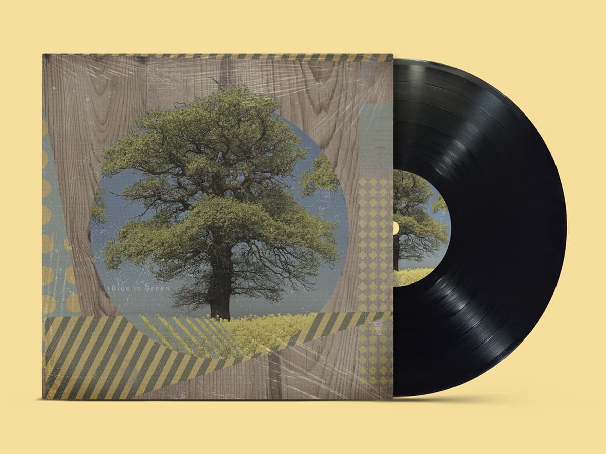


No single client. No single style.
From a 4x6 to a Building.
The Bokeh's Fall window translated the same atmospheric language to building scale. The source image is below, hand-shot on film. The window is what happened when it got blown out to street size and waited for foot traffic to find it.


Logos that sound like the client. Not the designer.
Flowing botanical illustration for a fashion collective, halftone dots and geometric sans for a DJ, a bird on a monogram for a lifestyle brand. Range from ornamental to blunt.
Whatever the brief asks for, the mark delivers without trying to add a signature. Five logos shown here, and nothing in the portfolio connects them except the hands that drew them. The signature lives in the range.
Where the Instincts Get Built.
Personal projects, deadline projects, album sleeves nobody asked for, logos for friends starting things. The fluency lives in the volume.
Services
Graphic Design
Album Art
Poster Design
Logo Design
Photo Compositing
Stack
Photoshop
Illustrator
InDesign
Camera
Hand-rendering
Links
The commercial work that came later traces directly back to this output - compositional habits, color confidence, the willingness to start with a blank page and not know which direction the piece will turn.
This section will keep growing. Every new piece becomes another reference point.