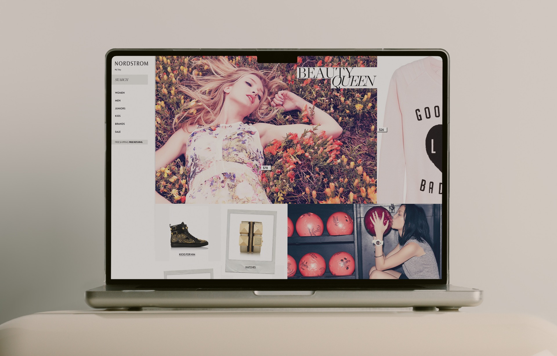
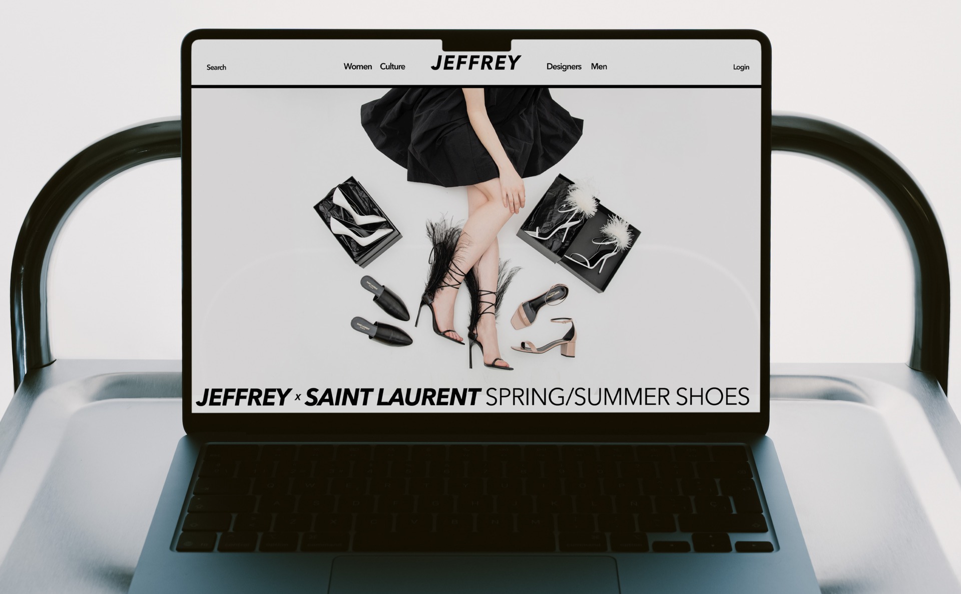
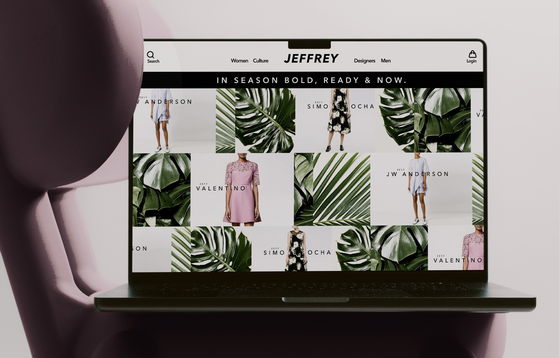
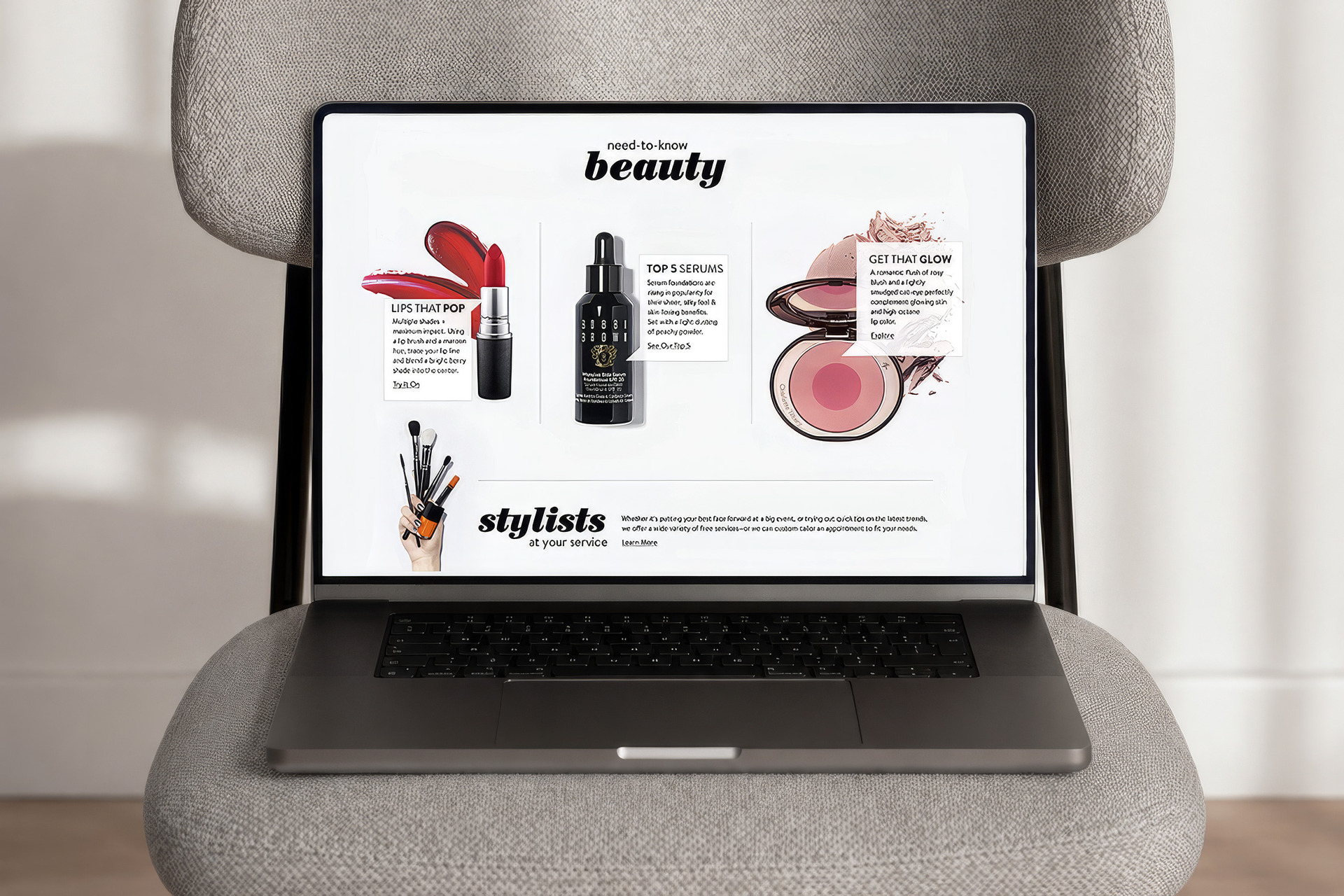
Neiman Marcus's digital editorial hub, InSite. Magazine layouts, runway typography, and studio-shot photography, all in service of the sale.
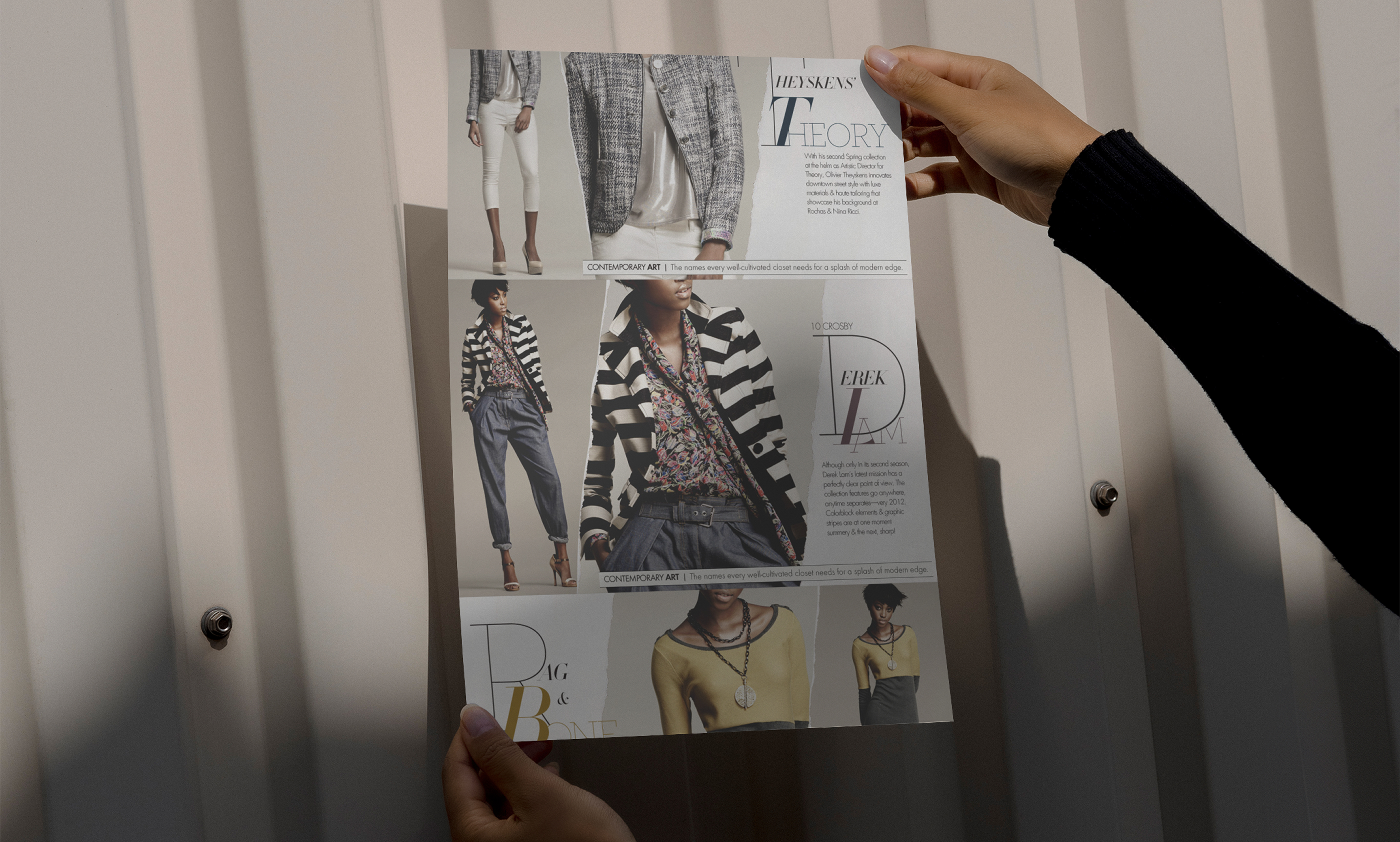
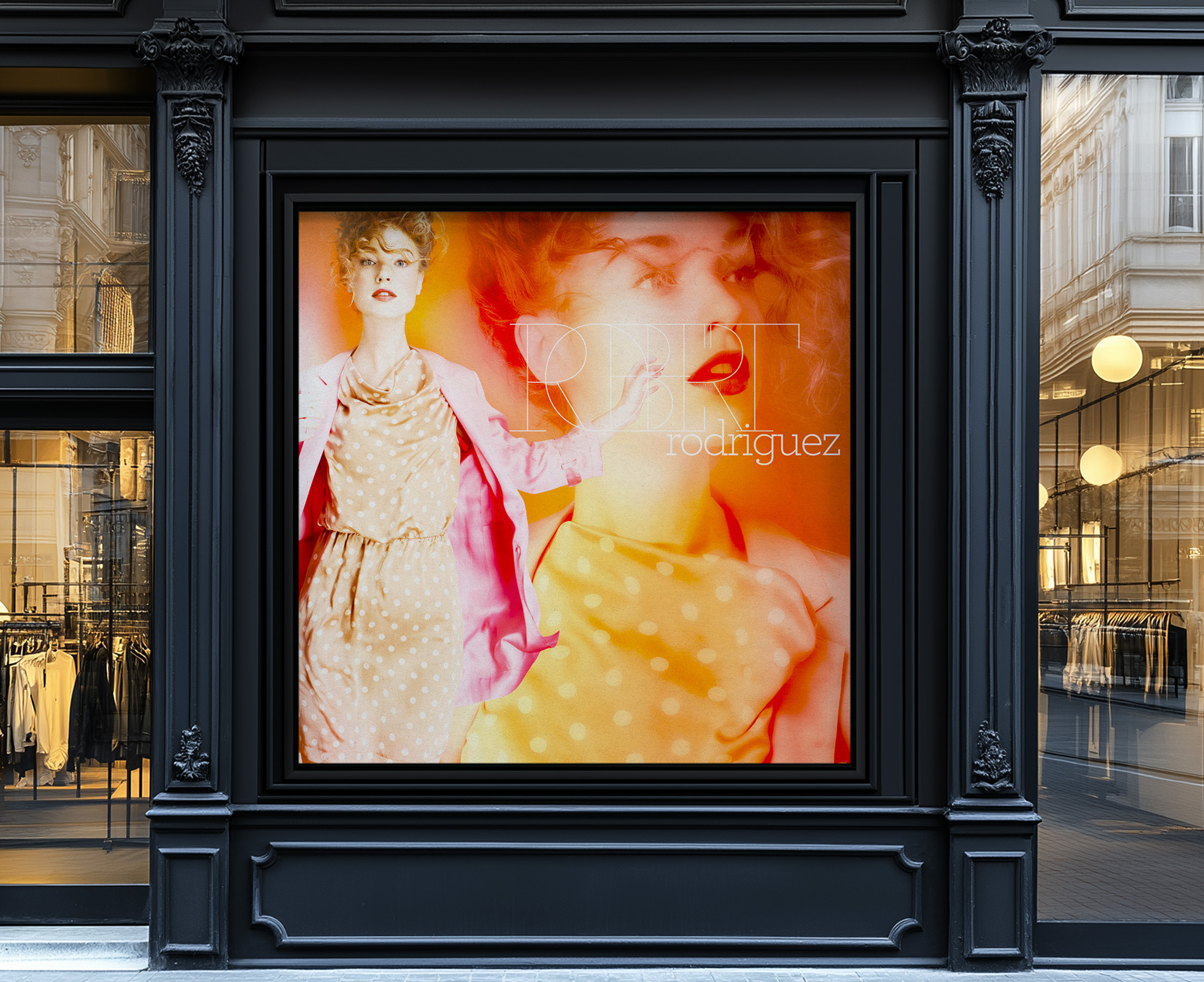
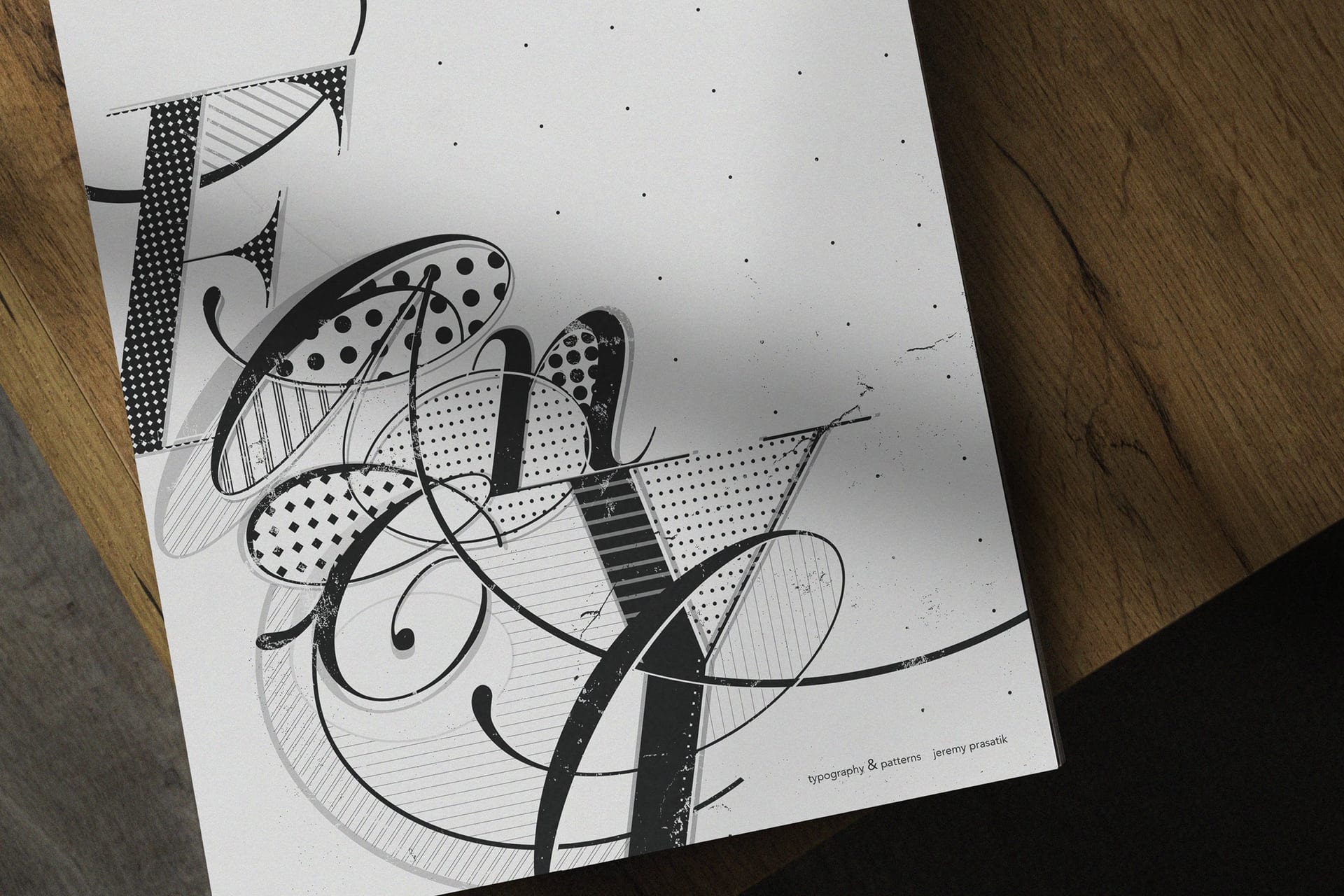
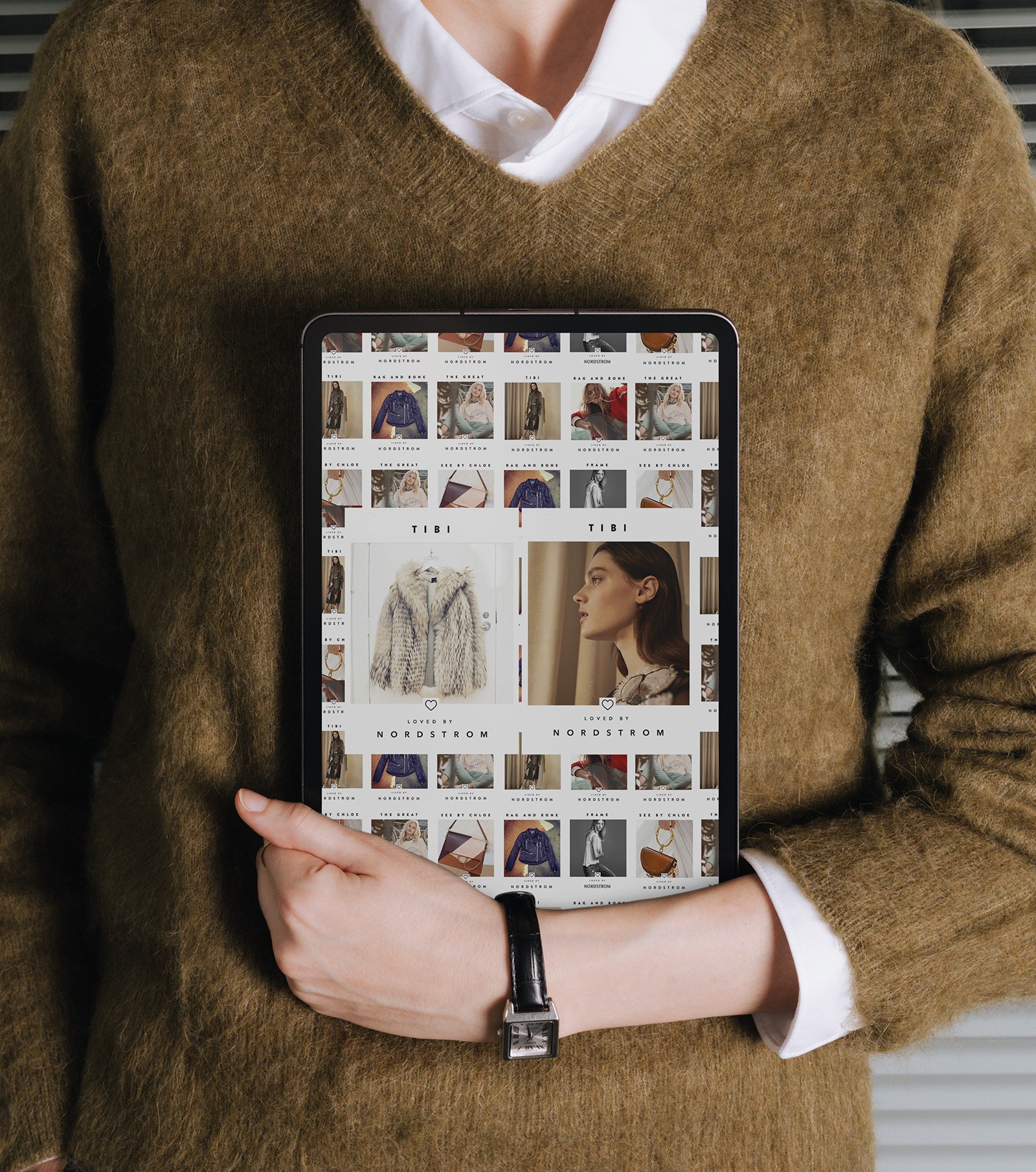
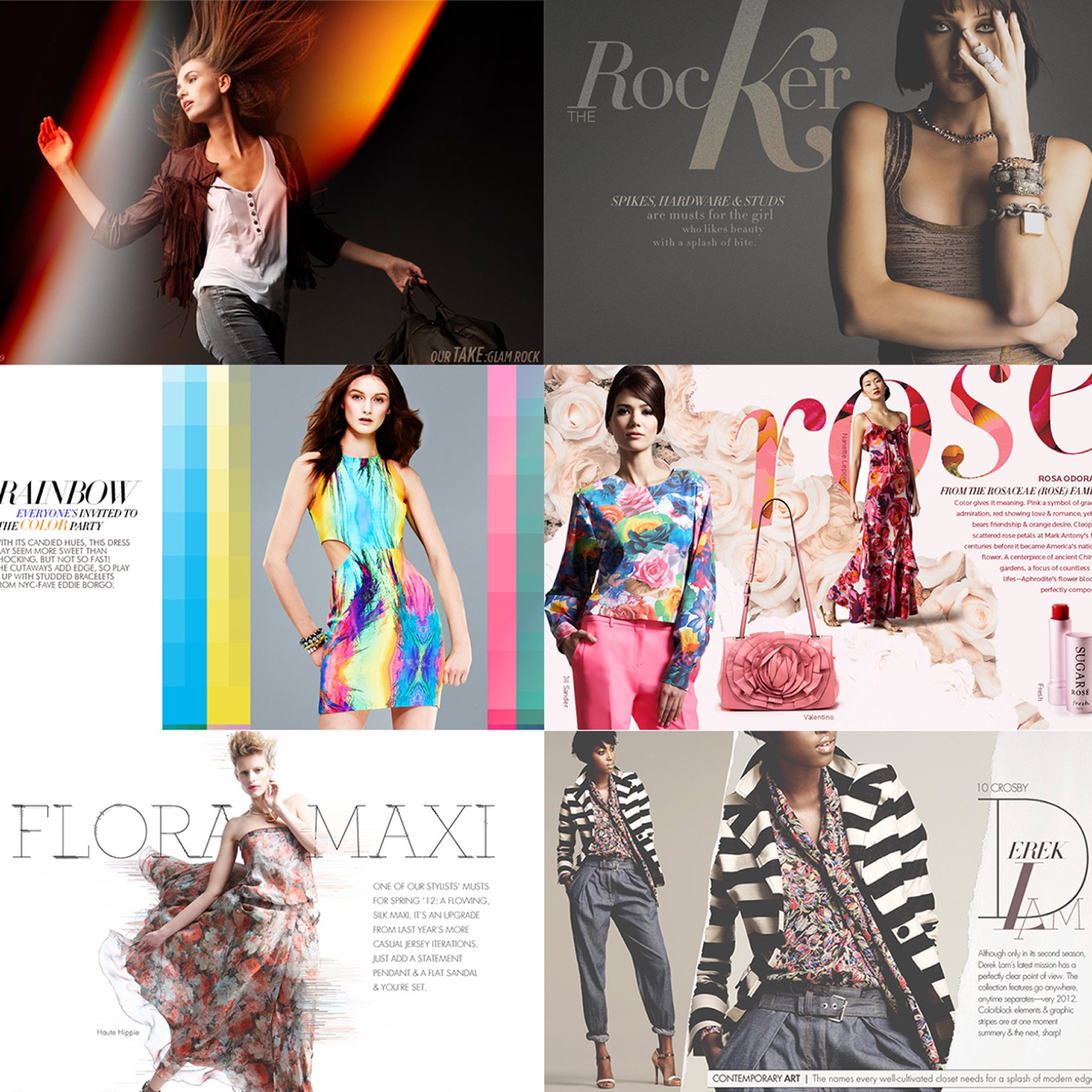
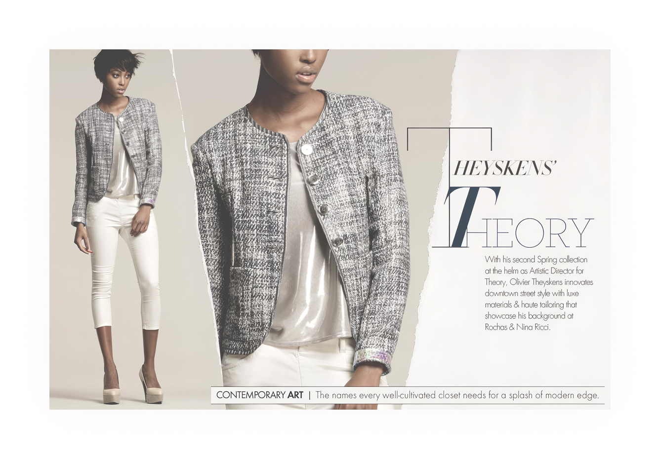
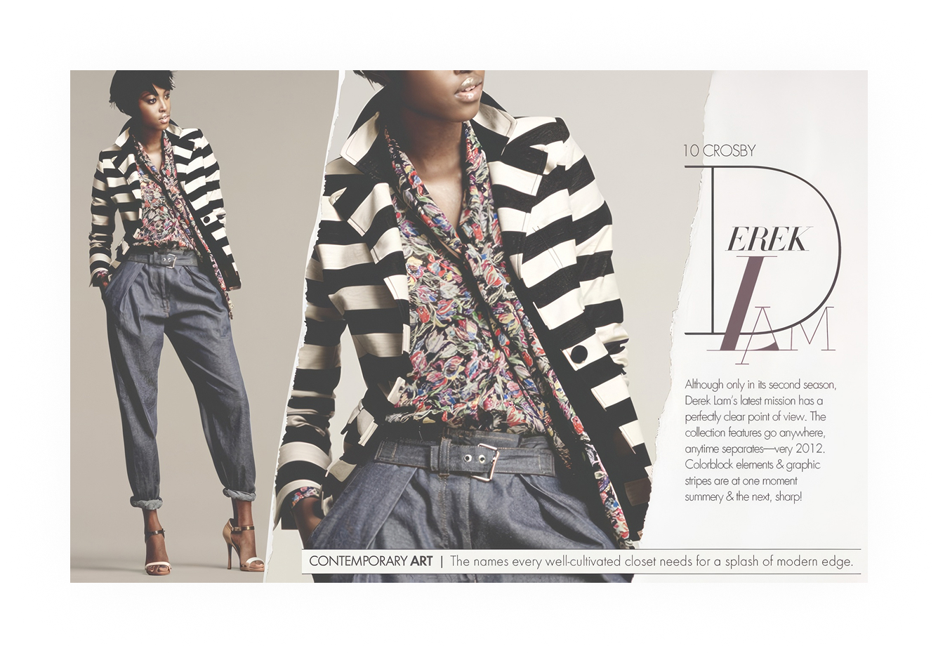
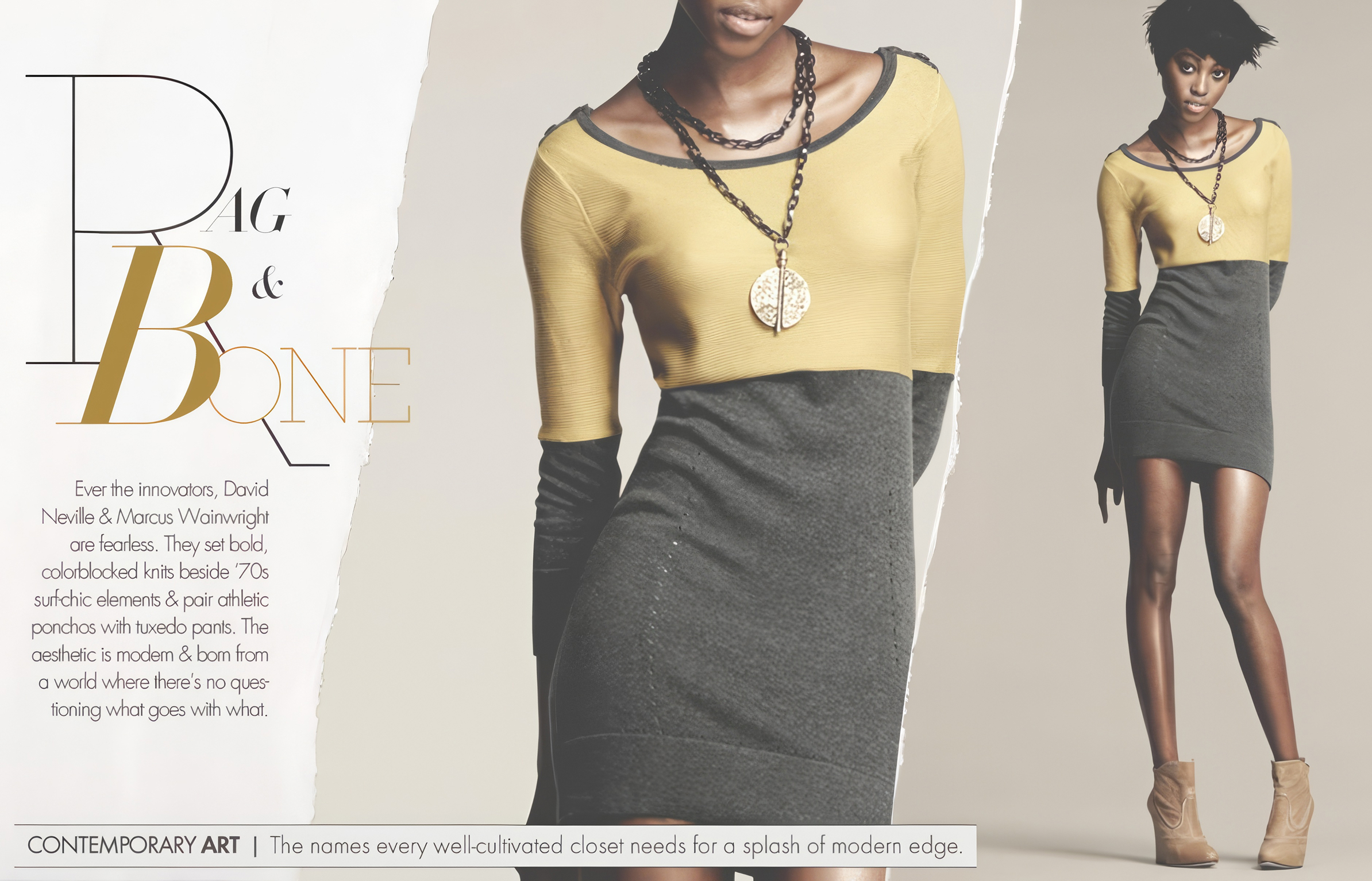
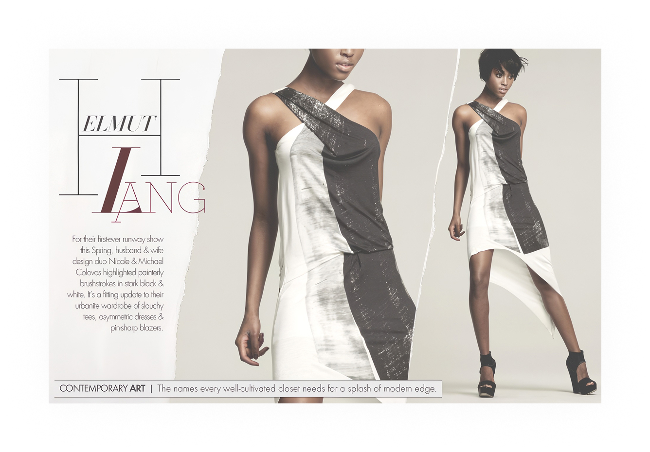
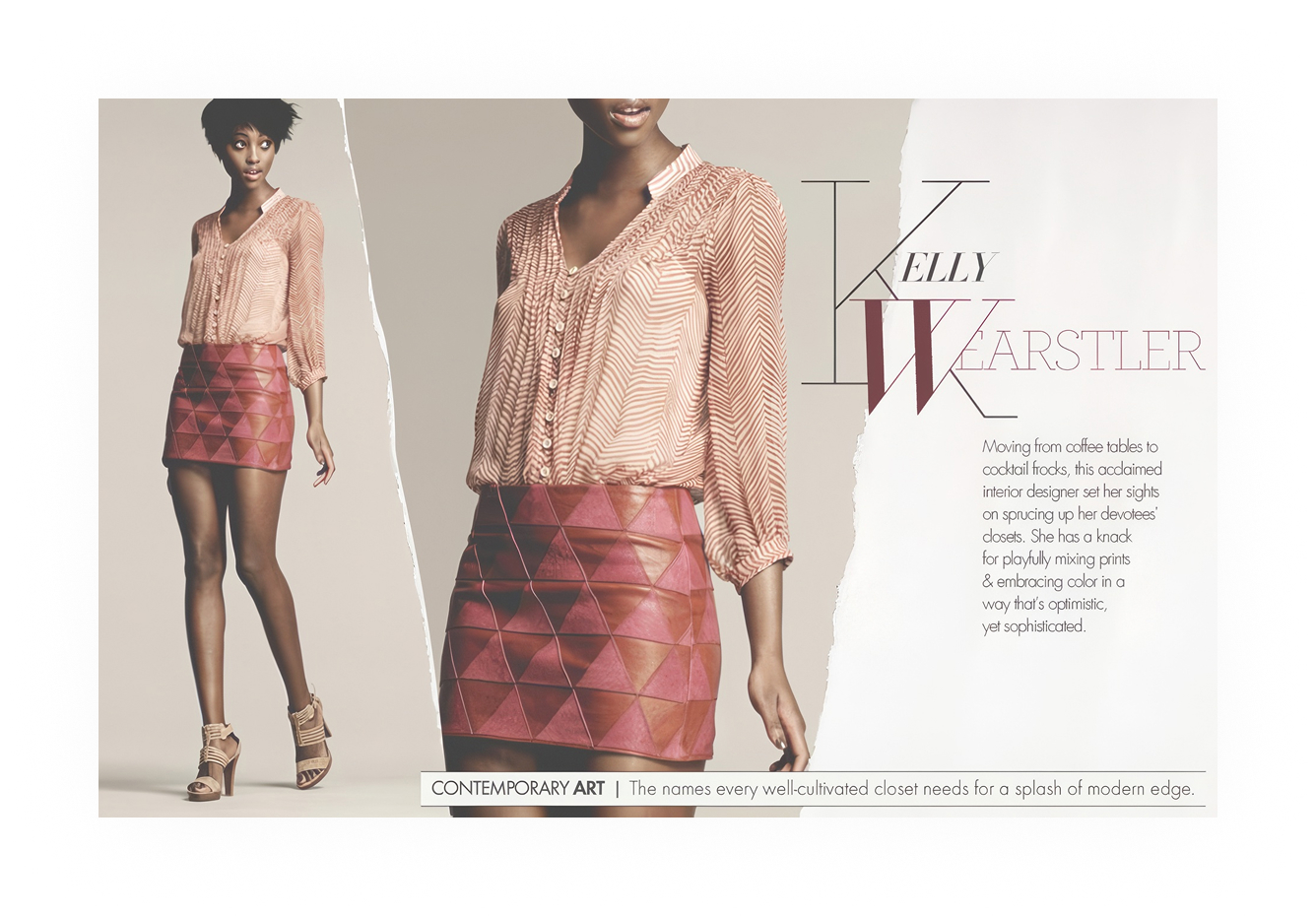
The name ran in oversized serifs. Theyskens' Theory, Rag & Bone, 10 Crosby Derek Lam, Helmut Lang, Kelly Wearstler.
Each spread set the designer's name as the composition, torn-edge framing and letters locked into the figure. In print a feature profile would have made the introduction. Here the type made it, and shoppers reached the product page having read something first.
Rainbow story
Color standing in for a set
InSite, on the laptop
Scroll. It fills the mat, then travels the frame
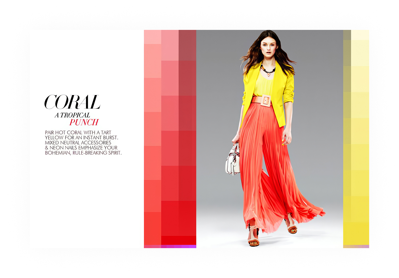
Every shoot was on seamless paper, so the color had to be the place.
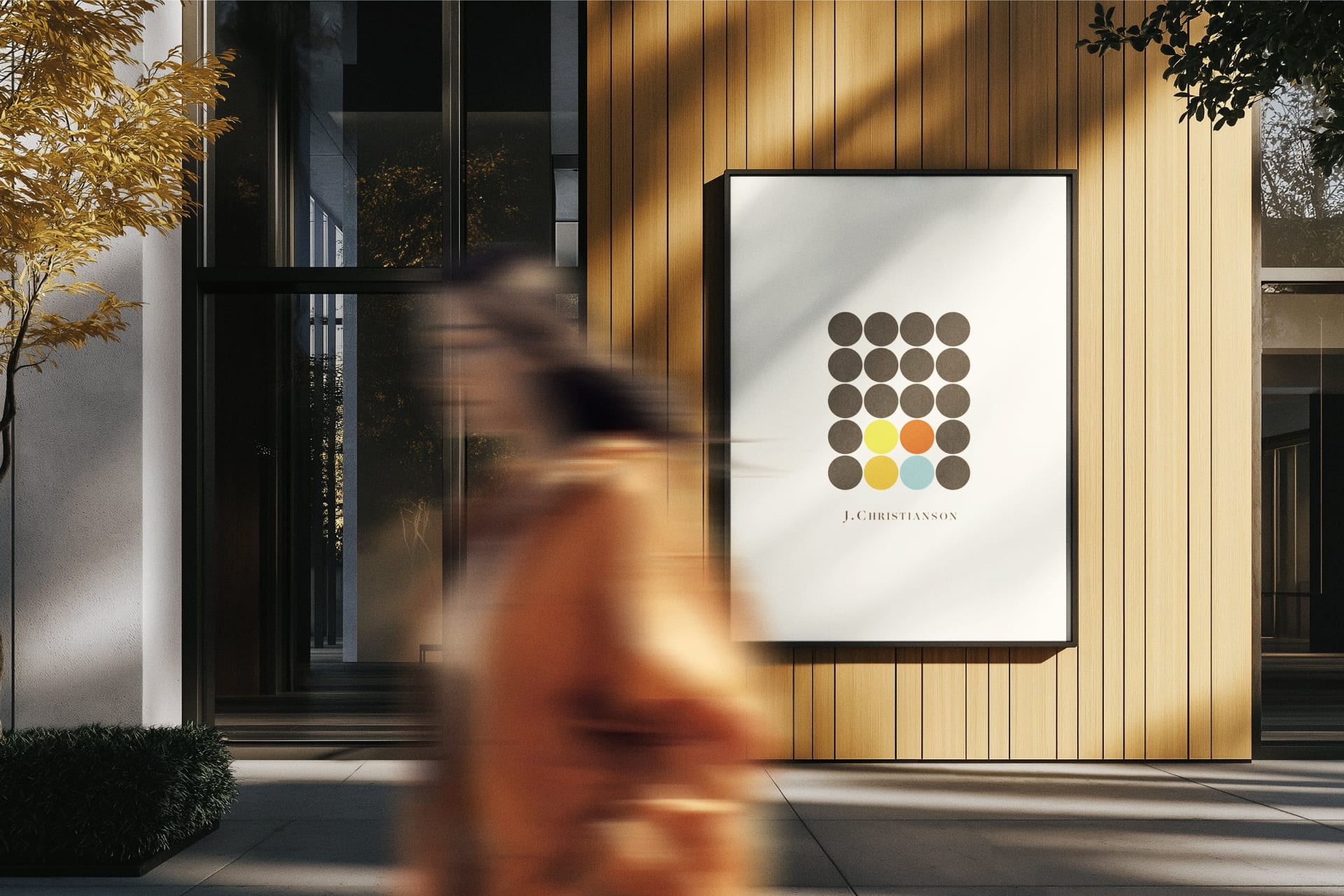
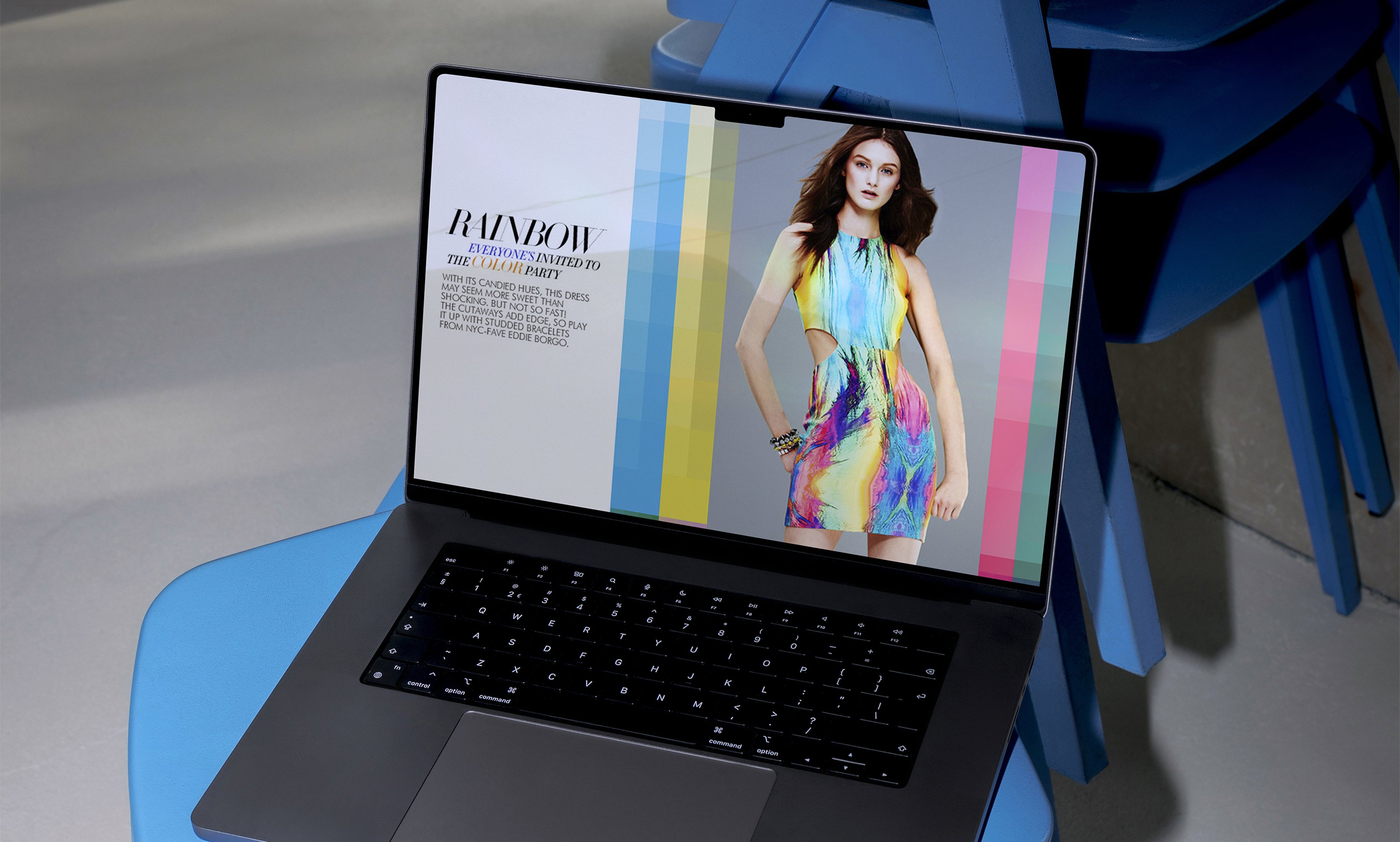
Hot Pink, Yellow, Rainbow, Orange, Coral. The chip grids stepped through the tones of one hue, and that stood in for wherever a bigger production would have flown.
The pixelation was on purpose. InSite lived on a screen, and this was the one treatment that stopped pretending it was print.
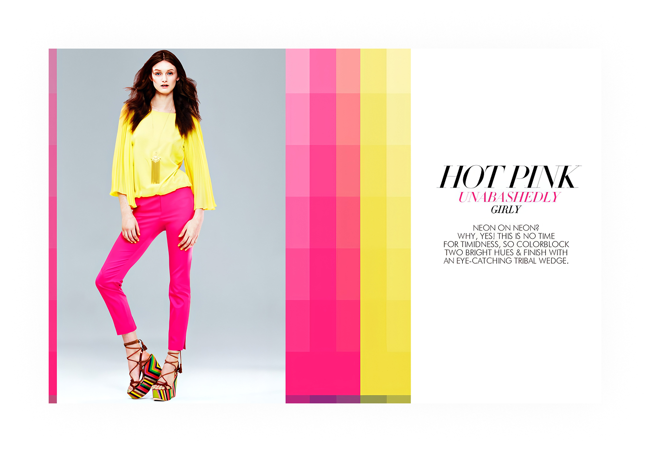
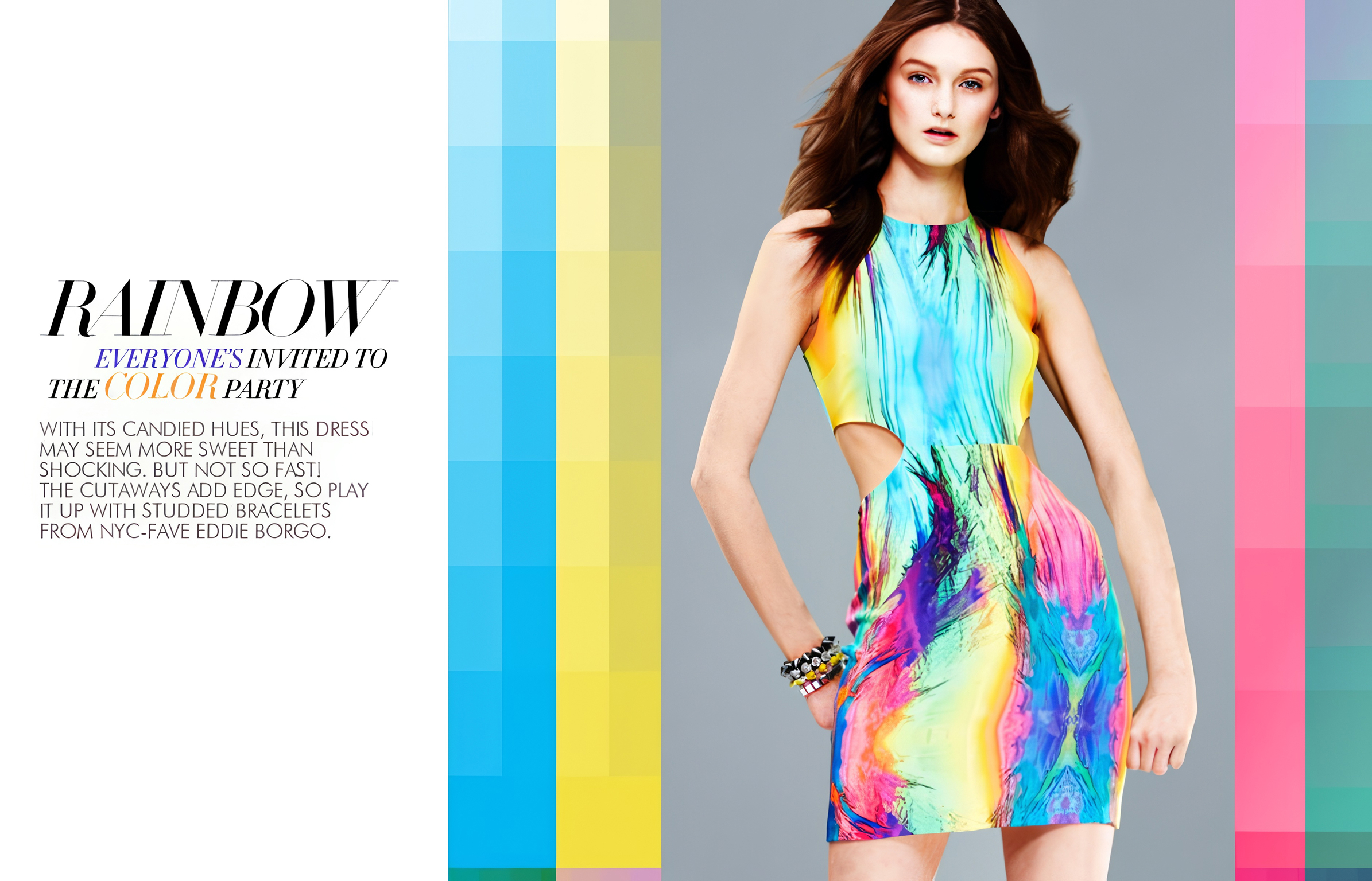
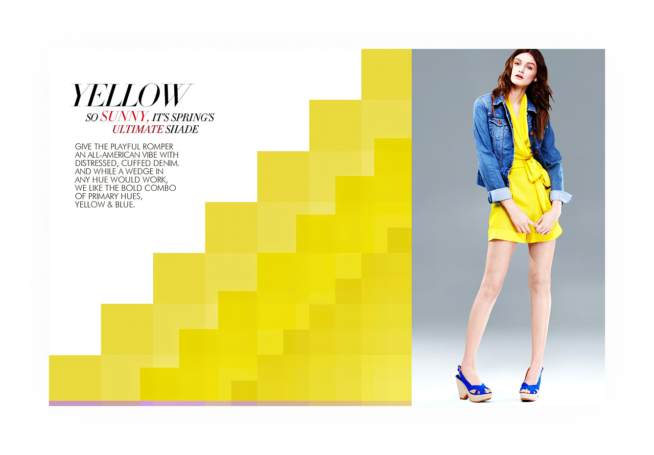
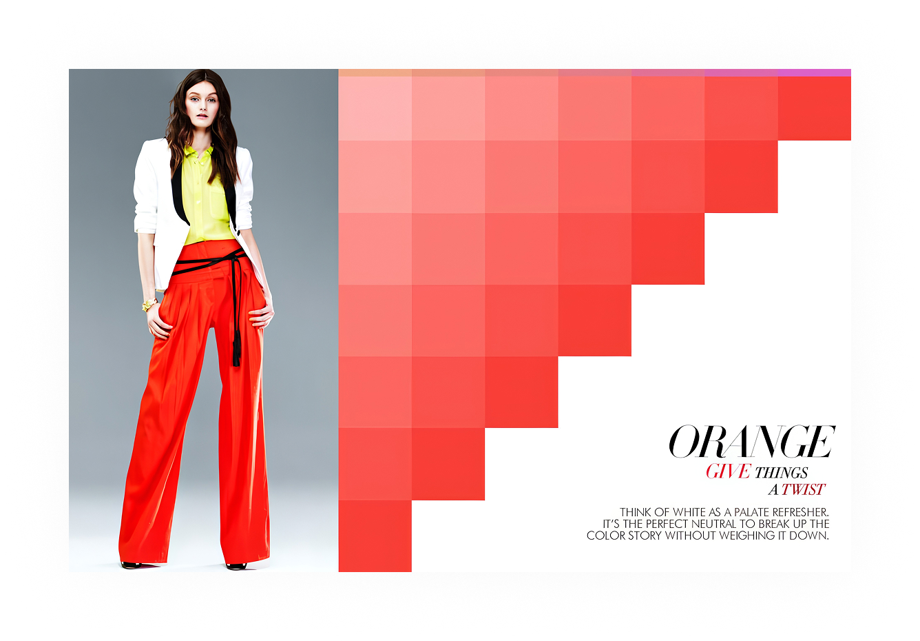
A story first, then the price
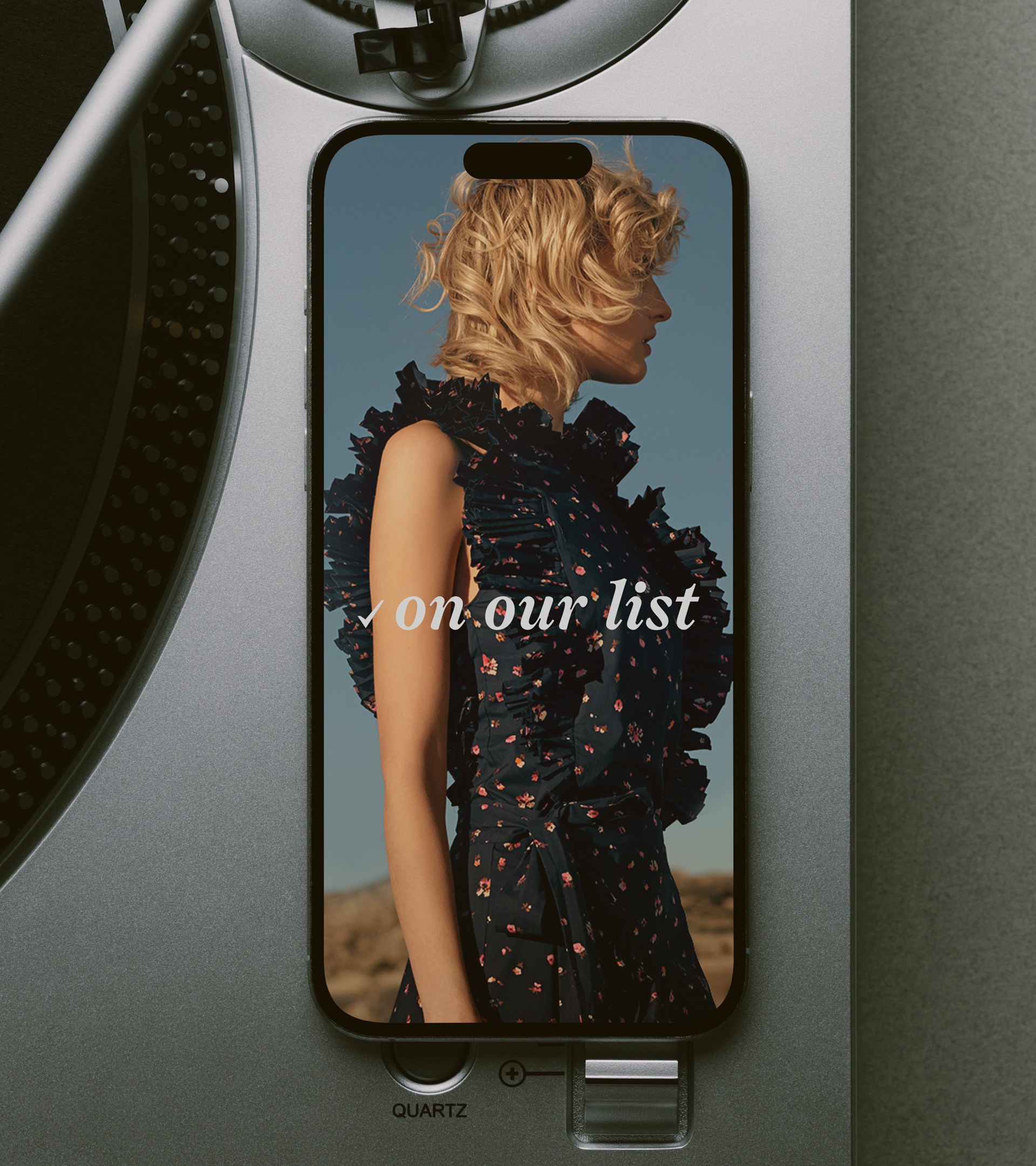
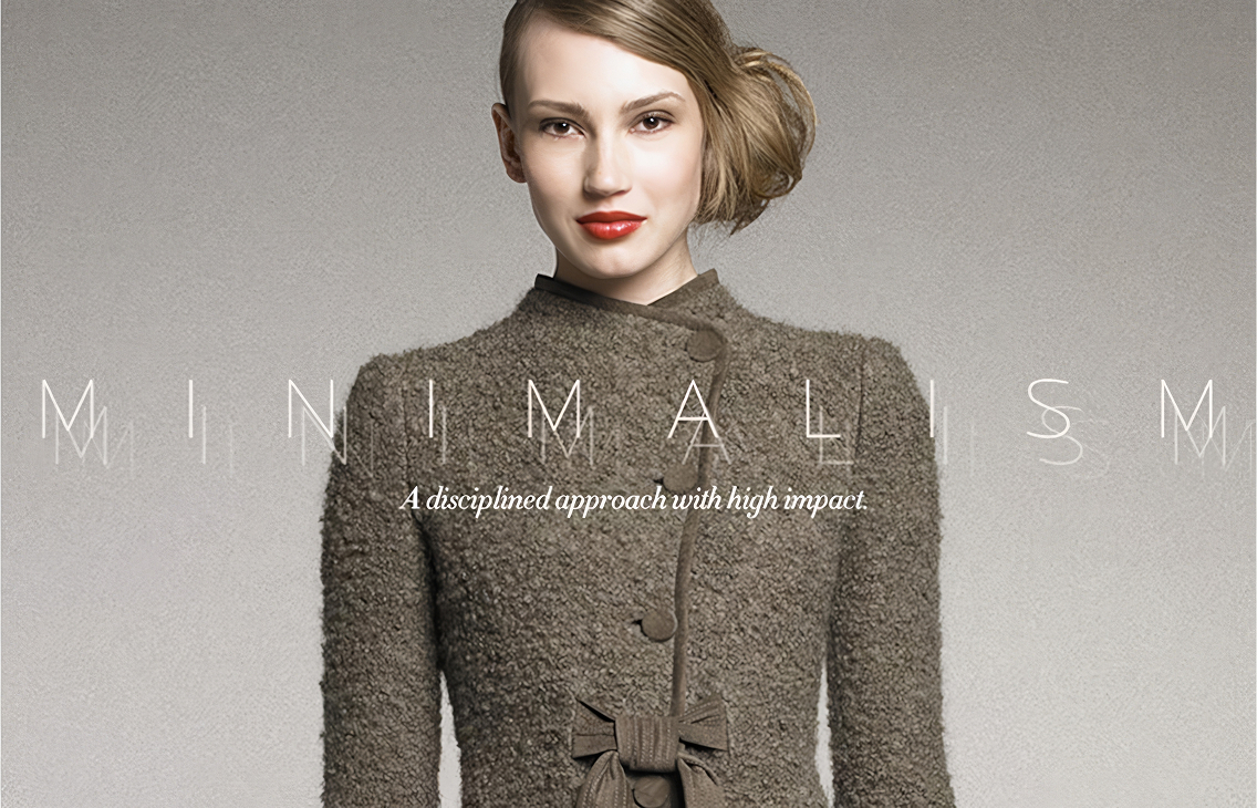
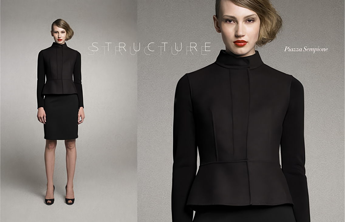
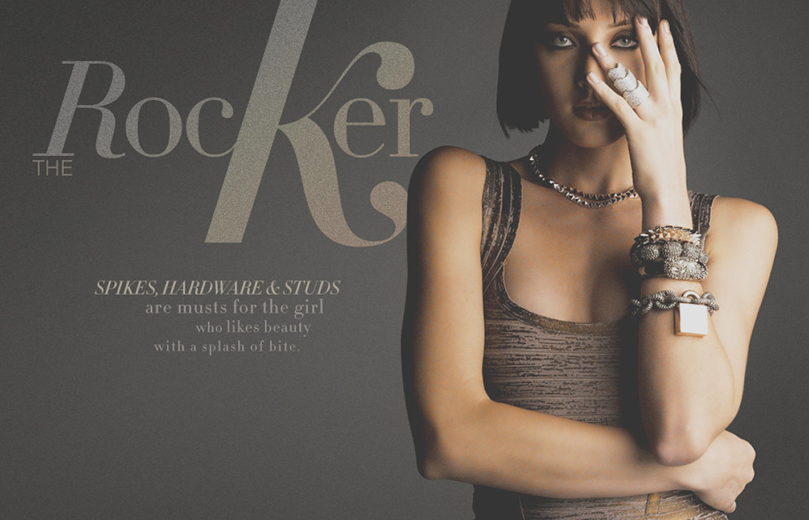
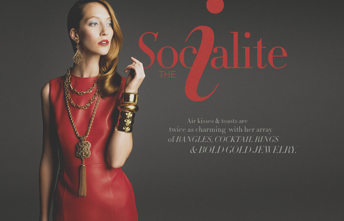
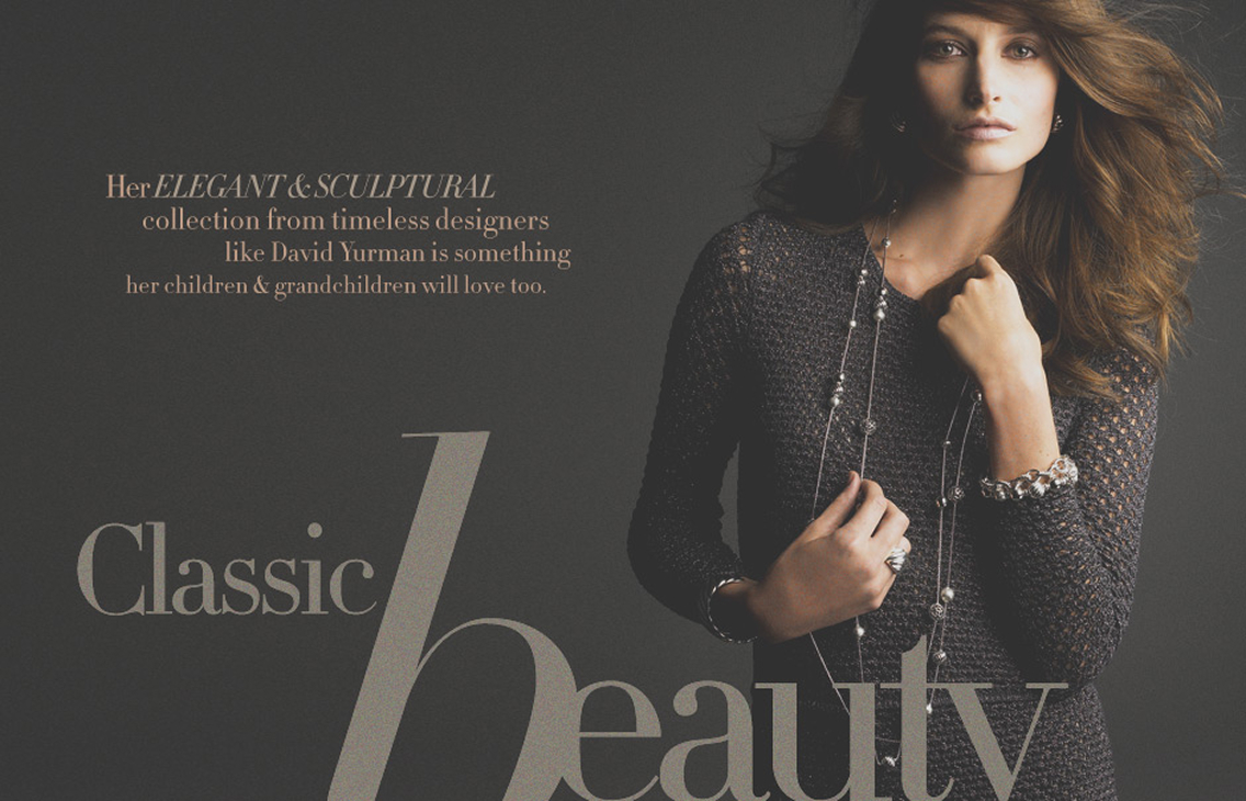
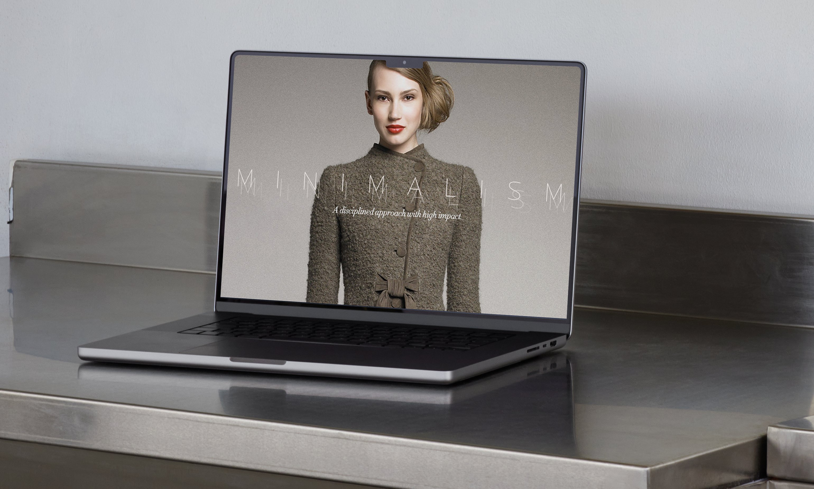
For Minimalism and Structure the letters nearly dissolve, thin outline serifs ghosting behind the garment. The Rocker, The Socialite and Classic Beauty went the other way, oversized display serifs wrapped into the model's silhouette with the negative space doing the layout.
Scale, weight and position came out of the story's concept, and the photographer got briefed with those. A restrained story got a still pose on flat gray paper. A loud one got a saturated backdrop and a pose with room for a letter to sit across the shoulder.
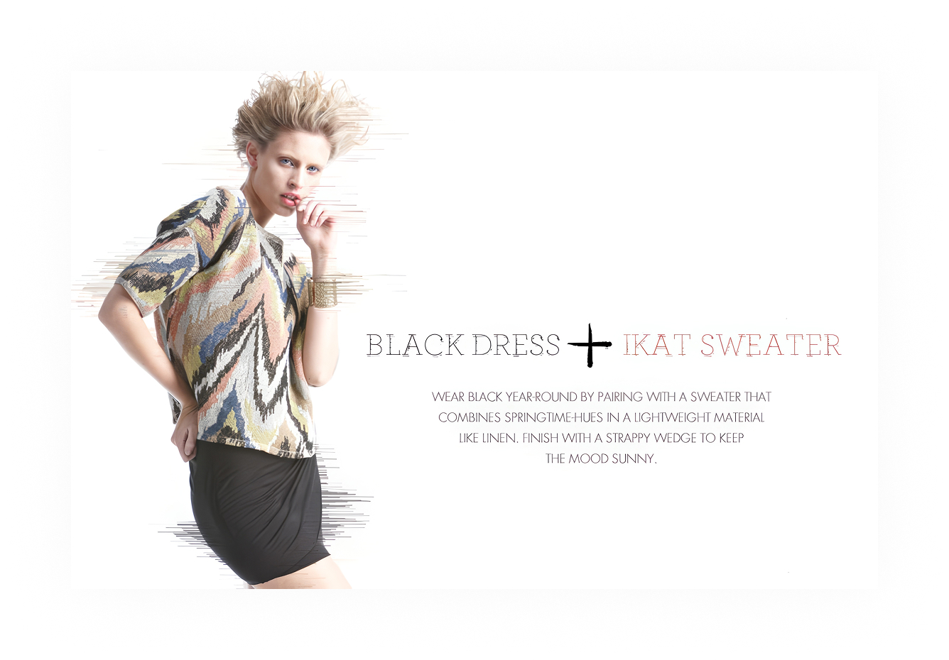
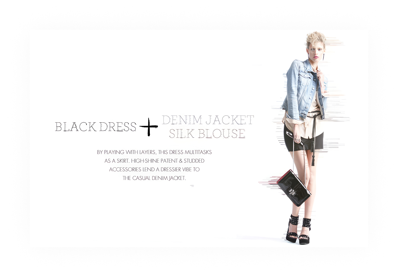
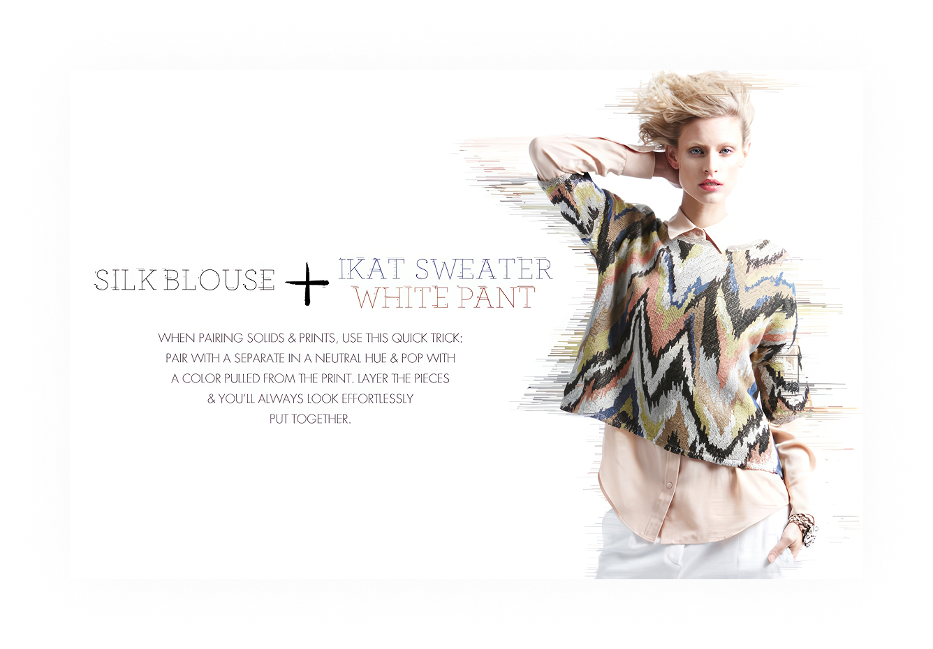
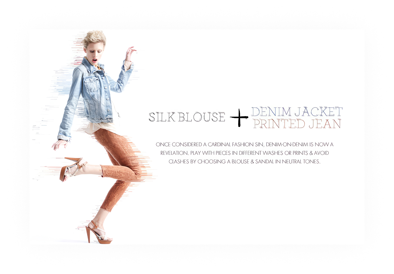
A black dress with a denim jacket, then with an ikat sweater. A silk blouse the same two ways. Noun plus noun plus noun, with the plus signs set oversized.
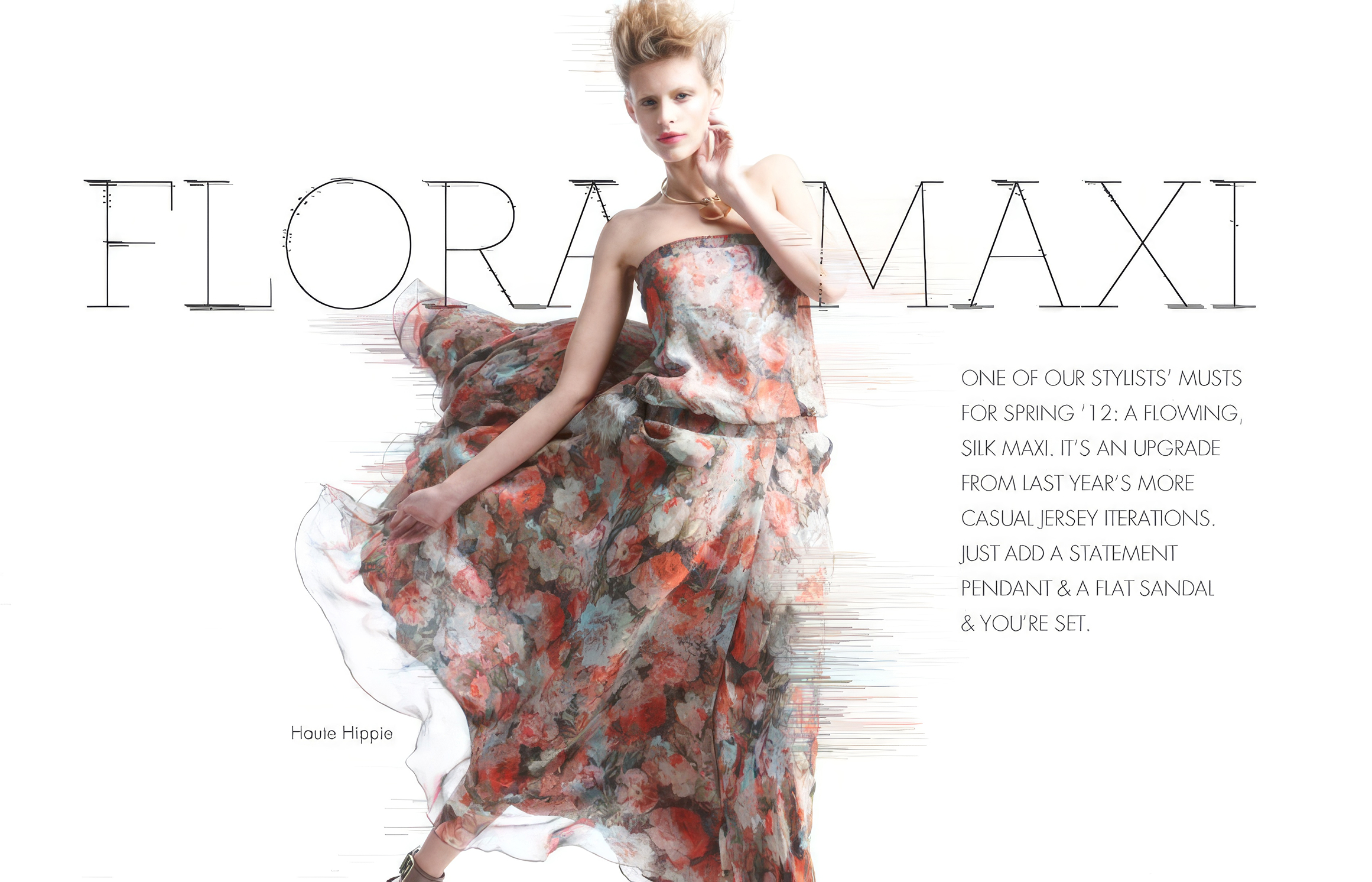
Speed lines drawn behind the models gave the spreads some motion a flat studio shot doesn't have. The grid never moved: figure on one side, type on the other, the equation stacked vertically. Merchandising could drop new product photography into the template and ship it without waiting on a custom layout, and the format stayed the same across dozens of variations.
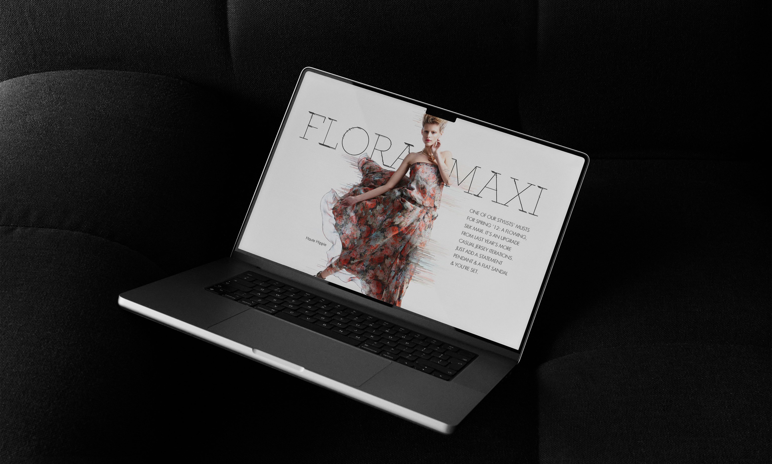
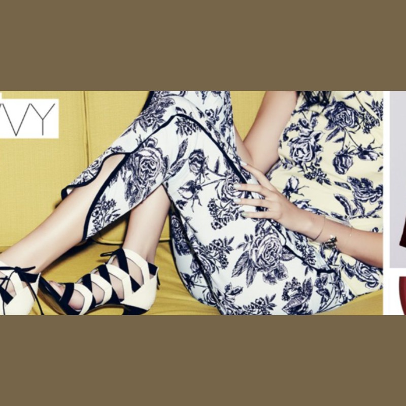
Flora Maxi feature
Outline type arching over the dress
Scroll. It fills the mat, then travels the frame
Dozens of stories on a handful of templates, and the store side still had to be findable.
The templates carried it. Ways-to-wear ran on a fixed grid, designer spotlights on open typography, trend pieces on color as the environment. That was loose enough for a dozen moods and tight enough that every story looked like it came from the same room.
Editorial Design
Photo Direction
Art Direction
Typography
Adobe Photoshop
Adobe Illustrator