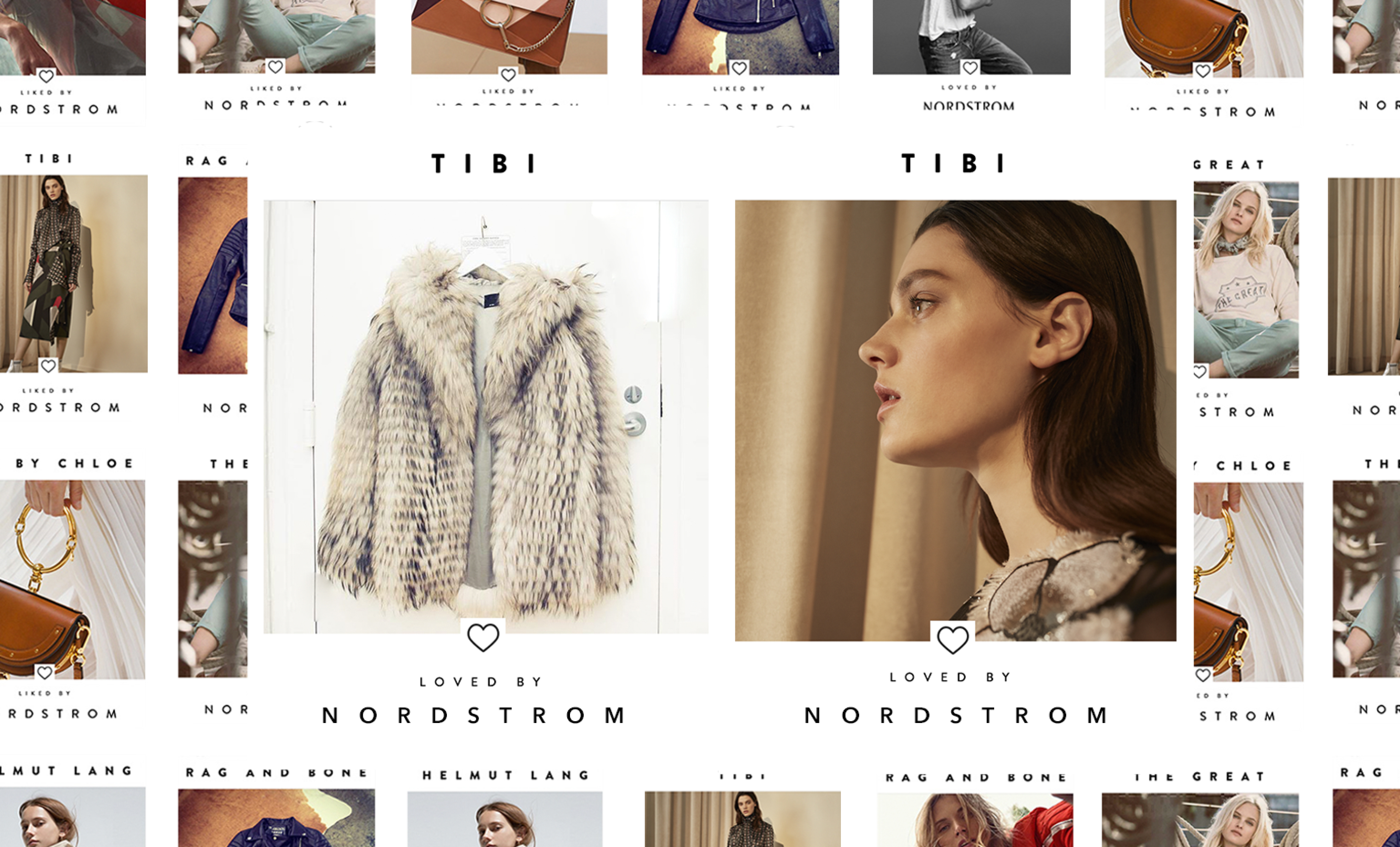
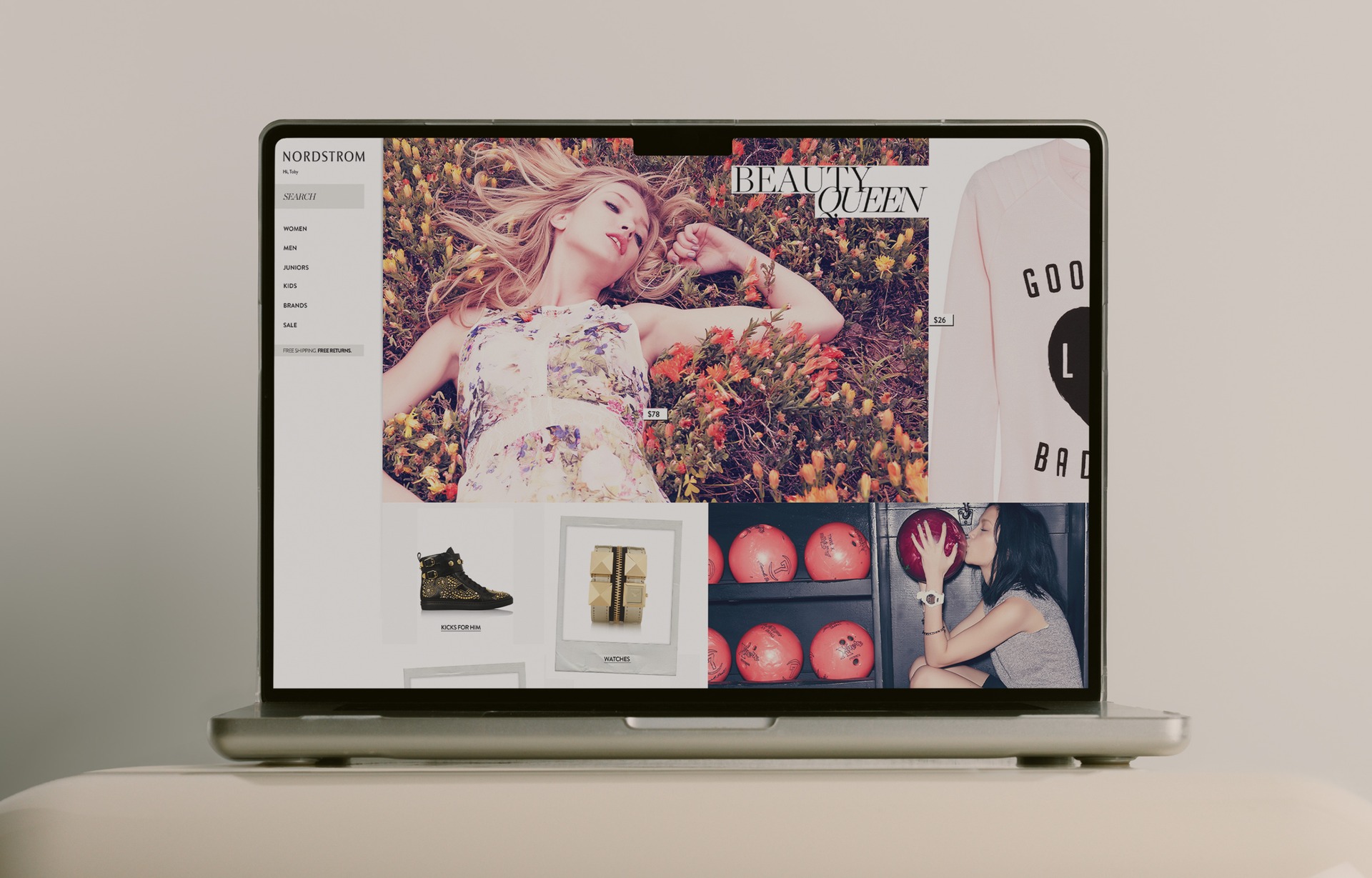
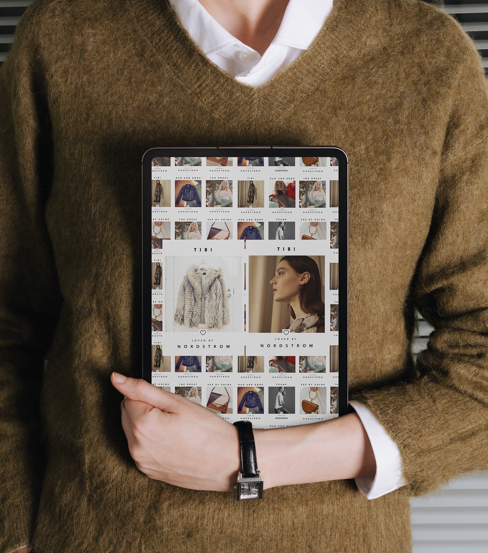
Loved by Nordstrom campaign gallery wall of brand tiles with two TIBI Loved By tiles at center

Loved by Nordstrom

One icon borrowed from Instagram, twelve months of brand merchandising built on top of it.

Field Creative Direction Campaign Design Design Systems

Author Jeremy Prasatik Published: 2017 Status: Complete

Classification Creative Direction Campaign Design Design Systems

Abstract

The brief was emerging brand awareness - a Nordstrom mandate to lift smaller designer labels across the department store floor and the digital storefront at the same time. The solve was simpler than it sounds: borrow the heart icon from Instagram and let it carry the campaign signature.

One mark, two voices. "Liked by Nordstrom" sat on the smaller tiles for day-to-day merchandising, and "Loved by Nordstrom" carried the hero slots that earned the extra real estate. Same icon, same typography, different emotional weight - merchandising had a dial they could turn without touching the design.

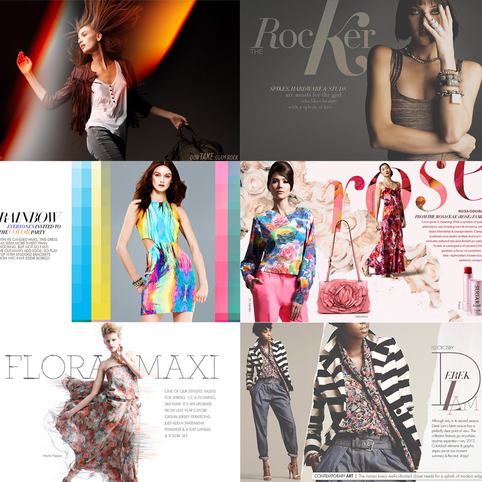
Twelve months across social feeds, email sends, in-store signage, and web landing pages. The template absorbed whatever the brand had already licensed - Helmut Lang shot minimal and cold, The Great shot warm and narrative, See by Chloé led with product. The frame held all of them without flattening any of them, and the campaign ran long because there was nothing to get tired of.

SECTION 02: THE IDEA

The Heart Was Already a Verb.

People tapped it thousands of times a day without thinking. Stamping it on a retail campaign meant the mechanic came pre-installed. No one needed to learn what Liked By meant.

Two typographic levels did the work of a full brand hierarchy. "Liked" sat on the smaller tiles and "Loved" carried the hero slots - same icon, same typography, different emotional weight. Merchandising picked which tier a brand earned and the design held the frame.

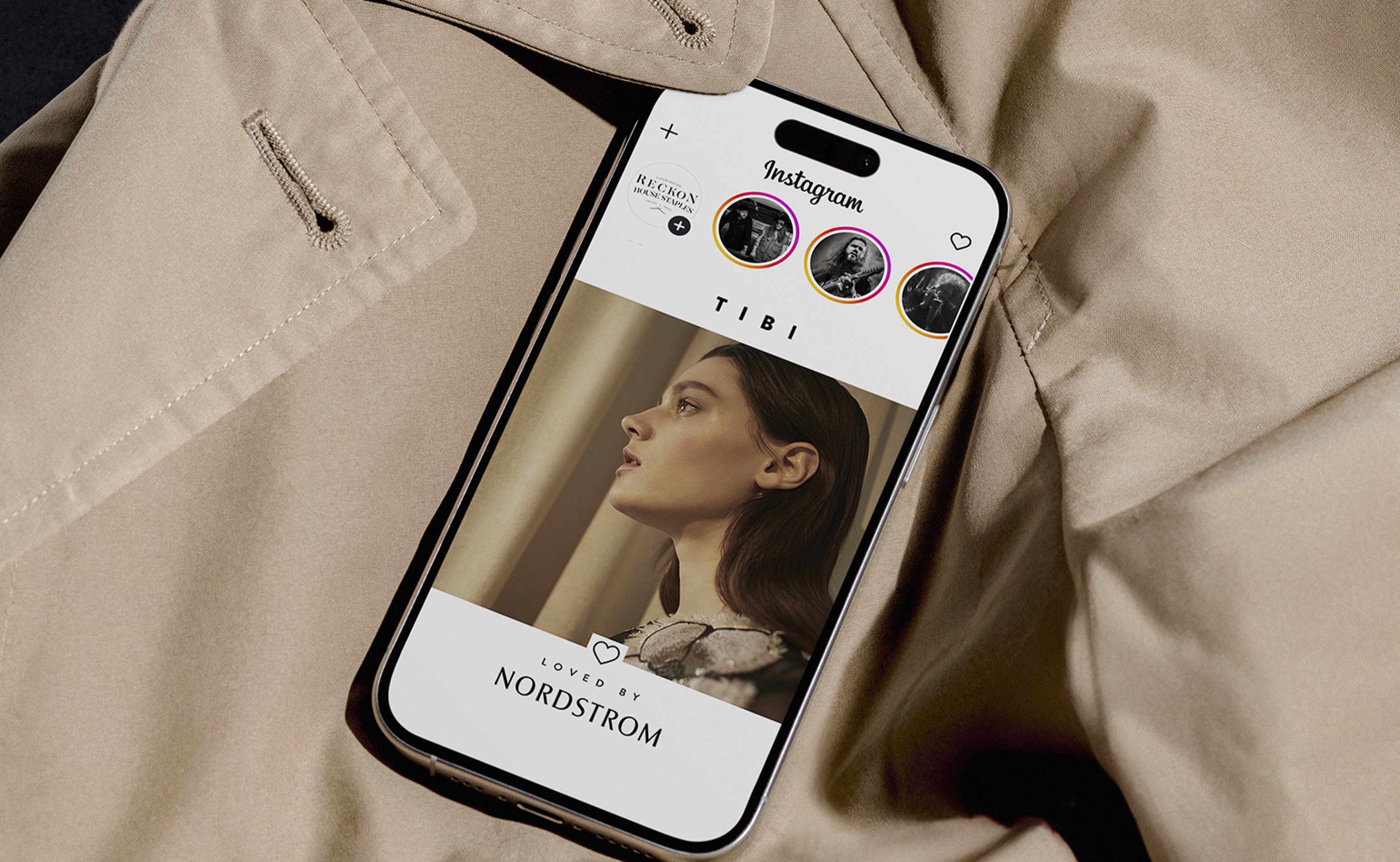
iPhone showing TIBI Loved by Nordstrom story on Instagram laid on a beige trench coat
SECTION 03: THE SYSTEM

A Tile That Worked As a Container.

Brand name on top, photography in the middle, heart and endorsement at the base. Anything could land in the middle slot - product shot, lifestyle frame, studio portrait, campaign still. The frame absorbed whatever the brand had already licensed.

The flexibility came from discipline at the structural level. Fixed grid, fixed type, fixed icon, everything else open. Merchandising got more freedom than the brands could have negotiated individually.

Liked by Nordstrom tile featuring Helmut Lang, model in beige canvas jacket
Liked by Nordstrom tile featuring The Great, model on boat in graphic sweatshirt
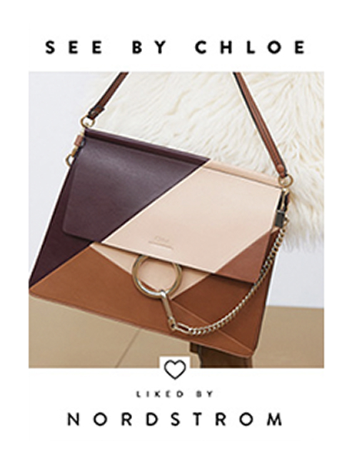
Liked by Nordstrom tile featuring See by Chloé colorblock leather bag
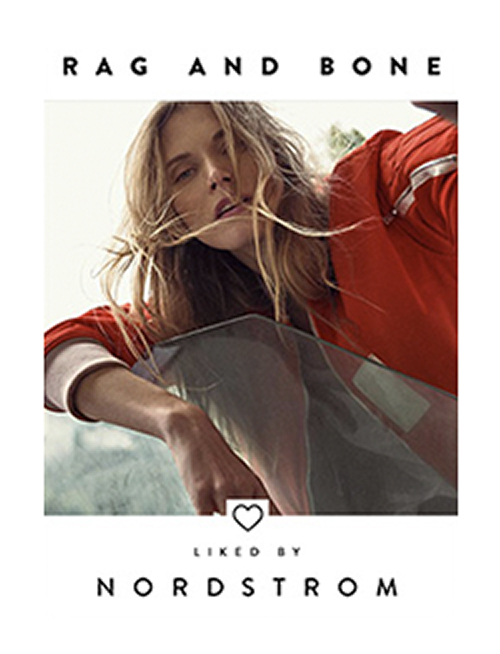
Liked by Nordstrom tile featuring Rag and Bone, model in red jersey
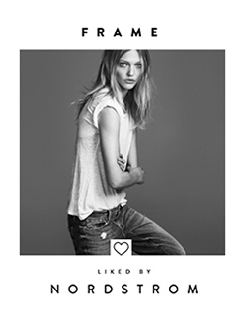
Liked by Nordstrom tile featuring Frame denim, black-and-white studio shot
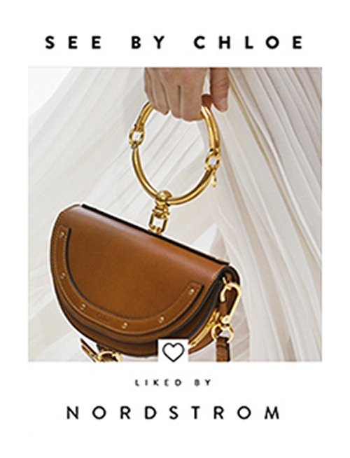
Liked by Nordstrom tile featuring See by Chloé saddle bag with gold ring handle
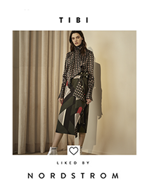
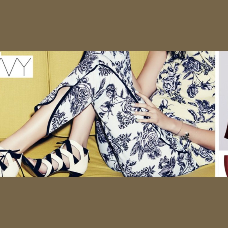
Liked by Nordstrom tile featuring TIBI printed top and colorblock skirt
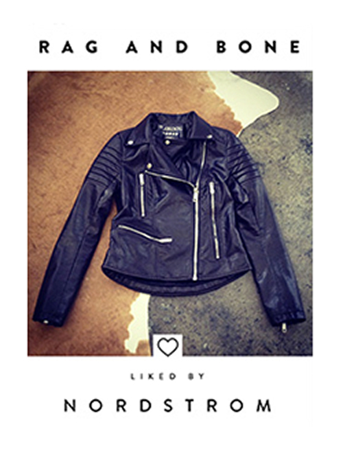
Liked by Nordstrom tile featuring Rag and Bone black leather motorcycle jacket

A heart does what a logo cannot

SECTION 04: HIERARCHY

Two Tiers Giving Merchandising a Lever.

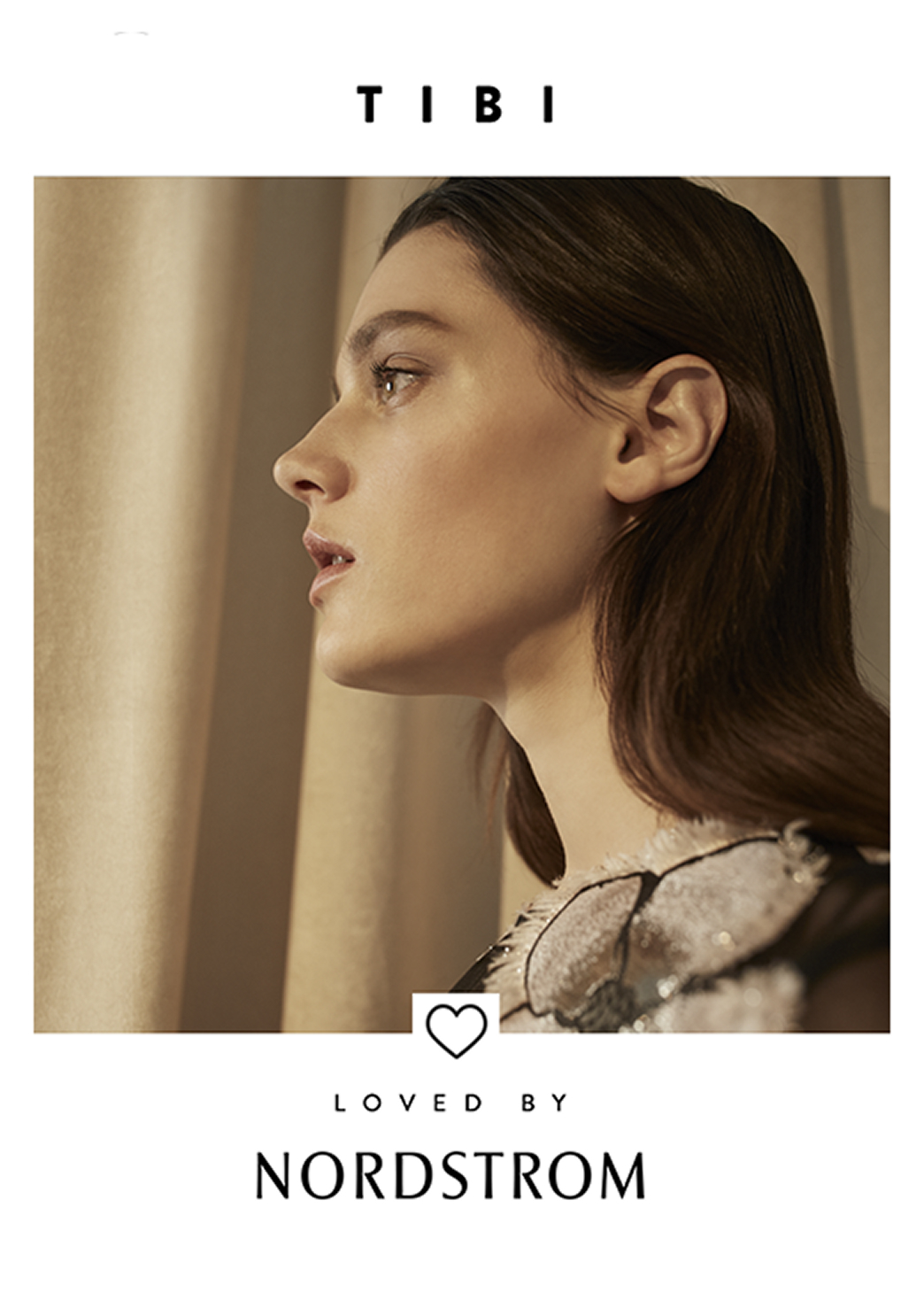
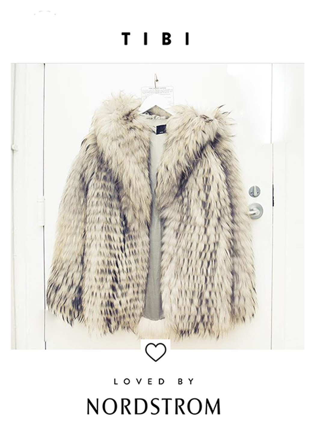
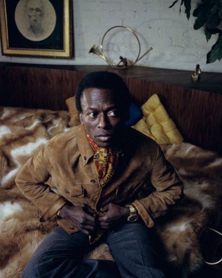
Loved By earned the bigger canvas - larger crops, tighter compositions, single-brand focus. When TIBI got the Loved treatment, the fur coat and the profile portrait ran at full-page scale, with the same type and heart but a different voltage.

Merchandising used the tier as a programming tool. Weekly pushes on Liked. Seasonal flagships on Loved. The design gave them a way to signal priority without writing a brief that said "make this one bigger." The tier showed up in the copy.
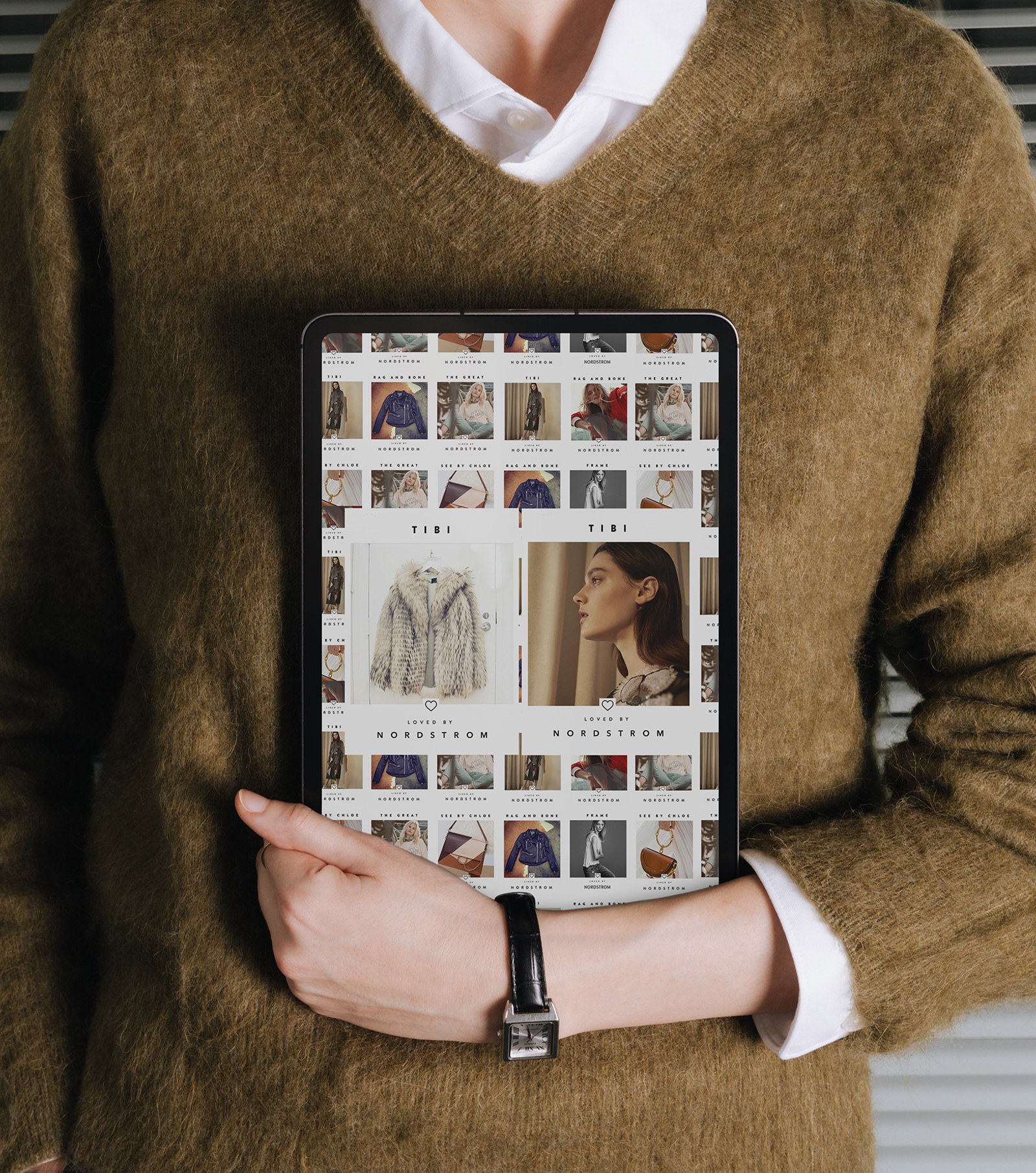
Loved by Nordstrom large format tile featuring TIBI, profile portrait with feathered detail
Loved by Nordstrom large format tile featuring TIBI faux fur coat on white door
SECTION 05: ACROSS CHANNELS

A Customer Saw It Twice in Two Days.

The tile rendered the same whether it showed up in a feed, an email hero, a window decal, or a landing page header. Scale changed, framing stayed, and recognition compounded across channels without anyone teaching the customer to look for it.

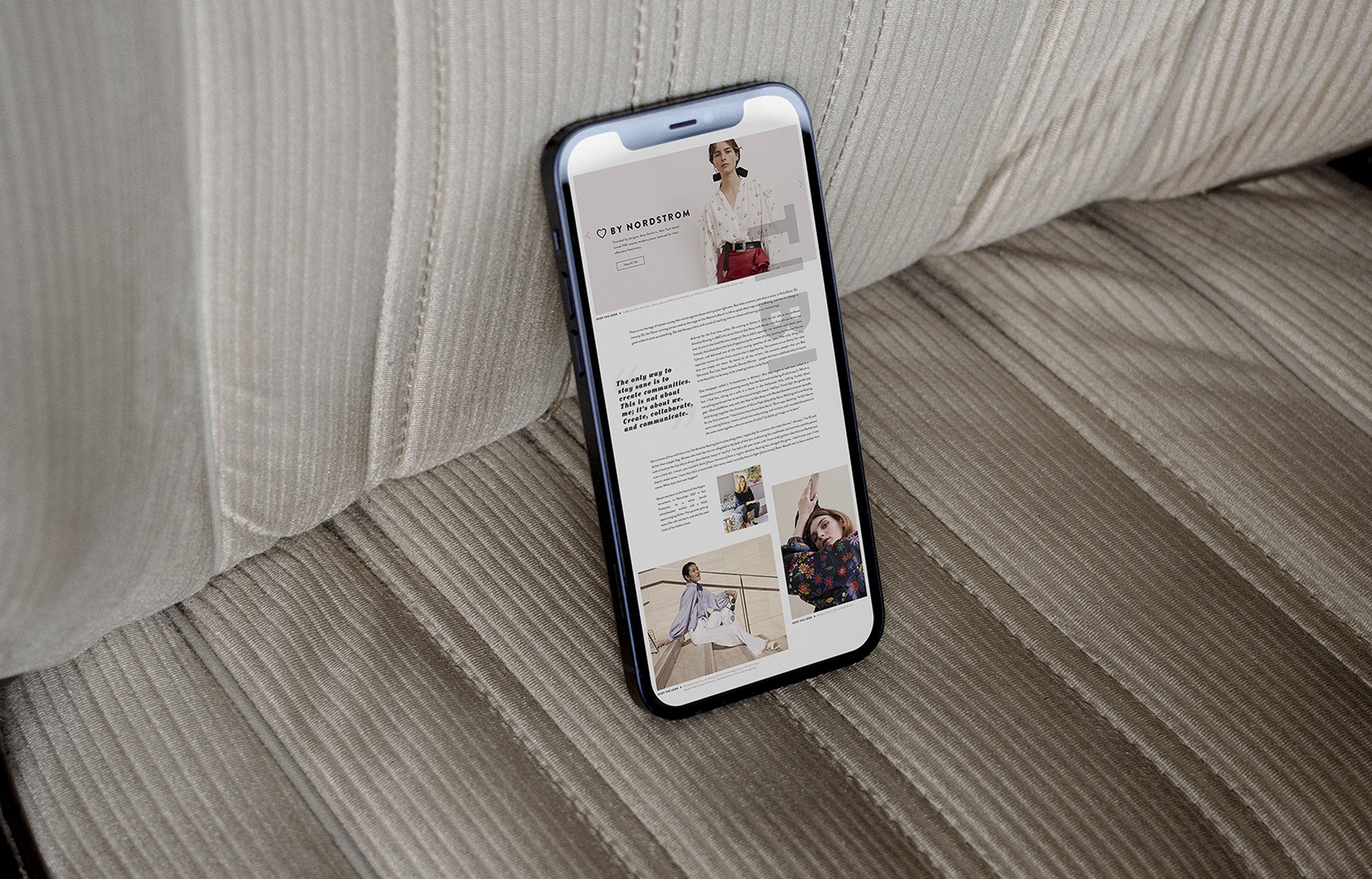
The landing page pulled the campaign into a navigation layer. Editorial stories organized by brand, the heart acting as a bookmark through the grid. The same photography that lived in a 1080-square social post scaled to a 1440-wide hero without new art direction. Crop spec, not redesign.

iPhone showing By Nordstrom landing page laid on corduroy couch
SECTION 06: CLOSING

A Year on One Icon.

Campaigns usually start with a concept and dress it in a system. This one started with a system and let the concept stay small. Twelve months, dozens of brands, one heart.

Services

Creative Direction

Campaign Design

Design Systems

Stack

Art Direction

Photography Licensing

Editorial Systems

Links

The Instagram heart was the argument and the rest was restraint - keep the frame constant, keep the typography quiet, let the brand photography do the talking. The campaign ran long because there was nothing to get tired of, no slogans to swap, no treatment to reinvent for fall.

The tier between Liked and Loved gave merchandising a lever and gave designers a reason not to touch the layout every month. One icon, two levels, any asset, a year of output from a five-minute idea.

Designing across space and material.

SECTION: PRACTICE

Putting the work first.

It's the part I love most.

Studio Reckon House Multi-disciplinary

Founded 2002 Location: Texas / Anywhere Status: Open for projects

Classification Digital Branding Interiors

Contact hello@reckon.house 214.697.4578 IG @reckonhousestaples

Abstract

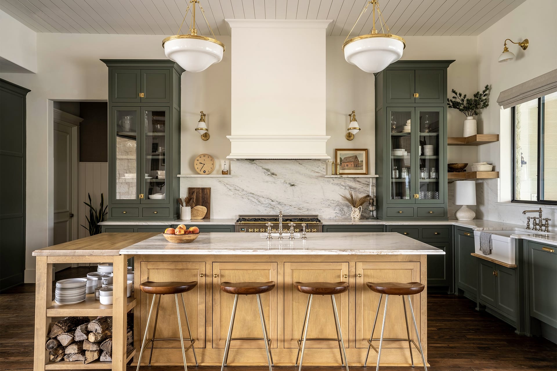
The work means a lot of things at once - writing the code that ships an app, picking the marble that goes in a kitchen, art directing a campaign shoot, building a brand voice from scratch, designing the AI tooling that runs marketing operations at enterprise scale. These aren't separate jobs, they're the same job showing up in different rooms.

What makes it work is the no-handoff part. Wireframing and coding happen in the same week. Picking kitchen finishes and coordinating the install happen on the same site visit. The thinking and the making stay close to each other, which is why the disciplines stay connected instead of competing for attention.

DIGITAL EXPERIENCES & SOFTWAREBRANDING & CREATIVE DIRECTIONINTERIORS & FABRICATIONReact / Next.jsTailwindOpenAI APIComputer VisionLLMsFramerWebflowReplit / V0SplineArt DirectionVoice & ToneTypographyColor SystemsAfter EffectsMidjourneyCustom LoRASocial GridsEmail ArchSpace PlanningFF&EMillwork DesignMaterial SelectionOn-site DirectionPop-up / RetailFabricationFull-Stack EngAI IntegrationSystems DesignProduct StrategyRapid PrototypingNo-Code ArchBrand StrategyCreative DirectionVisual Identity3D & MotionGen. ImageryContent SystemsInt. ArchitectureFF&E SourcingCustom FabricationInstallation MgmtExperientialDIGITALBRANDINGINTERIORSRHSRING INDEXDisciplineSkill / PracticeTool / MethodDISCIPLINESDigitalBrandingInteriors
© 2026 Reckon House. Made by Jeremy Prasatik.