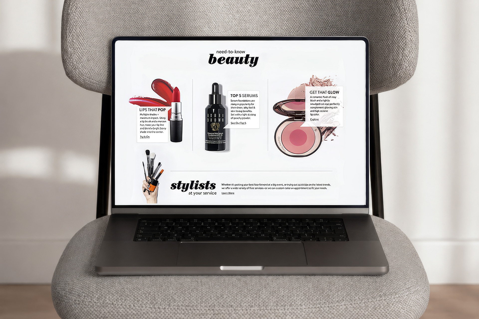
Nordstrom Beauty hub homepage on laptop, three editorial story cards, stylists section

Nordstrom Beauty

A beauty editorial hub where every story sells. Built to stay current without a content team rebuilding pages each week.

Field Product Design UX Design Visual Design

Author Jeremy Prasatik Published: 2018 Status: Complete

Classification Product Design UX Design Visual Design Editorial Templates

Abstract

Beauty content ages fast. New products launch weekly, trends shift seasonally, and static editorial goes stale before it publishes. The answer wasn't faster publishing - it was a template that aged better than the content inside it.

Three modular story formats, each designed with editorial voice but built so merchandising could swap products without touching the layout. "Get That Glow" and "Top 5 Serums" told seasonal stories while the underlying product grid stayed current. Content that looked curated but actually ran on rails.

A virtual try-on tool let customers upload a photo or pull their Style Profile selfie, then drag across a color gradient to preview shades on their own face. Pick a color, see it applied, buy without leaving the modal. Stories opened into a shoppable drawer rather than navigating away, so the flow kept customers inside the narrative instead of bouncing them through product pages.

SECTION 02: THE HUB

The Templates Aged Better Than the Content.

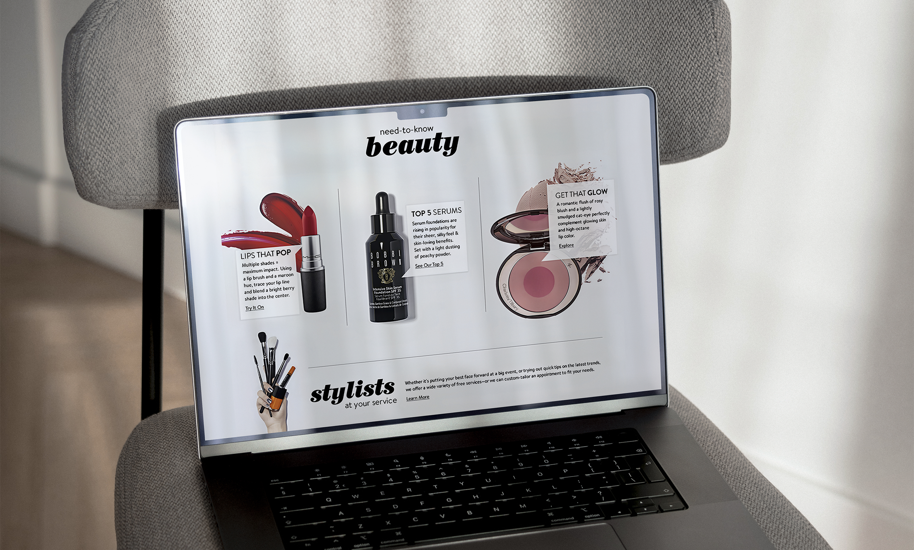
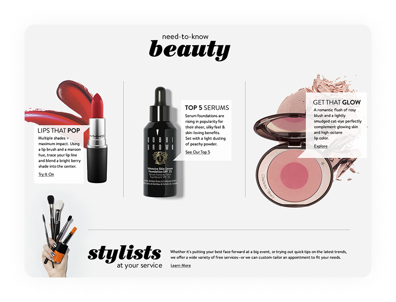
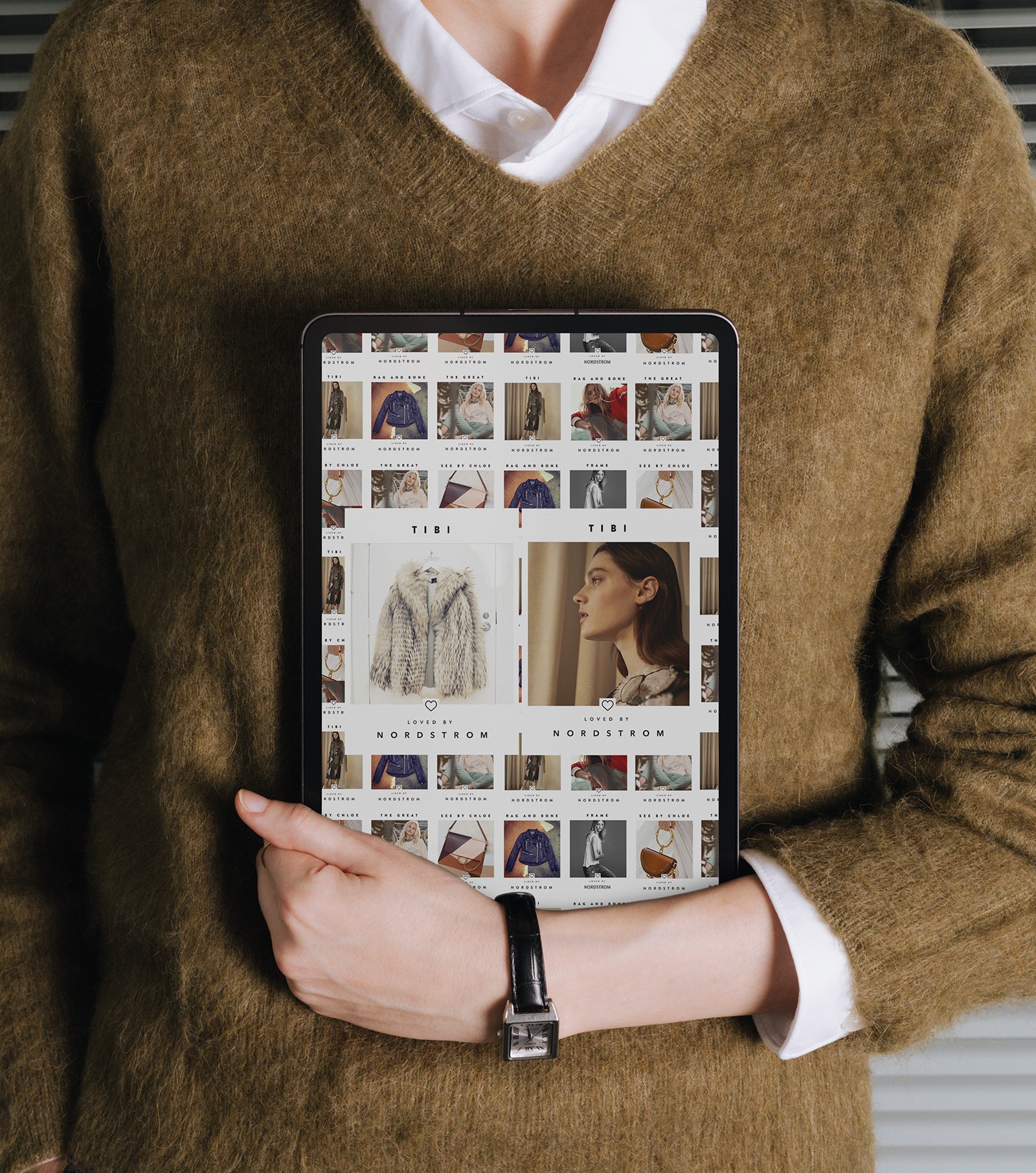
The hub anchored around three rotating editorial stories - "Lips That Pop," "Top 5 Serums," "Get That Glow" - each card opening into a full shoppable experience. The three-card layout gave merchandising enough surface area to feature seasonal pushes without overwhelming the page.

The templates separated content from structure. Editorial voice lived in the headlines, photography, and copy, while product data pulled from the catalog automatically - swap a SKU and the price, description, and imagery updated without a designer touching the page. They survived three seasonal rotations before anyone requested a layout change.

Nordstrom Beauty hub desktop, three editorial story cards with product imagery
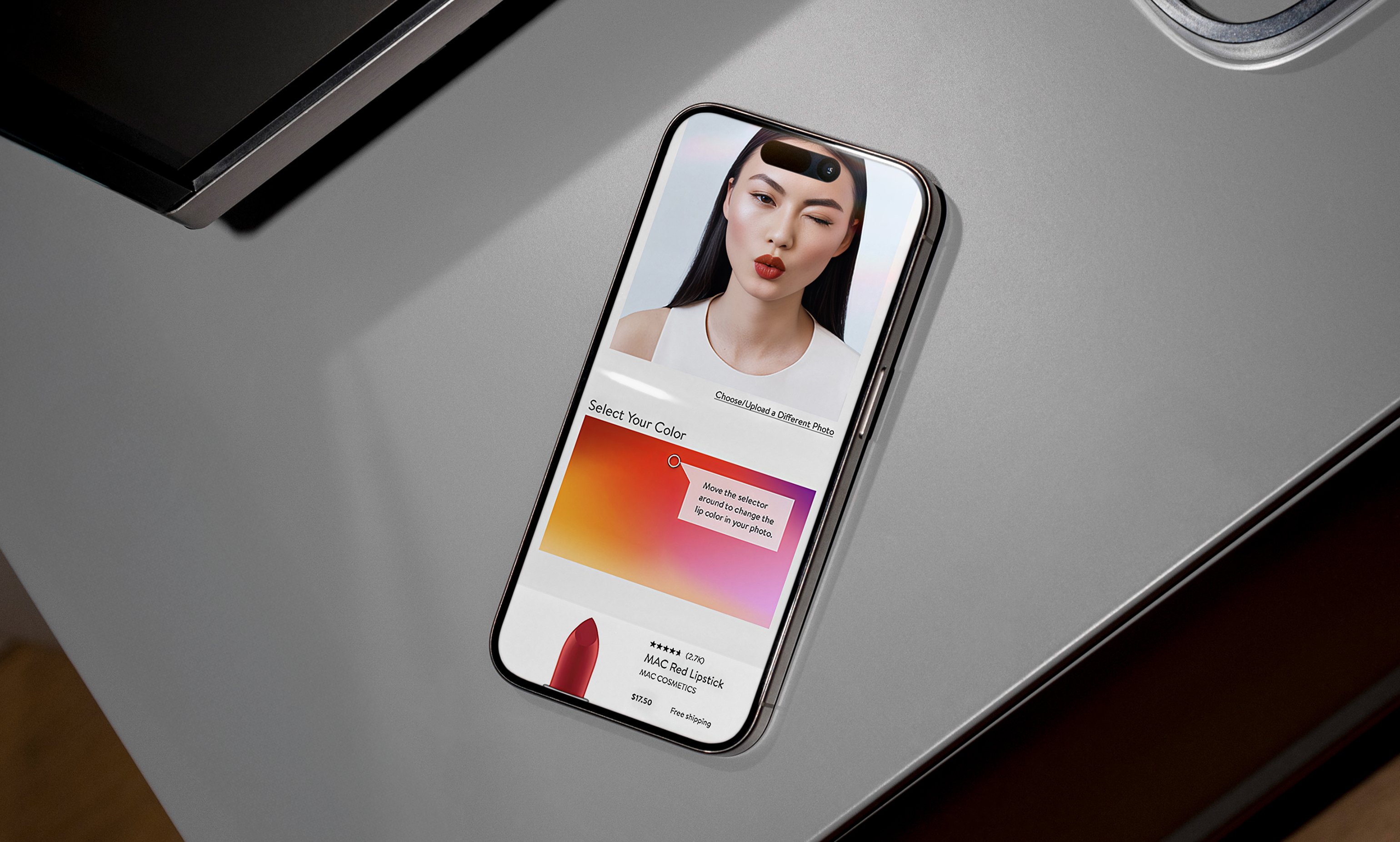
Nordstrom Beauty virtual try-on tool on iPhone, color gradient selector, lipstick preview
SECTION 03: VIRTUAL TRY-ON

Color Discovery That Lived on the Customer's Face.

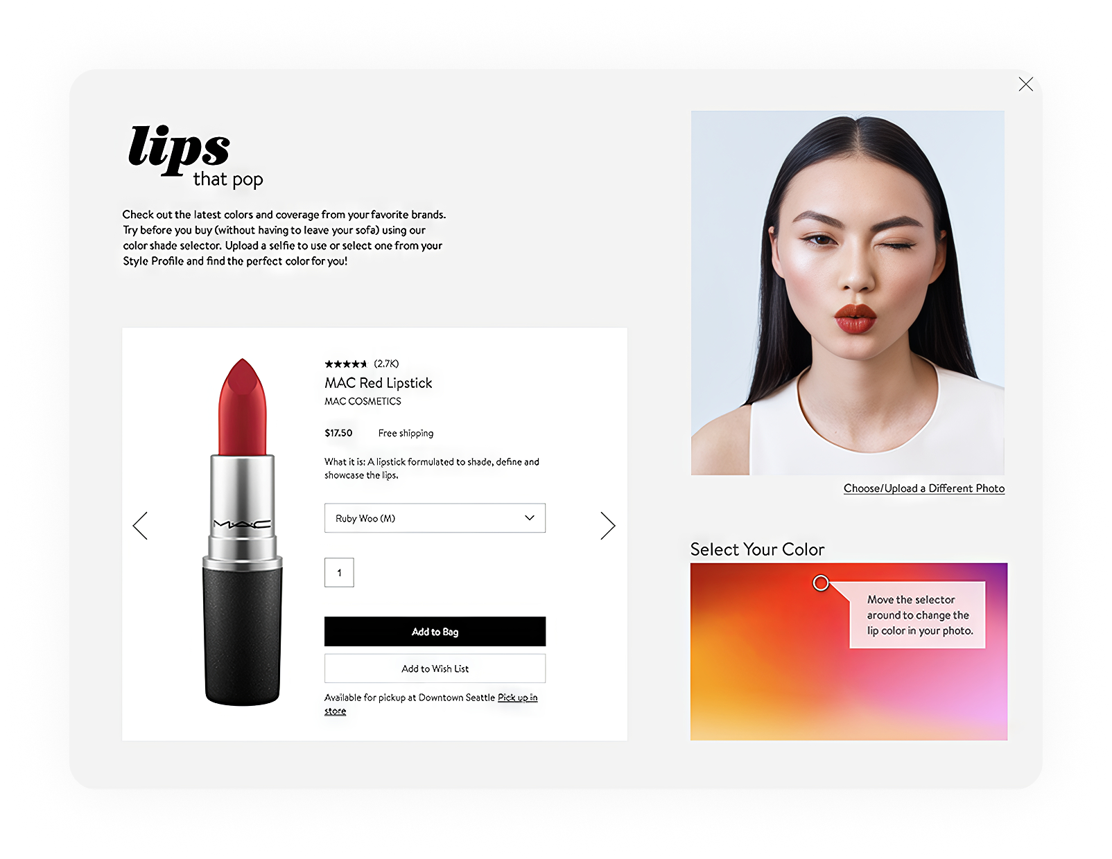
The tool brought product discovery into the customer's actual face. Upload a selfie or pull one from the existing Style Profile, drag across a color gradient and watch shades apply to the photo in real time. Find the right red, tap it, and the product card appears below with reviews, pricing, and an add-to-bag button.

The tool lived inside the "Lips That Pop" story but was designed as a standalone component, reusable across any color-driven category: lip, eye, cheek, nail. The color gradient mapped directly to available SKUs, so no shade appeared in the tool that couldn't be purchased - the function and the experience held the same shape.

Nordstrom Beauty Lips That Pop desktop experience with virtual try-on tool and product detail

Editorial that merchandises itself

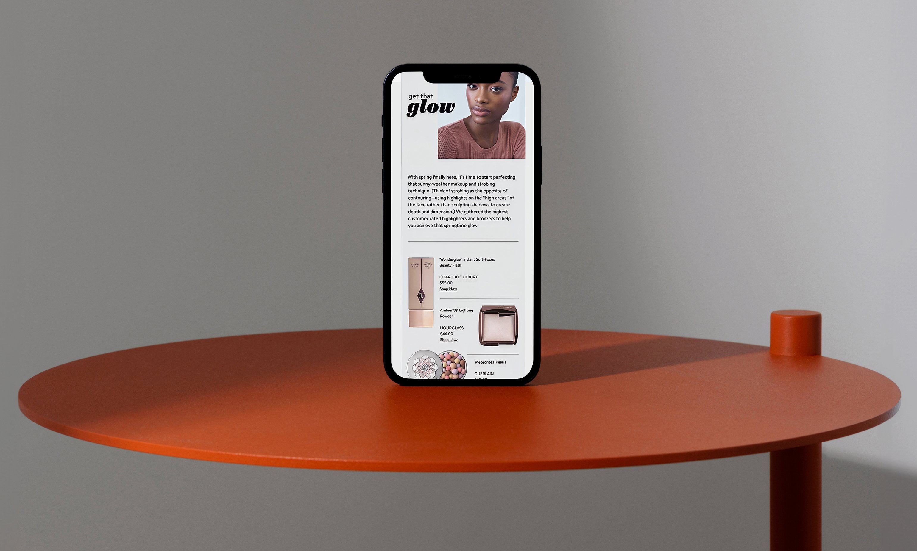
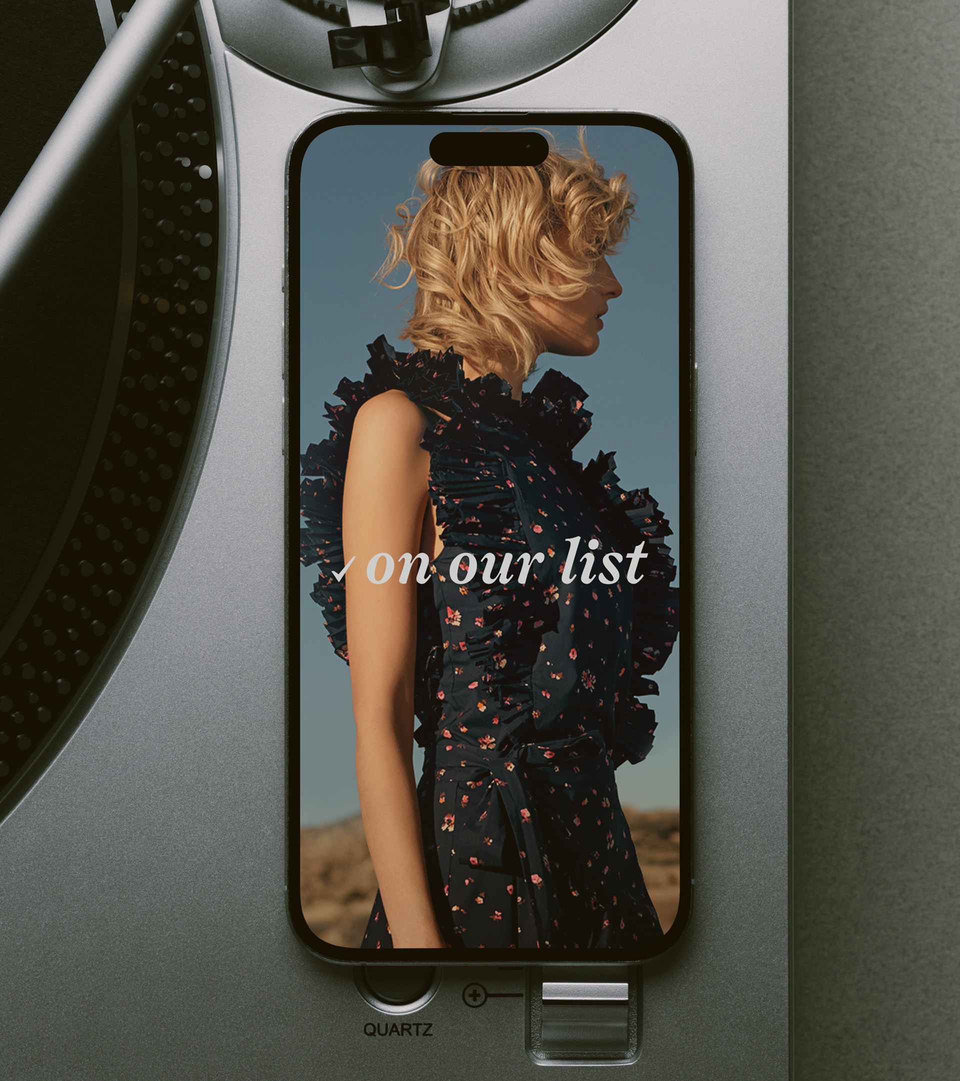
Nordstrom Beauty Get That Glow story on iPhone, orange table lifestyle mockup
SECTION 04: SHOPPABLE STORIES

The Customer Never Left the Story.

Every story opened into a shoppable drawer rather than a product page. The editorial narrative stayed visible while the product detail slid in from the side - reviews, pricing, size options, add to bag - and the purchase happened without breaking the read.

The drawer pattern kept engagement metrics inside the editorial experience. Time on page, scroll depth, and conversion all measured within the story context rather than fragmenting across product detail pages. Merchandising could track which editorial angles drove the most adds-to-bag without attribution guesswork.

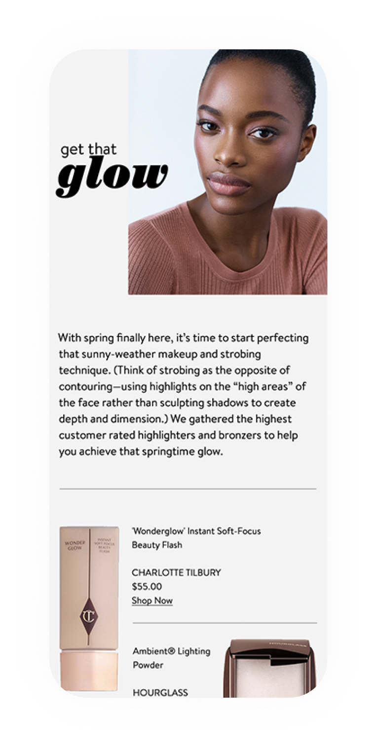
Get That Glow story mobile, editorial layout with model and copy
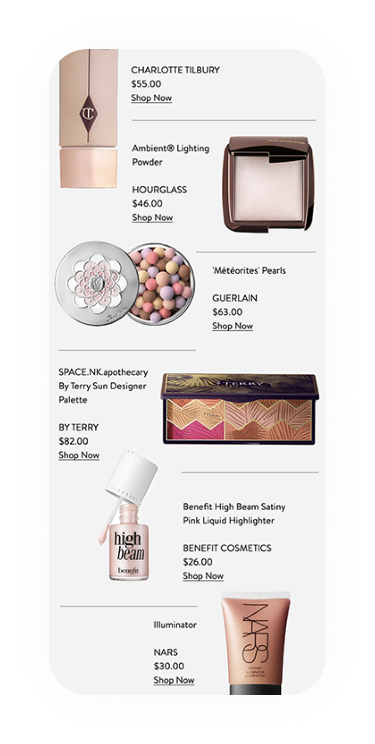
Get That Glow story mobile, shoppable product grid with pricing
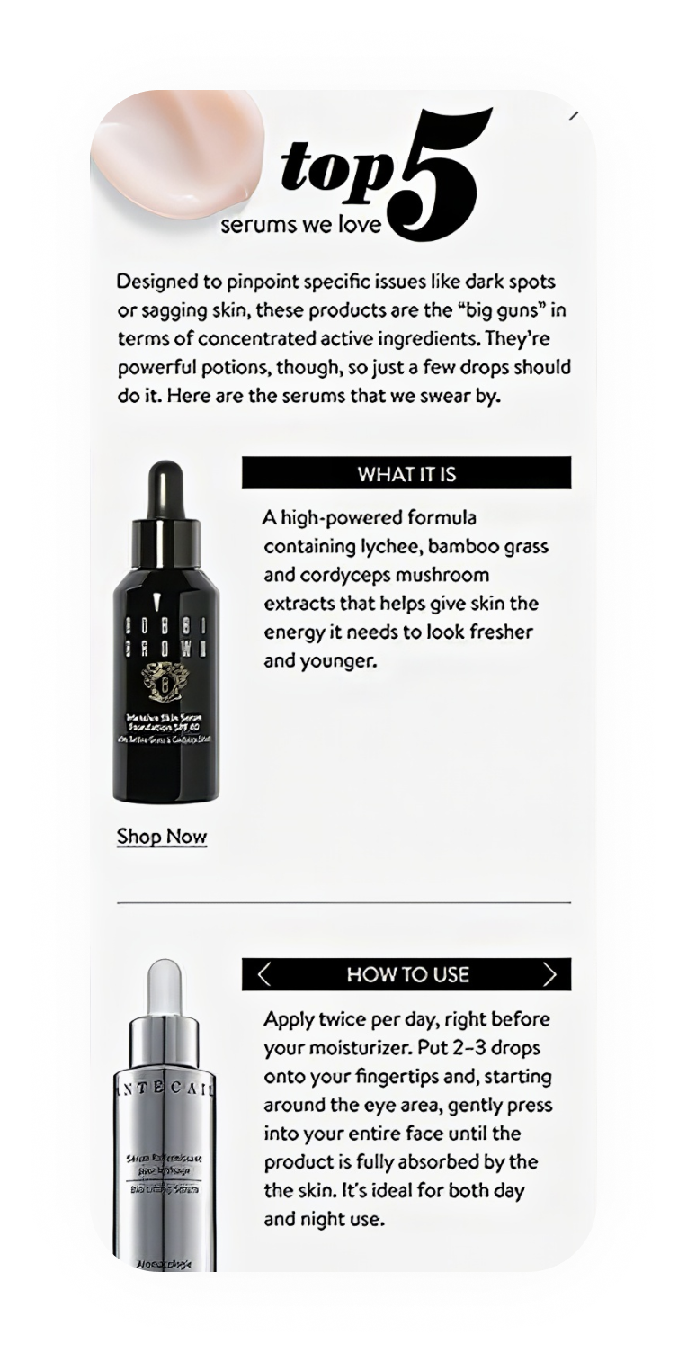
Top 5 Serums story mobile, editorial with product details and how-to-use
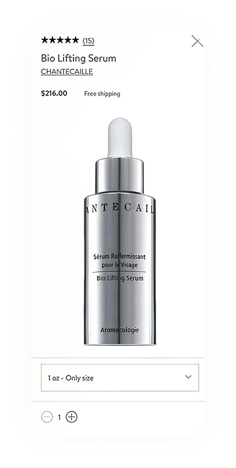
Product detail drawer mobile, Bio Lifting Serum with pricing and add to bag
SECTION 05: CLOSING

A Hub That Stayed Fresh Without Manual Updates.

Three story templates, one try-on tool, and a drawer pattern that kept customers inside the narrative.

Services

Product Design

UX Design

Visual Design

Editorial Templates

Stack

Nordstrom CMS

Custom Components

HTML/CSS/JS
Links

The beauty hub solved a publishing problem by turning it into a design problem - separate the editorial voice from the product data, and let the templates hold the layout while the catalog feeds the content. A hub that looked hand-curated every week without a designer opening a file.

The try-on tool turned browsing into trying, and the shoppable drawer kept the story visible during the purchase. Both patterns kept the customer inside the experience instead of scattering them across product pages.

Designing across space and material.

SECTION: PRACTICE

Putting the work first.

It's the part I love most.

Studio Reckon House Multi-disciplinary

Founded 2002 Location: Texas / Anywhere Status: Open for projects

Classification Digital Branding Interiors

Contact hello@reckon.house 214.697.4578 IG @reckonhousestaples

Abstract

The work means a lot of things at once - writing the code that ships an app, picking the marble that goes in a kitchen, art directing a campaign shoot, building a brand voice from scratch, designing the AI tooling that runs marketing operations at enterprise scale. These aren't separate jobs, they're the same job showing up in different rooms.

What makes it work is the no-handoff part. Wireframing and coding happen in the same week. Picking kitchen finishes and coordinating the install happen on the same site visit. The thinking and the making stay close to each other, which is why the disciplines stay connected instead of competing for attention.

DIGITAL EXPERIENCES & SOFTWAREBRANDING & CREATIVE DIRECTIONINTERIORS & FABRICATIONReact / Next.jsTailwindOpenAI APIComputer VisionLLMsFramerWebflowReplit / V0SplineArt DirectionVoice & ToneTypographyColor SystemsAfter EffectsMidjourneyCustom LoRASocial GridsEmail ArchSpace PlanningFF&EMillwork DesignMaterial SelectionOn-site DirectionPop-up / RetailFabricationFull-Stack EngAI IntegrationSystems DesignProduct StrategyRapid PrototypingNo-Code ArchBrand StrategyCreative DirectionVisual Identity3D & MotionGen. ImageryContent SystemsInt. ArchitectureFF&E SourcingCustom FabricationInstallation MgmtExperientialDIGITALBRANDINGINTERIORSRHSRING INDEXDisciplineSkill / PracticeTool / MethodDISCIPLINESDigitalBrandingInteriors
© 2026 Reckon House. Made by Jeremy Prasatik.