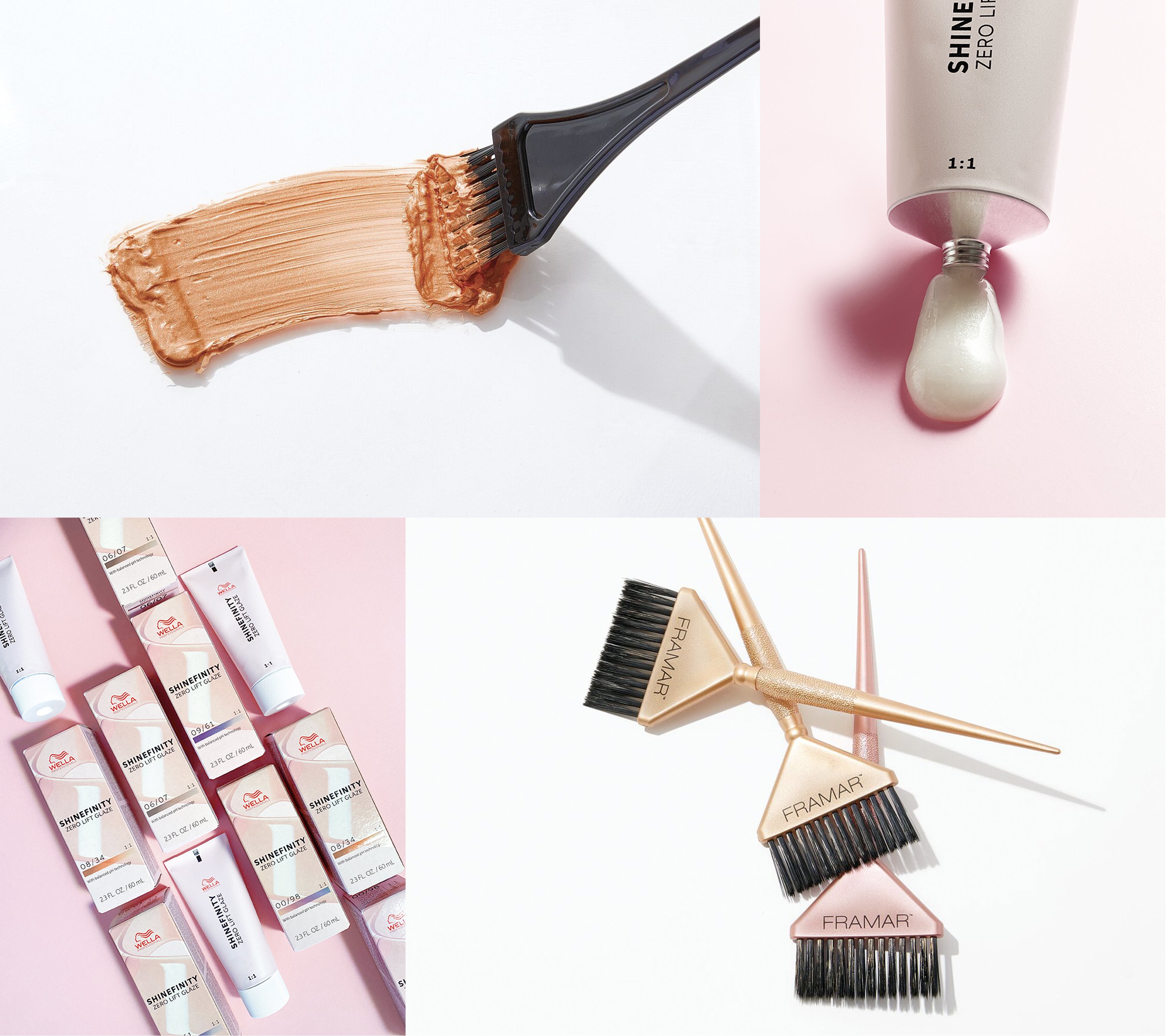
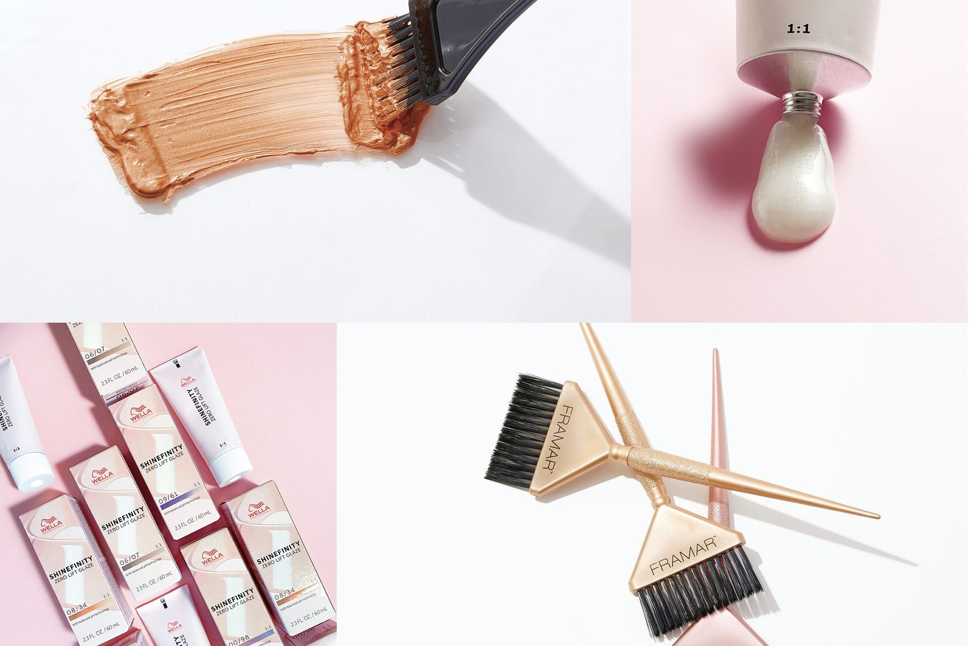
Cosmo Prof photography direction, four-quadrant composition: hair color stroke, color tube detail, product lineup, and Framar applicator brushes

Cosmo Prof.

Digital experience for a B2B salon retailer. Elevated photography, simplified navigation, and shoppable components built for working stylists.

Field Creative Direction Digital Design Photography Direction

Author Jeremy Prasatik Published: 2021 Status: Live

Classification Creative Direction Digital Design Photography Direction

Abstract

Cosmo Prof needed a digital refresh that matched the professionals using it. The existing site was functional but dated, and the work was to bring modern visual direction and clearer product discovery without slowing down commerce.

Started with photography - high-contrast lighting, defined shadows, cleaner compositions, product imagery that looks intentional rather than photographed for inventory. Typography shifted to Jost, and the palette paired soft neutrals with sharp black to ground the tone.

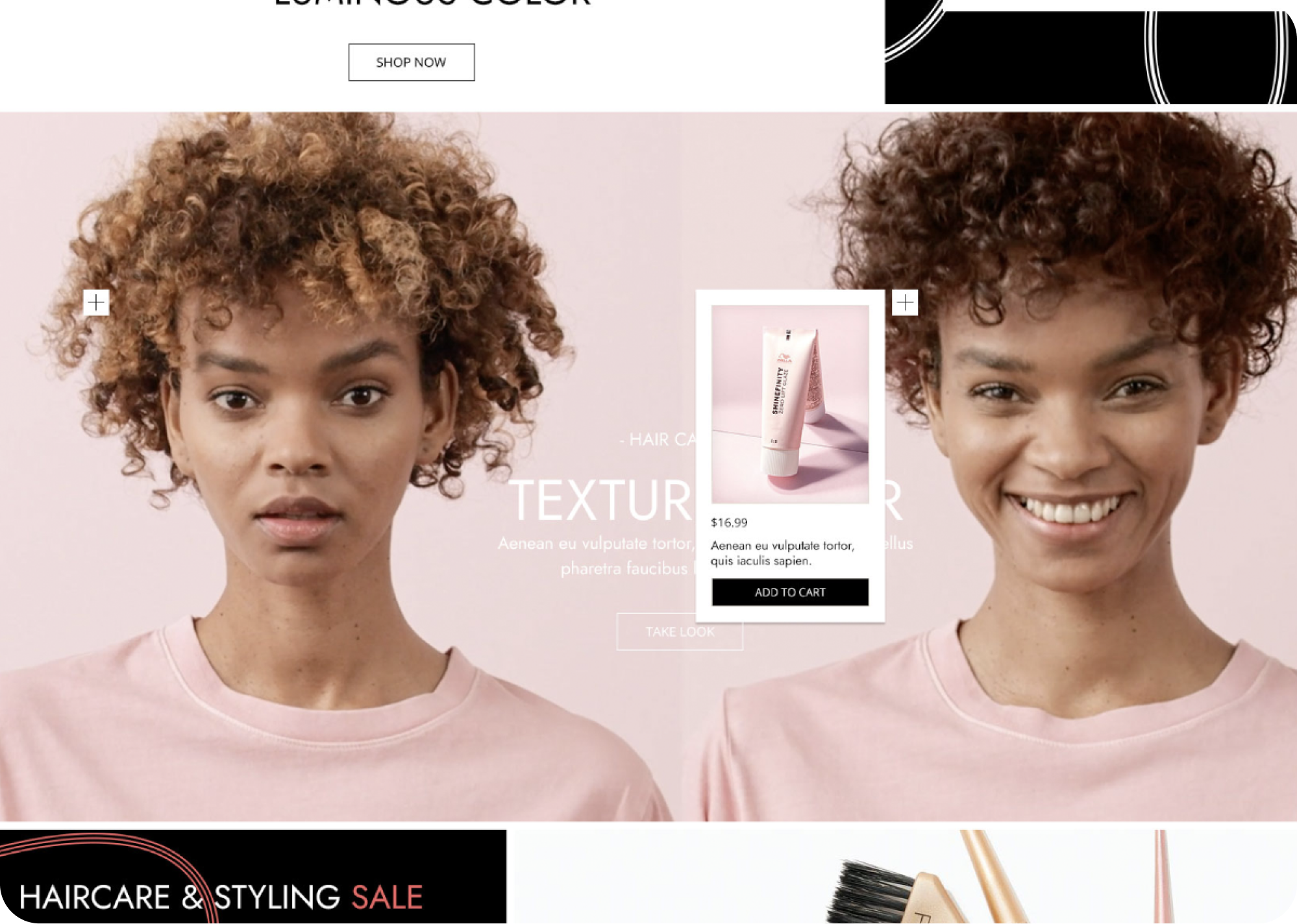
The redesigned homepage introduced tabbed recommendations personalized per stylist, shoppable video that let users explore looks and purchase during playback, and a stripped-back global header that gave screen space to content. Templates unified product photography, type, and layout across the site so promotions, brand campaigns, and education modules could all sit on the same chassis.

SECTION 02: PHOTOGRAPHY DIRECTION

Photography That Stops Looking Like Inventory.

High-contrast lighting, defined shadows, compositions that read at thumbnail and hold up at full bleed. Product imagery that looks intentional, not photographed for inventory.

Photography came first because nothing else mattered if the imagery still felt like a 2010 catalog. Each frame defined what a good Cosmo Prof picture looked like, then the templates that followed pulled from that library.

Maria Nila Colour Masque product photography on cream-and-blush ground with splattered pearl droplets framing the jarShine Zero Lift twin tube macro on pink ground with cream pearl droplets at the seal

Imagery built for the people who use the tools

SECTION 03: HOMEPAGE

A Header That Gets Out of Its Own Way.

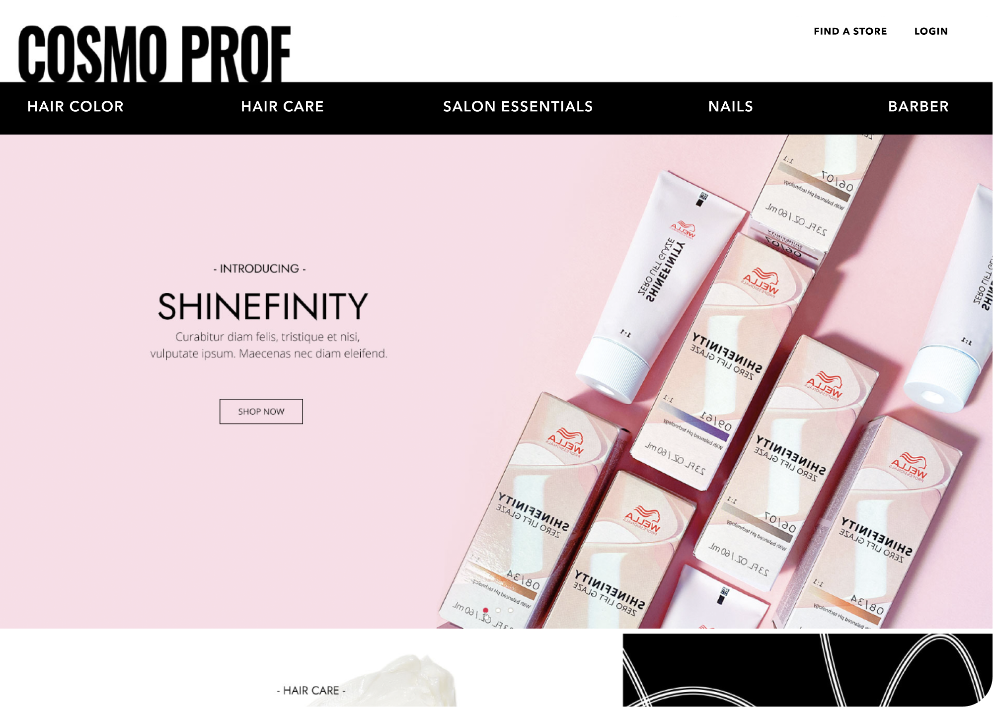
Global navigation reduced to category names. Hero gives the seasonal launch room to land. Below the fold, tabs sort recommendations to whoever is logged in.

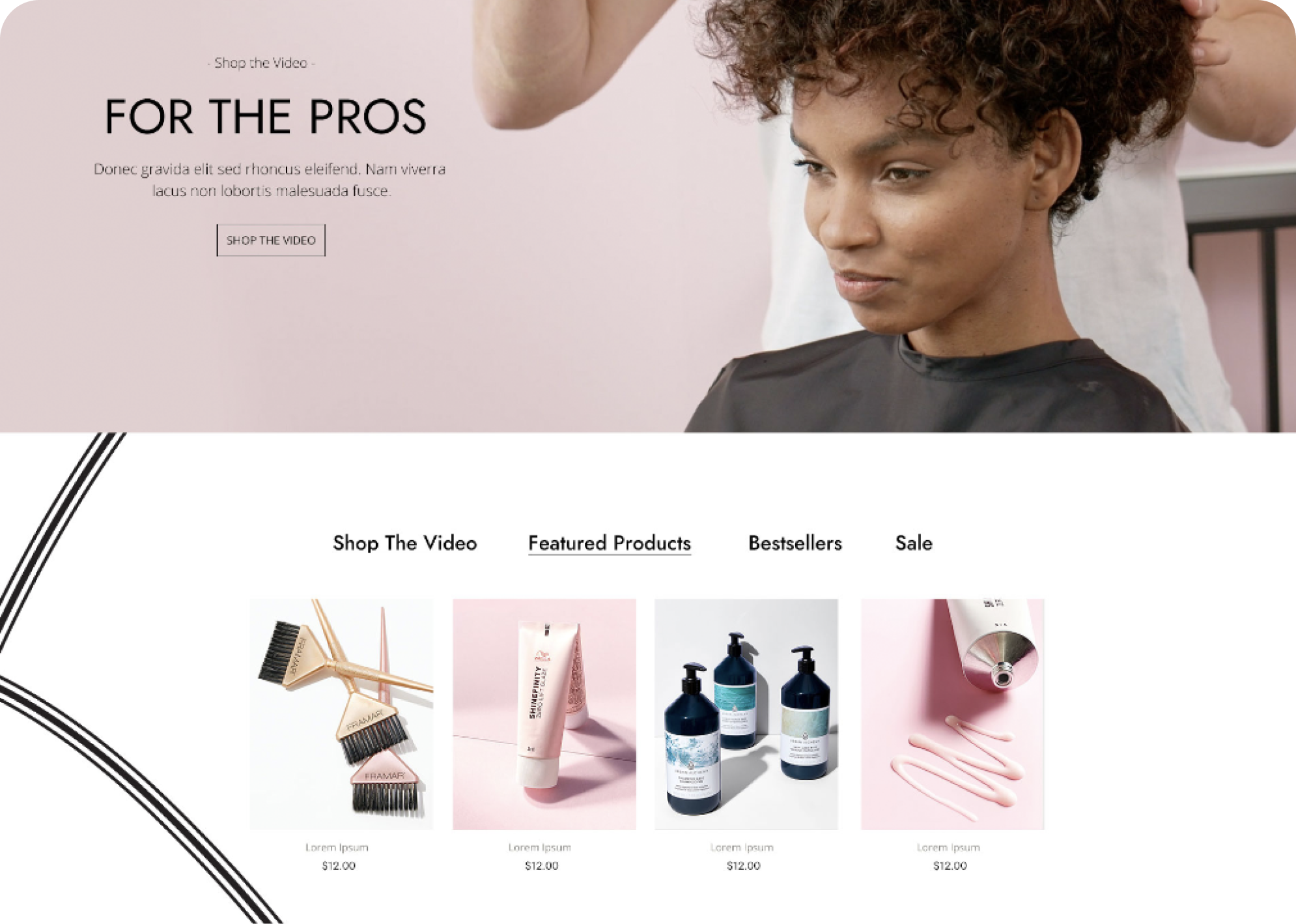
Personalization runs as a tabbed shelf, not a take-over. A stylist sees what they buy first, then the catalog underneath. The homepage doesn't pretend to know more than it does.

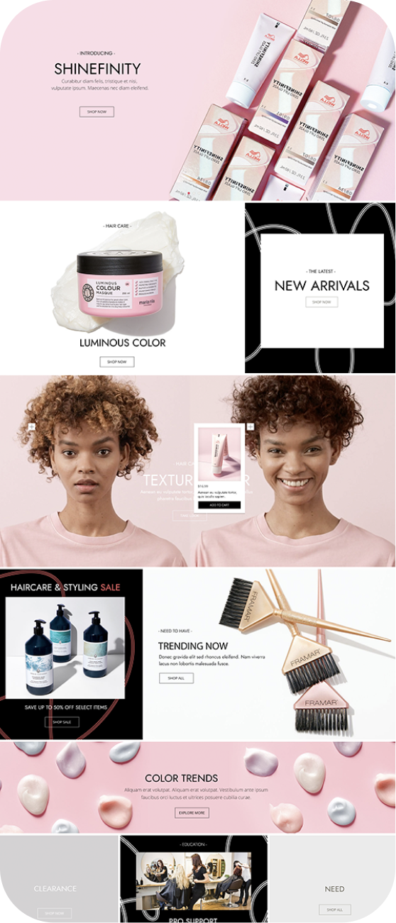
Cosmo Prof homepage with stripped global header, Shinefinity launch hero, and product mockup at right
For The Pros shoppable video module with tabbed product recommendations: Shop The Video, Featured Products, Bestsellers, Sale
Cosmo Prof homepage variant showing further down the page with category cards and editorial features
SECTION 04: MOBILE

The Same System, Resized for Pocket.

Mobile starts with the same content priorities. Tabs become swipes, the hero crops vertical without losing the product, and the catalog fits one column without feeling cramped.

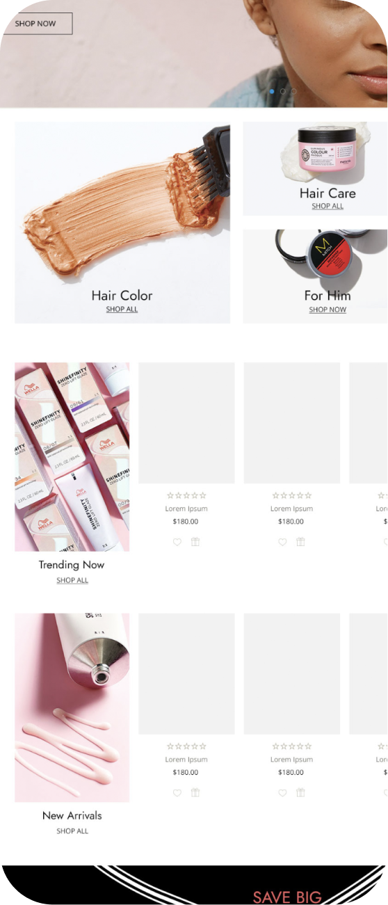
Cosmo Prof mobile homepage, primary view with cropped hero and stacked content
Cosmo Prof mobile homepage, scrolled view showing personalized recommendations and category navigation
SECTION 05: MARKS & MATERIALS

A Palette Tuned to Let the Photography Lead.

A palette that lets the photography lead. A type system that scales from header lockup to catalog caption without changing voice.

Chromatic brand circle

Cream

#F8F6F2

Paper, cards

Blush

#F4D9DC

Hero accent

Stone

#DBC5C8

Soft mid-tone

Sand

#E5D6C9

Warm neutral

Black

#000000

Type, structure

Brand philosophy

Cosmo Prof sells to working professionals, so the brand had to feel premium without getting precious about it. Soft neutrals carry the warmth, sharp black does the structural lifting.

Jost runs the whole system - block weights for the wordmark and category nav, regular for catalog copy, light for captions and pricing meta. The single family keeps the site from fragmenting into a dozen voices the way most B2B sites do.

Jost ExtraBold Wordmark & nav

Heavy geometric grotesque for the COSMO PROF lockup and primary category navigation. Block weight that reads at thumbnail.

Jost Medium Section headlines

Mid-weight Jost for module headlines like Introducing, For The Pros, Hair Care. Carries scale without leaning hard.

Jost Regular Body & catalog

Standard weight for catalog copy, product names, descriptions. The default voice everywhere outside of the navigation.

Jost Light Captions & meta

Light weight for captions, pricing meta, secondary information. Stays quiet so the photography stays loud.

Cosmo Prof

Wordmark & nav

Cream · #F8F6F2

Jost Medium

Section headlines

Blush · #F4D9DC

Jost Regular

Body & catalog

Stone · #DBC5C8

Jost Light

Captions & meta

Sand · #E5D6C9

Cosmo Prof homepage as a mark moment, showing the wordmark in context above the global header strip
SECTION 06: CLOSING

B2B That Reads Like Brand Work.

Photography, type, layout, components. Built as one system so promotions, brand campaigns, and education modules all sit on the same chassis.

Services

Creative Direction

Digital Design

Photography Direction

Stack

Figma

Sketch

Photoshop

Links

A B2B retailer needed a digital experience that matched the professionals using it. Photography led the refresh, and templates carried the system across promotions, brand campaigns, and education without breaking - same chassis, every page.

Designing across space and material.

SECTION: PRACTICE

Putting the work first.

It's the part I love most.

Studio Reckon House Multi-disciplinary

Founded 2002 Location: Texas / Anywhere Status: Open for projects

Classification Digital Branding Interiors

Contact hello@reckon.house 214.697.4578 IG @reckonhousestaples

Abstract

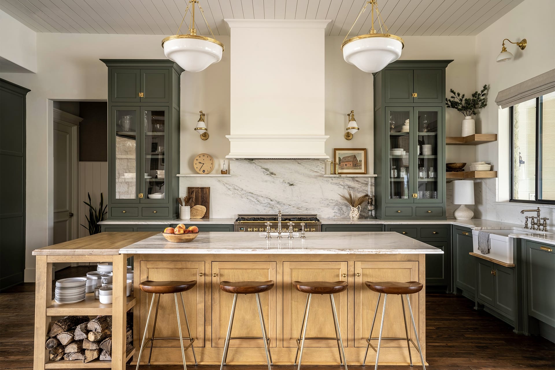
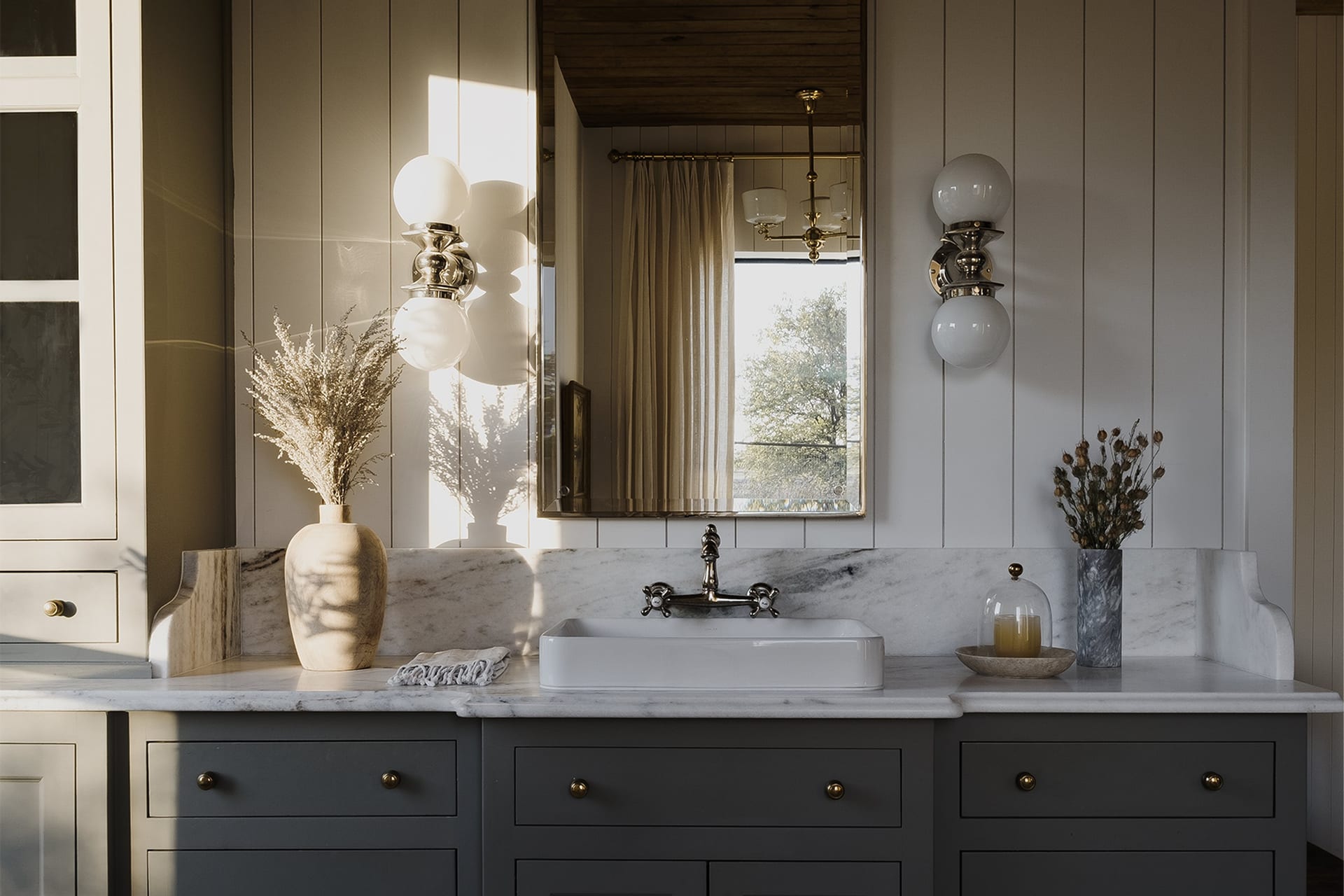
The work means a lot of things at once - writing the code that ships an app, picking the marble that goes in a kitchen, art directing a campaign shoot, building a brand voice from scratch, designing the AI tooling that runs marketing operations at enterprise scale. These aren't separate jobs, they're the same job showing up in different rooms.
What makes it work is the no-handoff part. Wireframing and coding happen in the same week. Picking kitchen finishes and coordinating the install happen on the same site visit. The thinking and the making stay close to each other, which is why the disciplines stay connected instead of competing for attention.

DIGITAL EXPERIENCES & SOFTWAREBRANDING & CREATIVE DIRECTIONINTERIORS & FABRICATIONReact / Next.jsTailwindOpenAI APIComputer VisionLLMsFramerWebflowReplit / V0SplineArt DirectionVoice & ToneTypographyColor SystemsAfter EffectsMidjourneyCustom LoRASocial GridsEmail ArchSpace PlanningFF&EMillwork DesignMaterial SelectionOn-site DirectionPop-up / RetailFabricationFull-Stack EngAI IntegrationSystems DesignProduct StrategyRapid PrototypingNo-Code ArchBrand StrategyCreative DirectionVisual Identity3D & MotionGen. ImageryContent SystemsInt. ArchitectureFF&E SourcingCustom FabricationInstallation MgmtExperientialDIGITALBRANDINGINTERIORSRHSRING INDEXDisciplineSkill / PracticeTool / MethodDISCIPLINESDigitalBrandingInteriors

© 2026 Reckon House. Made by Jeremy Prasatik.