Capitan Boot Co.
Western branding built to stamp, stitch, and emboss. Logo marks, typography, badges, and apparel graphics for a boot company rooted in heritage craft.TL;DR Built→ Logo system, badges, typographic lockups, apparel graphics, West Texas campaignScope→ Brand identity, logo system, apparel graphics, photographyTools→ Illustrator, Photoshop, InDesign, camera. Northwest and Oldman type pairingAngle→ Marks built to survive the material. Stamp, stitch, emboss, and still read at every scale.
Field Brand Identity Logo System Apparel Graphics Photography
Author Jeremy Prasatik Published: 2018 Status: Live
Classification Brand Identity Logo System Apparel Graphics Photography
Abstract
Capitan needed an identity that could work as hard as the product. Boots get scuffed, stamps blur, embossing flattens - the marks had to survive all of that and still read at every scale.
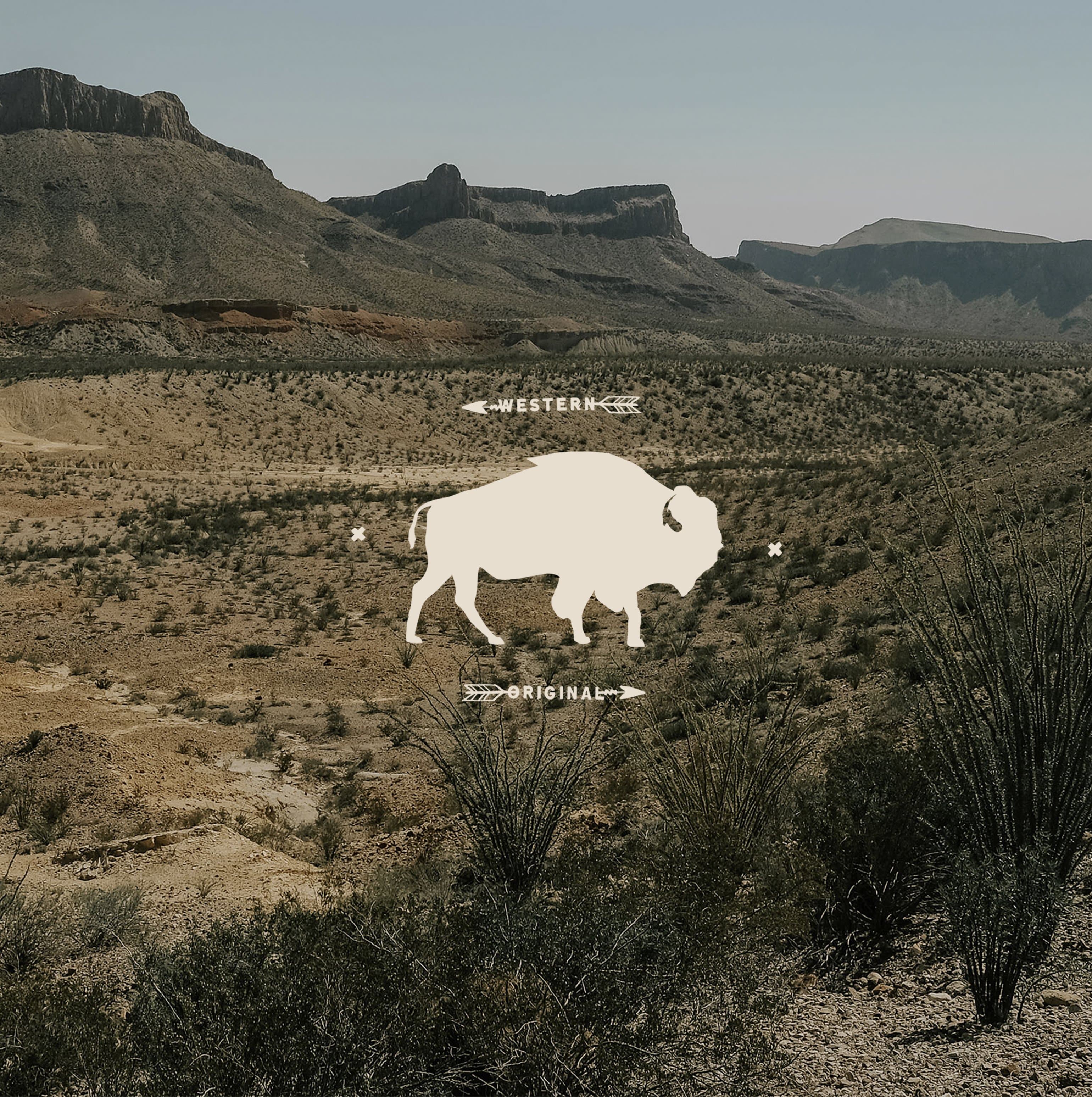
Built the system as interlocking elements - primary logo, secondary badges, typographic lockups, illustrative assets. Northwest Regular and Oldman Regular as the type pairing. The bull skull lockup constructs on a geometric grid. Each piece holds at stamp, stitch, embroidery, or print.
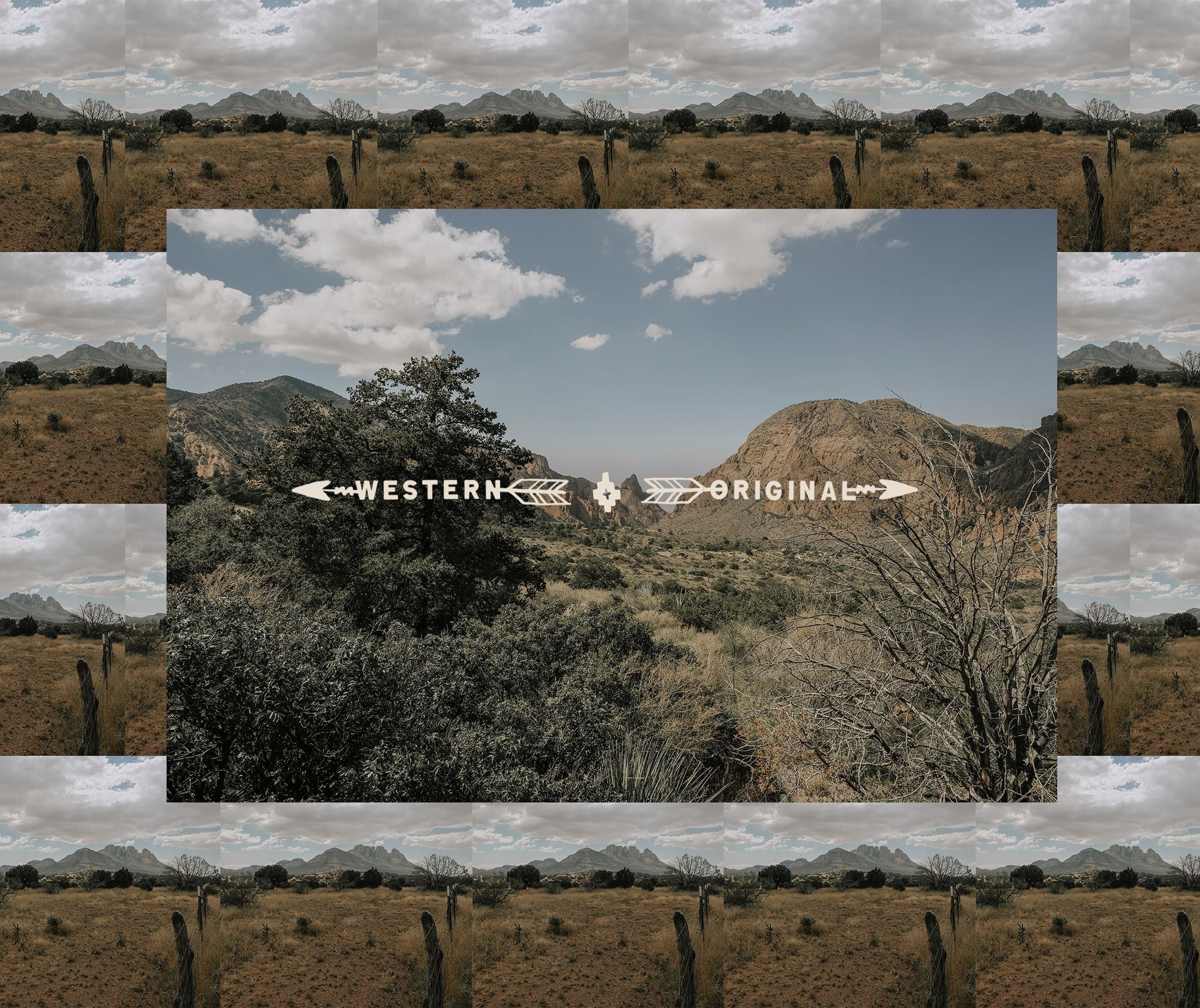
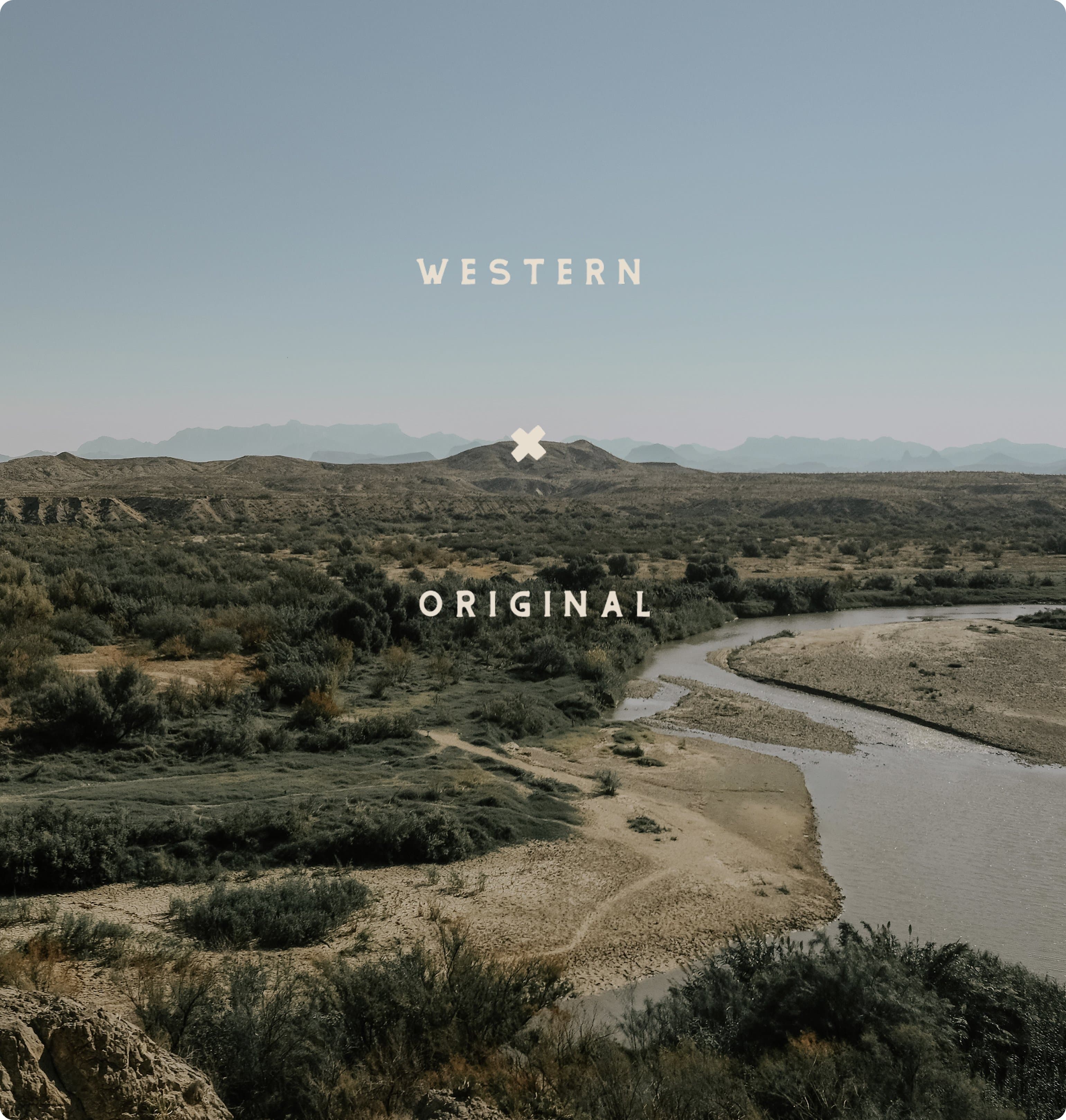
Shot the campaign in West Texas. Big Bend, mesa country, river bottom. No props, no stand-ins, no styling beyond what the place already had. The photography had to come from inside the landscape the boots are made for, not from a moodboard built around it.
Marks Built to Hold.
Leather takes pressure. Denim takes thread. The marks had to survive both and still read at thumbnail.The system includes primary logo, secondary badges, typographic lockups, illustrative assets. Range comes before decoration. Each piece holds at small scale and at full bleed alike.
Quiet. Weathered. Real.
Brand imagery shot on location. Big Bend, mesa country, river bottom. The marks needed photography that didn't fight them.No props. No stand-ins. The location was the styling. Same hands on the marks, same hands on the camera.
Heritage without
feeling dated
Identity Built for the Material.
Marks made for stamp, stitch, embroidery, print. Every color, every face, every lockup tested against the process before it earned a place in the system.Chromatic brand circle
Cream
#EFEAD9
Paper, hangtags
Tan
#C4B594
Photography, leather
Olive
#5A5945
Mid-tones, accents
Dark Olive
#2A2A1A
Structure, ground
Brand philosophy
The system holds primary logo, secondary badges, typographic lockups, and illustrative assets, each one keeping shape under load. Range comes before decoration.
Northwest handles scale, Oldman brings character, and the bull skull lockup constructs on a geometric grid. The buffalo lives as a stamp first and an illustration second. Every choice traces back to where the boot ends up.
Northwest Regular Display & signage
Bold geometric sans-serif. Carries scale on stamps, banners, and product labels. Holds at any size, survives any process.
Oldman Regular Wordmark & headlines
Hand-cut serif with rough edges. Carries character on packaging and apparel. Used for the primary wordmark and editorial moments.
Northwest Round Soft display
Rounded variant of Northwest. Used where the sharp edges of the regular would feel too aggressive on softer surfaces.
Times New Roman Body & legal
Default serif for fine print, certifications, and copy that runs long. The least precious font in the system.
Northwest
Display & signage
Cream · #EFEAD9
Oldman Regular
Wordmark & headlines
Tan · #C4B594
Northwest Round
Soft display
Olive · #5A5945
Times New Roman
Body & legal
Dark Olive · #2A2A1A
Built for Where the Boots Go.
Identity, marks, typography, photography. Same hands from brief through last frame.Services
Brand Identity
Logo System
Apparel Graphics
Photography
Stack
Illustrator
Photoshop
InDesign
Camera
Links
Capitan asked for branding that could survive where the boots end up. The system holds at every surface, and the photography came from the same place the boots are made for.