Ivy Park by Beyoncé
Nordstrom held the exclusive US launch. An NDA before the brief landed, six weeks from moodboard to live, and most of the product gone within days.
Field Creative Direction Campaign Design Experience Design
Author Jeremy Prasatik Published: 2016 Status: Complete
Classification Creative Direction Campaign Design Experience Design Copywriting
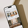
TL;DR Built→ Scrolling brand experience, launch emails, social, in-store signageScope→ Creative direction, experience design, copywritingStack→ Nordstrom CMS, custom components, HTML/CSS/JSAngle→ Nordstrom held the only US partnership, so the website was the entire launch. One polygon held the page, six weeks NDA to live.
Abstract
Beyoncé's first activewear line, with Nordstrom holding the exclusive US retail partnership. That meant the digital experience had to carry the full weight of the launch - no other retailer had product, no other site told the story, and the website became the storefront, lookbook, and campaign rolled into one URL.
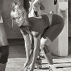
Four weeks to moodboards, wireframes, and a concept pitch, then two weeks to build and ship. The brief arrived under NDA before the team had cleared their schedules. Daily calls with Ivy Park while direction locked. Photography supplied: black-and-white athlete portraits and color product against blue and gray backgrounds, with everything else - typography, layout, copy, animation, interaction - left open. That kind of latitude on a project this visible doesn't happen often.
The polygon emerged during concepting as a way to break the rectangular grid the photography sat in. Angled, rotated, animated on scroll, it carried from hero banner through product carousels into email headers. Custom CMS components built for the project entered Nordstrom's shared library and powered other launches for two years. 95% of products sold out within days.
An NDA Before the Brief Landed.
A cleared calendar and an NDA before the brief landed, Beyoncé's name on the project, a timeline that left no margin. Four weeks to pitch, two to ship.
Nordstrom held the only US retail partnership, which made the website something it usually isn't - the entire launch surface. Brand story, product showcase, campaign rollout, all on one page that hadn't existed yet. The digital experience was the launch.
Week one: references, moodboards, competitive audit. Nobody in activewear had done what Ivy Park was attempting. The brand positioned itself between luxury fashion and athletic performance, and the digital experience needed to land in that gap without leaning too far toward either side.
Weeks two through four: wireframes, design concepts, copywriting, motion studies, everything presented to Beyoncé's creative team for approval. Daily calls, fast feedback, revisions turned around overnight.
Beyoncé's team supplied the photography - black-and-white athlete portraits, color product shots against blue and gray backgrounds, editorial in tone with range across body types and ethnicities.
Everything else was open. Typography, layout, copy, animation, interaction - that kind of latitude on a project this visible doesn't happen often. The type went larger than expected, motion lived in every scroll position, and photography got room to breathe.
One scrolling brand experience, a series of launch emails timed to the drop, digital marketing across Nordstrom's owned channels, social assets formatted for every platform, and in-store signage for physical locations carrying the line.
Six deliverable categories, all built on the same elements - the polygon, the typographic cadence, the progression from black-and-white into color.
The Timeline
Week one: references, moodboards, competitive audit. Nobody in activewear had done what Ivy Park was attempting. The brand positioned itself between luxury fashion and athletic performance, and the digital experience needed to land in that gap without leaning too far toward either side.
Weeks two through four: wireframes, design concepts, copywriting, motion studies, everything presented to Beyoncé's creative team for approval. Daily calls, fast feedback, revisions turned around overnight.
The Freedom
Beyoncé's team supplied the photography - black-and-white athlete portraits, color product shots against blue and gray backgrounds, editorial in tone with range across body types and ethnicities.
Everything else was open. Typography, layout, copy, animation, interaction - that kind of latitude on a project this visible doesn't happen often. The type went larger than expected, motion lived in every scroll position, and photography got room to breathe.
The Scope
One scrolling brand experience, a series of launch emails timed to the drop, digital marketing across Nordstrom's owned channels, social assets formatted for every platform, and in-store signage for physical locations carrying the line.
Six deliverable categories, all built on the same elements - the polygon, the typographic cadence, the progression from black-and-white into color.

The Polygon Held the Page Together.
A single scrolling page doing the work of a website, a lookbook, and a launch trailer at once. The polygon emerged during concepting as a way to break the rectangular grid the photography sat in. From there it spread.
Started as a crop mask for portraits. Angled edges against the rectangular photo grid gave athlete imagery a geometric tension that matched the brand's positioning between sport and fashion. The shape animated on scroll, rotated between sections, scaled from thumbnail to full-bleed. One geometric idea handling framing, motion, and signature.

A hexagonal frame. Angled, rotated, sometimes cropping a portrait tight to the jawline, sometimes opening wide enough to hold a full figure. The shape carried from the hero banner through product carousels and into email headers.
Animated on scroll. The polygon rotated slowly as the page moved, giving flat photography a sense of depth. A single CSS transform doing real design work.
"Confidence is Strength." Set large, overlapping imagery, running across the full viewport width with mixed weights and staggered baselines. The type wasn't captioning the photos - it competed with them for attention.
The brand voice came together during production. Short declarative statements, present tense, second person when it appeared at all. "Ivy Park is for everybody. And every body." Copy that worked at 12px in an email subject line and at 200px across a scrolling hero.
The experience required components that didn't exist in Nordstrom's CMS - parallax modules, animated polygon masks, full-bleed video sections with scroll-triggered playback, type lockups with responsive scaling.
Built them. After launch, they entered the shared library, and other brand launches and campaign pages used them for two years. The Ivy Park project paid for itself in reusable infrastructure.
The Polygon
A hexagonal frame. Angled, rotated, sometimes cropping a portrait tight to the jawline, sometimes opening wide enough to hold a full figure. The shape carried from the hero banner through product carousels and into email headers.
Animated on scroll. The polygon rotated slowly as the page moved, giving flat photography a sense of depth. A single CSS transform doing real design work.
Typography at Volume
"Confidence is Strength." Set large, overlapping imagery, running across the full viewport width with mixed weights and staggered baselines. The type wasn't captioning the photos - it competed with them for attention.
The brand voice came together during production. Short declarative statements, present tense, second person when it appeared at all. "Ivy Park is for everybody. And every body." Copy that worked at 12px in an email subject line and at 200px across a scrolling hero.
CMS Legacy
The experience required components that didn't exist in Nordstrom's CMS - parallax modules, animated polygon masks, full-bleed video sections with scroll-triggered playback, type lockups with responsive scaling.
Built them. After launch, they entered the shared library, and other brand launches and campaign pages used them for two years. The Ivy Park project paid for itself in reusable infrastructure.


Confidence is Strength. Courage is Power.

Built Without a Brand Guide
No palette. No type system. No rules at all. The photography and the name arrived, the rest got invented.
Six weeks to build the visual language while the page itself came together. The polygon, the type set at volume, the scroll that ran from grayscale into color. One system carrying a launch that lived on a single URL.
The System
No master file ever existed. The palette, the type, the shape, all of it got set during production and stayed consistent because the group building it was small and stayed the same.
What follows is the working kit. The letterform behind the logo, the colors as they ran, the type at full volume, and the one shape the identity leaned on.
Colour / as used
HEX #18A6CC
HEX #8E9499
HEX #0E0E0E
Type / at volume
The polygon / signature
One System, Every Format.
The scrolling page carried the brand, and the campaign pushed the same elements out across every channel Nordstrom owned - launch emails, digital ads, social assets, in-store screens.
Once the page locked, the rest was format adaptation. Polygon, type, photography already established - email templates, banner ads, and social formats became execution rather than invention. The visuals scaled because the elements were simple: a polygon crops the same at 300px and 3000px, bold type reads at any size, black-and-white photography converts to any aspect ratio.


Sold Out in Days
Six weeks from NDA to live. 95% of product gone within days.
Services
Creative Direction
Campaign Design
Experience Design
Copywriting
Stack
Nordstrom CMS
Custom Components
HTML/CSS/JS
Links
Beyoncé's team brought the photography and the brand name. The creative direction, typography, layout, motion, copy, and rollout happened in a Nordstrom office with a small team and a hard deadline. The brief was open enough to allow real decisions and tight enough on time to require them.
The polygon, the type at scale, the progression from black-and-white into color - none of it came from a brand guide. There wasn't one.
After launch, Beyoncé sent the team a personal thank-you video. That part stays off social.