Nordstrom Personalization System
Mass scale, individual feel. A content engine built on three shapes that adapt to user, season, and story.
Field Design Systems Art Direction Product Photography Direction
Author Jeremy Prasatik Published: 2015 Status: Complete
Classification Design Systems Art Direction Product Photography Direction
TL;DR Built→ Content engine on three tile shapes. Square, hero, vertical, resizing across every breakpoint.Scope→ Design systems, art direction, product photography direction.Tools→ Nordstrom CMS, editorial templates, asset library. One asset, multiple applications.Angle→ Personalization that stayed quiet underneath. Strict rules, loose output, mass scale that still looked hand-built.
Abstract
Nordstrom needed dynamic content for millions of customers without feeling algorithmic. The question: how does personalization keep personality?
Built a flexible system around three tile shapes - square, hero, vertical - each designed to resize, remix, and reflow across mobile and desktop while holding visual consistency. Strict enough to scale, loose enough to surprise.
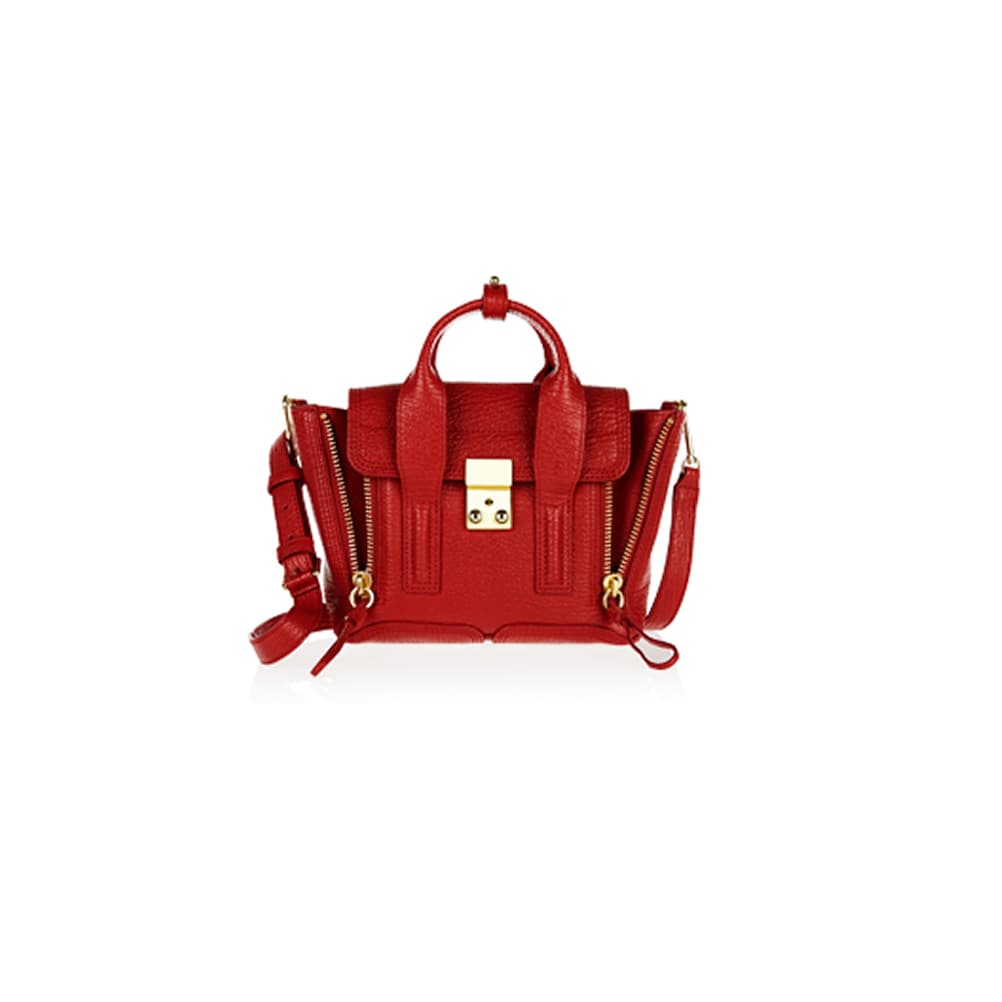
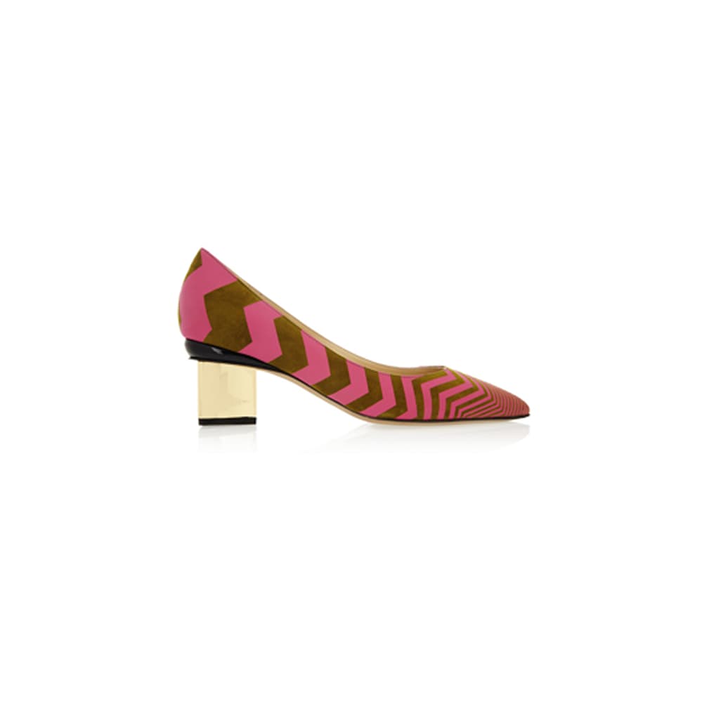
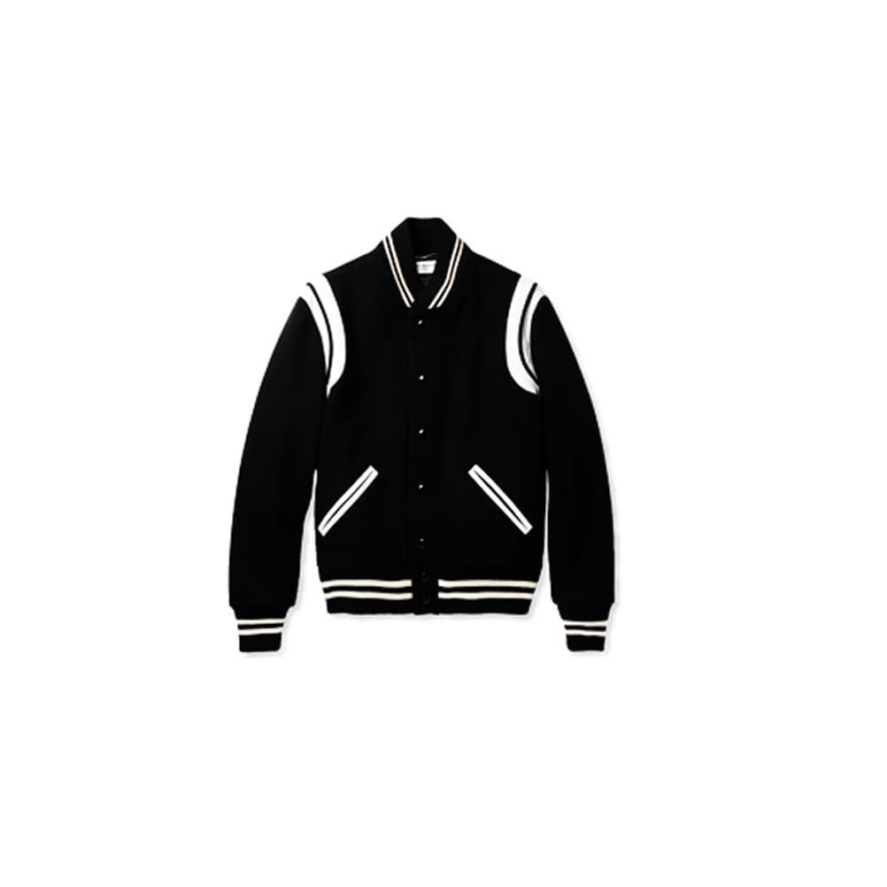
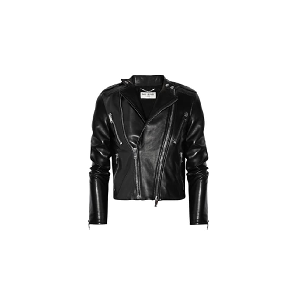
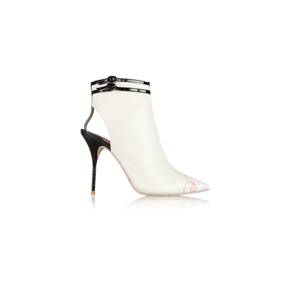
Product photography followed the same logic. Deliberate contrast, precise angles, no styling props, with each image holding its own as editorial or stacking into a grid as ecomm depending on context. One asset, multiple applications.
The system powered homepage layouts, campaign modules, and product tiles - relevant content at scale that still felt considered.
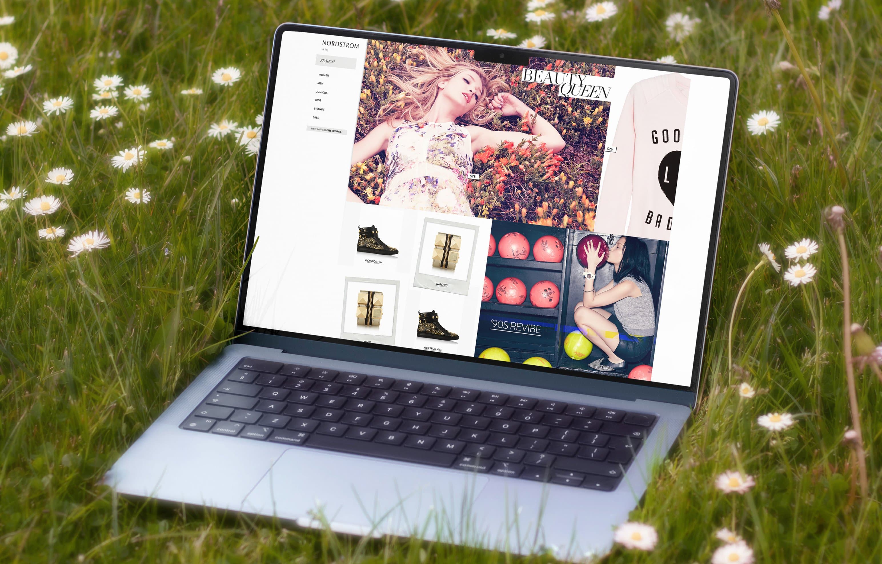
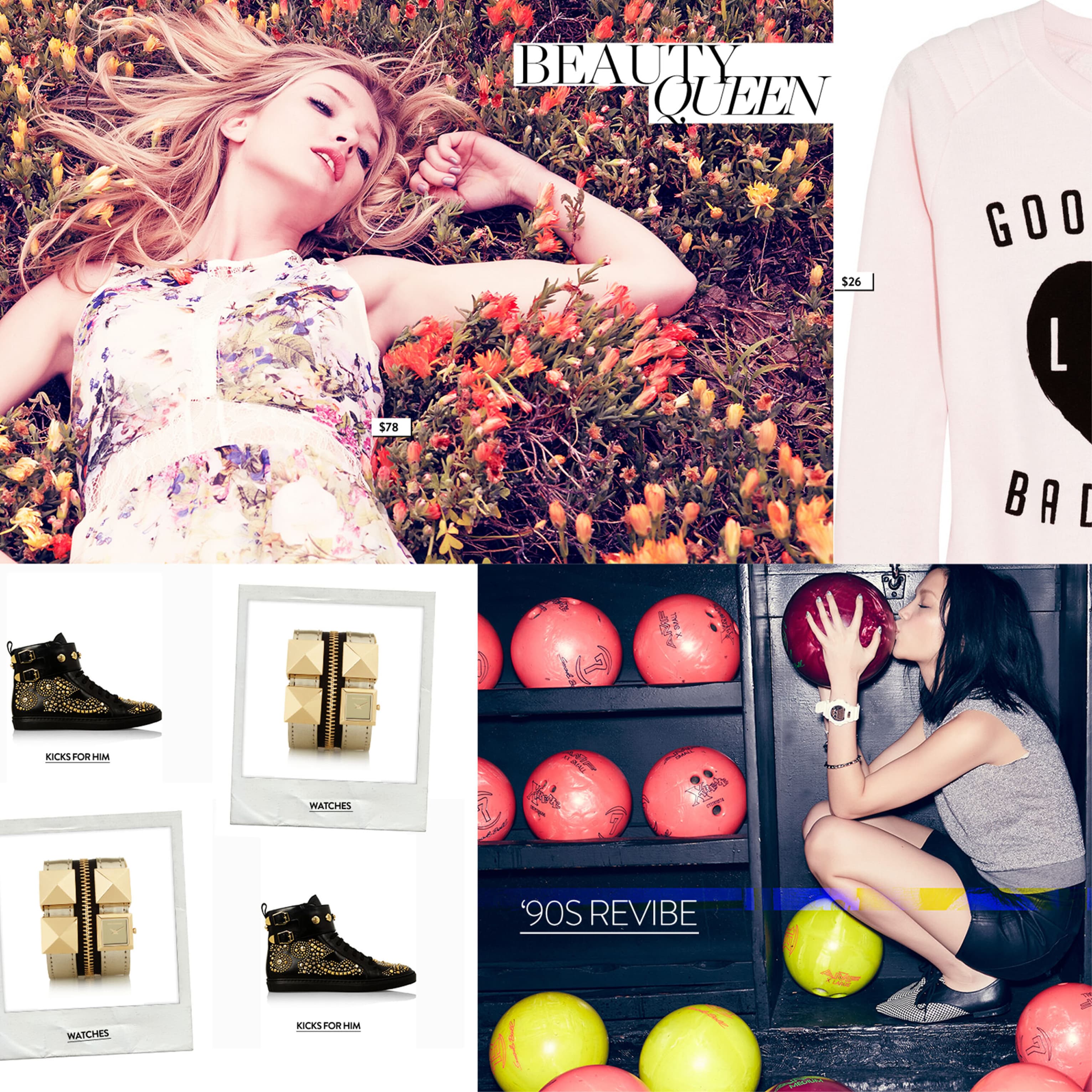
Three Shapes Driving Every Composition.
Square, hero, vertical. Three tile shapes that resize, remix, and reflow across every breakpoint. The constraints created the freedom.
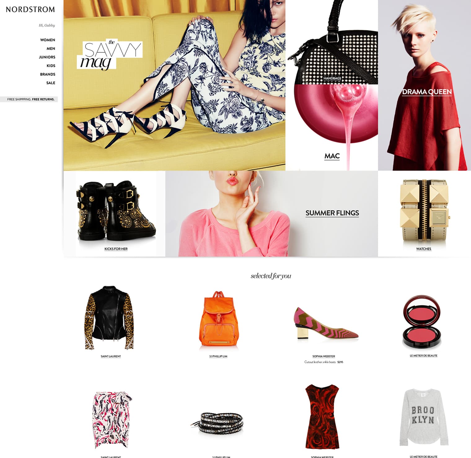
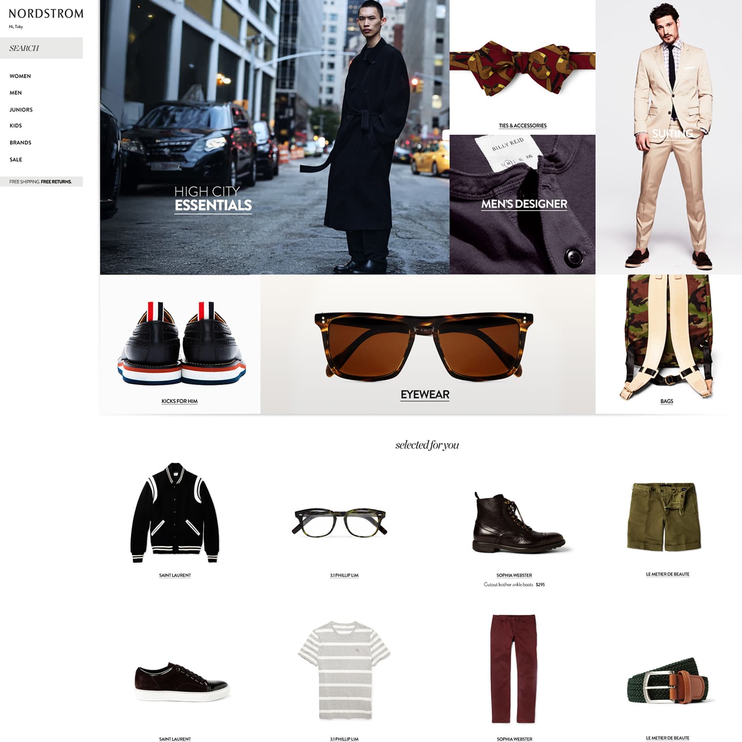
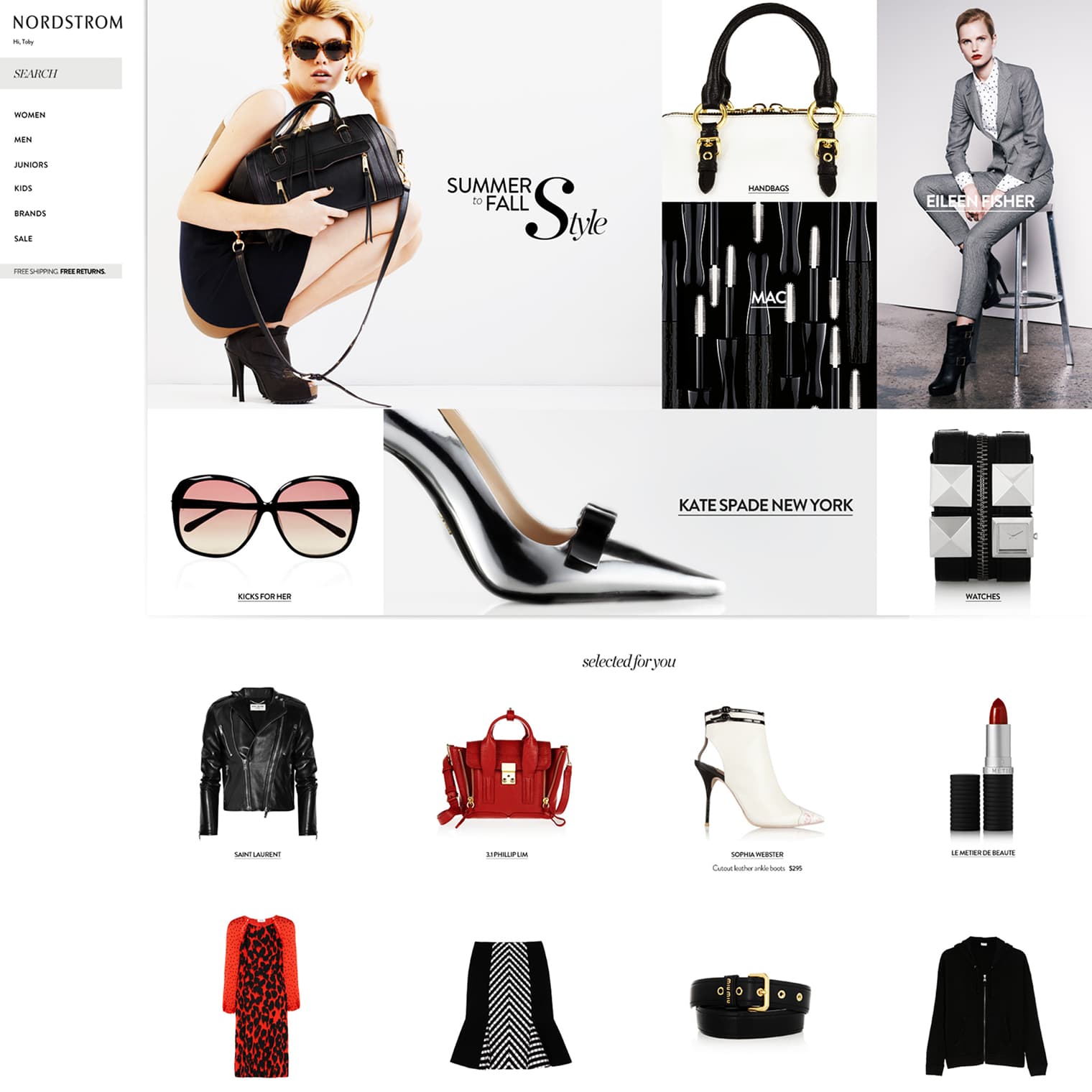
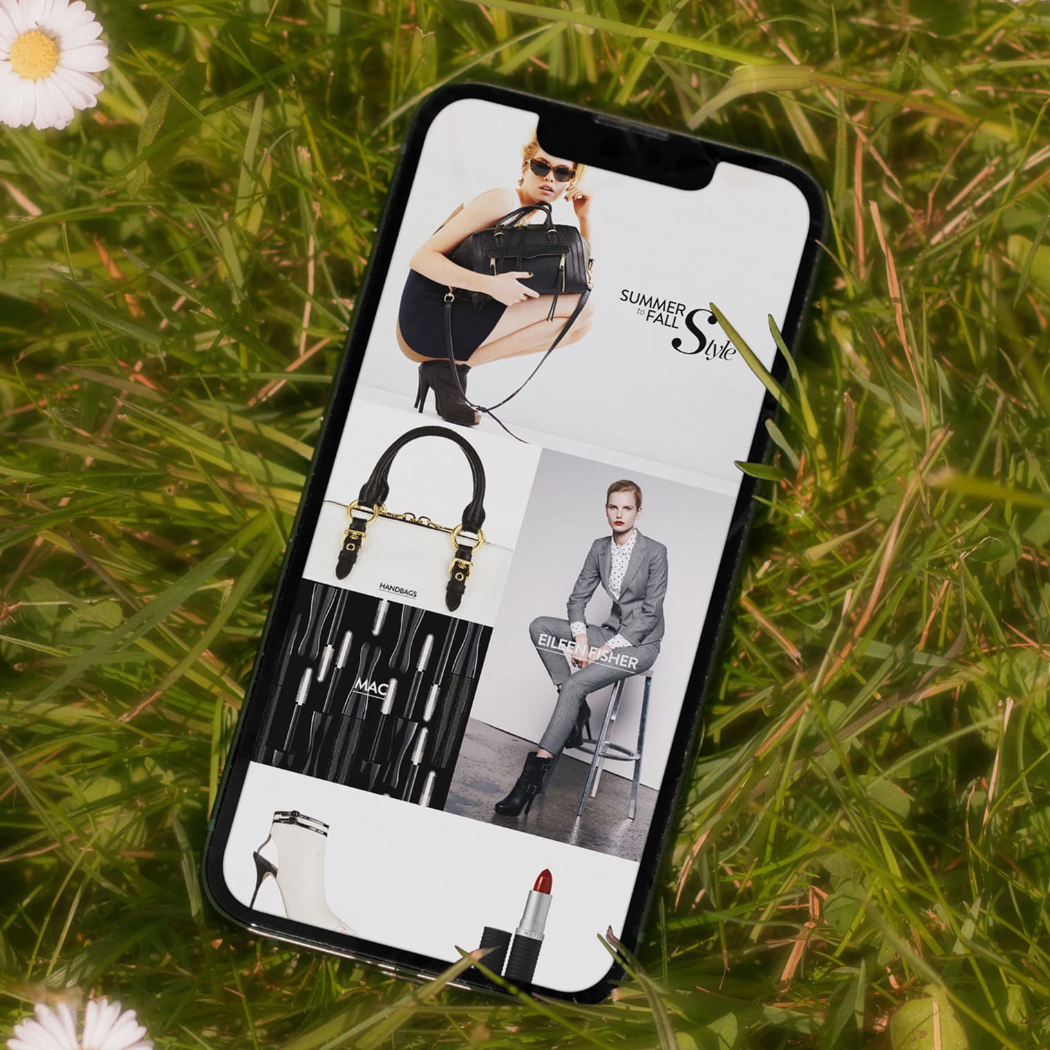
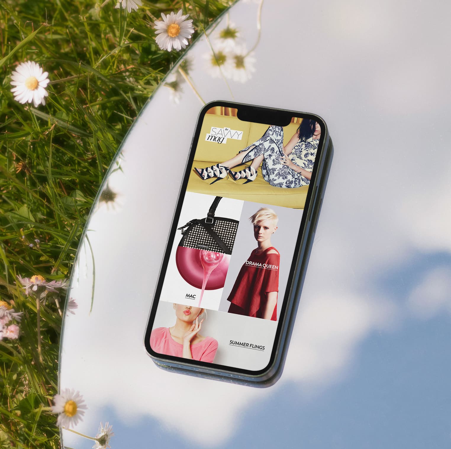
Editorial stories, brand modules, and merchandised picks all rendered through the same three shapes. Square tiles carried product, hero tiles carried photography, and vertical tiles bridged the two. Any combination produced a layout that looked designed, not assembled.
One Engine Driving Three Different Audiences.
Three audiences, three homepages, one engine. The young customer landed on Savvy Mag, the designer-brand shopper got Summer to Fall styling, and the men's shopper opened on city essentials. Same shapes, different stories - each composition felt edited rather than generated.
Personalization that stayed quiet underneath
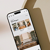
The Same Composition Logic on a Phone.
The three shapes restacked on phones without losing the editorial voice - same hero photography, same product cards, smaller canvas, same composition logic.
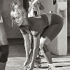
Photography Built to Double as Editorial.
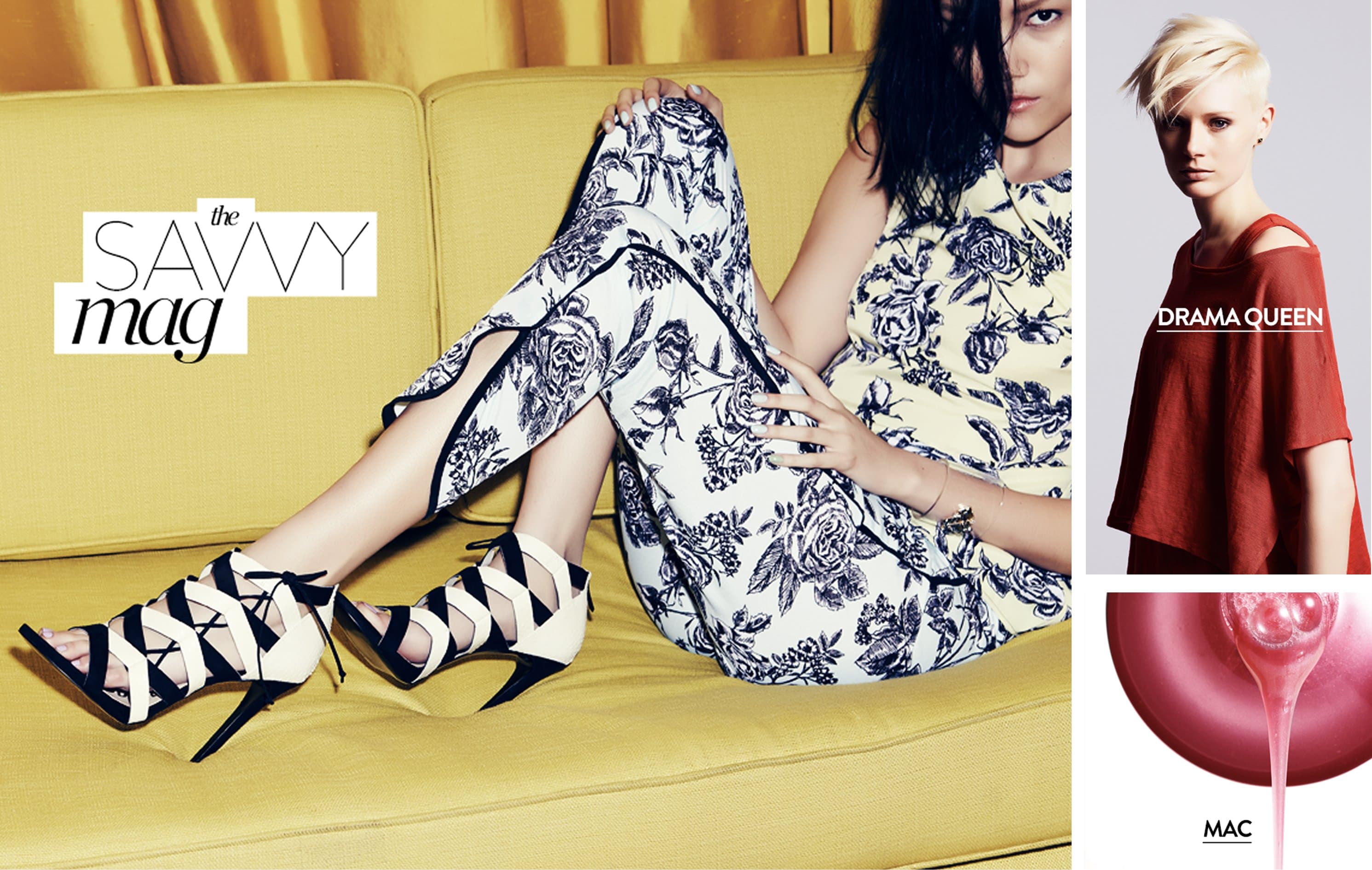
Deliberate contrast, precise angles, no styling props. Each shot held its own as a hero or stacked into a grid as ecomm. The art direction was the system.
White seamless, consistent eye level, the same shadow falloff on every product. Restraint that let the merchandise read first - when the same shoe appeared in a Saturday editorial story and a Sunday inventory clear-out, both placements looked planned.

Mass Scale That Still Looked Hand-Built.
Three shapes and one asset library. The system stayed quiet so the content could feel hand-built, even when it wasn't.
Services
Design Systems
Art Direction
Product Photography Direction
Stack
Nordstrom CMS
Editorial Templates
Asset Library
Links
Personalization usually shows its work - algorithmic carousels, generic recommendation rails, blocks that feel templated even when they're tailored. This system did the opposite, with the constraints living underneath and the output looking like editorial.
The rules were simple enough that any merchandiser could compose a layout in an afternoon, and strict enough that no layout looked like the others. The same engine ran the homepage, campaign sends, and the long tail of category pages.