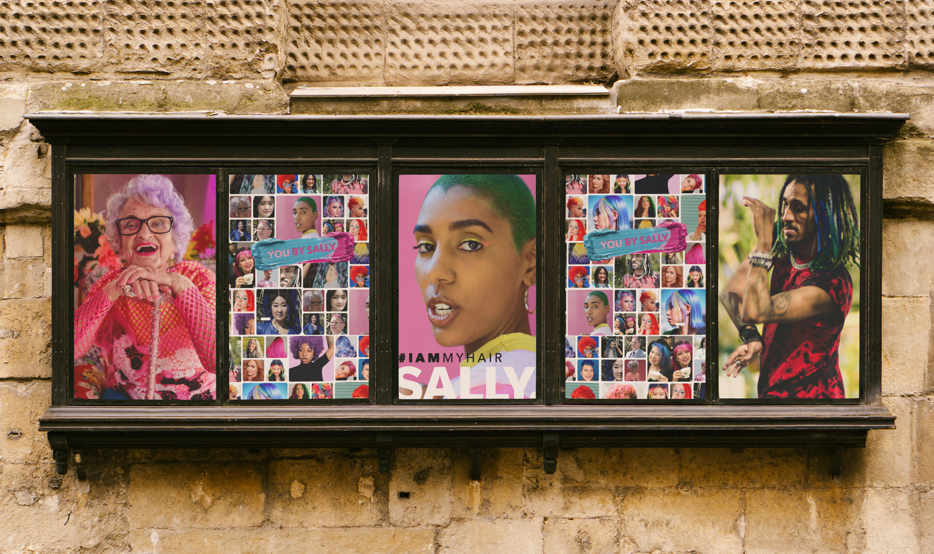
You By Sally hair color campaign hero

You By Sally

A hair color brand campaign for Sally Beauty. Real cast, oversized swatches, and a system built to scale from influencer bio pages to retail signage without losing recognition.

Field Campaign Direction Brand System Digital Design Retail Signage

Author Jeremy Prasatik Published: 2021 Status: Live

Classification Campaign Direction Brand System Digital Design Retail Signage

Abstract

Hair color usually lives under fluorescent lights next to the toothpaste. The brief was to make it feel like something you choose, not something you grab.

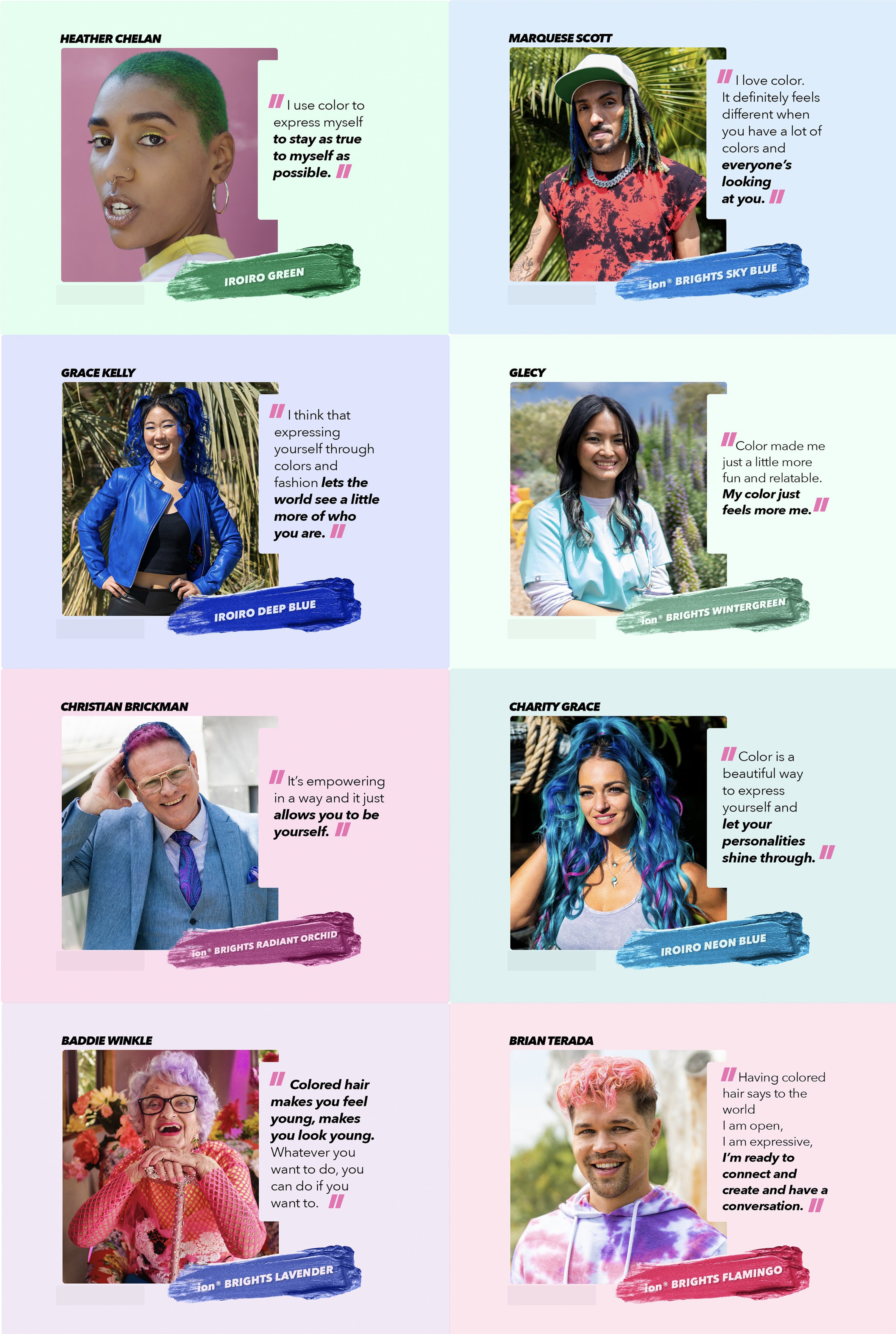
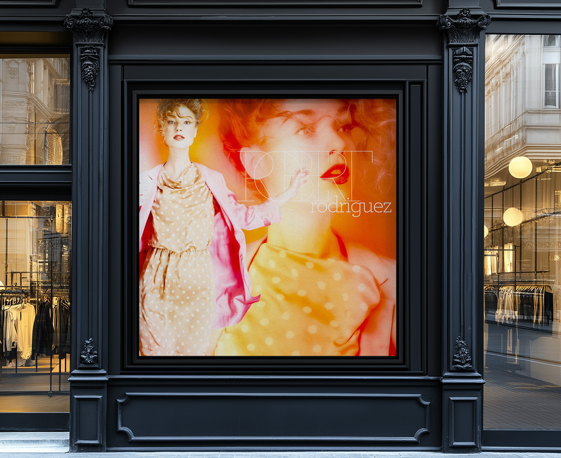
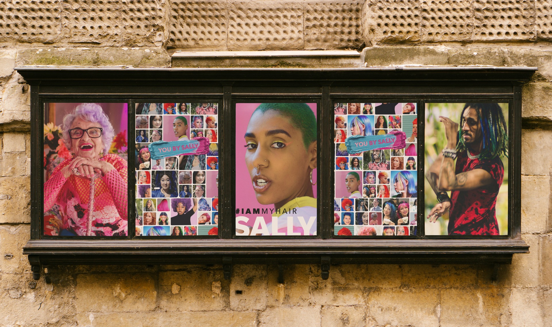
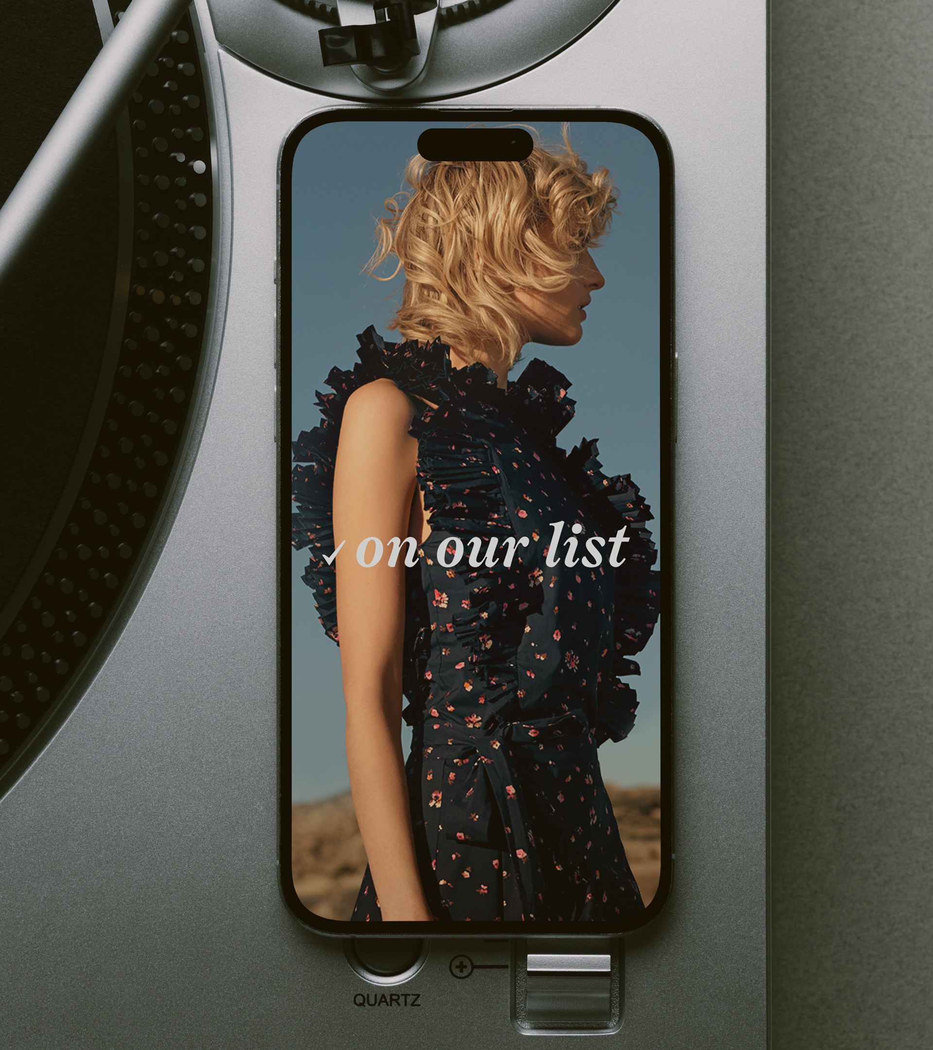
Started with casting - real people across age, gender, and style, each paired with a signature shade. The portraits drove the campaign - saturated backgrounds, confident styling, personality leading and product following.

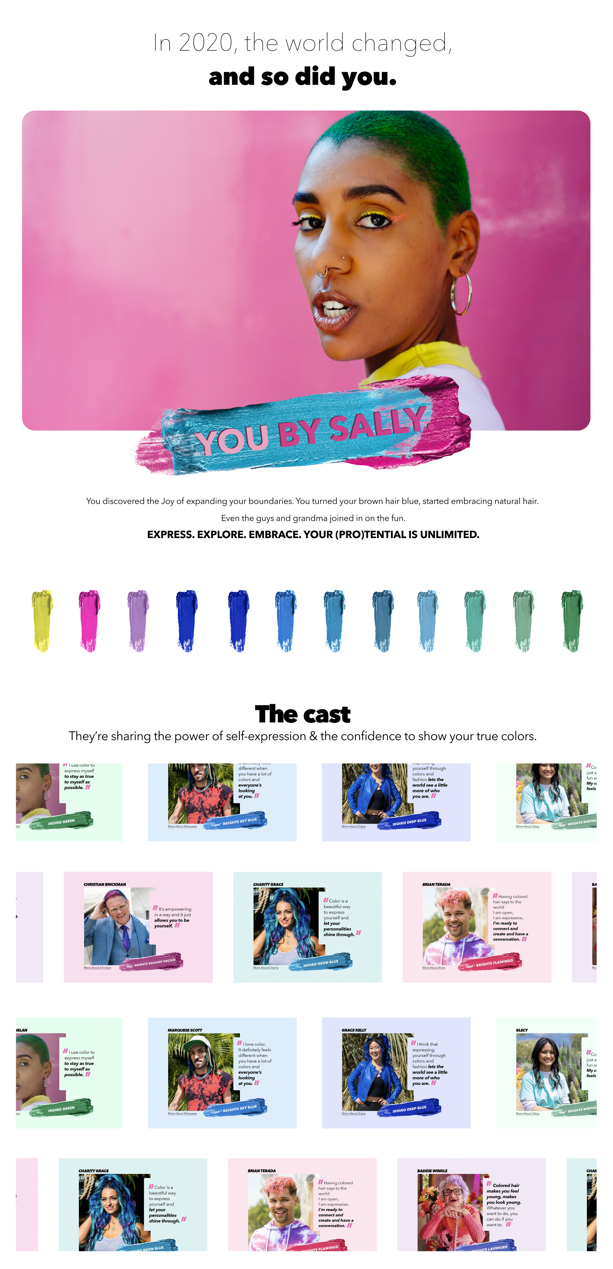
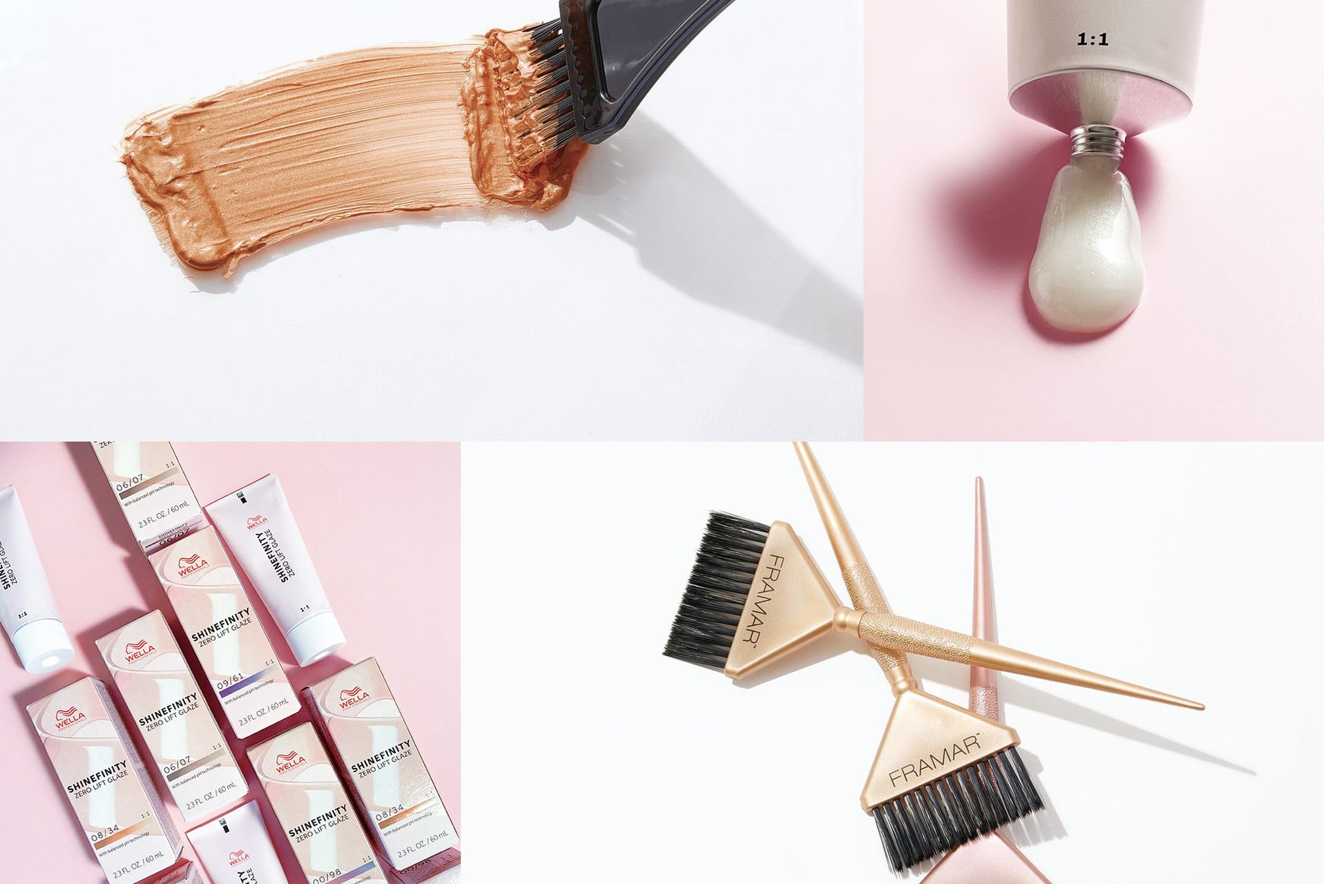
The swatch system turned shade exploration into a visual decision rather than a technical one. Oversized color blocks replaced tiny chips, and clean grids made browsing intuitive across mobile, desktop, and in-store signage. Avenir Next across weights anchored the type, pink and cyan held the primary chromatic register, and the system scaled from influencer bio pages to email to retail without losing recognition.

SECTION 02: THE CAST

Real People, Signature Shades.

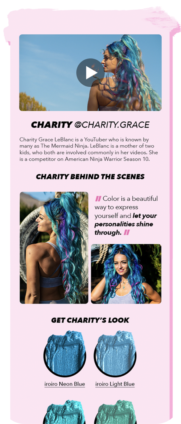
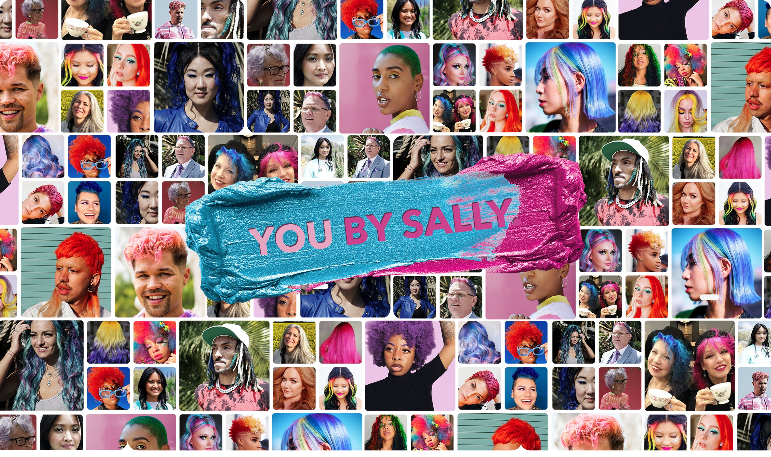
Casting drove the campaign. Real people across age, gender, and style, each paired with the shade that suited them.

Saturated backgrounds and confident styling let the portraits carry the brand. Product photography sat second to personality, which inverted the usual hair-color shoot order.

You By Sally cast portraits — real people paired with signature hair color shades on saturated backgrounds
You By Sally campaign — additional cast frame on saturated color ground

Color treated like a creative decision

SECTION 03: THE SWATCH SYSTEM

Shade Exploration at Eye Level.

Oversized color blocks replaced the tiny chips that usually live on the back of a box. Clean grids made browsing intuitive across mobile, desktop, and in-store signage.

The grid logic carried the same way at every scale - from a 320px influencer bio page to a 6-foot retail sign. Same blocks, same hierarchy, just sized to the surface.

You By Sally swatch system on mobile — oversized color blocks in a clean grid
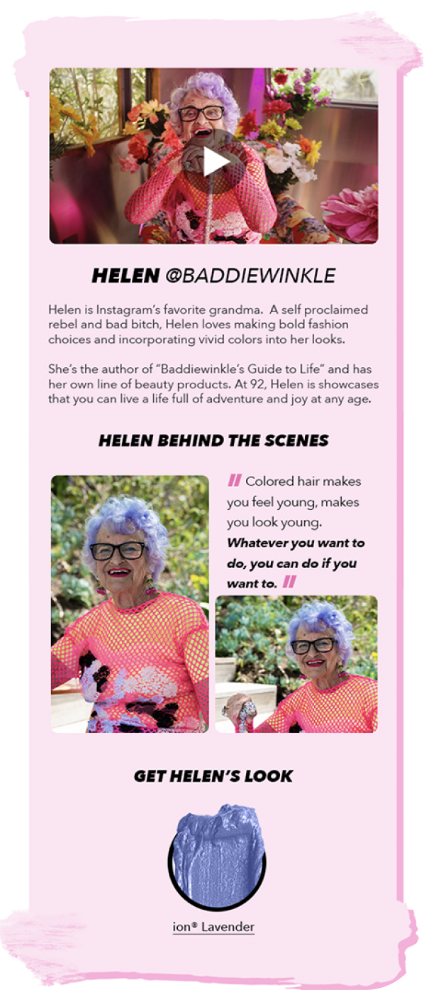
You By Sally influencer bio page on mobile — saturated portrait with shade name and product link
You By Sally influencer bio page variant on mobile — second cast member with their signature shade
SECTION 04: MARKS & MATERIALS

A Palette Tuned to Hold a Color Aisle.

Pink and cyan as the chromatic register, black for grounding, Avenir Next across weights. The same kit ran from influencer bio pages to retail signage without changing voice.

Chromatic brand circle

Hot Pink

#E91E63

Primary, personality

Cyan

#00B8D4

Contrast, accent

Black

#141414

Type, grounding

Cream

#F5F2ED

Paper, ground

Brand philosophy

Pink set the personality, cyan set the contrast, and black anchored every layout so the saturated palette never tipped into noise. The chromatic register stayed consistent across every surface, which is what made the system recognizable from a phone screen and from a 6-foot retail sign at the same time.

Type is one family. Avenir Next Heavy carried the wordmark, Demi Bold carried the shade names and CTAs, Medium carried the rest. The single family kept the system tight, and the weight contrast did the work that a multi-font stack usually has to.

YOU BY SALLY Wordmark

Avenir Next Heavy at scale. Set wide, locked tight, no italics. The wordmark sits as a block of type that reads as a graphic mark before it reads as a word.

Avenir Next Demi Bold Shade names & CTAs

Mid-heavy weight for the shade names, swatch labels, and SHOP NOW callouts. The structural voice that ties the catalog together.

Avenir Next Medium Body & captions

Standard weight for product copy, descriptions, and longer-form text. Quiet enough to let the photography and color blocks lead.

YOU BY SALLY

Wordmark

Hot Pink · #E91E63

Avenir Next Demi Bold

Shade names & CTAs

Cyan · #00B8D4

Avenir Next Medium

Body & captions

Black · #141414

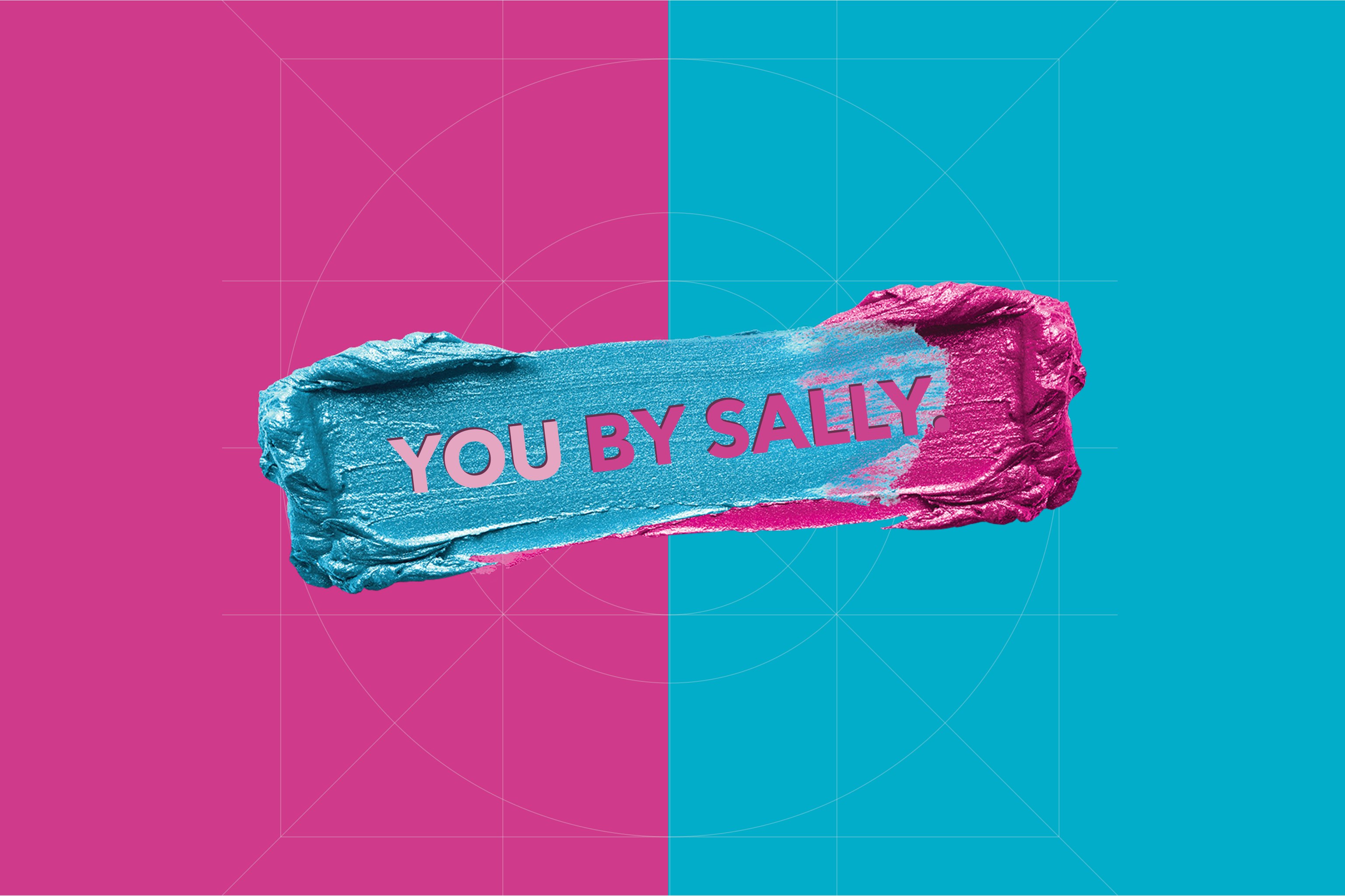
You By Sally wordmark lockup with the Avenir Next type system in context
SECTION 05: CLOSING

A Brand That Treats Color as a Choice.

Casting, swatches, type, color - one kit running from a phone bio page to a retail sign without changing voice.

Services

Campaign Direction

Brand System

Digital Design

Retail Signage

Stack

Photoshop

Illustrator

InDesign

Studio photography

Links

A hair color brand campaign that took the casting seriously and let the personality lead. The swatch system turned shade exploration from a technical task into a visual one, and the type system held the same shape from a phone bio page to retail signage.

Designing across space and material.

SECTION: PRACTICE

Putting the work first.

It's the part I love most.

Studio Reckon House Multi-disciplinary

Founded 2002 Location: Texas / Anywhere Status: Open for projects

Classification Digital Branding Interiors

Contact hello@reckon.house 214.697.4578 IG @reckonhousestaples

Abstract

The work means a lot of things at once - writing the code that ships an app, picking the marble that goes in a kitchen, art directing a campaign shoot, building a brand voice from scratch, designing the AI tooling that runs marketing operations at enterprise scale. These aren't separate jobs, they're the same job showing up in different rooms.

What makes it work is the no-handoff part. Wireframing and coding happen in the same week. Picking kitchen finishes and coordinating the install happen on the same site visit. The thinking and the making stay close to each other, which is why the disciplines stay connected instead of competing for attention.


DIGITAL EXPERIENCES & SOFTWAREBRANDING & CREATIVE DIRECTIONINTERIORS & FABRICATIONReact / Next.jsTailwindOpenAI APIComputer VisionLLMsFramerWebflowReplit / V0SplineArt DirectionVoice & ToneTypographyColor SystemsAfter EffectsMidjourneyCustom LoRASocial GridsEmail ArchSpace PlanningFF&EMillwork DesignMaterial SelectionOn-site DirectionPop-up / RetailFabricationFull-Stack EngAI IntegrationSystems DesignProduct StrategyRapid PrototypingNo-Code ArchBrand StrategyCreative DirectionVisual Identity3D & MotionGen. ImageryContent SystemsInt. ArchitectureFF&E SourcingCustom FabricationInstallation MgmtExperientialDIGITALBRANDINGINTERIORSRHSRING INDEXDisciplineSkill / PracticeTool / MethodDISCIPLINESDigitalBrandingInteriors

© 2026 Reckon House. Made by Jeremy Prasatik.