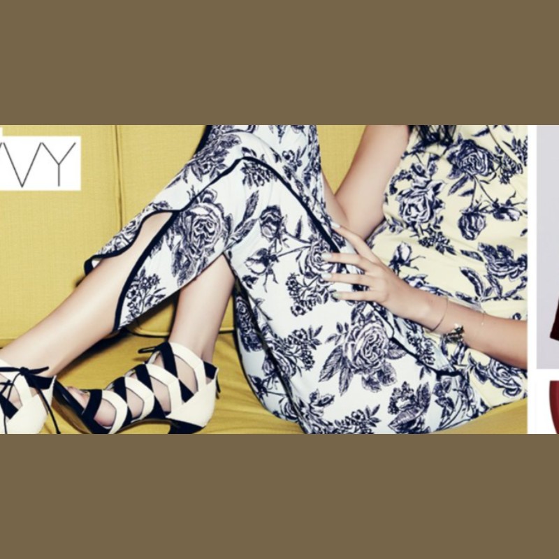
Nordstrom Content Framework
Content taxonomy built from scratch. Custom typeface, icon set, naming language, and a system that organized everything from homepage to email to dedicated landing pages.
Field Content Strategy Brand Design Naming
Author Jeremy Prasatik Published: 2016 Status: Complete
Classification Content Strategy Brand Design Naming Design Systems

Abstract
Nordstrom was producing more digital content than the site had structure for. Brand launches, seasonal pushes, occasion guides, new arrivals. All hitting email and site simultaneously with no organizing logic. Customers saw volume, not clarity.
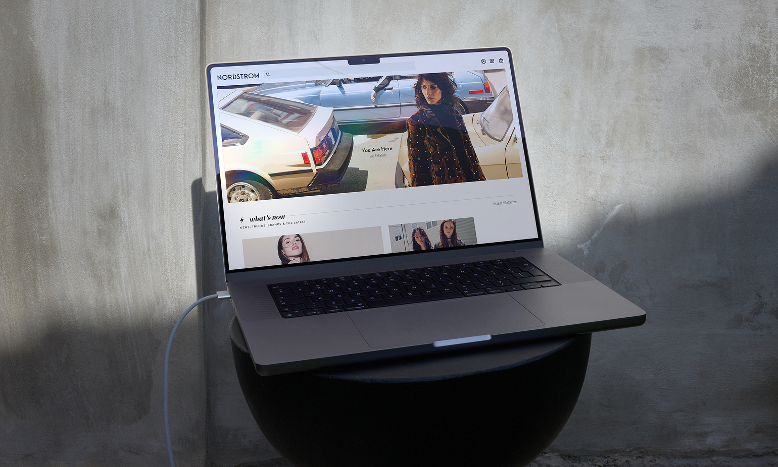
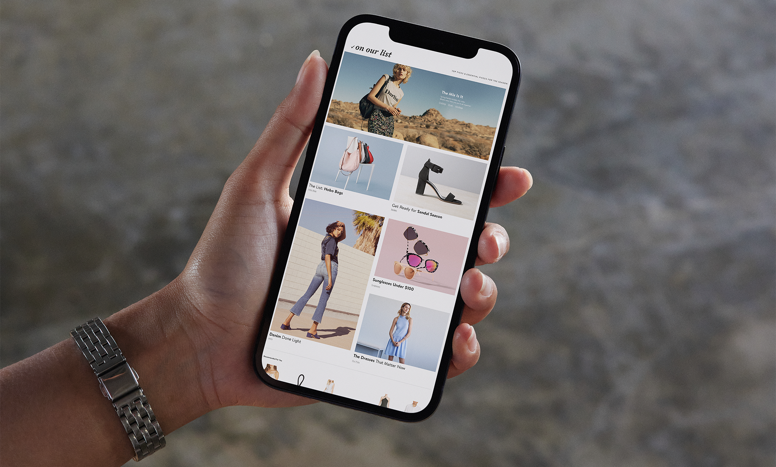
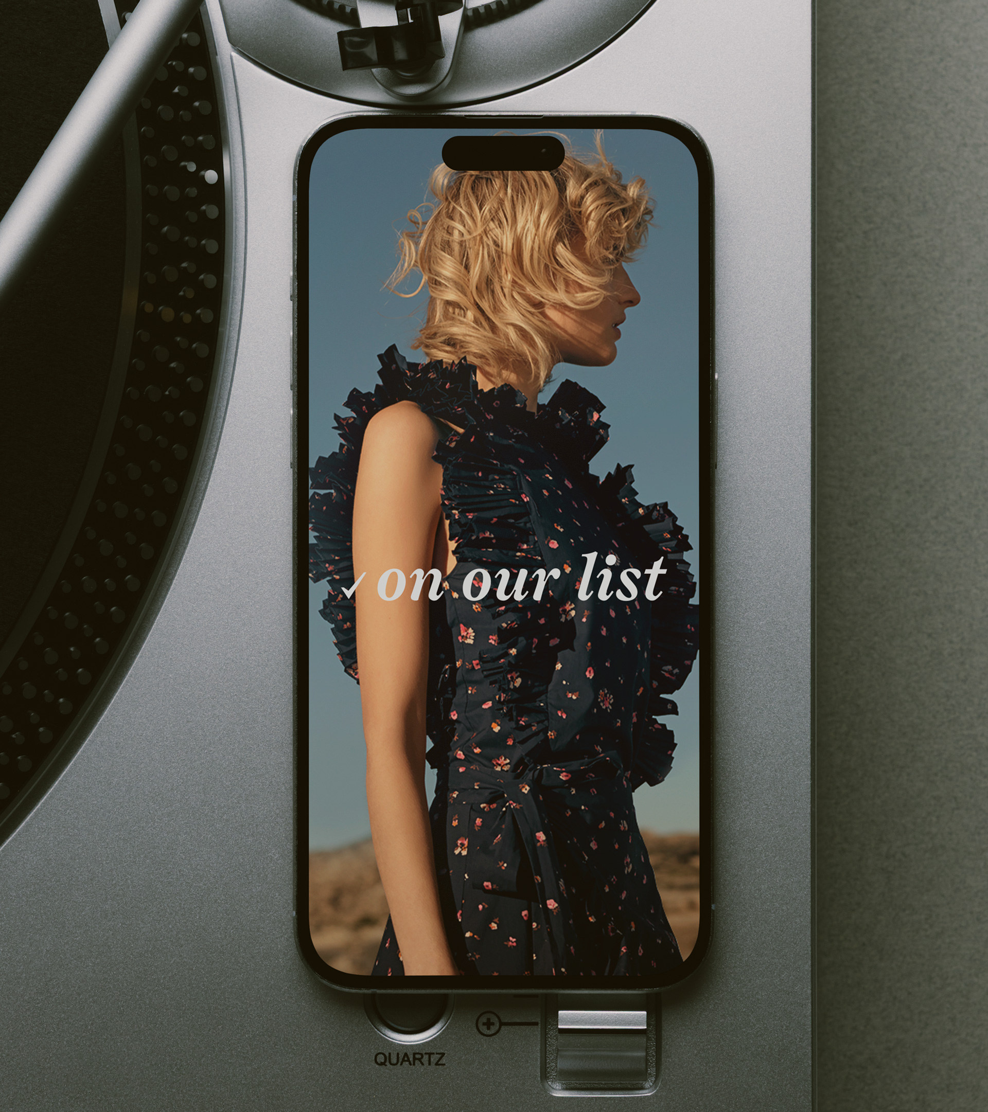
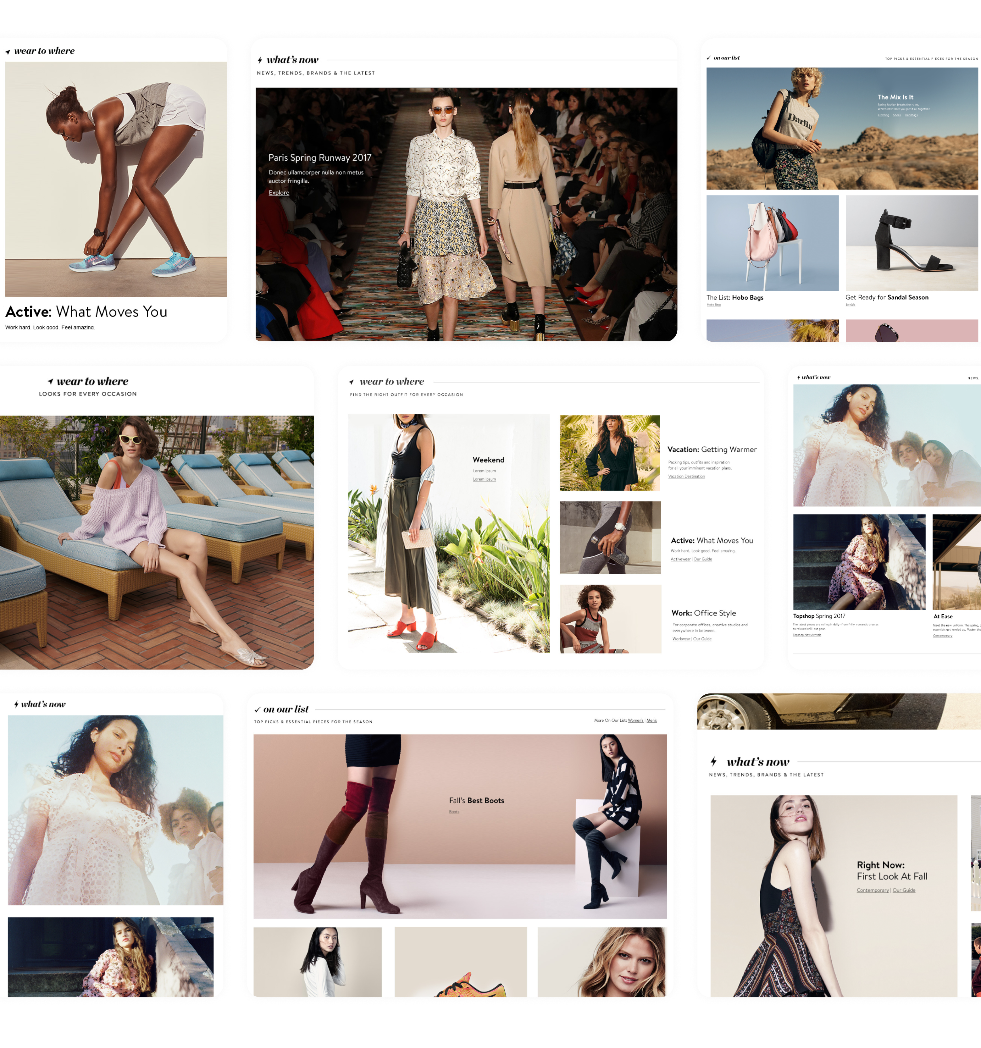
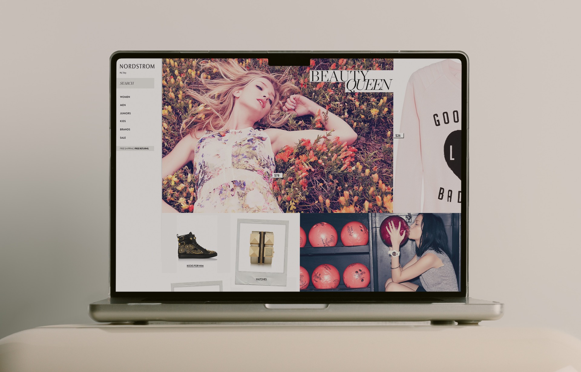
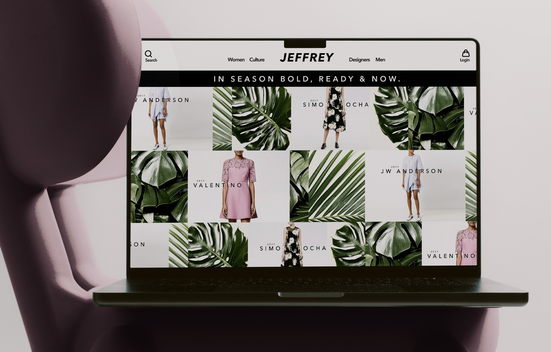
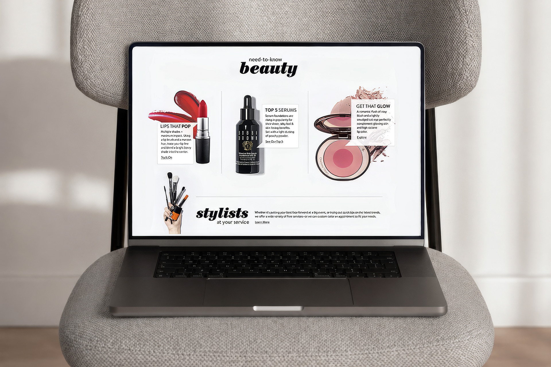
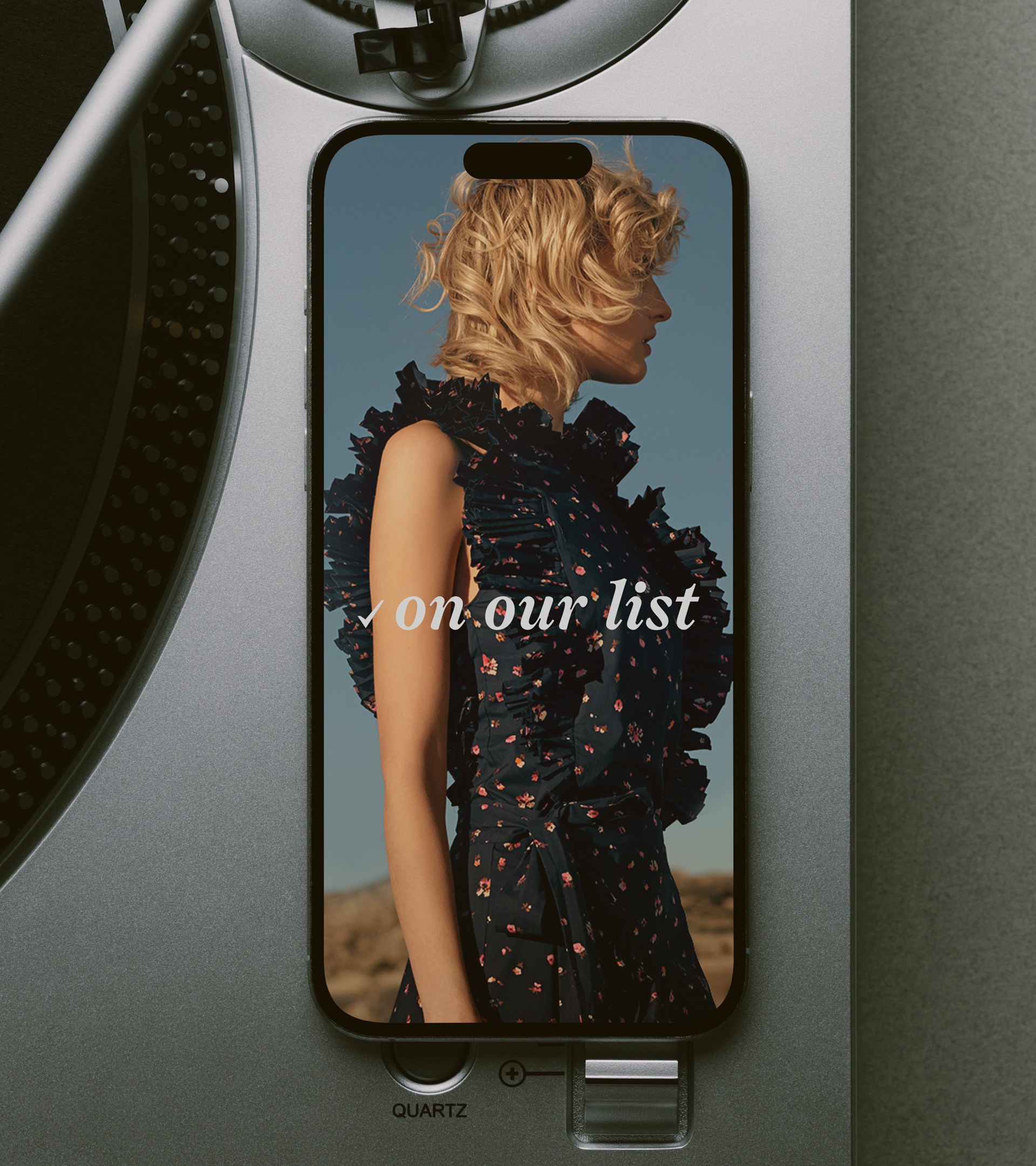
Concepted a content framework that sorted everything into named buckets, each with its own identity. "What's Now" for trending brands and arrivals. "On Our List" for seasonal picks. "Where to Wear" and "Wear to Where" for occasion dressing from opposite directions. Custom icons, dedicated typographic marks sourced specifically for the system. Magazine language, not menu language.
Pitched it across merchandising, marketing, and editorial. The framework became an internal organizing tool before it ever reached customers. Once it shipped, it powered homepage modules, email sections, and dedicated landing pages. Engagement lifted 22%. The vocabulary held for years.
Volume Without Vocabulary.
Nordstrom's digital calendar was producing more stories than the site could absorb. Every new brand, seasonal push, and occasion guide landed on the homepage with the same weight as the next.
Customers were getting volume without context. Merchandising, marketing, and editorial each pushed in parallel with no shared language for what any of it was. Email ran its own cadence. Landing pages followed a separate lifecycle. The only thread connecting any of it was the date on the calendar.

Four Buckets, Four Identities.
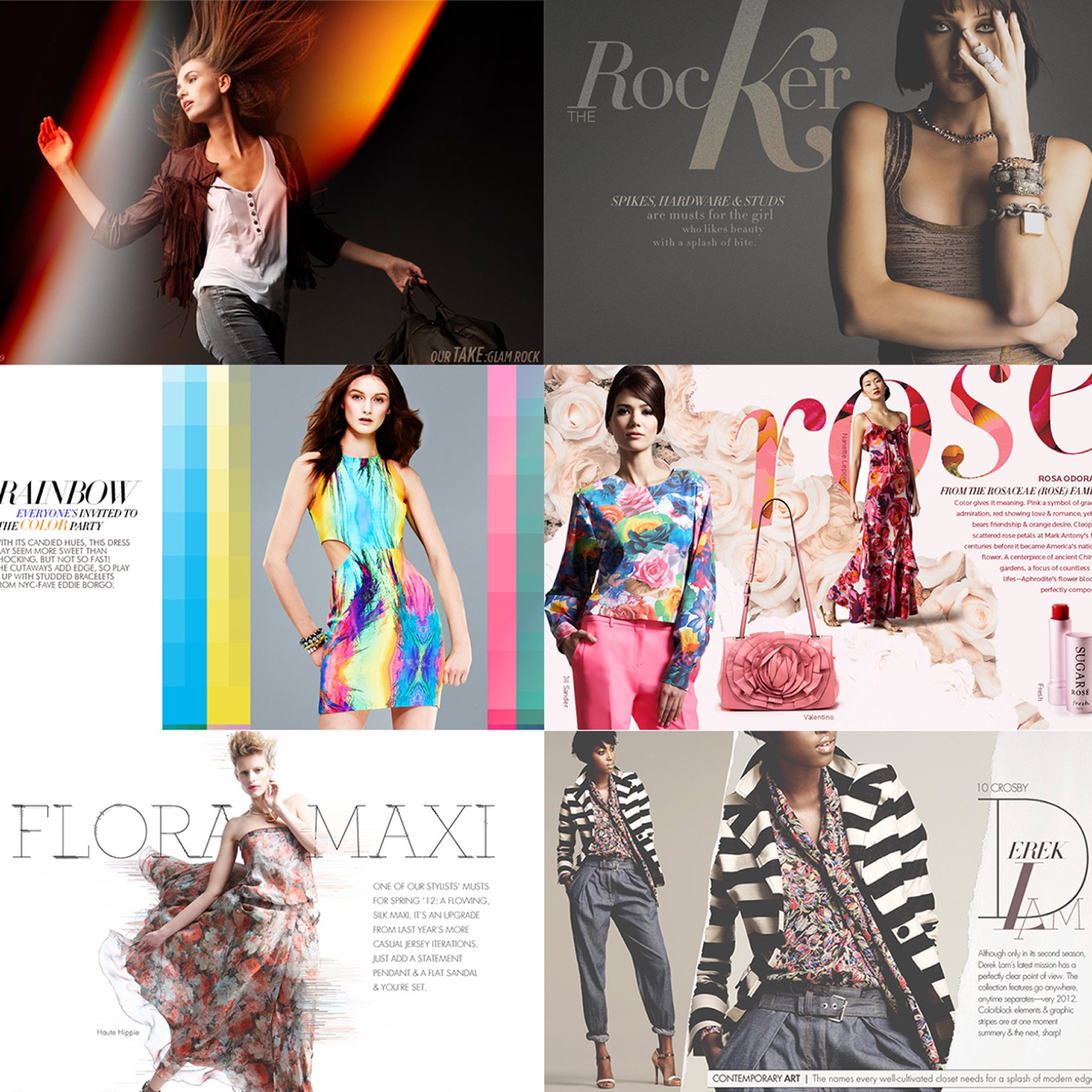
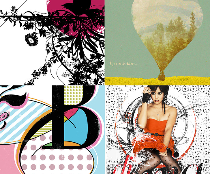
Sorted everything into four named categories. Each got its own typographic mark, custom icon, and a tone of voice that read editorial instead of navigational.
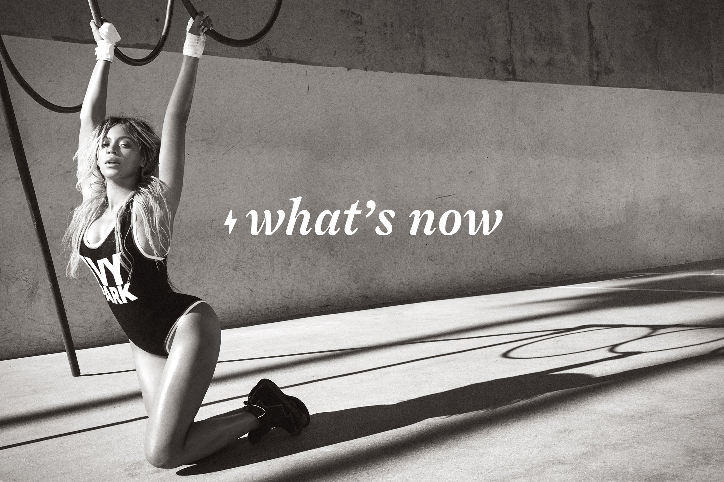
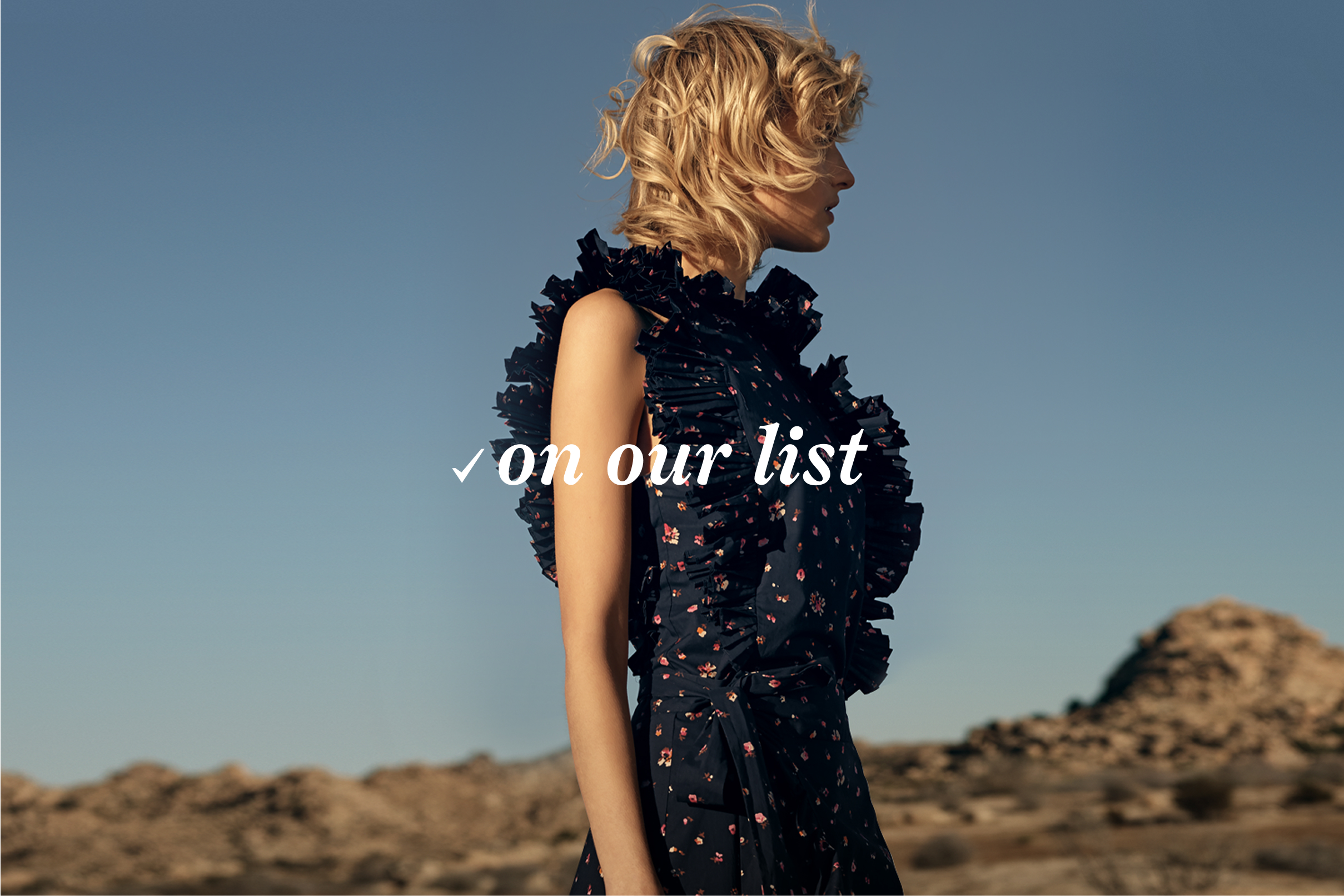
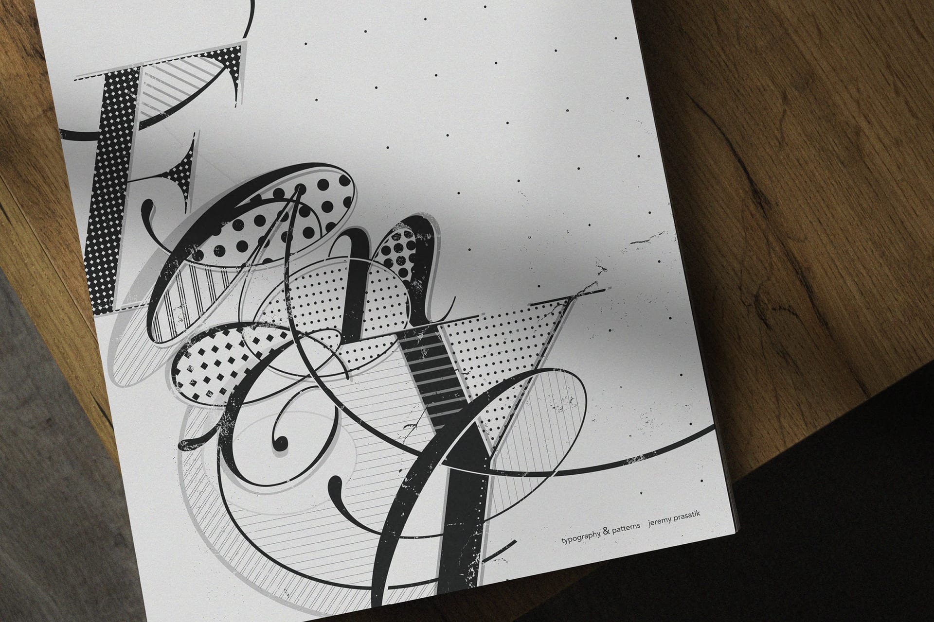
"What's Now" was for arrivals and trending brands. "On Our List" framed seasonal picks and essentials. "Where to Wear" approached occasion dressing from the event side. "Wear to Where" came at it from the outfit side. Same question, opposite angles. The naming had to feel like a magazine masthead instead of a navigation menu. Sourced custom typefaces for each lockup so no two marks shared a face.
Magazine language, not menu language


Homepage, Email, Landing.
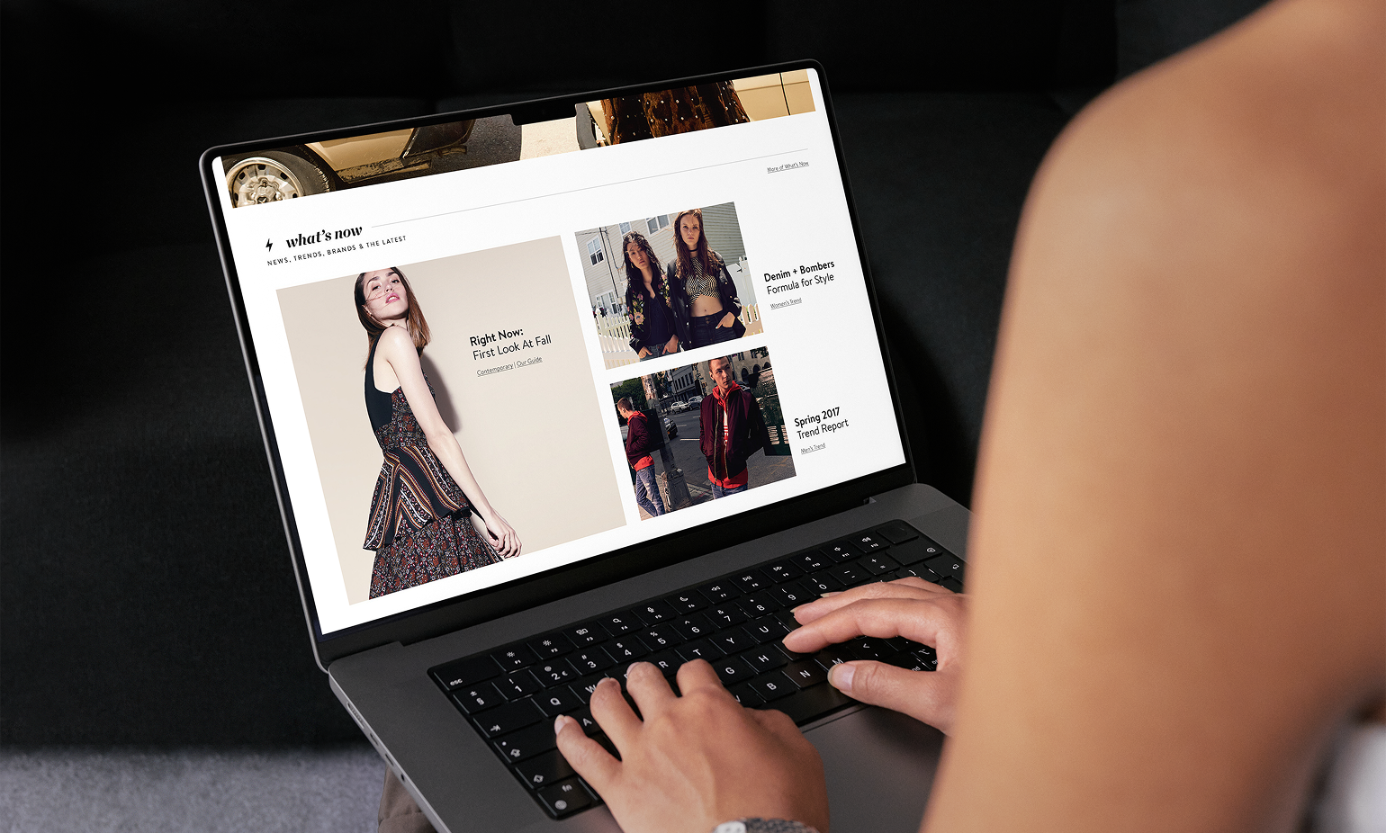
The framework powered homepage modules, dedicated email sections, and full landing pages built around a single bucket. Each piece carried the matching icon and lockup, so customers could read the signal anywhere they encountered it.
More important: the framework worked as an internal tool before it reached anyone outside. Planning meetings used the same vocabulary. Content calendars mapped stories to buckets at the brief stage. Teams stopped treating each campaign as a one-off and started thinking in categories. The customer-facing system was the artifact of an organizational shift that had already happened.


Names Before Templates.
Engagement lifted 22% once the framework rolled out. The bigger outcome was internal: every team that touched digital content was now speaking the same language about it.
Services
Content Strategy
Brand Design
Naming
Design Systems

Stack
Links
The framework held for years and became foundational vocabulary across the digital organization. Icons evolved. Typography refreshed. Buckets renamed. The structure underneath stayed the same.