J. Christianson
Mid-century warmth without the nostalgia trap. A brand identity built from the name outward, designed to live on a storefront sign and a clothing tag with equal presence.
Field Brand Development Naming Logo Design Graphic Design
Author Jeremy Prasatik Published: 2019 Status: Complete
Classification Brand Development Naming Logo Design Graphic Design
TL;DR Built→ Name, four-circle mark, color system, tree graphic, product applicationsScope→ Brand development, naming, logo and graphic designTools→ Adobe Illustrator, Adobe PhotoshopAngle→ One mark shifts its palette by context without losing recognition. One tree drawing, four colorways, doing the work of a full product line.
Abstract
Ground-up brand development for a fashion and home goods label. Started with the name, then built the mark, color system, typography, and product graphics from there.
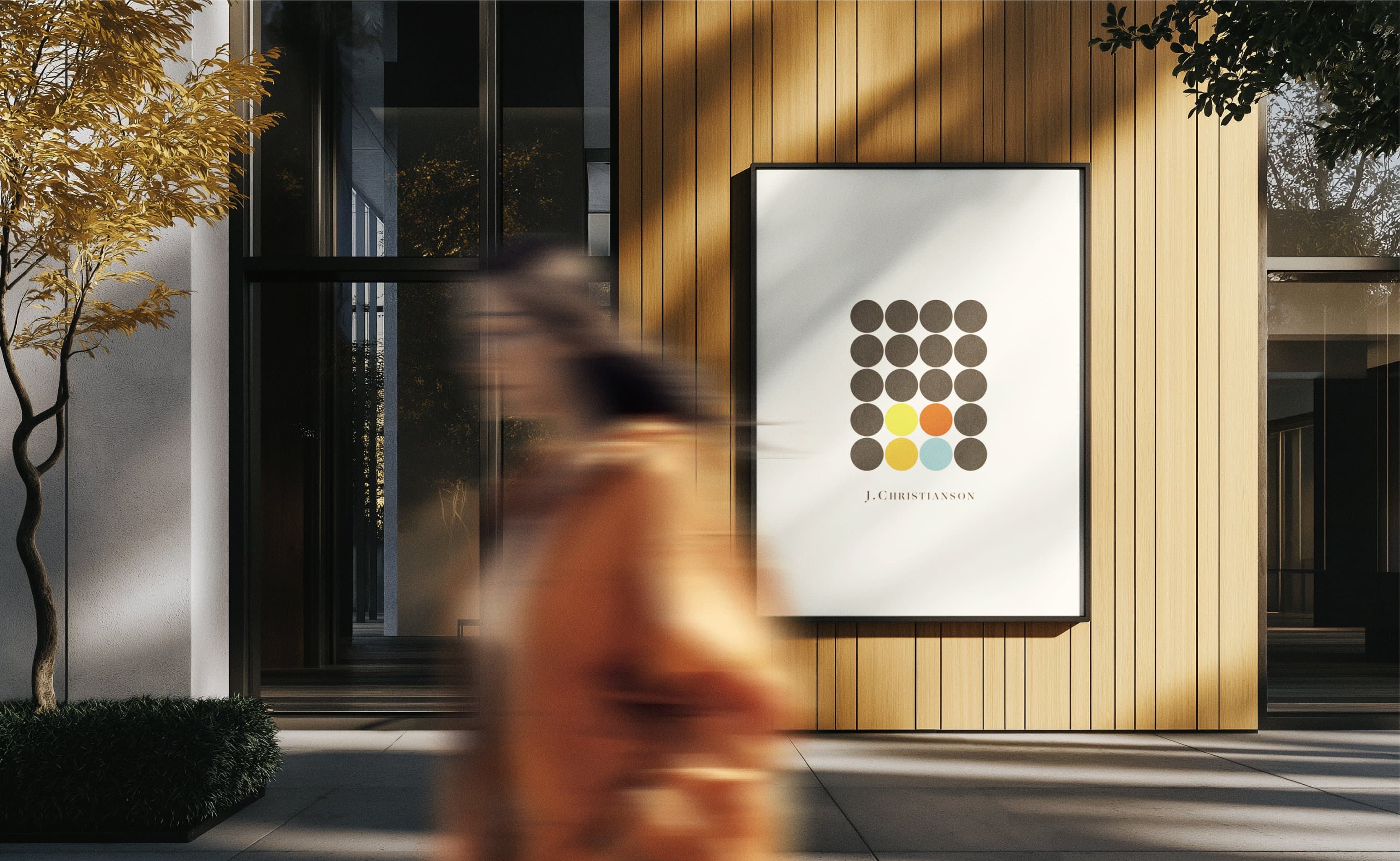
The logo is four circles in a tight grid - same form, different color combinations depending on where it lives. Brown circles with accent colors for one context, olive circles with the same accents for another. Flexibility was built into the identity from the first sketch, so one mark could shift its palette without losing recognition.
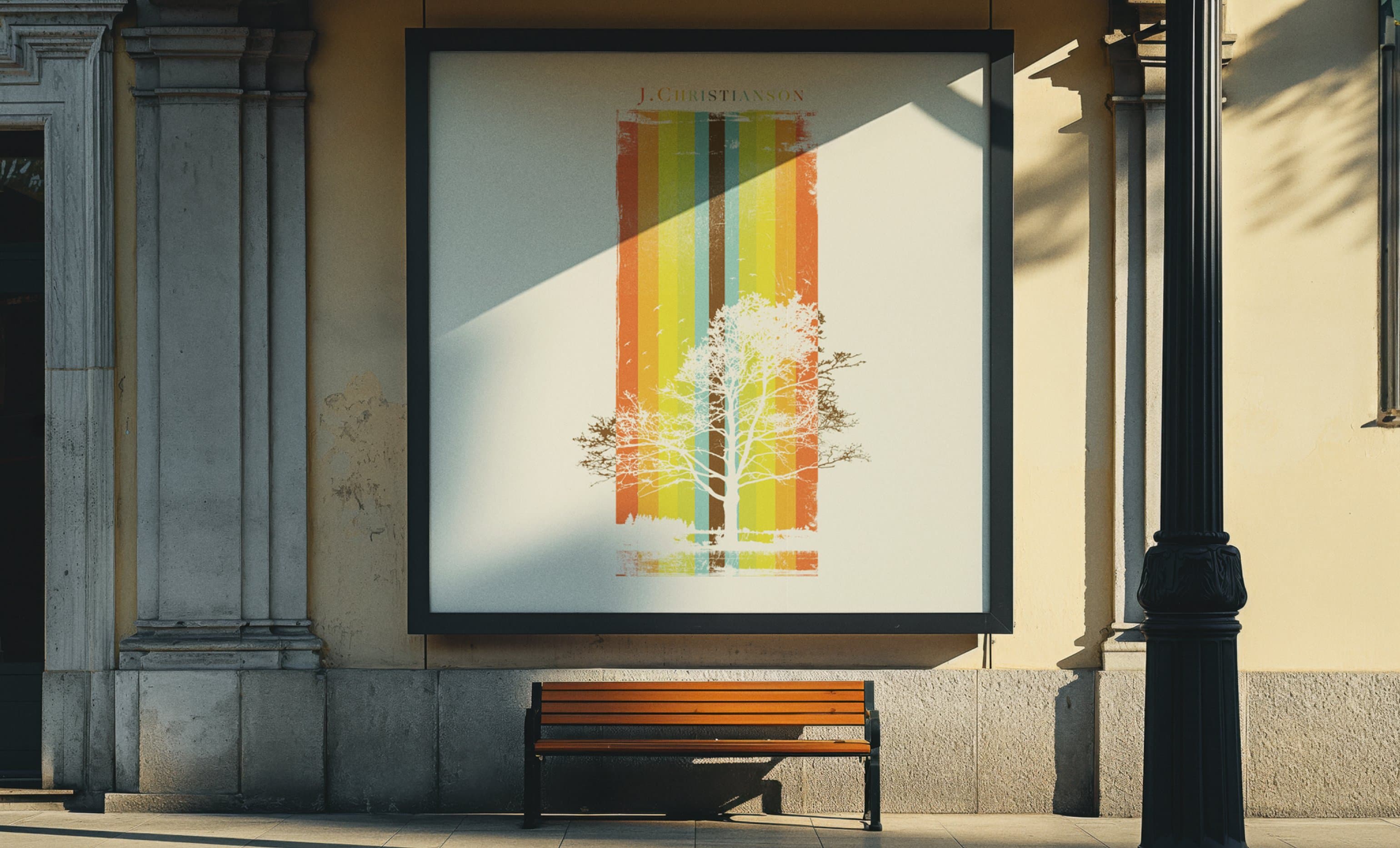
A tree silhouette did the rest of the heavy lifting, rendered in four seasonal colorways and layered over a striped color field pulled from the brand palette. The graphic showed up on apparel, candles, hangtags, and print materials - one drawing doing the work of a full product line.
One Drawing Carrying a Full Range.
Where the logo gave the brand recognition, the tree gave it a story - a white silhouette layered over the brand's stripe pattern, breaking out at the edges into white space.
Four colorways - teal and dark green, yellow and gold, orange and rust, brown and earth tones. Same tree and stripe pattern, different palette in each. Branches reach past the color block into white space, breaking the rectangle so the graphic feels drawn rather than placed. Used on apparel, candle labels, hangtags, and promotional print, one drawing earned a full product range.


A Mark That Shifts Its Palette by Context.
Four circles arranged in a square - tight spacing, no outline, constant form. The colors rotate depending on where the mark appears.
Brown circles with yellow, orange, red, and teal accents in one version. Olive circles with the same accents in another. The accent colors hold position (bottom-right cluster) while the dominant color shifts. Recognition comes from the grid, not the fill. Fewer locked variations meant more places the mark could land without redrawing.


Type that feels found rather than designed

From a Name to a Storefront.
A brand built from a blank page. Name, mark, color, graphics, product applications. All developed as one connected set of decisions.
Services
Brand Development
Naming
Logo Design
Graphic Design
Product Applications
Stack
Adobe Illustrator
Adobe Photoshop
Links
Four circles in a grid, a tree silhouette over color stripes, a palette pulled from mid-century earth tones warm enough to feel organic without leaning into the nostalgia. The identity holds from a billboard down to a clothing tag because the elements were built to scale.
The color-shifting logo meant fewer production variants, and the seasonal tree graphic let one illustration cover a full product calendar. Decisions made at the system level so the surface could stay simple.