Robert Rodriguez x Neiman’s
’80s mall glam meets high fashion - the double-exposure glamour shot reimagined with mesh color fields instead of airbrushed backdrops and couture instead of puff sleeves.
Field Campaign Design Art Direction Photo Compositing
Author Jeremy Prasatik Published: 2024 Status: Complete
Classification Art Direction Photo Compositing Typography Design Campaign
TL;DR Built→ Spring campaign across social, email, retail, editorialScope→ Art direction, photo compositing, typographyTools→ Photoshop, Illustrator, Capture One. Double-exposure layers, mesh color fieldsAngle→ The mall portrait studio taken seriously, not ironically. Four studio frames recombined into a whole campaign.
Abstract
The reference was the mall portrait studio - soft-focus close-ups, oversaturated color, a little too much hairspray. Kept the energy and replaced everything else.
Four studio shots, one model, custom compositing. Double-exposure layers stretched the shoot into a full campaign system, with mesh color fields giving the backgrounds pop-art softness without the dated airbrush look. Typography was built for this project - playful enough to match the concept, refined enough for the brand.
One Shoot Day Stretched Into an Entire Campaign.
Neiman Marcus needed a spring campaign for Robert Rodriguez that felt current without abandoning the brand's romantic sensibility. The budget was a single shoot day. The deliverable was a full multi-channel system: social, email, in-store, editorial.
The constraint became the concept. One model, four setups, and a compositing technique that turned four photographs into an entire visual language. Every piece of the campaign traces back to those four original frames, layered and recombined into something that feels like fifty shots instead of four.
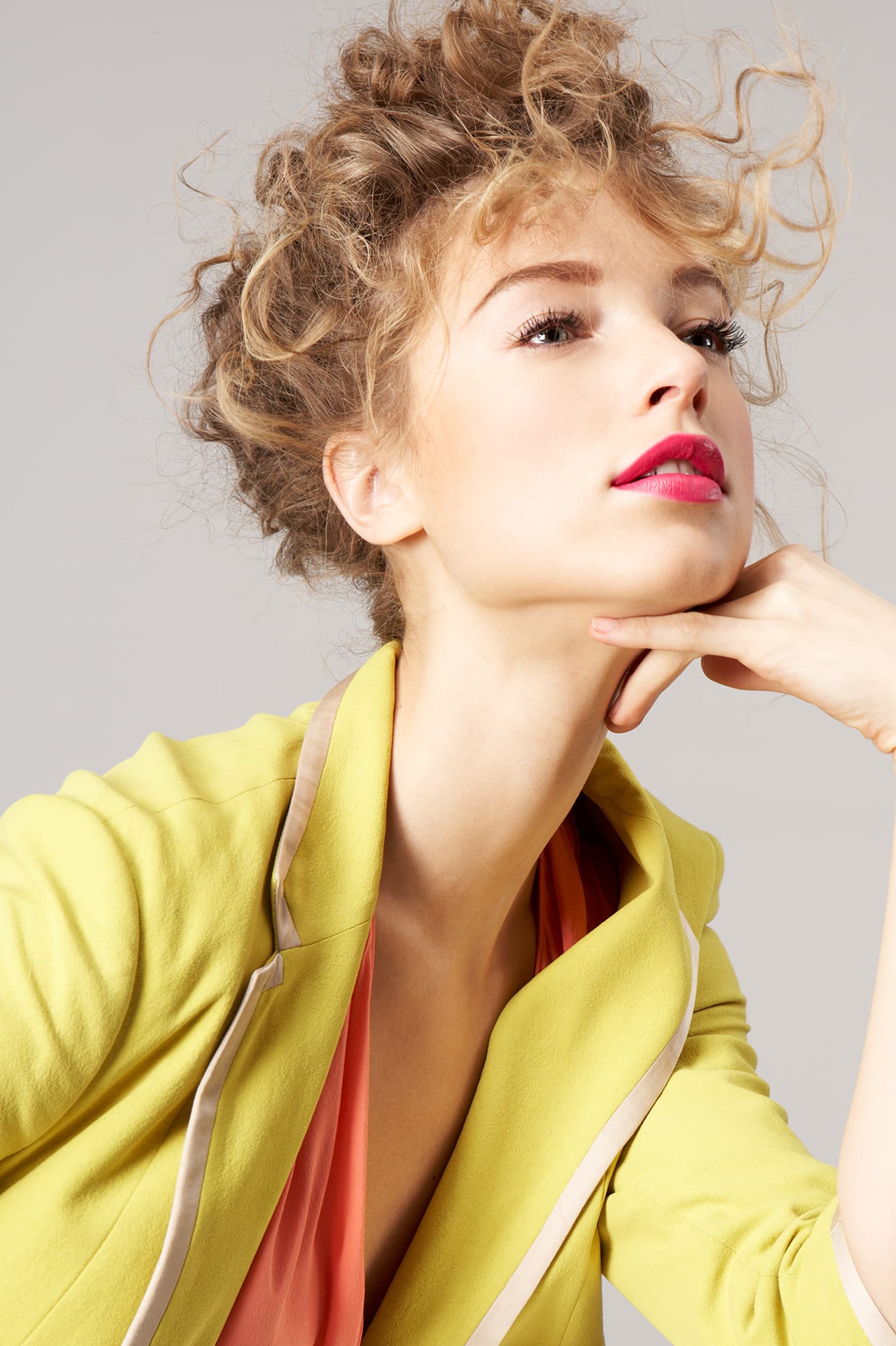
Mall portrait studios. Glamour Shots. The oversaturated close-up with a soft-focus background and a fan blowing from somewhere off-camera - the aesthetic that defined aspirational beauty for an entire decade before fashion decided it was embarrassing.
The brief was to take that energy seriously - the confidence and the color, the full unironic glamour - and rebuild it with contemporary craft. A translation, not a parody.
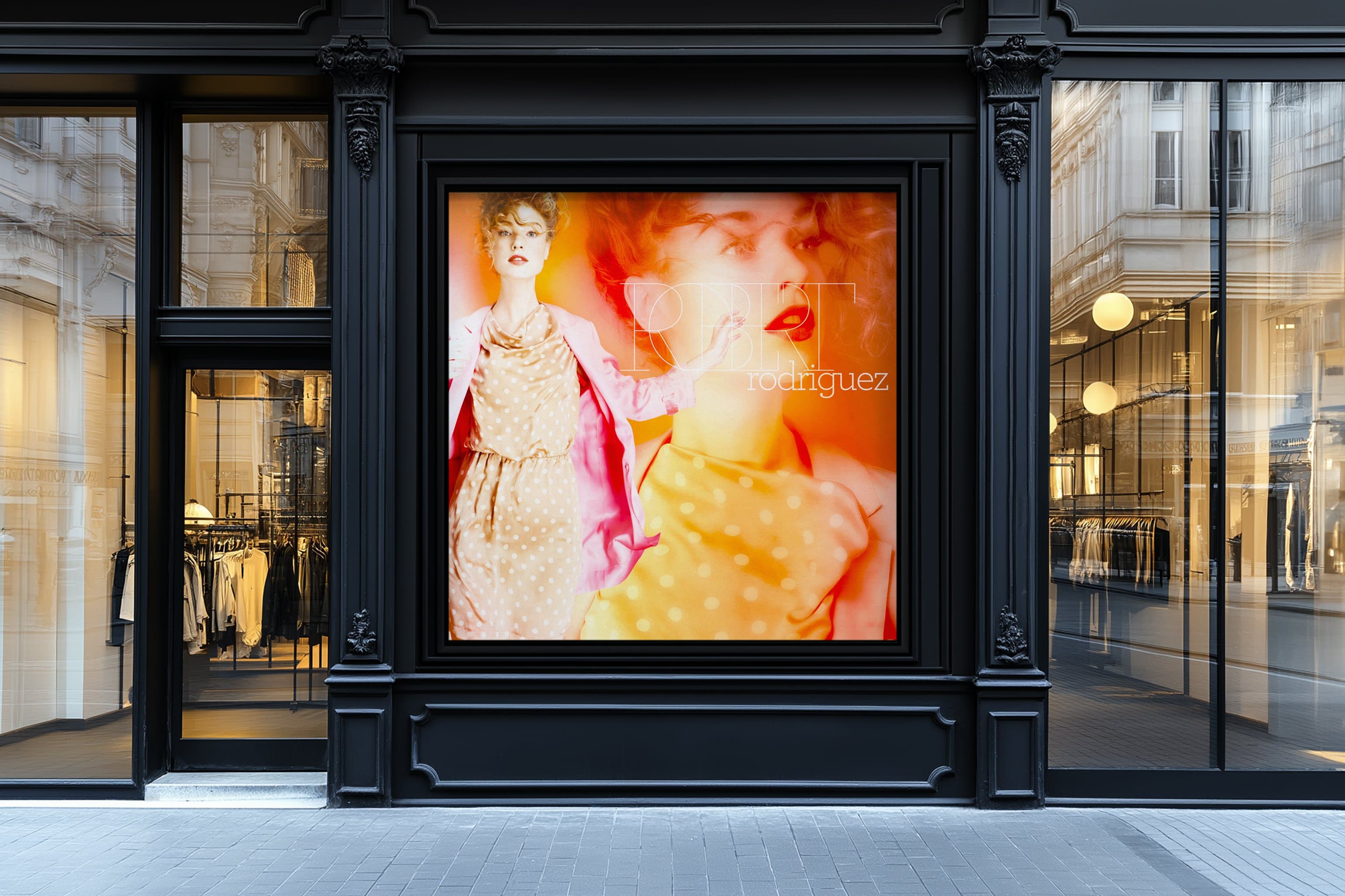
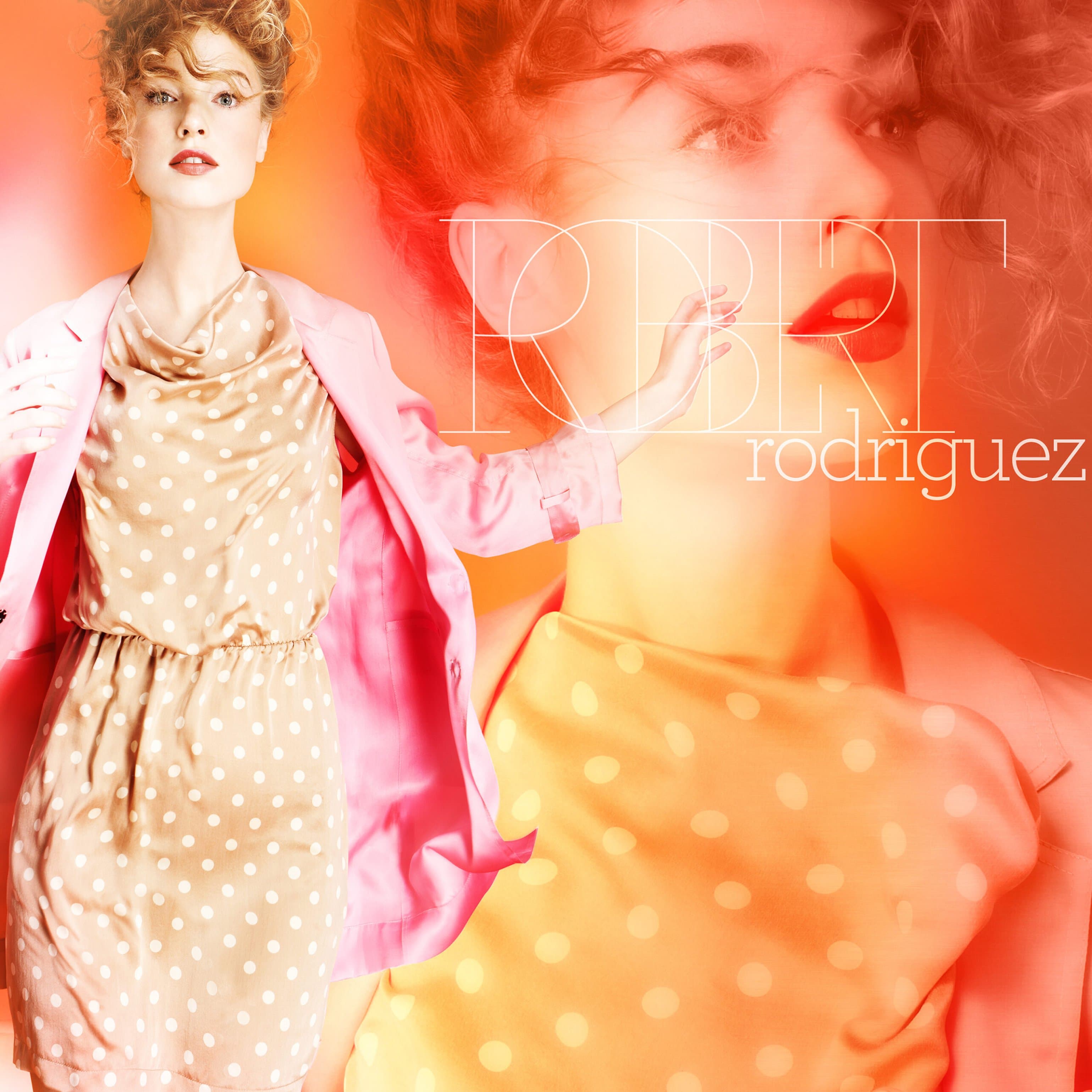
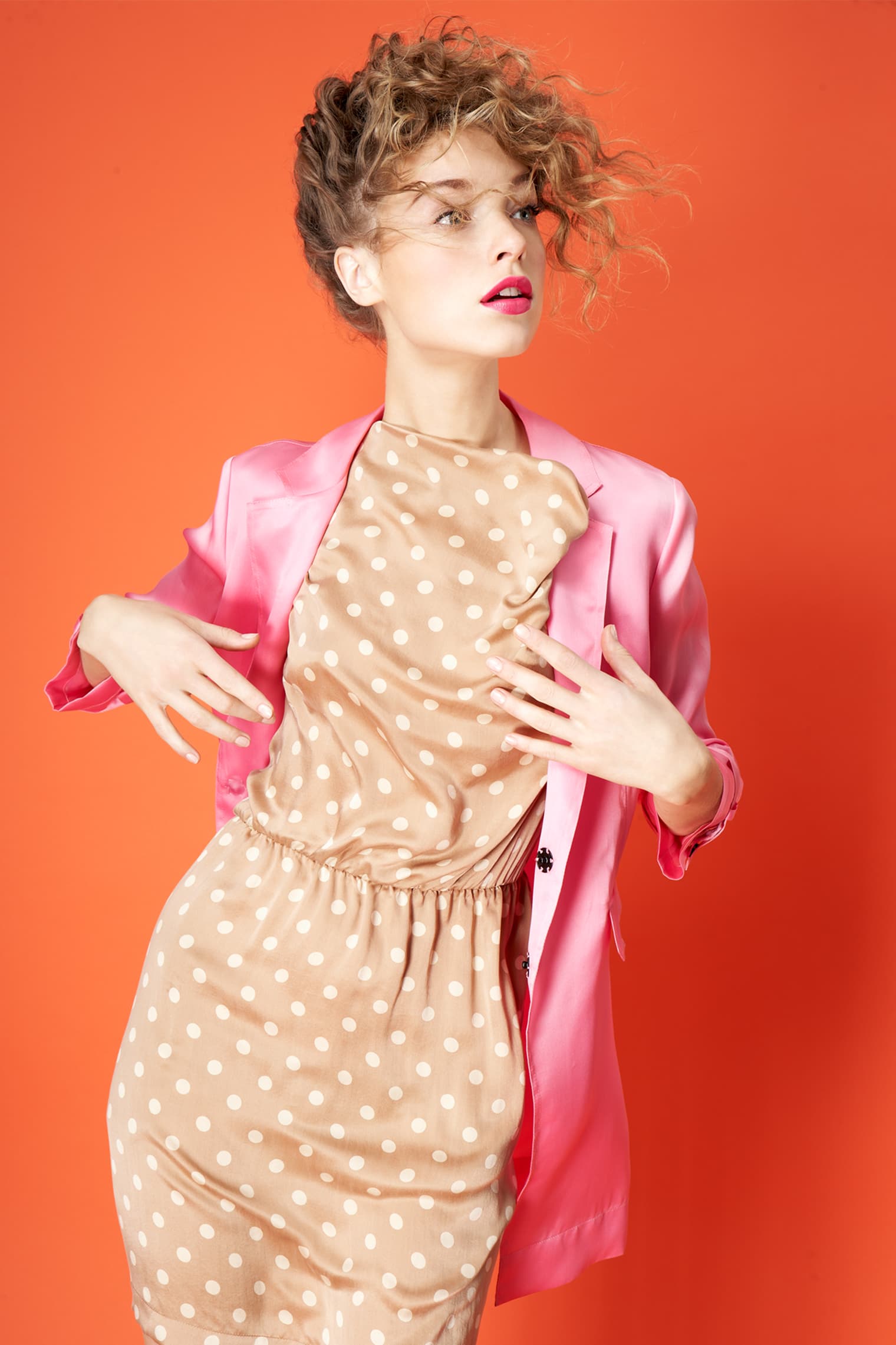
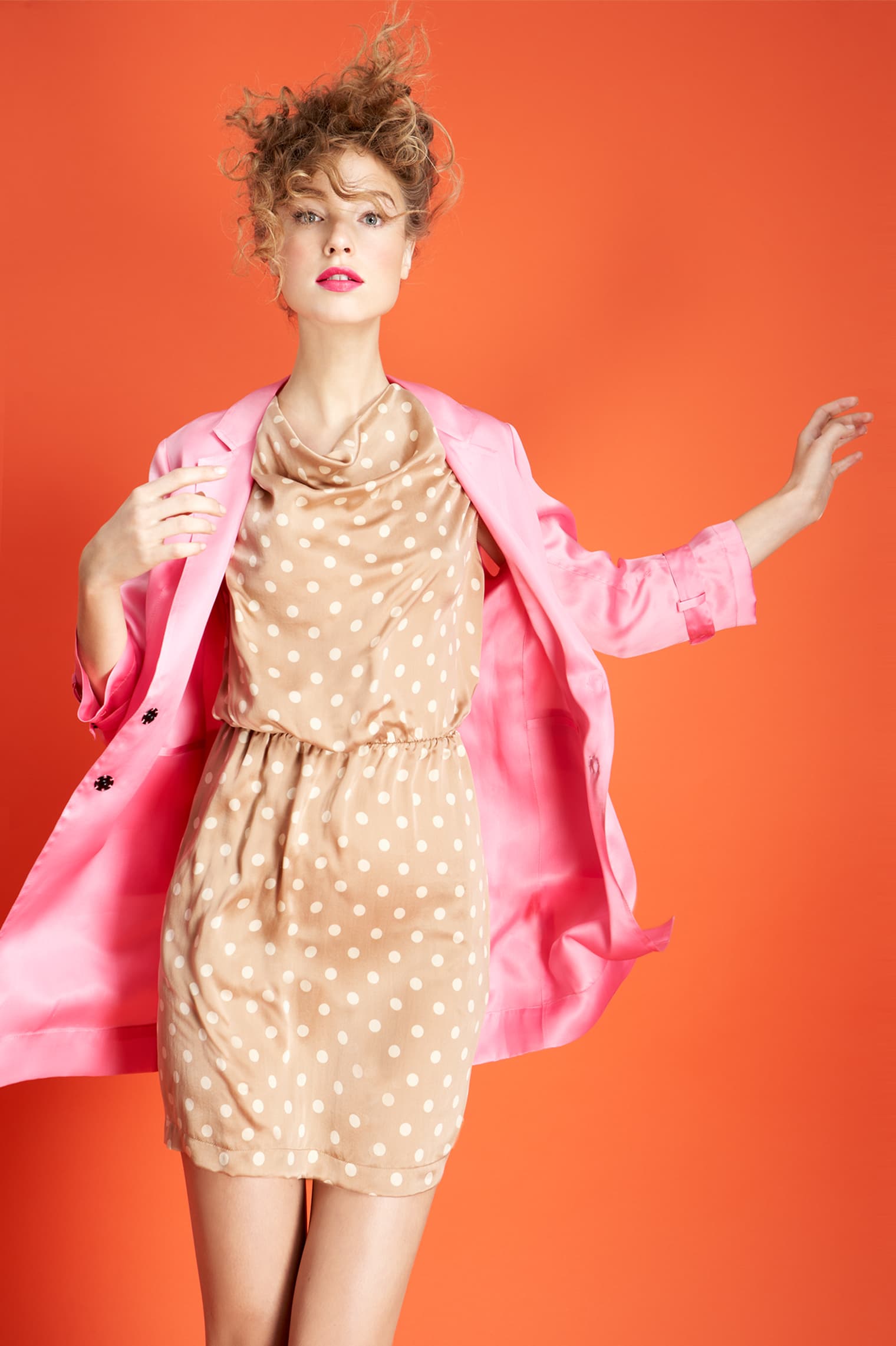
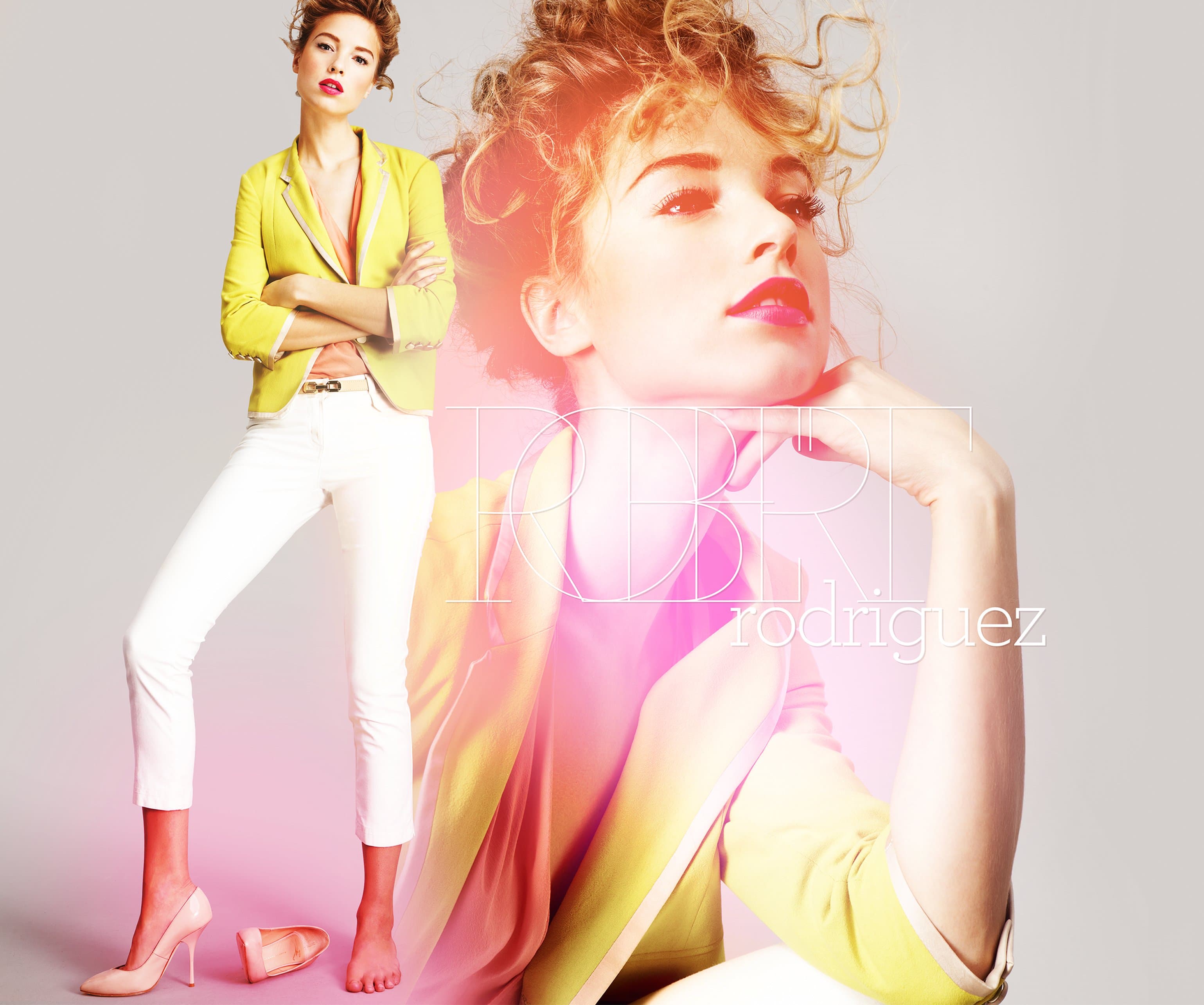
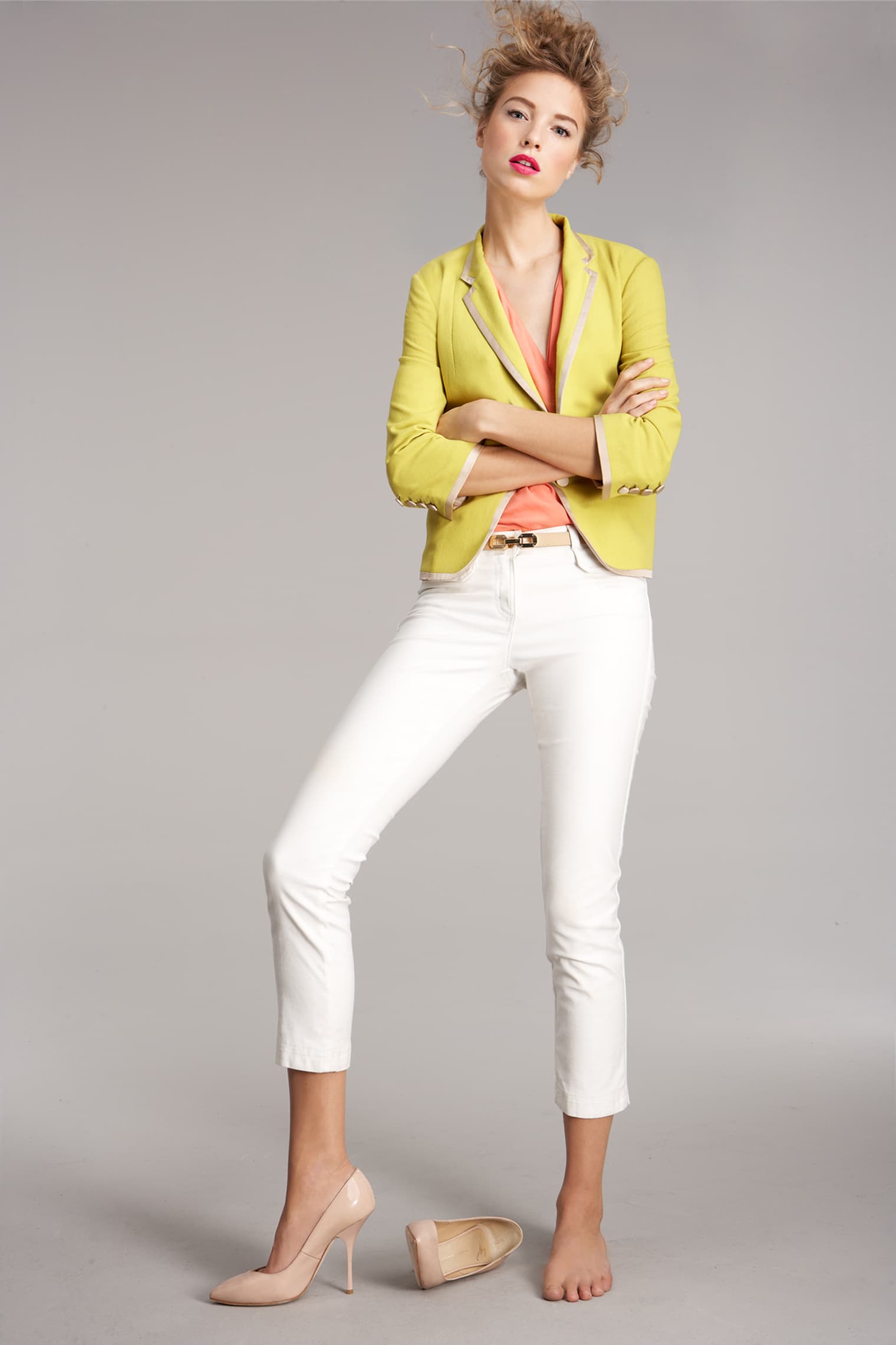
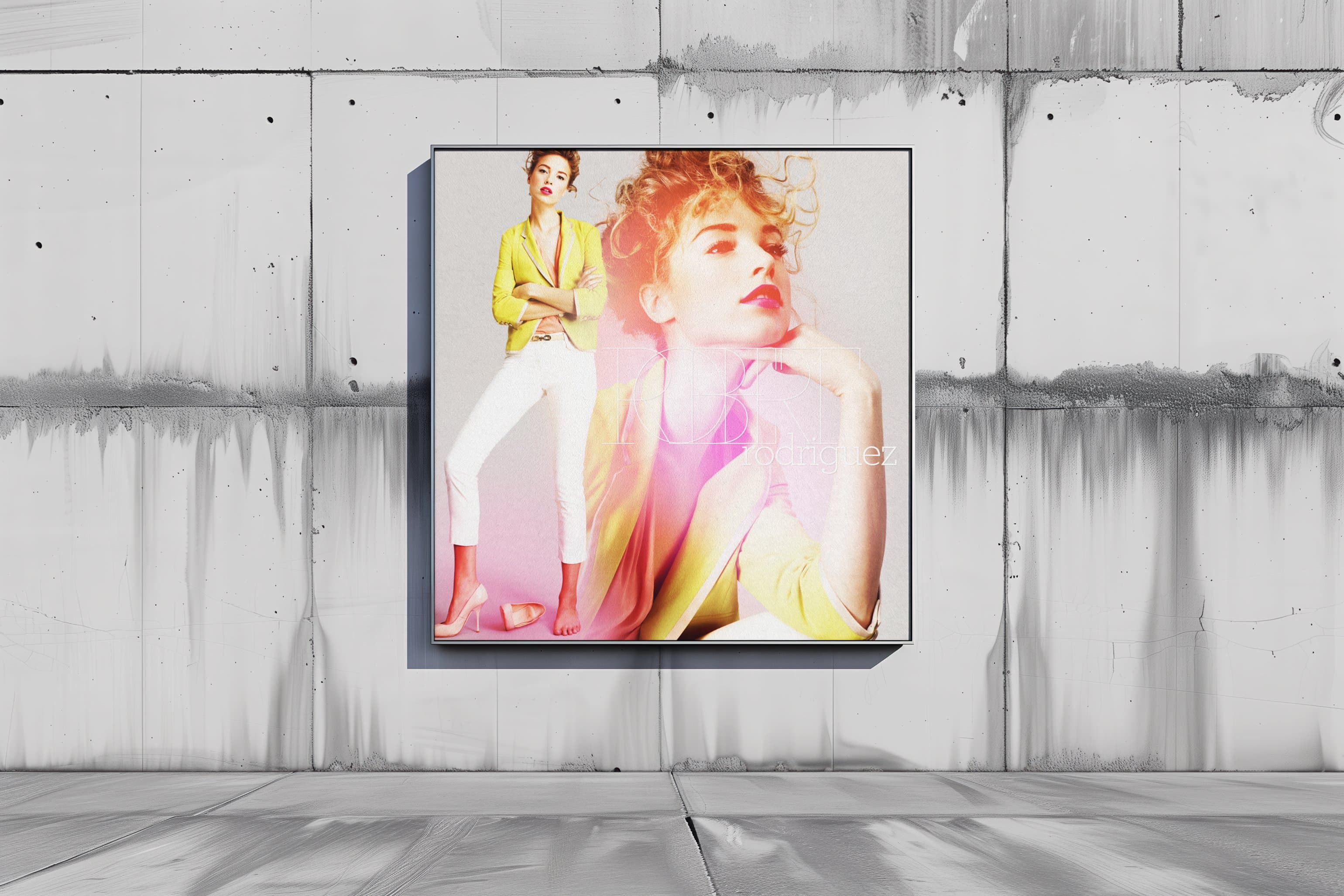
Double-exposure compositing. Two frames from the same shoot layered together, one tight, one wide, with the overlap creating a third image that neither frame contains alone. A close-up bleeds into a full-length, a gesture becomes a texture.
Mesh color fields replaced the airbrushed backdrops - mathematically smooth washes shifting from coral to orange to pink. The warmth of the original reference without the noise.
Four source photographs became a campaign library. Social cards, email headers, retail signage, editorial spreads - each combination tells a slightly different story from the same visual DNA.
The typography, Archer Hairline paired with Archer Book, was selected specifically for this project. Thin enough to float over dense imagery without competing, with curves warm enough to match the softness of the photography.
The Reference
Mall portrait studios. Glamour Shots. The oversaturated close-up with a soft-focus background and a fan blowing from somewhere off-camera - the aesthetic that defined aspirational beauty for an entire decade before fashion decided it was embarrassing.
The brief was to take that energy seriously - the confidence and the color, the full unironic glamour - and rebuild it with contemporary craft. A translation, not a parody.
The Technique
Double-exposure compositing. Two frames from the same shoot layered together, one tight, one wide, with the overlap creating a third image that neither frame contains alone. A close-up bleeds into a full-length, a gesture becomes a texture.
Mesh color fields replaced the airbrushed backdrops - mathematically smooth washes shifting from coral to orange to pink. The warmth of the original reference without the noise.
The System
Four source photographs became a campaign library. Social cards, email headers, retail signage, editorial spreads - each combination tells a slightly different story from the same visual DNA.
The typography, Archer Hairline paired with Archer Book, was selected specifically for this project. Thin enough to float over dense imagery without competing, with curves warm enough to match the softness of the photography.
Double Exposure as Design System
Each composite starts with two frames from the same session. A wide shot anchors the composition, then a close-up bleeds across it - the face dissolving into color, the gesture becoming a wash. Every layer is placed to create depth where the original photograph is flat.
The mesh backdrops are generated to complement the clothing in each frame - coral for the polka-dot dress, pink for the yellow blazer, orange for the seated portrait. The color fields don't just fill space, they extend the garment's color story into the entire image until the background becomes part of the outfit.
The mall studio, rebuilt for the runway
Four Source Frames Feeding Every Channel.
The compositing system meant every deliverable felt like its own photograph. Social crops pulled from the layered files differently than email headers, retail signage used the color fields at full saturation, and editorial spreads let the double-exposure breathe across wide formats.
The campaign ran across Neiman Marcus social channels, email marketing, and in-store retail displays. The storefront window installation used the composites at large format. The mesh color fields held up at scale because they were mathematically generated, not resolution-dependent. A three-foot print has the same color smoothness as a phone screen.
Archer Hairline Meets Mesh Color Field
The typography was chosen for this campaign specifically. Archer Hairline for headlines, thin enough to sit over dense, colorful imagery without fighting for attention. Archer Book for body copy, warm rounded serifs that echo the softness of the photography.
The color palette lives in the space between coral, orange, and pink. Three colors that shouldn't work together but do when the transitions are smooth enough. The mesh technique creates shifts that feel organic rather than designed, the same way a sunset moves through those exact colors without any of them clashing.
The logo treatment layers Archer Hairline over Archer Book. The weight contrast, featherlight caps over solid lowercase, mirrors the double-exposure technique in the photography. Two weights of the same typeface creating depth through overlap, just like two frames from the same shoot.
A Reference Taken Seriously, Not Ironically.
A focused campaign that took the mall portrait studio reference seriously - the saturated warmth, the unapologetic glamour, rebuilt with contemporary craft.
Services
Art Direction
Photo Compositing
Typography Design
Campaign Design
Stack
Adobe Photoshop
Adobe Illustrator
Capture One
Links
Four studio photographs became a complete campaign system through double-exposure compositing and mesh color-field backgrounds. The technique turned a single shoot day into a visual language that scaled across social, email, retail, and editorial, with each format pulling differently from the same layered source files.
The typography, color palette, and compositing approach were designed as a unified system. Archer Hairline floats over saturated imagery, soft washes extend the garment's color story into the background, and two frames become one image that contains more depth than either original.
Social, email, retail. One model, one concept, one day of shooting, every deliverable tracing back to four original frames.