The daybook left the board's rail. It opens from Info now, under Shipped lately, as its own column: a chip for each month, and the full page at the foot.
The day’s work, entered as it happens. Ships, fixes, and notes across RHS, Sally, and A.R.C., with a picture when one earns it. Newest first, numbered from the first entry.
100 entries since June 2026, drafted from the commit logs and edited by hand. A number, once minted, never changes.The ledger
September 2026 31 entries
The daybook moved onto the board's layout: the statement, then a column for each month, newest first, each one counting the entries left below it. The board's rail has a door to it. The old homepage that was still printed at the foot of the other pages is gone.
The Ask's answer names the studies, and the rows under it follow the names. Asked about packaging, it finds Capitan Boot Co. and J. Christianson, which the old keyword match never found. Each study also carries the kinds of work it is, judged from its pictures and its prose: eight studies are ecommerce, and two of them used to say so.
Every column on the board that scrolls counts what is left in it, at the foot of its own rule: all of its pictures at the top, one at the bottom. A wide hero keeps its own shape instead of being cropped to fit, anchored bottom right.
Campaign sheets edit in place. Click a headline on an asset and type, drag an image to re-crop it, and a properties panel beside the canvas holds the rest. A save is one new version, so the history and the checks behind it are unchanged.
Twice, a study opened from the board stayed under its curtain, finished underneath but covered, until a reload. The curtain lifts itself after six seconds now if nothing else has.
Twenty-two of twenty-nine study previews opened on the same photograph twice, the cover and the hero it was cut from. The board compares the pixels and shows it once.
Nordstrom Framework's lockup deck held a still plate for a screen after each landing: 2,000 of the section's 4,535 pixels of scroll with nothing moving. Each slot is a screen tall now, and the plates no longer pause.
A line on the board can open on one big picture. A tall one takes a column of its own beside the line's head; a wide one spans the pair under it. Interiors leads with the Hill Country kitchen, and a line's list opens on a plus that turns into a minus.
Columns, the engine under the board, has a written contract: what a set of work gives it, what it promises to do with it, and what still belongs to this site. Everything that is reckon.house's moved into one file of eighteen keys, so a second site is a second file.
A study can sit on several lines, its home first: A.R.C. is listed under Apps, Digital and Branding, and each of its pictures deals on one of them. Any card on the board can be swapped for a better picture from its own study.
Ivy Park's polygon portrait turns on the board as it does in the study, inside seven hairline rings drawn from the study's own numbers.
Branding is a line of its own. Six studies moved to it from Campaigns: Capitan Boot Co., Hill Country Oakworks, J. Christianson, Amber Shockey & Co., Black & white type and Various design. The old category pages redirect to the board's shelves, and the order each line is dealt in is set by hand.
The ops map runs on the office wall, and it carries the whole Trend Map now instead of 1% of it.
On a phone, each column of the board scrolls on its own again. A sync left over from the two-up layout had been moving every column together.
The board is the homepage
reckon.house opens on the board. It carries the site's own head, so the title, the share card and the analytics match every other page, and each case study pulls back to it at its end.
The work is dealt in runs: the statement and the first six covers, then Digital, Apps, Campaigns and Interiors, then Staples with the quotes. Two passes took 191 pictures off the board that only work inside their studies, which leaves 352 tiles.
Sideways, the row rides a spring and lands on the next column in the direction it was moving. One count at the top right says what is past the edge, and the page keeps its state in the address, so an open column that gets shared stands back up where it stood. A study's bar names the lines it sits on, each one a door back to the board.
Columns, the board's engine, was written up to travel: a README and seven documents on the row model, the data it reads, the Ask and what it costs, and what is still tied to this site.
The second voice pass went through the headlines, subtitles and closings of twenty-three studies, each one cut back to what the thing is. The Staples head became one plain sentence.
The Ask answers from Sonnet 5, picked on a bench of twelve why questions, and a why gets two sentences. A day later it moved to low effort: 132 output tokens an answer instead of 159, and 3.2 seconds instead of 3.6.
The mark is Reckon*House, and it names the shelves standing open beside it, the one in view in the heavier weight. On a phone the board is one column and a fifth of the next.
The first voice pass read every abstract and subhead against one rule: say what the thing is or why it was decided, and stop. Fifty-two lines changed across the thirty studies, the body copy of twenty-two studies followed, and a lint now flags the sentence shapes that read as AI.
The board's phone pass in Safari: turning the phone reloads the layout its width needs, a question moves to the top of its column with the keyboard, and the closed sheet holds back its 36 pictures until it opens.
The footer, as two columns
The board has no bottom, so the site's footer became two columns on it. Info holds the notes on how the work gets made and the credits, set as a wall of marks. Connect holds the message form, the week's open times and the ways in.
Every column of the board scrolls on its own now, which gives the wheel, the momentum and the bounce at each end back to the browser. And a case study ends at the homepage: scrolling past the end used to reach a copy of the front page rebuilt under the study.
Jim can import a campaign intake workbook: attach it in chat, Jim checks it and shows the plan, and the requests are written once you confirm. An import builds what the brief allows and names what it had to leave out, campaign notes reach the copy generator, and one Jim tool fills in copy across three channels.
The board began on 1 September as a lab page: every picture from every study, the Staples pulls and the kept lines, 541 tiles on one grid. Two days in, up and down scrolls and left and right turns one column at a time, and each picture decodes at the size it is drawn: forty-five tiles had been holding 291MB of decoded image.
The ops map
A second wall display went up on 2 September, for the social team: weather alerts, local news and what is trending near the stores, on one canvas that pans and zooms, with every event counting the stores within reach of it.
Today two lanes went on it. City pulse says what is going on in each store city, past and upcoming, in a neutral voice. And conversation on X, read through Grok, sits beside a year of search demand, so a topic people talk about before anyone searches for it shows up early.
The PDF report is an insurance contents schedule now. The old one drew a card and a full-page photo for every item, about 148 pages for a 73-item project. It was rebuilt after the first App Store review, then tested against inventories built to break it: long names, missing photos, empty rooms.
Fixes that are only JavaScript reach the iOS app without an App Store submission, through live updates served from storage and a server the app already runs on. They replaced a paid update service.
The marketing homepage is responsive, where it had been a 448px phone column on every screen. The hero plays a 15-second tour of the app: the home, an item and its claim fields, documents, and reports.
Deleting an account on iOS now warns a paying user that Apple keeps billing until the subscription is cancelled in Settings. Cancellations and deletions send an alert.
Copy Compare runs from a pasted brief, handed to every model word for word, and Claude Fable 5.1 is one of the models it compares.
August 2026 49 entries
The site sets in Avenir Next. The heavier weights were already licensed for the A.R.C. and Ivy Park brand sections; Regular, the weight the body copy uses, is licensed and hosted now as well, so a visitor without the font installed no longer sees Medium in its place.
On a phone, a study's bottom bar opens into every section as a row, with a thumbnail, a number and a name, and a tap lands on the section.
Paying subscribers could stay on the free tier when purchases were set up before sign-in finished. Fixed. Signups, purchases and support tickets send an alert by email and push.
Asked for green, the search said no match while nineteen projects had green in their photographs. It reads the vision catalogue now: 358 photographs, 2,477 terms.
The rail's rows became chips that hug their words and flood to ink when they open, on the homepage and at the foot of every study at once. Contact is Connect. A chip gets the same answer from the model on every page it is pressed on.
/book became the calendar the six-way exploration picked, and its lede starts from the sentence written for the contact form: let's talk about what you have in mind. The contact form stopped showing a not-secure warning; its action was a mailto link, which browsers treat as insecure and turn autofill off for.
PDP Studio asks the answer engines what they tell a shopper about a product today, and which retailer they send the shopper to.
An adversarial review of the new phone gestures raised thirty defects, and seventeen held up; one had stopped the Faux Reel tile opening its study on a slow click. The gestures were reworked against all seventeen, and the scroll choreography now runs at a phone's own scale.
The portal's rail consolidated: Trends became Intelligence, Briefing became Jim, Sheets became Campaign Studio and Utilities became Apps, and every old link still lands. Briefs export as PowerPoint decks too.
Competitive Compare replaced a spreadsheet kept by hand: a weekly scan of each product at each retailer, the price read off the top of the page, and a screenshot kept as evidence.
An audit walked every action in the portal to see what happens when it goes wrong, and confirmed 71 defects. The four most feared were fixed first, nine quick wins followed the next day, and six rules for the unhappy path went into the project's instructions.
The intel brief is written once a day and opens without a wait; every visit to the tab had been running a 110-second synthesis and timing out. Campaign plays check each picture beside its play before the feed shows it, and can pick none when nothing fits.
What a phone was paying
Measured cold and fully scrolled, the homepage cost 18.76 MB and the DSC study 25.20 MB. Images were 99% of both, and not one image on the site had a srcset, so a phone downloaded the file a desktop would.
Plates ask for the size the screen can paint now. The cover reels had been fetching 218 full-size frames to fill a box 98 pixels wide on a phone, 10.91 MB on one study before a word could be read, and play small thumbnails instead. Six heroes that preloaded on every phone route, 5.22 MB even on /book, load on desktop only.
And iOS had been zooming the page whenever a field under 16px took focus, every field on /book included. Fifteen fields are 16px on touch now.
The booking screen always promised a confirmation email, and nothing sent one. Now the person who books gets it, with the time zone in the subject line.
The Trend Map: 51 Google Trends state feeds on a live map of the US, built to be read from ten feet away.
The campaign sheet is a board with a camera, where it had been one 420px column. Every master template renders at true size on a canvas of its own, through the same code a real sheet uses, and an audit of the Figma plugin's draw path found 25 silent defects; the eleven render divergences are fixed.
Jim suggests SKUs for a sheet's products. Tick the rows, choose the variant and apply, and the choices are written back to the request, so a rebuild keeps them.
Every study cover carries a spine line down its edge, assembled from what the study already declares: its classification and its stack. Twenty-eight covers had gone without one. One line used to end on the word Camera; it names the Fuji X-T30 and its 35mm prime now.
Workspaces
A workspace is one person's page, made from the documents they upload and arranged by talking to Jim. Every edit is a new version of that page and nothing else, and a revert adds a copy instead of rewinding.
The analytics team publishes theirs as a library the whole portal reads, and refreshes the persona data from the portal itself: upload, preview, state the date the export covers, confirm.
A new check fails on the kind of prompt template that took Jim's chat down for twelve minutes that day.
The homepage, in three columns
The homepage is three columns now: the wordmark left, the sentence and the question in the middle, the address right. They sit on the nav bar rather than under it, so the bar carries the page's own type instead of a strip of empty rule. Everything came down to two sizes, 32 and 12, inside a 50px frame on all four sides.
The work below runs in offset pairs, the right column a frame ahead of the left, 100px between one pair and the next. A name sits on the outside edge of its picture and swings across to the far side as the picture opens. Two hairlines run the height of the page and hold their place while the work scrolls past.
Then the same pass across every route: search results, the studies, the daybook, and the two black beats in the footer. Two old bugs fell out of it. The full-bleed rule measured 100vw, which is three pixels wider than the page whenever a scrollbar is showing, so every page sat three pixels left and the burn pill was off centre. And the masthead scrolled sideways on a phone, which hid the question field completely.
The lab caught up last. The homepage stylesheet and its driver are generated from public/lab/pressing-home.html, and none of this had been written back, so running the port would have regenerated the old homepage over the new one. It regenerates both byte for byte now.
Image editing takes twelve inputs instead of four.
The homepage cover became the page's own three columns instead of a bar sitting above them. The rail dropped its labels at the same time; six of them were naming things the type already said.
The inline image card had never rendered. Fixed, and a check for placeholders went in so it cannot come back quietly.
The ask receipt reads as a ledger now. It names the model, keeps each source in its own row, and says plainly that this site is a working concept testing AI as the thing that runs it. Info is gone, because every line on it was the homepage's left rail restated, and Staples moved onto the current design. The old desk drawings were still mounted behind every page and only ever showed up as a bug; they are unmounted.
Jim takes attachments. A .pptx comes back as a designer's review with real edits made to it, and images generate or restyle inside the chat. The body cap went from 1MB to 24MB, which is what an attached image needs to get through the door at all. Jim also reads its own build before a human does, and reports the copy and the image as a pair rather than scoring them apart.
Jeffrey Spring had two cards on the homepage and now has one. The contact form's email line steps back from the button.
The drawing era
The Figma plugin draws every asset now. Until today it filled in master frames a designer had built by hand, which meant a template with no master could not be produced at all. It builds the frame from the same spec that drives the portal's own preview, so there is nothing to keep in sync and nobody to wait on.
Around that: it lists what the open file can actually build before you click, it picks the sheet from a list instead of asking anyone to type a slug, and it carries its own token so nobody pastes a credential. Building is the default now. The dry run that used to gate it was ceremony.
Campaign sheets reached phase two: a selector, patch and resolve endpoints, and a rewrite that edits a built sheet in place. The Figma plugin moved into the repo instead of living beside it. An adversarial review of the two found twenty defects, and all of them were fixed before any of it deployed.
The homepage index got standing rules: two running down the page instead of one per row, then a third. A frame opens to the column edge on hover, and the cap is worked out from geometry rather than waiting on paint to report it.
Cover and tile pass across sixteen studies. Fairview's hero went back in at 3840 wide. Three new heroes compressed, 703K off, nothing visible lost.
Copy pass across all 30 studies. Every headline says a sentence now instead of performing one, and the site went sentence case throughout. Black & white type lost its pattern matrix and had its prints named right. The Sally study was reordered to run in the order the loop actually runs.
I get an email the moment someone writes in, and they get one when I reply. Tested both directions today. The alert has the whole message in it plus the reply command, so I can read and decide from my phone and only sit down at the laptop to actually answer.
Thread pages refresh on their own now. If I reply while someone still has the page open, it shows up for them in about two seconds without a reload. It stops checking when the tab is hidden and slows down to every 45 seconds once the conversation goes quiet.
The site search can now answer the questions a business owner would ask: what does it cost, could this work for a restaurant, what's your process, who built this, is this AI. Yesterday all eight of those came back empty. Five of the answers are written by hand now, and the pricing one opens the message form right under it.
Faux Reel moved to the new case study design. The cover's small reel replaces the old hero image, so the page about cutting stills into motion opens with the tool actually running.
Fifth demo added to the Sally study, right after the pipeline diagram since it shows the same thing live: the feed flags a story, Sally's Take reads it, Jim gets briefed, and a campaign play gets drafted and approved into four requests.
The Sally demos, framed
Four Sally portal demos went into the case study: Jim chat, PDP audit, email build, Figma build. The plan was one React component per demo. They ended up as standalone HTML files shown in frames instead.
The portal's UI code was copied over as-is, about 3,200 lines of it, and rewriting that as components would mean two versions to keep in sync. The class names are generic (.header, .message) and would collide with the site's own. And the portal is built for a fixed 1120px screen anyway, so components wouldn't have solved the scaling either.
Scroll choreography enabled on phones. Every pin, scrub and parallax now runs at any width. 29 studies checked at 375px, none clip.
Site search moved to Haiku. A test bench grades the answers against the copy rules before anything ships.
A.R.C. study pass: the live demo in a phone mask, coverage cards rebuilt from the app's own screens, three charts redrawn.
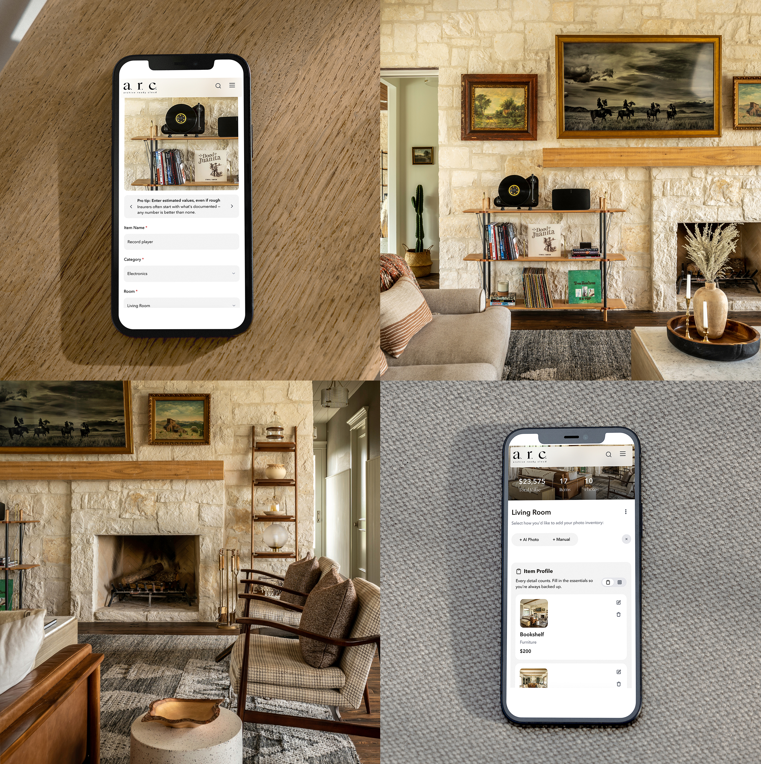
Vision pass: 565 case study images read and indexed. The search can now answer questions about what's actually in the pictures.
Chart system rebuilt on four shapes: sticks, rings, dots, swatches. An audit gate ships with it and runs green.
27 studies ported to the redesign in one pass. 29 of 30 now on Pressing.
Found 44 sections of authored copy rendering as nothing. Fixed.
New homepage. All the projects sit in one grid, and the search rearranges it instead of showing a list.
The shipped A.R.C. app runs framed inside its own case study.
41-agent review of the Pressing system. 34 real findings, all fixed, and the porting guide came out of it.
Pressing C shipped sitewide: new masthead, motion kit, Robert Rodriguez rebuilt as the reference implementation. The old site archived at site-v1.
Pressing C prototype added to the lab. The redesign started as one HTML file.
July 2026 17 entries
Competitive context shipped in PDP Copy Studio: retailer scans, per-retailer counts, and the whitespace read the rewrite cites.
2026 CRM email templates live. The Figma plugin resynced after serving a July 9 build for three weeks.
P0: the market scan had written zero records for seven days. Found, fixed, and the trends feed rebuilt as real masonry.
Strategy lane moved to Opus 5. Google Ads Keyword Planner wired live: real demand growth, ranked per source, refreshed weekly.
Jim can draw. A create_graphic tool ships vector output with a preview card.
Brand Theme Registry: the marketing calendar in Sally's own language. Jim moved to Sonnet 5 and writes Word documents.
Plays: signal-triggered campaign proposals, delivered with rendered assets.
PDP Copy Studio: Workspace and Page tabs. Jim proposes copy edits and saves them on confirm.
Awwwards: Nominee became Honors.
Intake workbook: WEB and PAID tabs added, and a validator that reads a filled workbook and prints a triage report.
Intake workbook generator v1. One Excel workbook drives the whole request pipeline.
The montage engine renamed twice in a week: SizzleReel, then Reel Tool, then Faux Reel.
Type scale rebuilt across the site, and the flowing headline pattern with it.
SizzleReel: a code-only montage engine. Fourteen transition types, a playground, a GIF exporter, and a case study with the tool running inside its own write-up.
The same engine ported into the portal that afternoon: saved reels, beat reordering, MP4 and GIF export straight to the DAM.
PDP Copy Studio: SEO and AEO chips, compliance guardrails, an attribute-schema fix. The editorial redesign went live the next day.
Category pages: featured heroes, plainer voice.
June 2026 3 entries
v1.0.1 build 5 to the App Store: in-app rating prompt at scan-save, and a pass over the store metadata.
Fixed the paywall's couldn't-load-subscriptions bug.
Build 1.0.0 (3) resubmitted to App Review, with the demo re-architected as a no-save trial.