Hill Country Oakworks.
Campaign for a Texas barrel maker. Sun-washed color, heritage silhouette, land and craft.
Field Art Direction Campaign Design
Author Jeremy Prasatik Published: 2019 Status: Live
Classification Art Direction Campaign Design
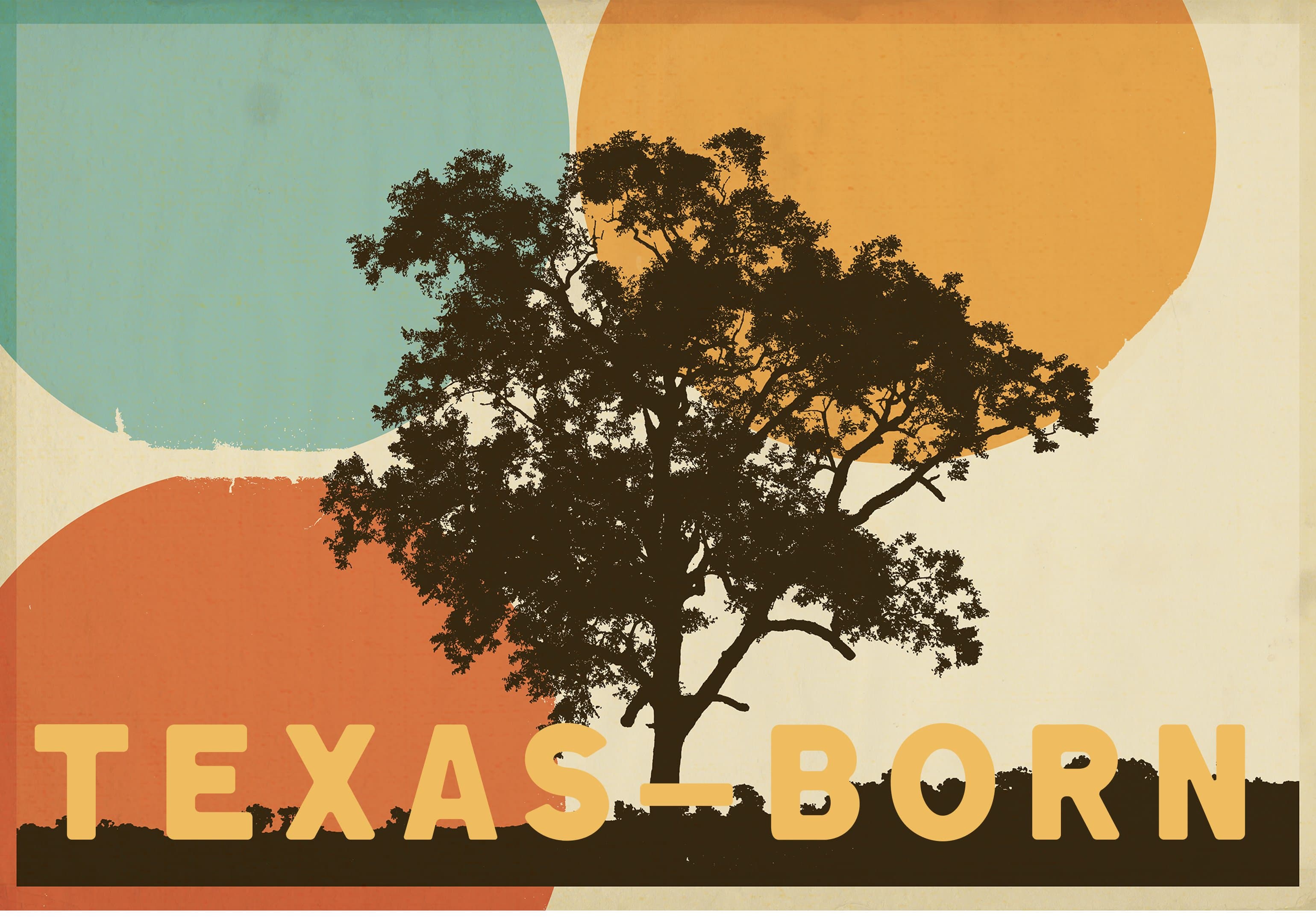
TL;DR Built→ Brand campaign for a Texas barrel maker. One graphic idea sized billboard to phone screen.Scope→ Art direction and campaign design.Tools→ Sun-washed palette: burnt orange, mustard, teal, cream, charcoal. Heavy geometric sans, vintage display face.Angle→ Heritage without the cosplay. Mid-century poster language carrying Texas without the Western cliché.
Abstract
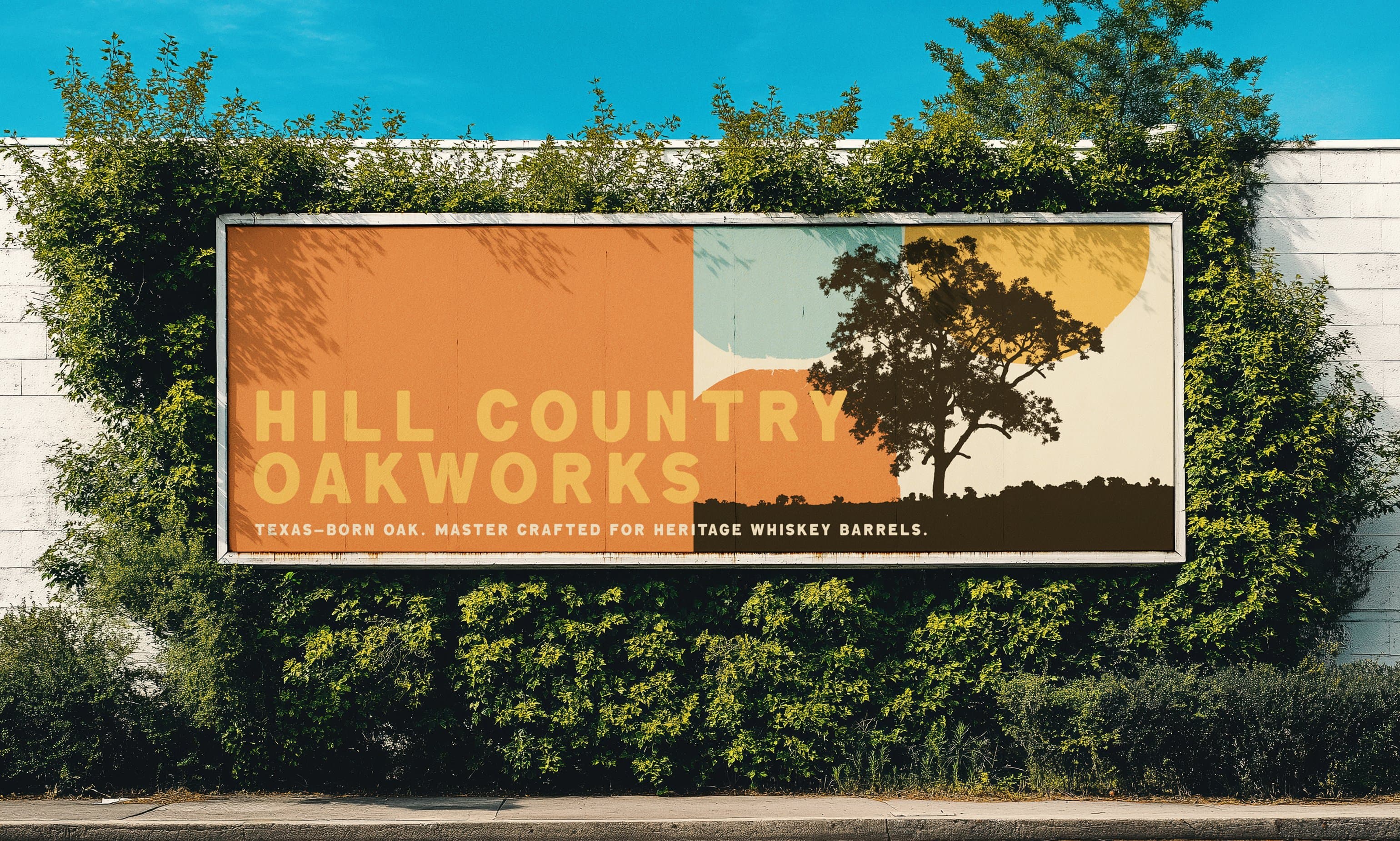
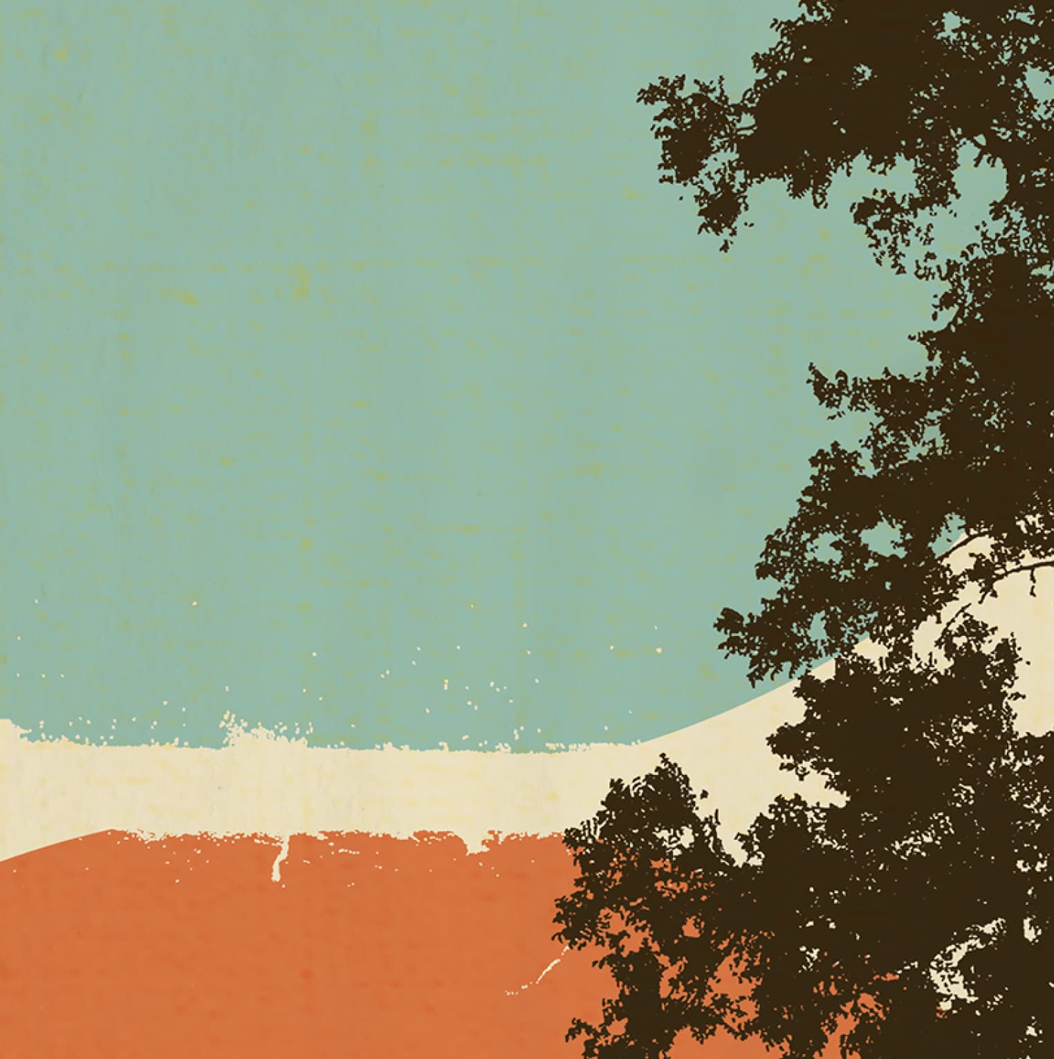
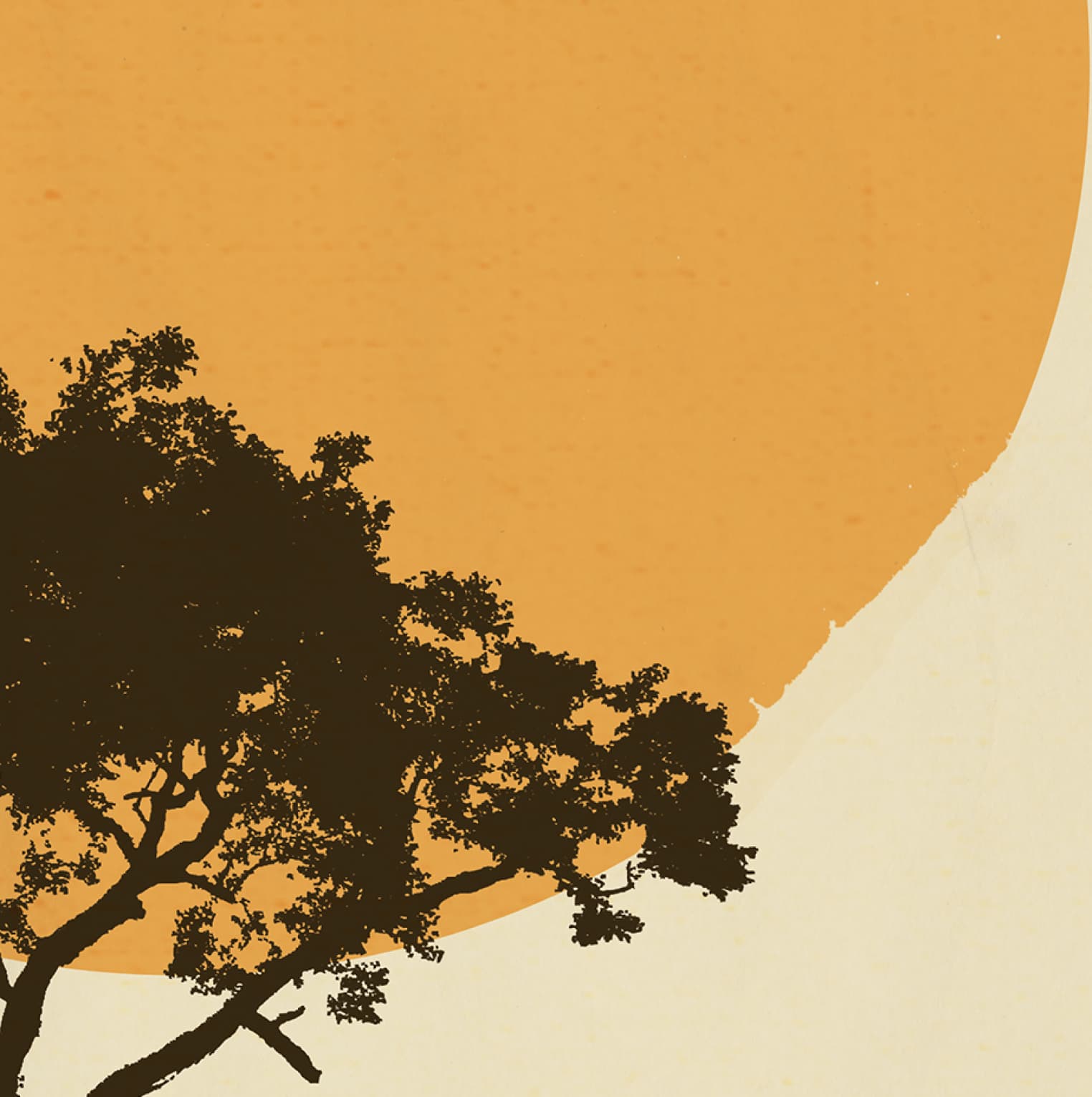
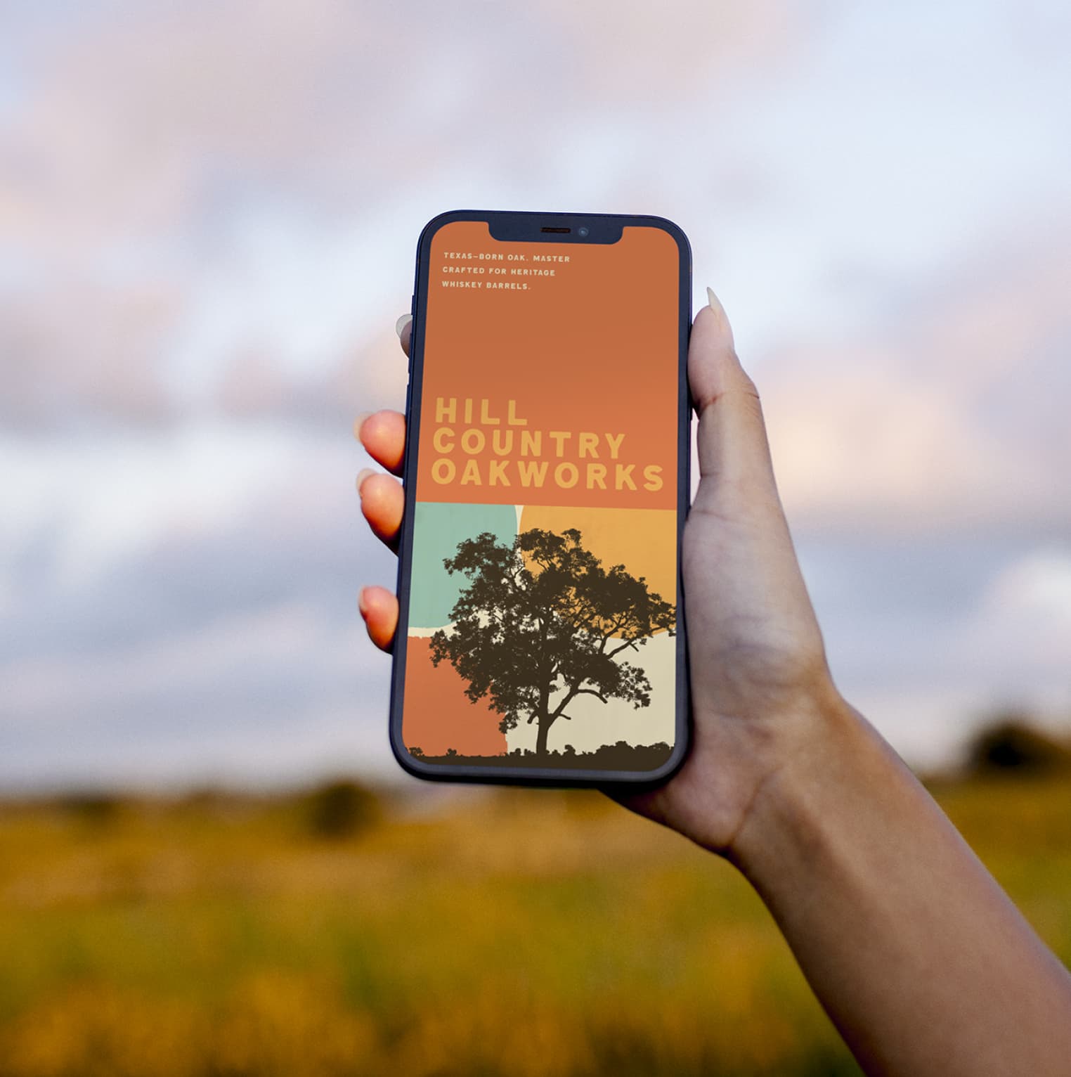
Texas oak, whiskey barrels, and the landscape that grows both. The brand needed a visual language that could carry from billboard to phone screen without losing the heritage feeling.
The system pulls from mid-century poster design - warm color blocking, silhouetted trees, geometric shapes that echo the barrel geometry. Typography stays utilitarian, and a distressed texture gives the whole thing weight without feeling forced.
Built to scale across billboard, print, and digital out of a single graphic idea.
Mid-Century Posters Meet Workshop Type.
Color blocking, tree silhouettes, a heavy geometric sans used at scale. The kit does the work the imagery doesn't need to.
The brief called for heritage without falling into Western cliché. Reference set: mid-century travel posters. Bold flat color, silhouetted nature, a wordmark that holds at billboard scale and at phone-screen scale. Texas, but printed.

Land and craft in one frame
One System Sized for Billboard to Phone Screen.
Campaign assets sized from outdoor banners down to phone screens, all sharing the same color blocking, silhouettes, and type. The surface changes, the brand doesn't.

A Sun-Washed Palette Paired with Workshop Type.
Five colors pulled from a Texas hour-before-sunset, one type family used at every weight the system needed - the same kit applied across every surface.
Chromatic brand circle
Cream
#ECE2C5
Paper, ground
Mustard
#ECC265
Wordmark, accents
Burnt Orange
#DA8849
Color blocks
Brick
#D45E3D
Foreground hills
Charcoal Brown
#3B2F1F
Silhouettes, type
Brand philosophy
The palette had to feel like Texas without leaning into red, white, and blue. Burnt orange, mustard yellow, teal sky, cream paper, charcoal silhouette. Pulled from old highway signs and the actual color of the landscape during last-light.
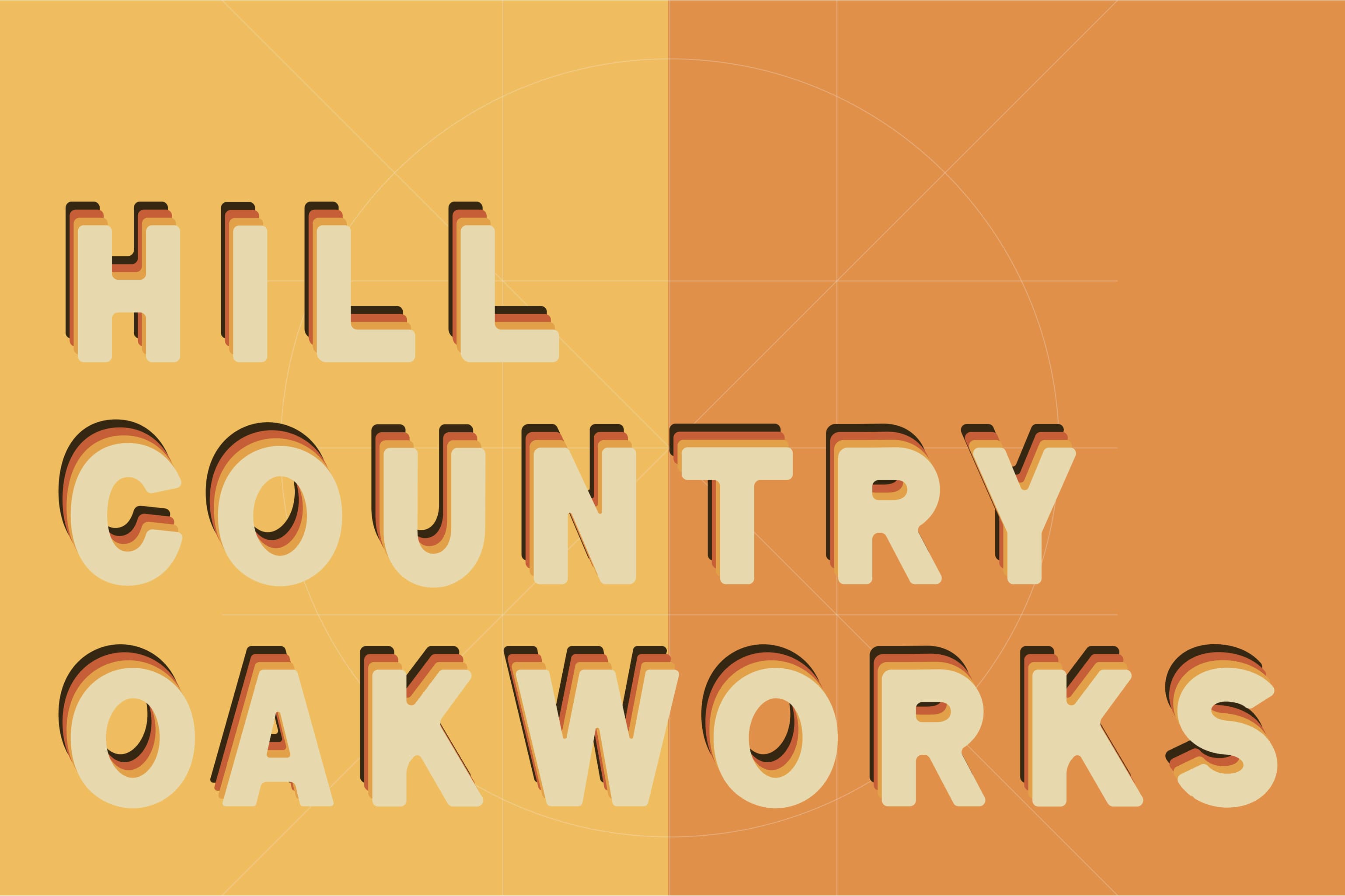
Greatdome carries the editorial headlines. Avenir Next runs everything else, heavy weight for the wordmark, lighter for body. The display face does the heritage work so the workhorse sans doesn't have to.
Greatdome Headline display
Vintage display face for editorial headlines and poster moments. Carries period character without leaning into kitsch.
Avenir Next Heavy Wordmark & posters
Heavy geometric sans for the wordmark and poster headlines. Holds shape at billboard scale and at phone-screen scale.
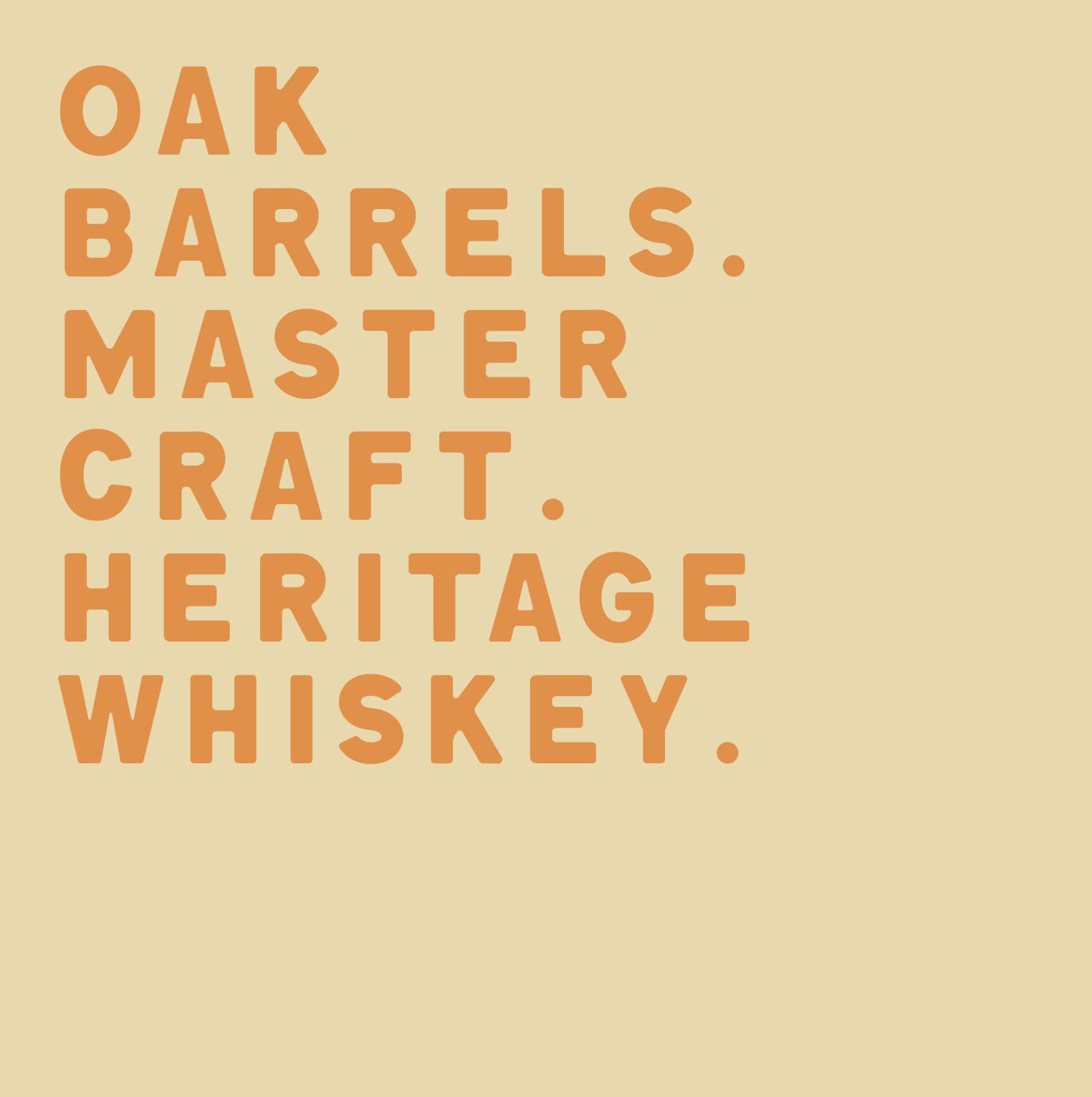
Avenir Next Demi Bold Tagline & subhead
Mid-weight for taglines like OAK BARRELS, MASTER CRAFT, HERITAGE WHISKEY. Carries the spec sheet voice.
Avenir Next Regular Body & captions
Standard weight for product descriptions, fact sheets, and any longer-form copy on packaging or print. Workshop-utilitarian, no flourish.
Greatdome
Headline display
Cream · #ECE2C5
Oakworks
Wordmark & posters
Mustard · #ECC265
Avenir Next Demi Bold
Tagline & subhead
Burnt Orange · #DA8849
Avenir Next Regular
Body & captions
Brick · #D45E3D
Heritage Without the Cosplay.
A campaign language built once and applied everywhere - the same color blocks, silhouettes, and type running across every surface the brand lands on.
Services
Art Direction
Campaign Design
Stack
Illustrator
Photoshop
InDesign
Links
A Texas barrel maker needed a brand language that could carry from a roadside billboard down to a phone wallpaper without diluting. Mid-century color blocking, silhouetted oaks, and utilitarian type held the system together. Heritage without the cosplay.