Hill Country Kitchen
Four materials applied across every surface, fixture, and finish. The constraint held the room together.
Field Interior Design Kitchen Design Material Specification
Author Jeremy Prasatik Published: 2023 Status: Complete
Classification Interior Design Kitchen Design Material Specification Custom Millwork
TL;DR Built→ Ground-up Hill Country kitchen. Cabinetry, island, dining zone, full material spec.Scope→ Interior design, space planning, fixture selection, construction documentation.Materials→ Sage green, raw white oak, Calacatta marble, unlacquered brass. Four finishes, every surface.Angle→ Designed the way a product gets designed. Lock the palette to four, let the constraint become the aesthetic.
Abstract
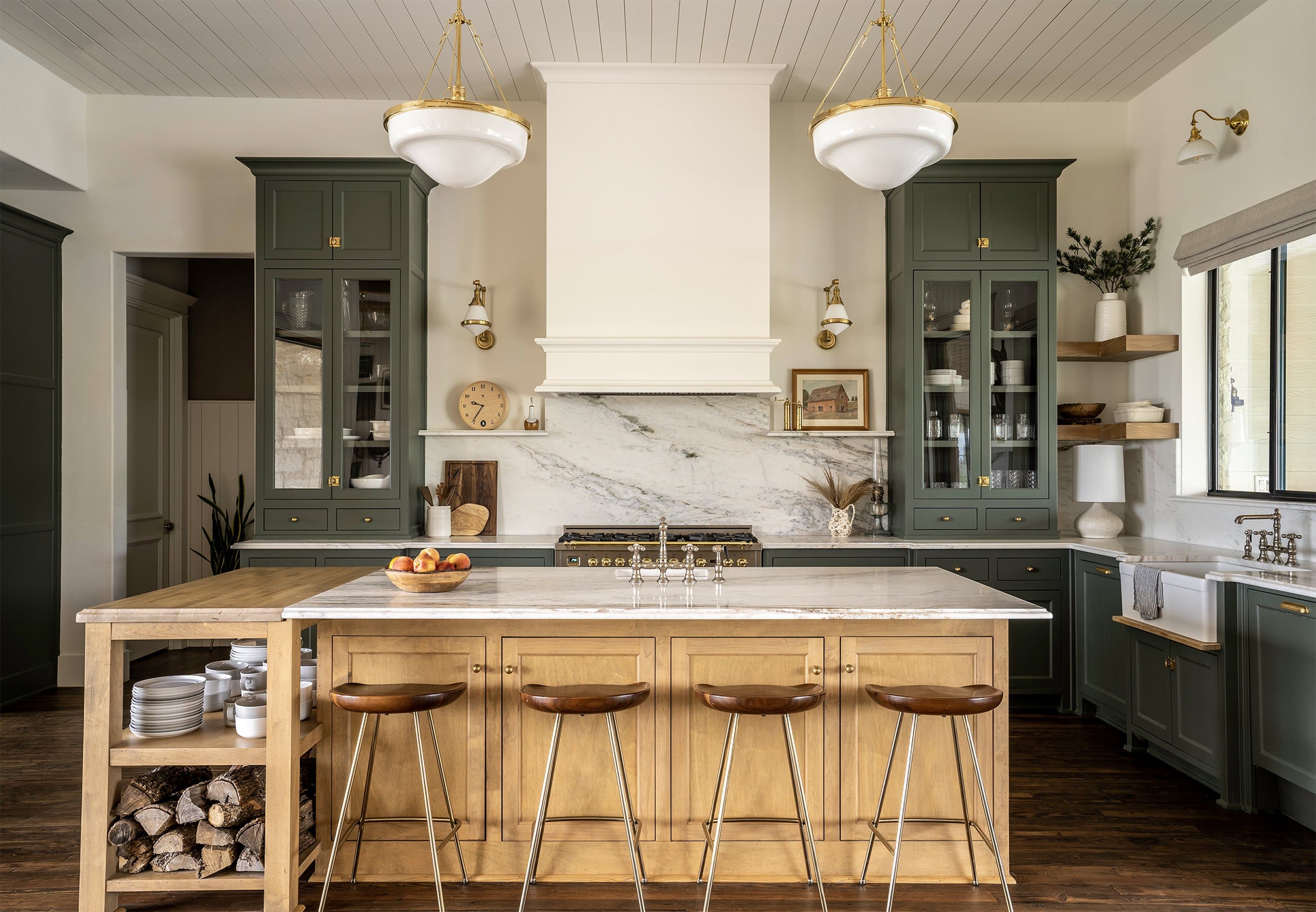
A kitchen designed the way a product gets designed. The material palette is the design system - sage green setting the dominant surface, raw white oak providing the warm counterpoint, Calacatta marble handling the work surfaces and backsplash, unlacquered brass connecting every touchpoint. Four finishes applied consistently across every cabinet face, countertop, and piece of hardware in the room.
The style mixing is deliberate. Shaker-profile cabinet doors reference traditional American kitchens, steel-frame windows and open shelving pull contemporary, cremone bolts and schoolhouse pendants read European antique, and a turned-leg dining table sits against leather safari chairs. None of these elements belong to the same era - they belong to the same room because the material palette holds them together.
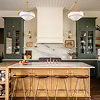
The space functions as the central hub of a Texas Hill Country home, used for cooking, gathering, and working in roughly equal measure. The island anchors the room, with open shelving at one end, seating at the other, and a marble work surface running the full length. Every decision was made for how a family actually uses a kitchen, not how one photographs.
A Four-Finish Palette Locked Before Drawing.
The palette was locked before a single cabinet got drawn. Sage green, white oak, Calacatta marble, unlacquered brass - every specification traces back to one of these four, with no accent materials, no tile backsplash, no stainless pulls, no painted island.
Constraint at the material level works the same way it works in any design system - fewer variables means stronger cohesion. A room with twelve finishes feels decorated. A room with four feels designed. The limitation forced every surface to carry more visual weight, and the relationships between materials became the entire aesthetic.
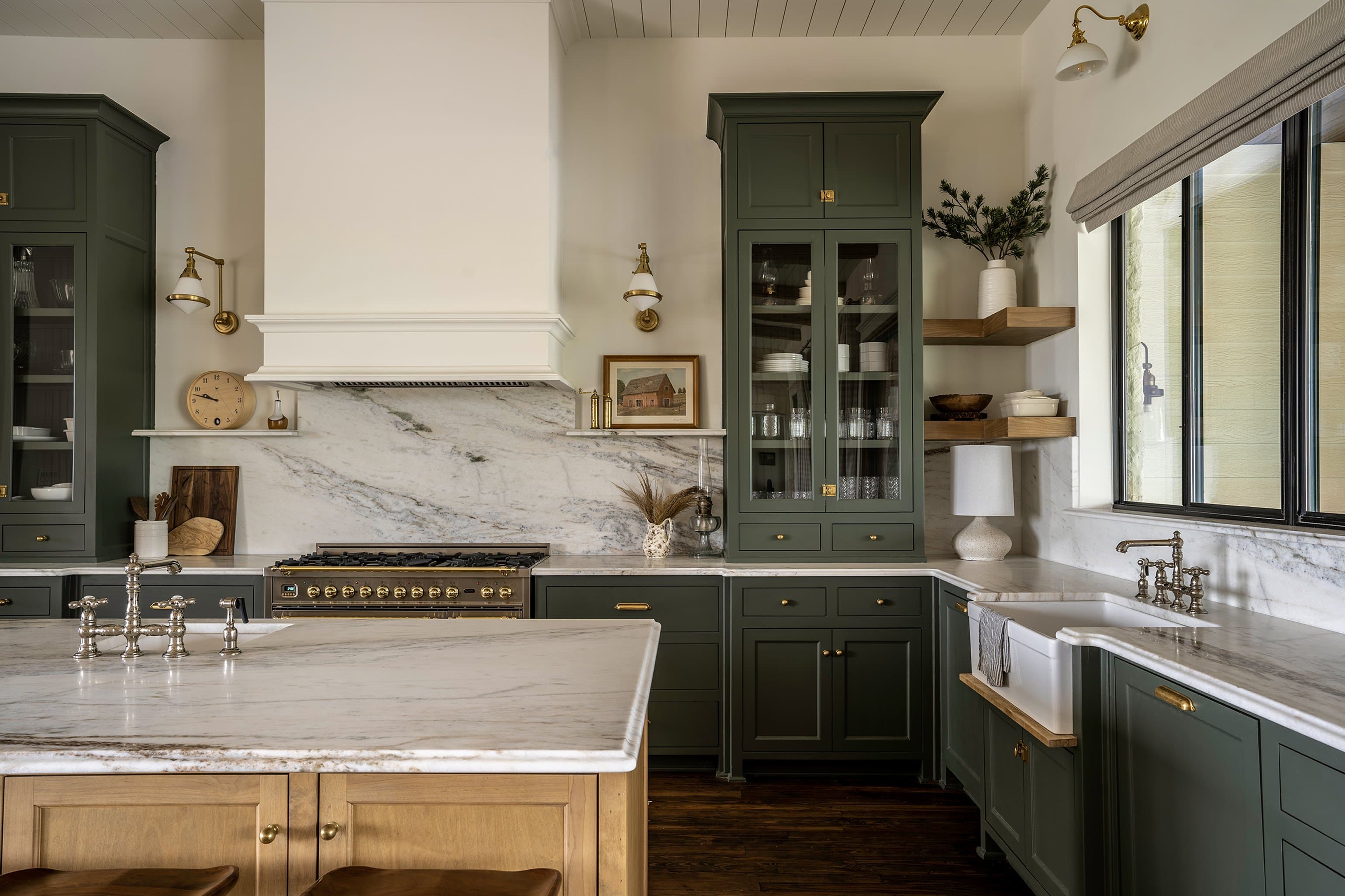
The cabinet color sets the room's identity. A muted sage with enough gray to read sophisticated, enough green to read alive, applied floor to ceiling on the perimeter: base cabinets, uppers, glass-front display, the range hood surround, the refrigerator panel, the pantry wall. The color doesn't compete with the marble or the brass - it recedes just enough to let the textures work.
The finish is matte. Satin would have pushed the cabinets toward contemporary and gloss would have fought the raw oak, but matte lets the shaker profiles cast soft shadows and keeps the room feeling grounded rather than polished.
The island is raw white oak, unsealed, with the grain visible and the end-grain on the open shelving showing the growth rings. This is the warmest element in the room and the most honest one - it ages, darkens, and marks, which is the point.
Calacatta marble runs the perimeter countertops and the full backsplash behind the range. Gray and gold veining against a warm white base. The marble does the visual work of separating the green cabinetry from the white walls - the transition material. Where oak meets green, marble mediates.
Every metal touchpoint is the same finish - cabinet pulls, cremone bolts on the tall pantry doors, the bridge faucet, pendant light fixtures, sconce arms, range knobs and trim. Even the bar stool frames pick up the brass tone.
Unlacquered means the brass patinas. It darkens at the touchpoints and stays bright where hands don't reach, so after a year the hardware tells you exactly how the kitchen gets used. The pulls on the most-opened drawers develop the deepest color while the decorative bolts stay pale. Functional archaeology built into the material choice.
Sage Green
The cabinet color sets the room's identity. A muted sage with enough gray to read sophisticated, enough green to read alive, applied floor to ceiling on the perimeter: base cabinets, uppers, glass-front display, the range hood surround, the refrigerator panel, the pantry wall. The color doesn't compete with the marble or the brass - it recedes just enough to let the textures work.
The finish is matte. Satin would have pushed the cabinets toward contemporary and gloss would have fought the raw oak, but matte lets the shaker profiles cast soft shadows and keeps the room feeling grounded rather than polished.
White Oak + Marble
The island is raw white oak, unsealed, with the grain visible and the end-grain on the open shelving showing the growth rings. This is the warmest element in the room and the most honest one - it ages, darkens, and marks, which is the point.
Calacatta marble runs the perimeter countertops and the full backsplash behind the range. Gray and gold veining against a warm white base. The marble does the visual work of separating the green cabinetry from the white walls - the transition material. Where oak meets green, marble mediates.
Unlacquered Brass
Every metal touchpoint is the same finish - cabinet pulls, cremone bolts on the tall pantry doors, the bridge faucet, pendant light fixtures, sconce arms, range knobs and trim. Even the bar stool frames pick up the brass tone.
Unlacquered means the brass patinas. It darkens at the touchpoints and stays bright where hands don't reach, so after a year the hardware tells you exactly how the kitchen gets used. The pulls on the most-opened drawers develop the deepest color while the decorative bolts stay pale. Functional archaeology built into the material choice.


Shaker Cabinets, Brass at Every Touchpoint.
The cabinet program runs floor to ceiling on three walls. Base cabinets, upper glass-fronts, a built-in hutch flanking the range, full-height pantry storage with cremone bolt closures. The same sage green, the same shaker profile, the same brass hardware throughout.
Cremone bolts on the tall pantry doors are the signature hardware choice. A French mechanism on American shaker cabinets in a Texas kitchen. The style collision is the point. The bolts add vertical visual interest to the tallest cabinet faces and give the pantry wall architectural presence that standard pulls would miss. They also function well. A single lever locks top and bottom simultaneously.


The constraint became the entire aesthetic
Raw Oak Anchoring the Whole Room.
The island is the primary interaction surface for prep, cooking, eating, gathering, and homework. It needed to handle all of it without looking like it was trying to. Raw white oak solved the problem.
Open shelving on the working end holds plates and bowls within arm's reach of the dishwasher. A firewood cubby at the base adds texture and signals that this kitchen connects to the rest of the property. The marble top runs the full length, transitioning from food prep surface to bar seating without a material break. Four bar stools with brass-tone frames tuck under the overhang. The island feels like furniture, not cabinetry. That distinction matters. Furniture invites interaction. Cabinetry stores things.
White oak with no stain and no polyurethane seal, just a penetrating oil finish that lets the wood breathe and develop character over time. The grain stays open and the color will shift from pale honey to deeper amber across years of use.
This was the riskiest material call in the kitchen. Raw wood in a wet environment invites concern, but the response was that this is Texas Hill Country, not a showroom. The island should look used - water rings, knife marks, flour dust in the grain. The patina is the design intent.
The island sits centered in the room with circulation on all four sides. It's the first thing visible from the entry. The scale is generous. Eight feet of usable counter, open shelving visible from the dining side, seating for four on the bar side.
Every sight line in the kitchen crosses the island. From the range, you look over it to the windows. From the dining table, you look through it to the backsplash. The oak breaks up the green-and-marble perimeter and gives the eye a warm landing point at the center of every view.
The island has legs - visible legs with open shelving between them - and that's the detail that makes it read as a freestanding piece rather than a built-in. The perimeter cabinets are architecture, and the island is furniture.
That distinction changes how people approach it. Guests lean on furniture, they sit around it, they set things on it without asking. A cabinet island with solid panels and a granite overhang creates a barrier, while an oak table with open shelves creates an invitation.
The Oak Choice
White oak with no stain and no polyurethane seal, just a penetrating oil finish that lets the wood breathe and develop character over time. The grain stays open and the color will shift from pale honey to deeper amber across years of use.
This was the riskiest material call in the kitchen. Raw wood in a wet environment invites concern, but the response was that this is Texas Hill Country, not a showroom. The island should look used - water rings, knife marks, flour dust in the grain. The patina is the design intent.
Spatial Anchor
The island sits centered in the room with circulation on all four sides. It's the first thing visible from the entry. The scale is generous. Eight feet of usable counter, open shelving visible from the dining side, seating for four on the bar side.
Every sight line in the kitchen crosses the island. From the range, you look over it to the windows. From the dining table, you look through it to the backsplash. The oak breaks up the green-and-marble perimeter and gives the eye a warm landing point at the center of every view.
Furniture vs. Cabinetry
The island has legs - visible legs with open shelving between them - and that's the detail that makes it read as a freestanding piece rather than a built-in. The perimeter cabinets are architecture, and the island is furniture.
That distinction changes how people approach it. Guests lean on furniture, they sit around it, they set things on it without asking. A cabinet island with solid panels and a granite overhang creates a barrier, while an oak table with open shelves creates an invitation.

A Dining Zone on the Same Palette.
The dining area occupies the same open room but holds its own mood. A dark-stained turned-leg table set against the light oak and green of the kitchen. The shift is abrupt on purpose - a different activity, a different material temperature.
Leather-and-oak safari chairs surround the table. The leather picks up the brass warmth. The oak frames reference the island wood. A dark patterned rug grounds the furniture group and separates it visually from the kitchen's hardwood floor. The dining zone uses the kitchen's palette but runs it quieter - darker, more contained.


Designed the way a product gets designed.
Systems Thinking Applied to a Room
A kitchen where every specification traces back to the same four-material palette. The room holds together because the system holds together.
Services
Interior Design
Space Planning
Material Specification
Construction Documentation
Fixture Selection
Stack
AutoCAD
SketchUp
Adobe Creative Suite
Links
The same discipline that makes a digital design system work makes a room work. Limit the variables, define the relationships between elements, apply them consistently, and let the constraints generate the aesthetic rather than fight against them.
Four materials, repeated across every surface - sage green on the vertical planes, marble on the horizontal, oak at the center, brass at every point of contact. The style mixing of shaker cabinets next to steel windows next to French hardware holds together because the material system holds together.
The kitchen functions as a hub. Cooking flows into gathering flows into working flows into eating, and the spatial plan supports all of it without dedicated zones that go unused half the day. The island handles prep, serving, and seating simultaneously, and the dining table sits close enough to stay connected and far enough to feel separate.