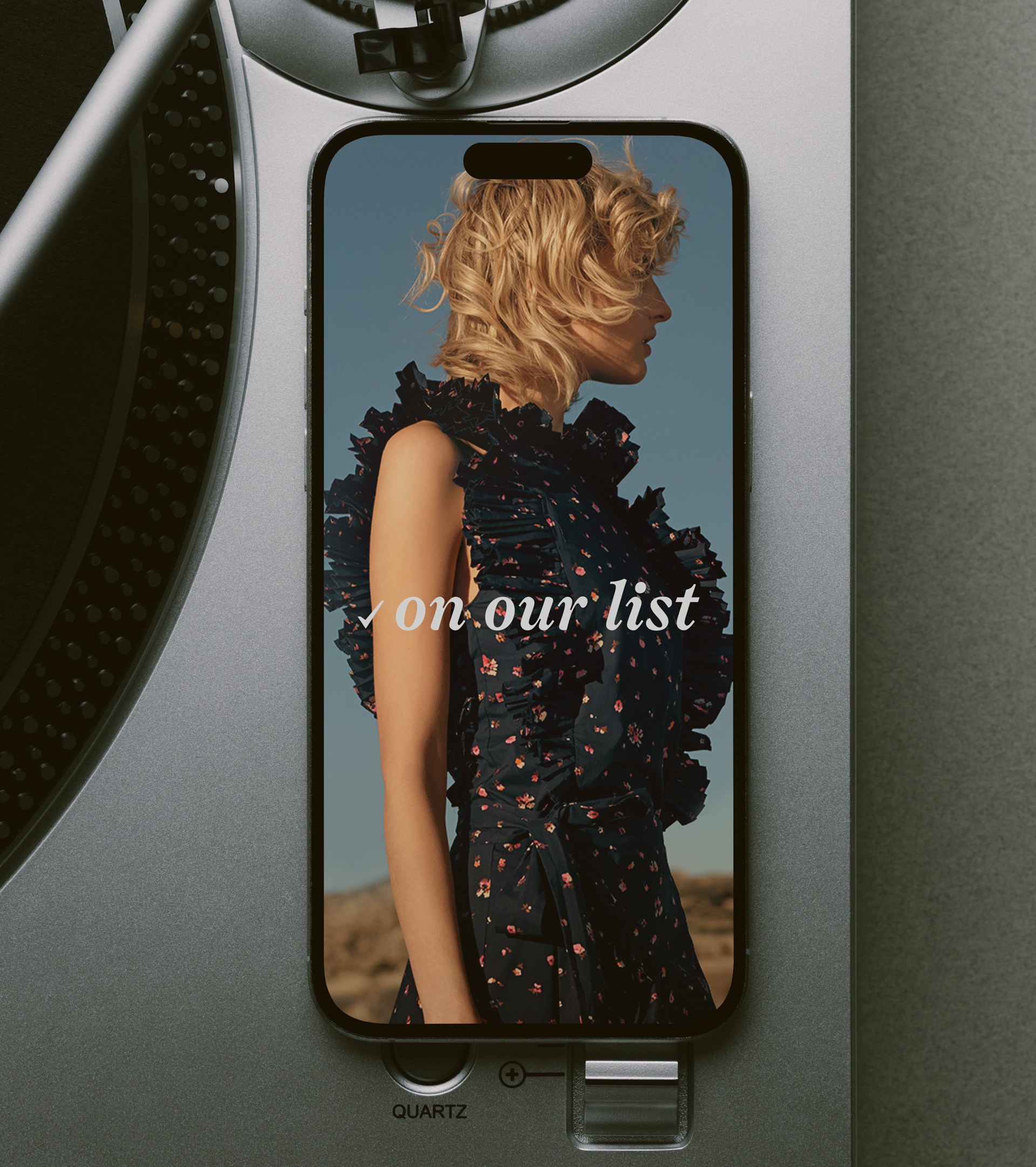
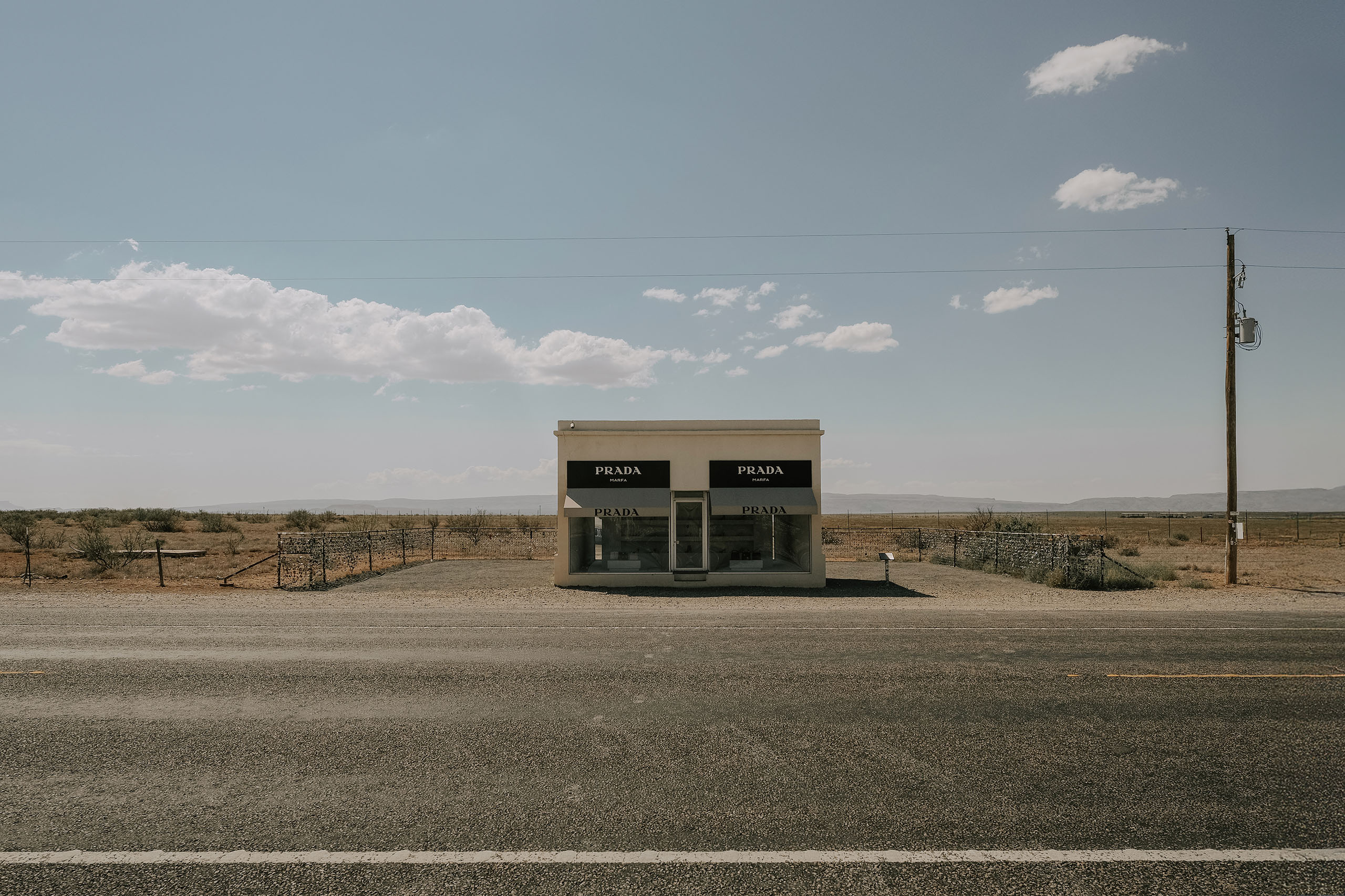
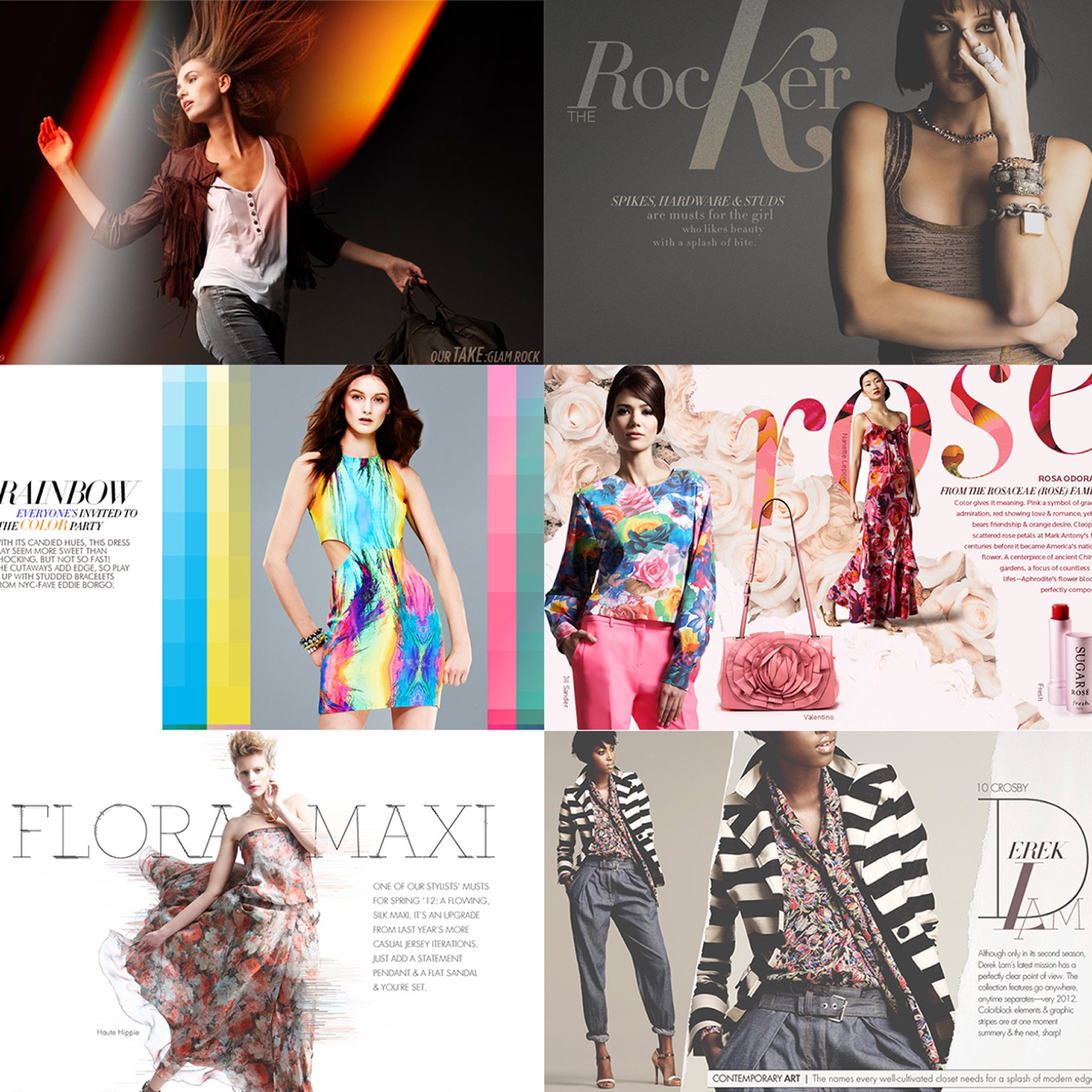
Jeffrey New York's first online store, built from zero: the brand, the site, and the way it told stories. A gallery of a shop, translated to a screen without flattening it into a catalog.
Preview · 6 frames
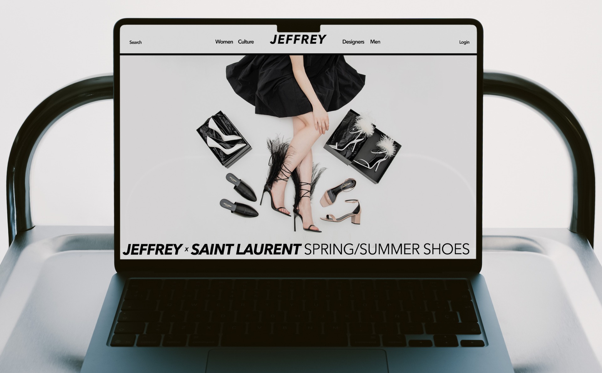
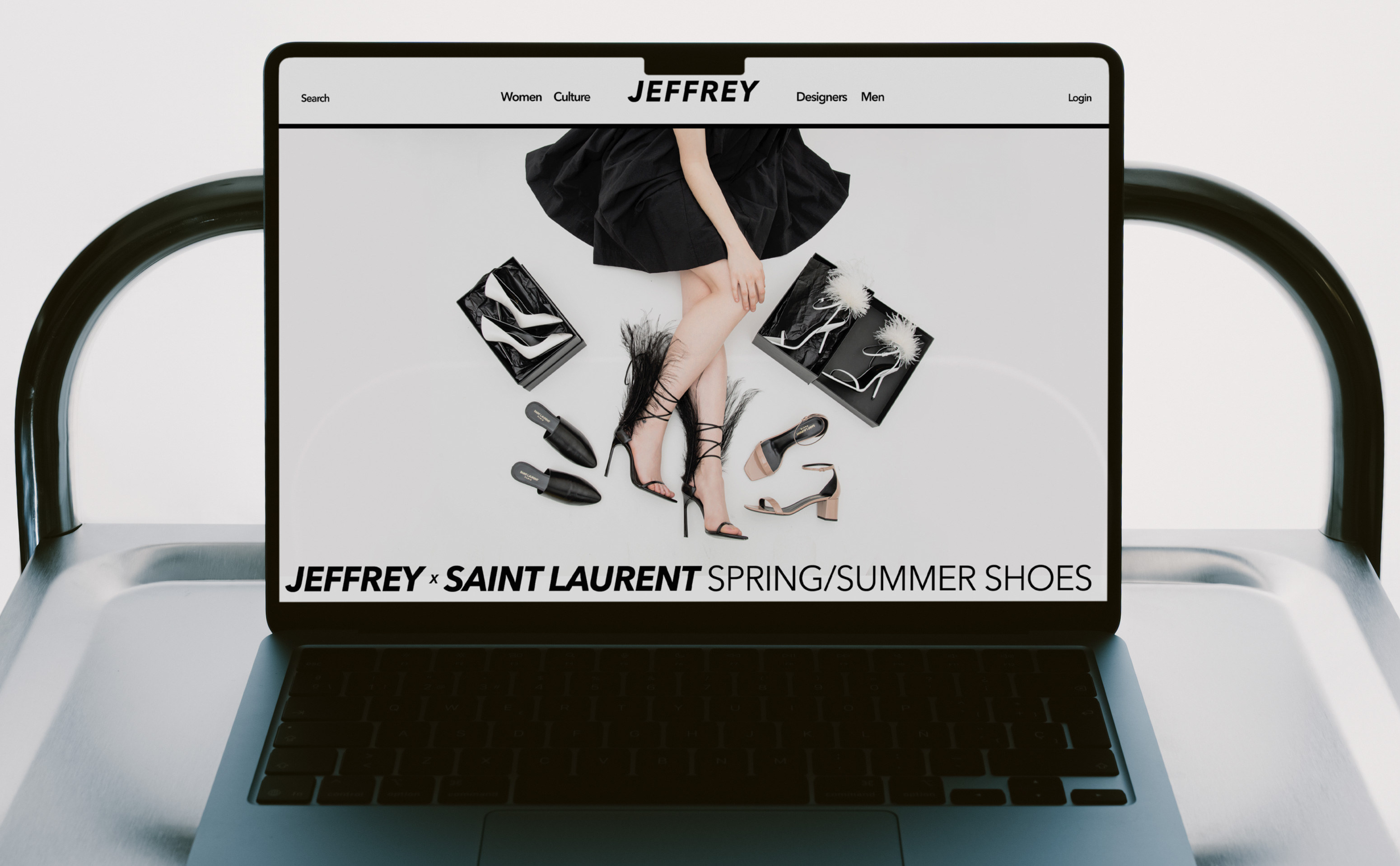
The Jeffrey homepage open on a laptop, the Jeffrey x Saint Laurent spring/summer shoes story running across it
2Six Homepages

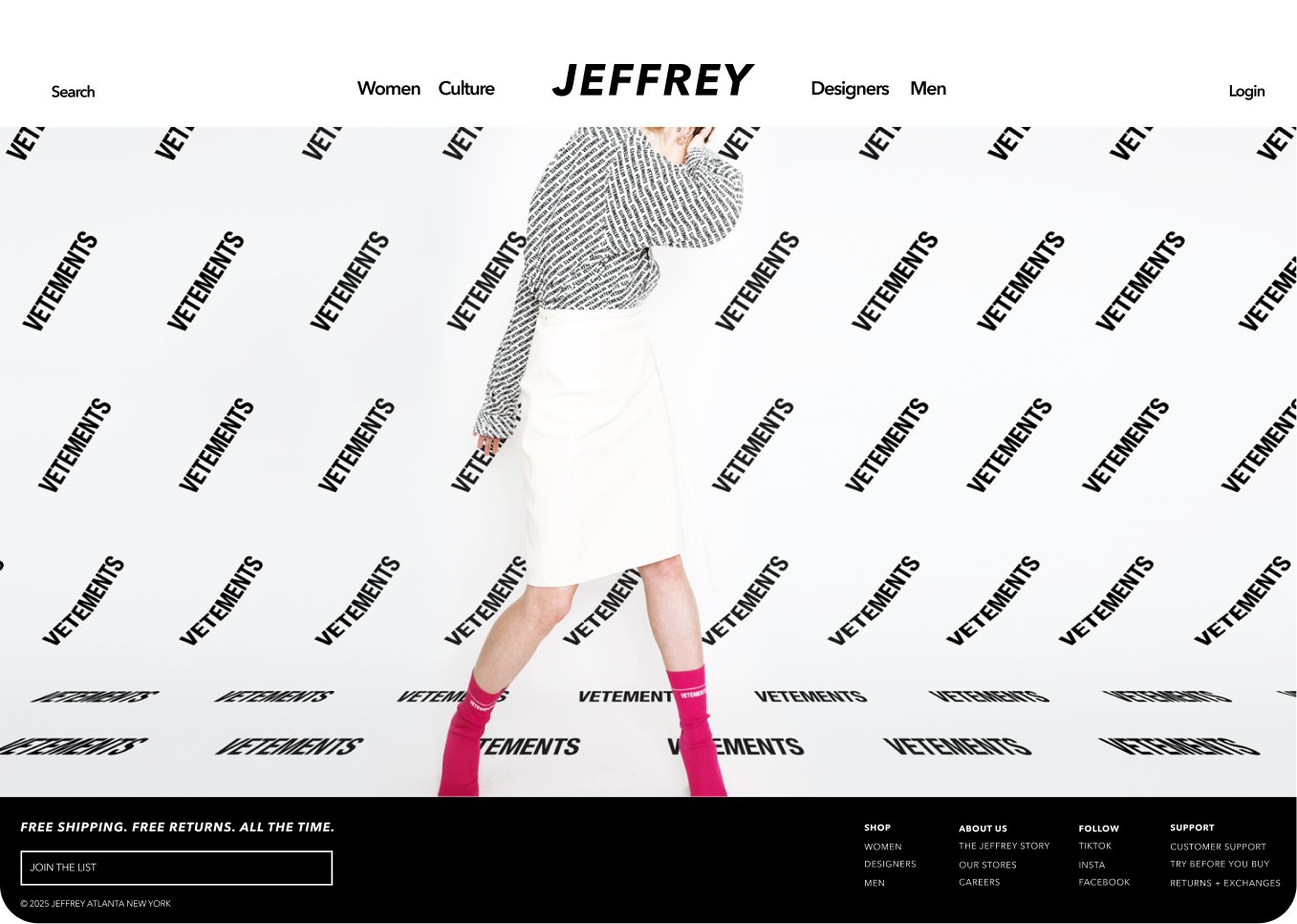
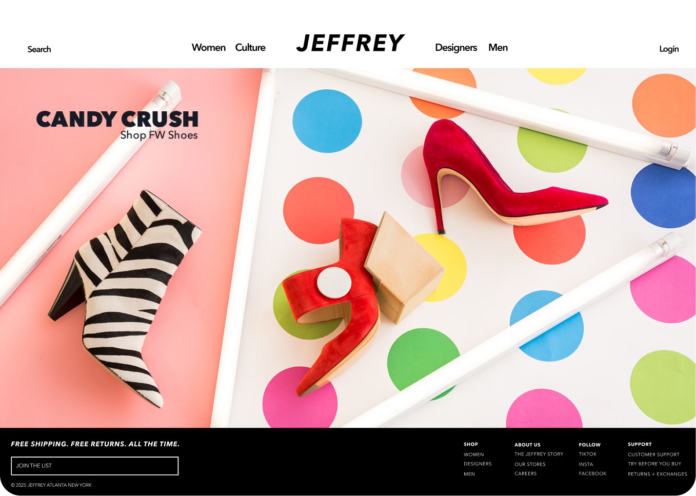
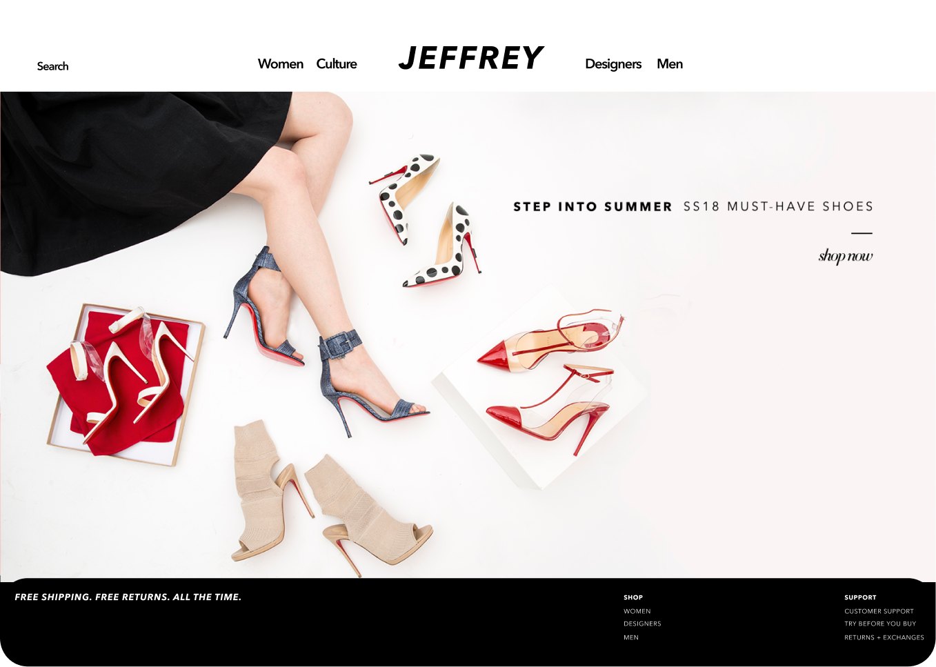
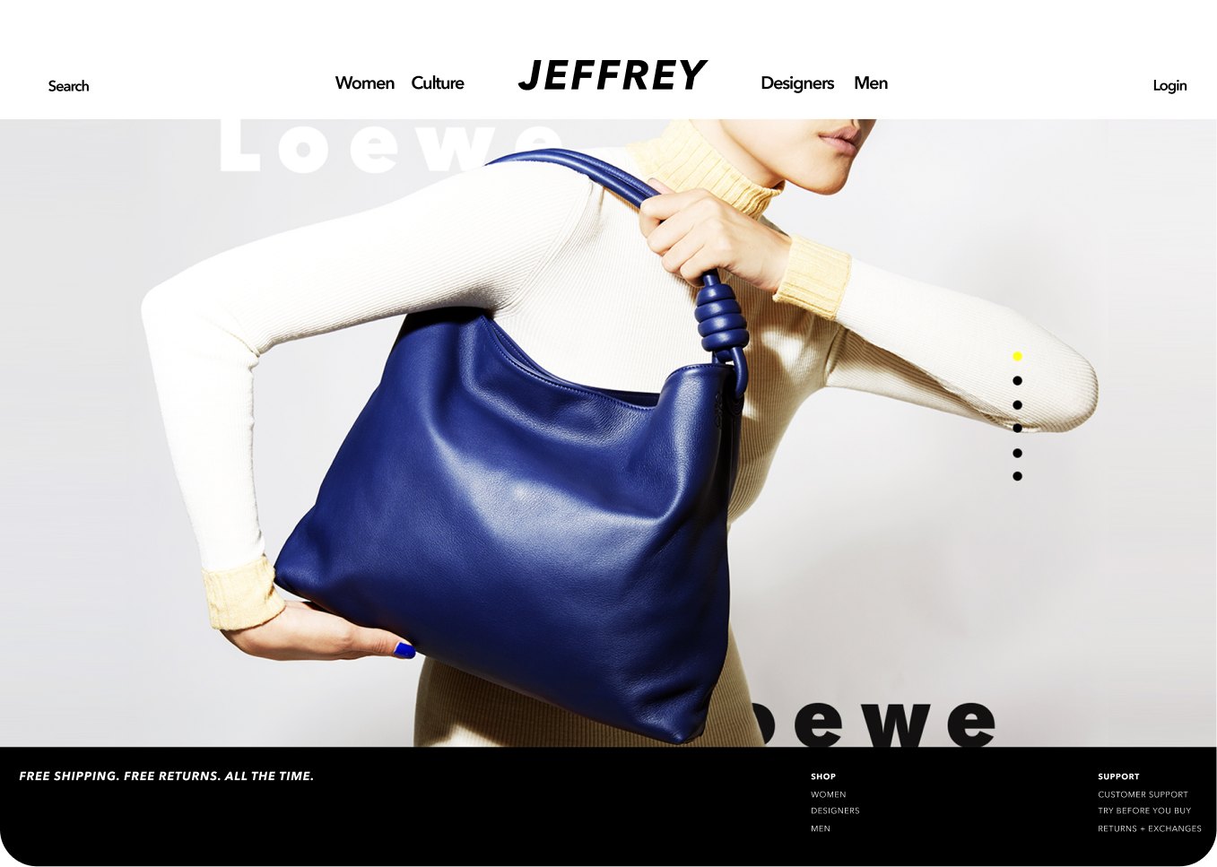
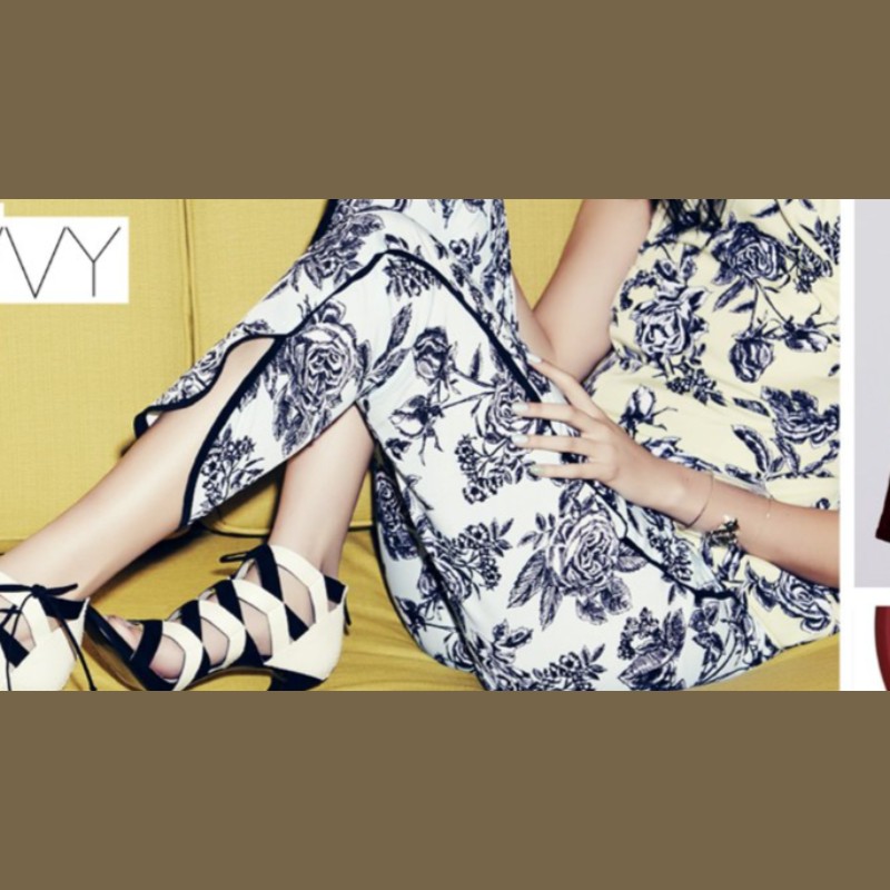
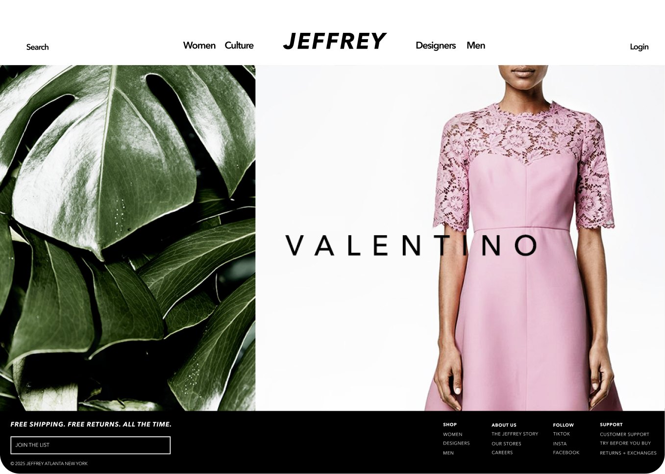
Dries Van Noten, Valentino, Vetements, a Candy Crush shoe story, summer shoes, Loewe. The masthead and footer stayed put.

The floor got regrouped every time the season shifted, and the homepage had to turn over the same way. So the templates for a launch or a new story came first, and the product pages came after.
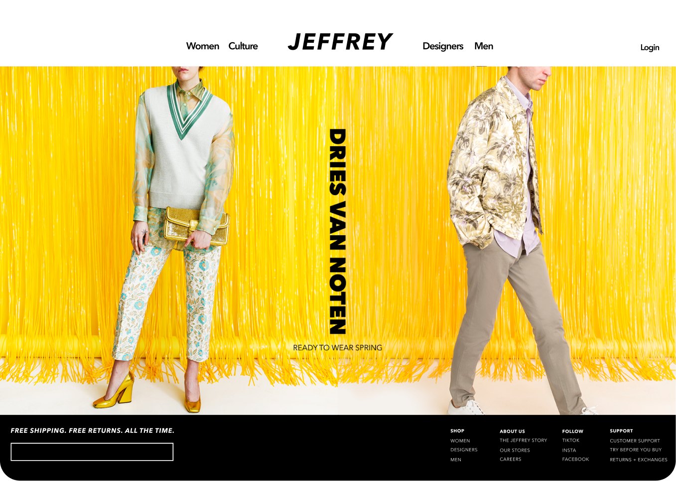
Jeffrey New York homepage, Dries Van Noten ready-to-wear against a yellow fringe backdrop
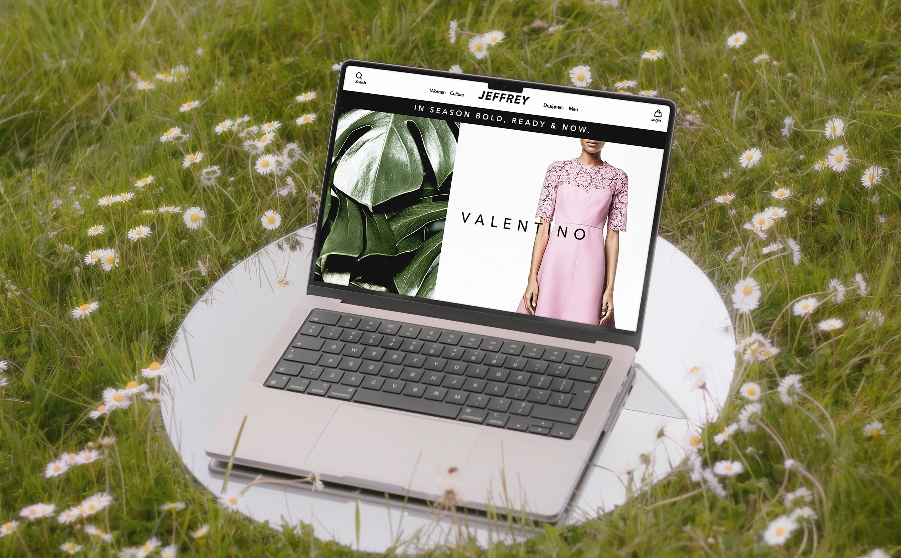
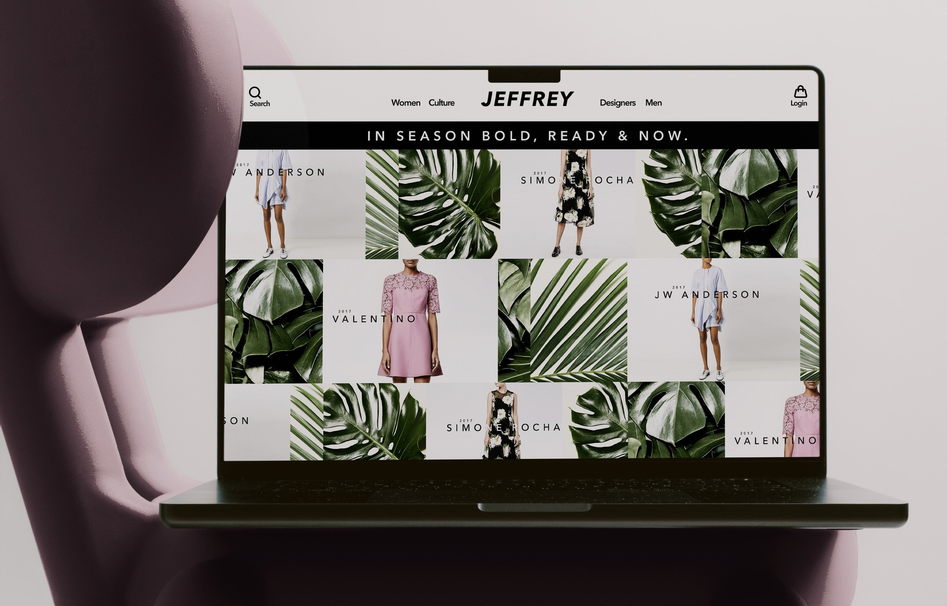
Jeffrey New York homepage, Valentino pink lace dress paired with monstera leaves
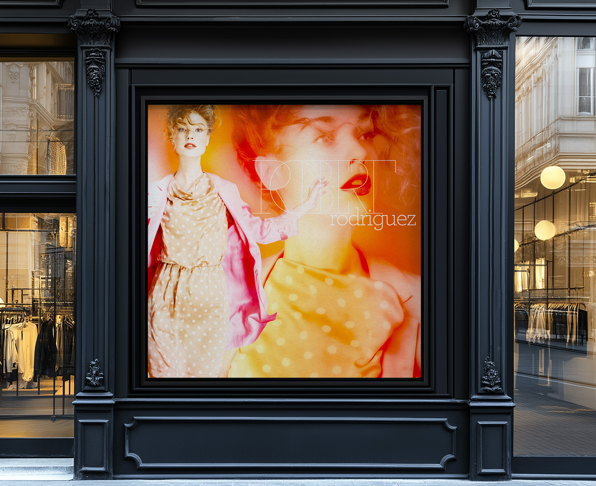
Jeffrey New York homepage, Vetements logo step-and-repeat wall
Jeffrey New York homepage, Candy Crush fall shoes on a polka-dot set
Jeffrey New York homepage, Step Into Summer must-have shoes
Jeffrey New York homepage, Loewe blue leather bag
The Valentino homepage open on a laptop sitting on a small table in a field of daisies

Built to change as often as the store did

3Modular Grids

The product page ran one large photograph and little else.

A short row of curated cross-sells sat underneath. Navigation followed the edit instead of a list of categories, the same way the floor did.

Merchandising could lay out a new season without touching the templates underneath: swap the photography, swap the copy, publish. The type hierarchy did not move, which is what kept the site from sliding toward a catalog as the store grew.
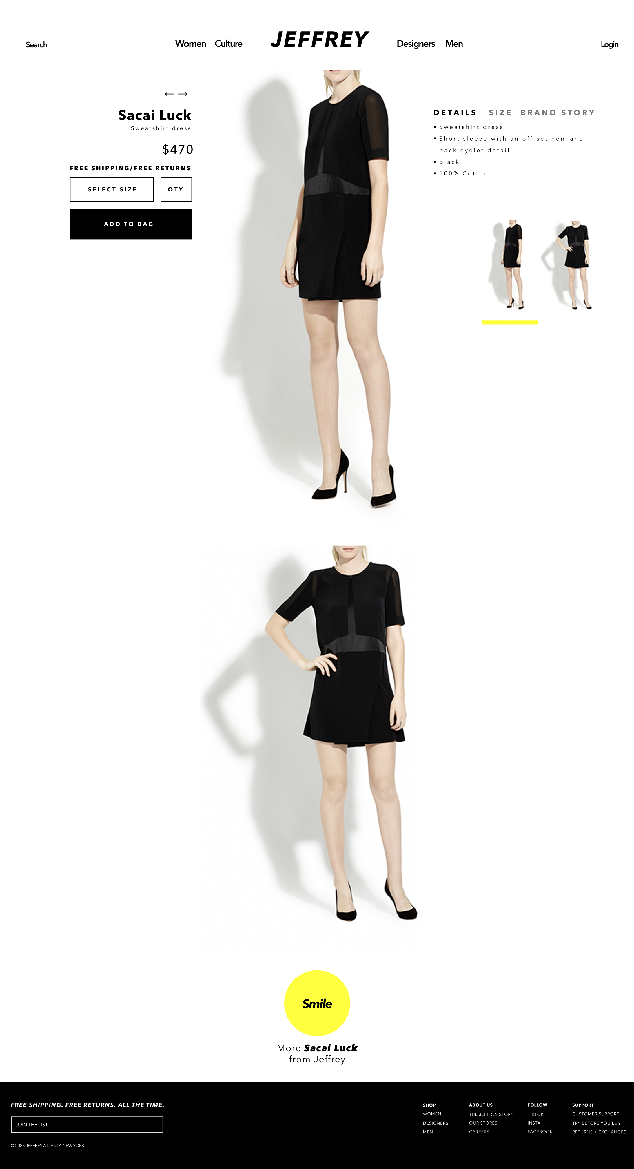

Jeffrey New York product detail page — large imagery, minimal chrome, curated cross-sells
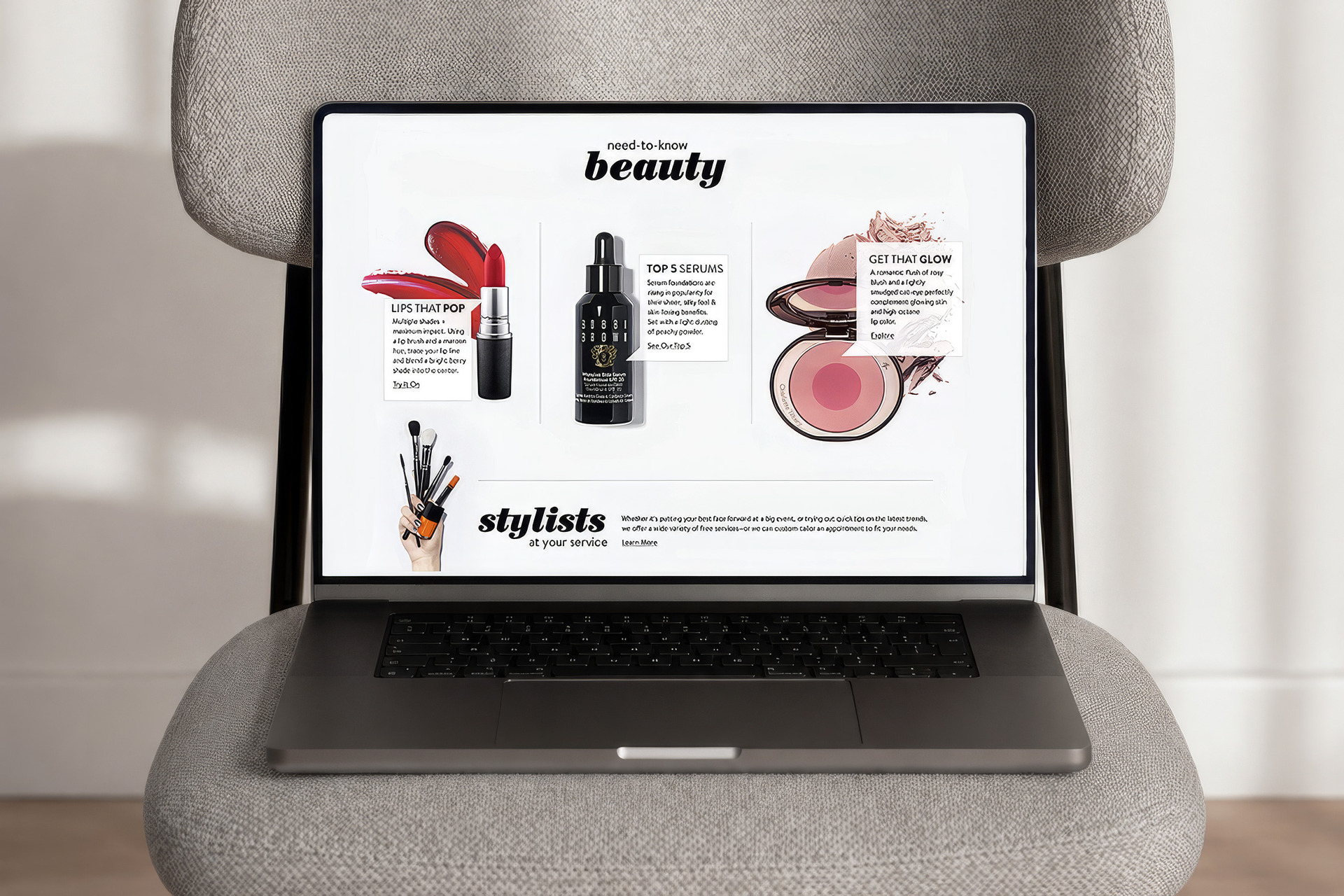
Jeffrey New York site in context — additional editorial hero
03

Homepage editorial spread
Designer launch as the lead moment
Photography carries the page

Scroll. It fills the mat, then travels the frame
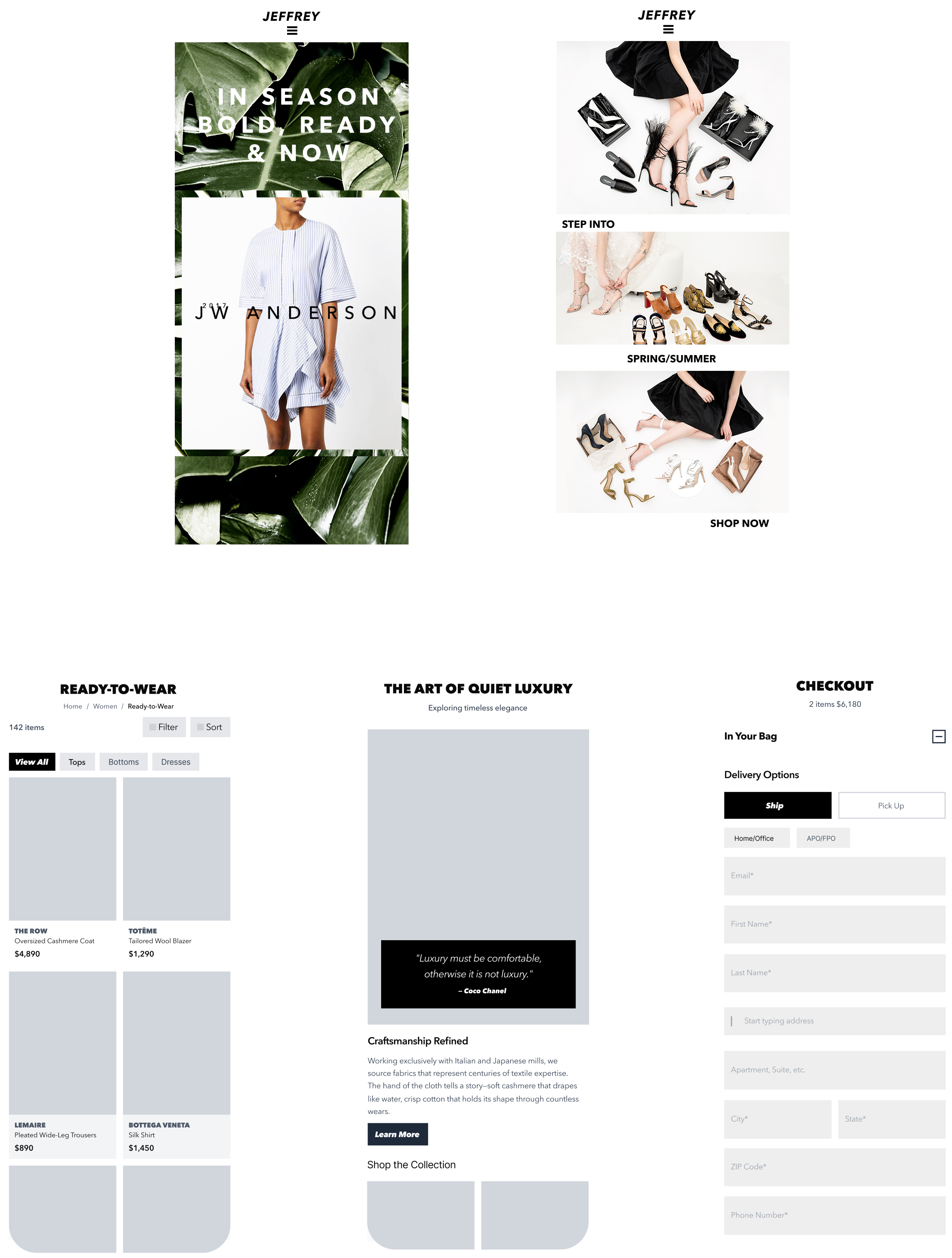
Jeffrey New York system spread — homepage, designer page, and product templates rendered together

The wordmark, Avenir Next Heavy Italic set wide, worked as a graphic mark before it read as a name. Everything else stayed out of the photography's way.

The palette is narrow on purpose. Charcoal for the type, cream as the ground so the photography reads, a soft gray for captions and meta, and one yellow accent pulled straight from the wordmark for the editorial moments. There is no second accent. The merchandise brings whatever color it needs. The type is one family. Avenir Next Heavy for the wordmark and feature headlines, Demi Bold for subheads and calls to action, Medium for everything else. The weights do the hierarchy on their own, so there is no second typeface.
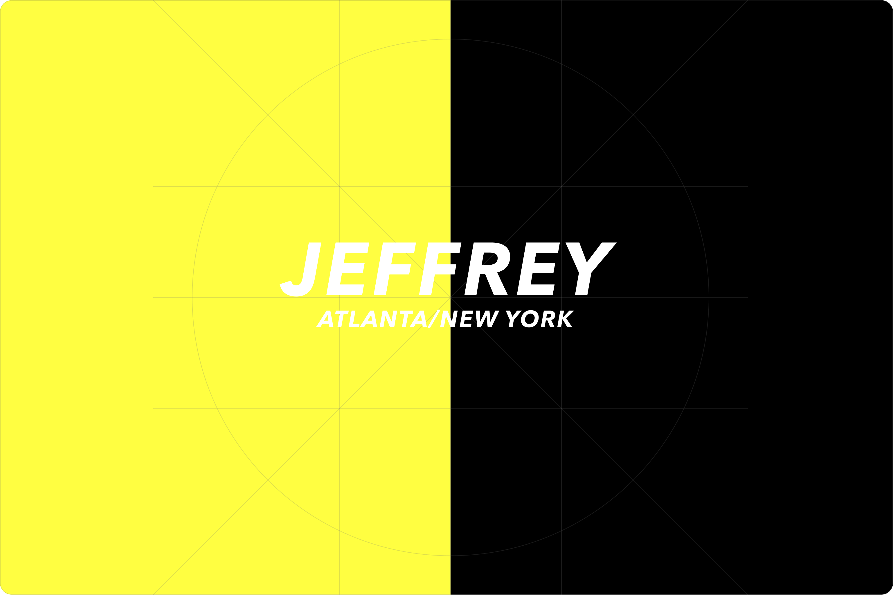
MarkMark: The markThe mark
TypefaceJEFFREYJEFFREYWordmark
Palette
4Four Pieces

The chart traces those four pieces from the brand experience at the center out through every surface a customer touched. Denser rays mean more assets on that surface.

Surface load8 surfaces · 358 assets · 6 system elements
WORDMARKAVENIR NEXTHEAVYDEMI BOLD/ CTAMODULARGRIDEDITORIALPHOTOGRAPHYCURATORIALVOICEHOMEPAGE MODULES12DESIGNER PAGES38PRODUCT DETAIL PAGES240EDITORIAL SPREADS14BUYING EDIT22EMAIL CAMPAIGNS18NAVIGATION SYSTEM6CART & CHECKOUT8
5Outlasted the Team

Jeffrey eventually sold the business.

Strategy, brand, architecture and content, all working from the same edit as the floor. The type kept the voice steady while everything under it changed every week.

Services
Digital Strategy
Brand System
Ecommerce Design
UX Architecture
Stack
Photoshop
Illustrator
Sketch
InVision
RContact

How it starts

A real conversation and a brainstorm, and a direction we both agree on. The work moves quickly from there.
What I take on
The brand, the thing people use, and the back of house that keeps it running. Not just a handoff, and not just a tool.

When it's done

A brand, a piece of software, a room. None of them are ever really done. There's a time to launch, let it sit, see how people use it, and decide what's next. You can't keep working on it in the background forever.

Services

  • Art Direction
  • Brand Systems
  • Digital Design
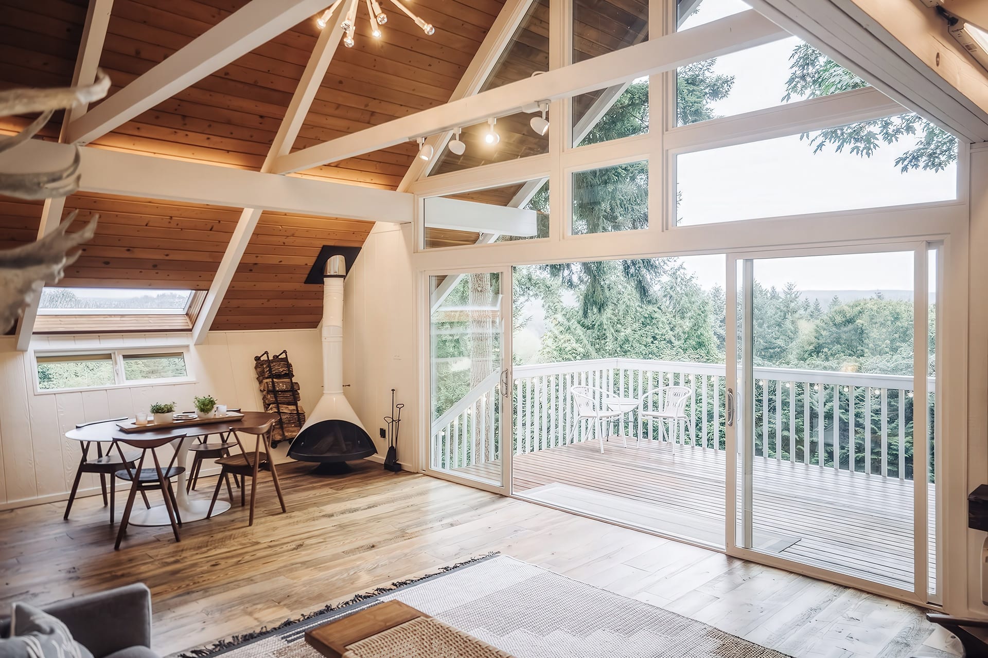
  • Interiors

Practice

  • Independent, Texas
  • Design and build
  • I love the work
Or · hello@reckon.house
HCredits

  1. Crate & Barrel
  2. Nordstrom
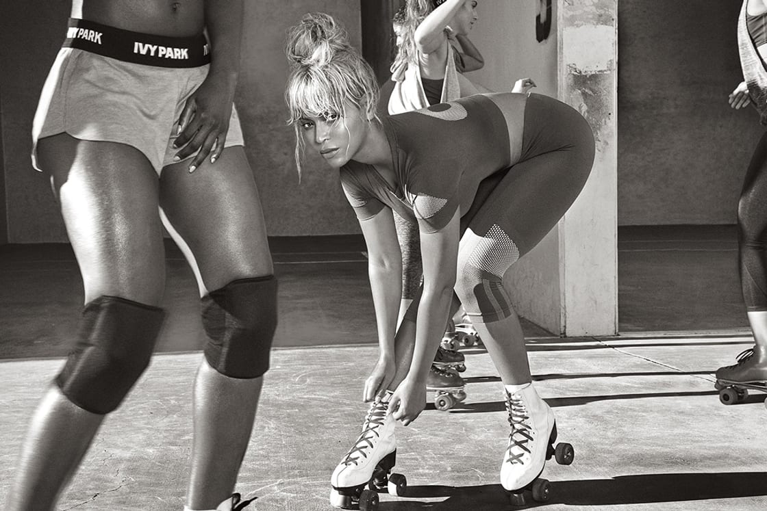
  3. Ivy Park by Beyoncé
  4. Neiman Marcus
  5. Rejuvenation
  6. Lostine Home
  7. Visual Comfort
  8. Floor & Decor
  9. Kingston Brass
  10. Design Within Reach
  11. Vivir Homes
  12. Haven
RecentlyAwwwards Honors, 2026. Faux Reel released as an open repo. 28 case studies online.
Get in touchhello@reckon.house
The setupIndependent, Texas. Design and build. I love the work.
What I doArt direction. Brand systems. Digital design. Interiors.
Aug 22

The homepage is three columns now: the wordmark left, the sentence and the question in the middle, the address right. They sit on the nav bar rather than under it, so the bar carries the page's own type instead of a strip of empty rule. Everything came down to two sizes, 32 and 12, inside a 50px frame on all four sides.

RHS
Aug 22

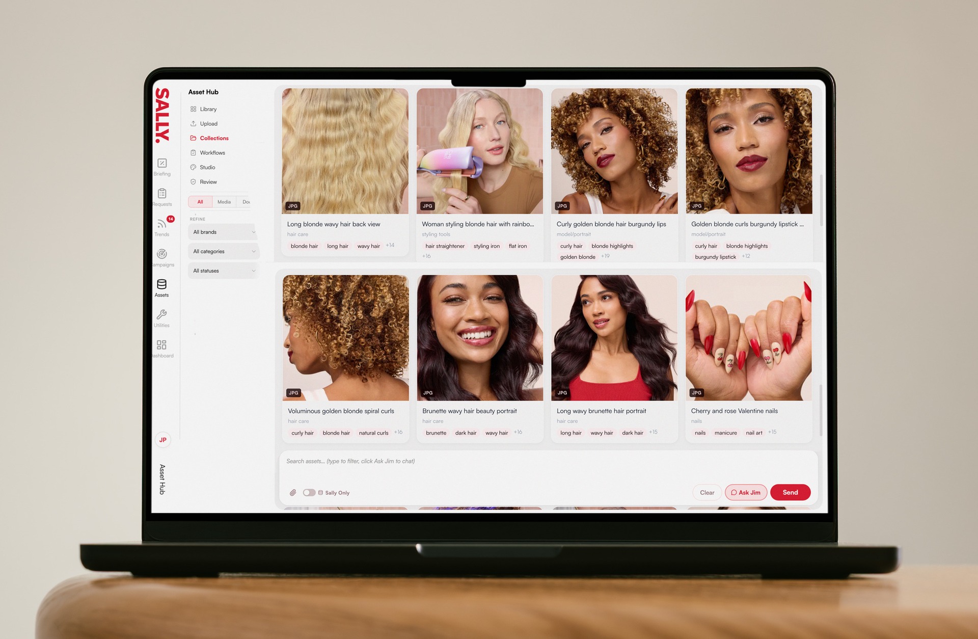
Image editing takes twelve inputs instead of four.

Sally
© 2026 Reckon HouseAwwwards Honors, 2026 · Faux Reel released as an open repo